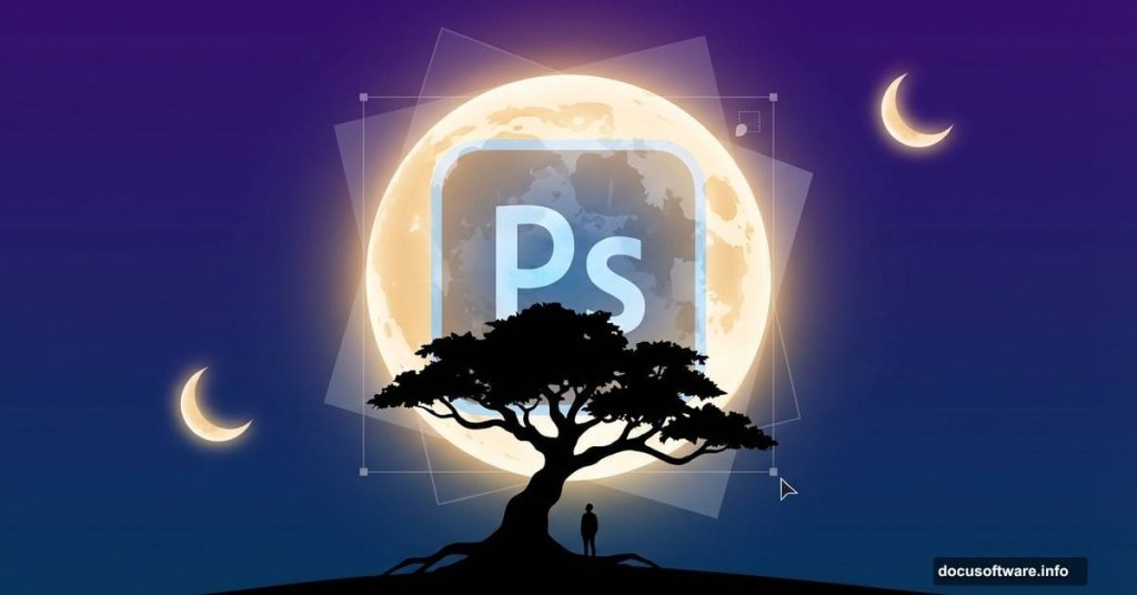
Photoshop lets you build impossible worlds. Today you’ll learn how to craft a dreamy nightscape where oversized moons hover above a solitary tree.
This tutorial covers photo manipulation fundamentals that work across countless projects. You’ll master layer blending, lighting adjustments, and the transition from daylight to moonlit scenes. Plus, the techniques apply whether you’re building fantasy landscapes or touching up product photos.
No advanced skills required. Just Photoshop CS3 or newer and patience to follow each step.
What You’ll Build
Picture this: A single tree stands in an open field. Multiple moons float in the twilight sky above. A figure rests beneath the branches, absorbed in shadow and silver light.
Sounds complex. But we’ll break it down into manageable chunks. First, we construct the landscape. Then we add the tree and atmospheric elements. Finally, we shift everything from day to night using adjustment layers.
The whole process takes about two hours once you understand the workflow.
Gathering Your Resources
Before opening Photoshop, collect these stock images:
- Grass field photo (for your foreground)
- Sky image (dramatic clouds work best)
- Tree with transparent background (saves masking time)
- Moon photo (you’ll duplicate this later)
- Model photo (optional but adds scale)
Free stock sites like Unsplash or Pexels offer all these elements. Make sure images are high resolution—at least 2000 pixels on the longest side. Low-res sources create fuzzy, unprofessional results.
Building Your Canvas
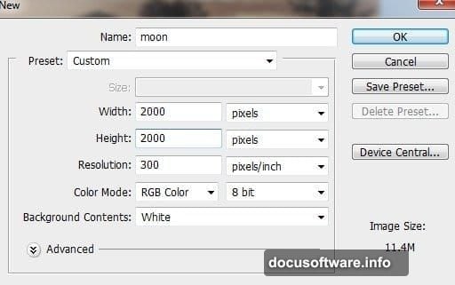
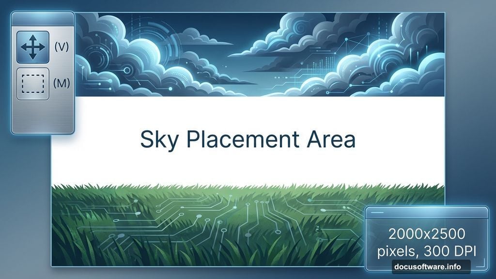
Start with a new document. Go to File > New and set dimensions to 2000×2500 pixels. Use 300 DPI if you plan to print. Stick with 72 DPI for web-only projects.
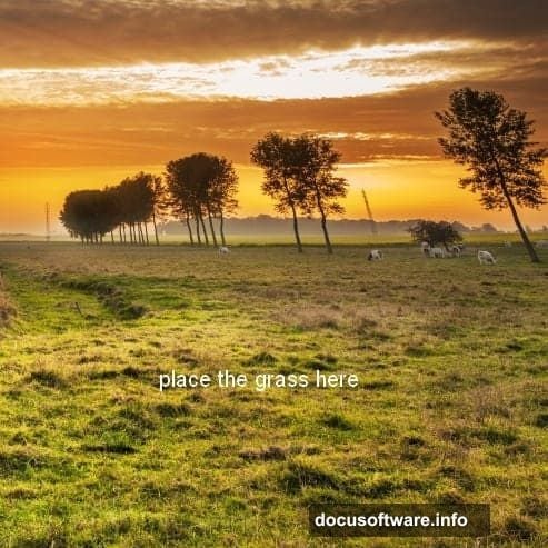
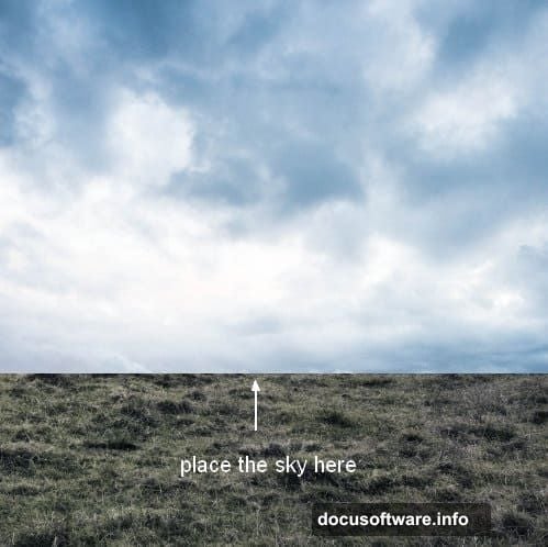
Now drag your grass image onto this blank canvas using the Move Tool (V). Position it across the bottom half. The top stays empty for now—that’s where your sky goes.
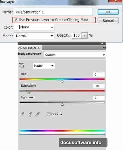
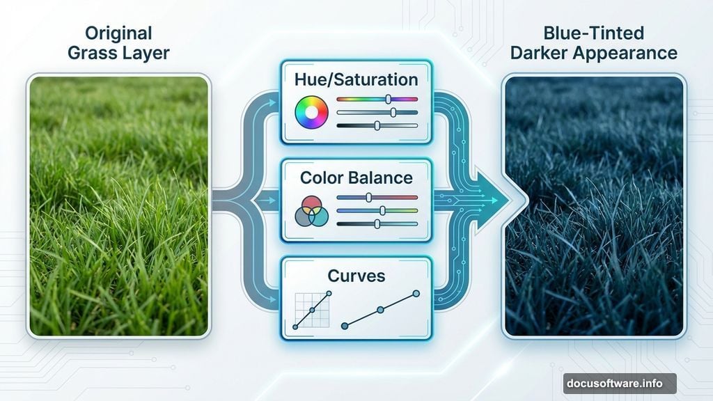
Notice the grass looks too saturated? Fix it immediately. Select Layer > New Adjustment Layer > Hue/Saturation. Drag the Saturation slider left until the grass feels muted and natural. This creates consistency before you add more elements.
Adjusting Grass Tones
The grass needs color correction. Add a Color Balance adjustment layer (Layer > New Adjustment Layer > Color Balance). Push the sliders toward blue and cyan. This prepares the grass for nighttime lighting later.
Next, add a Curves adjustment layer. Pull the curve down slightly to darken the grass. But here’s the trick: Use a soft black brush at 40% opacity on the layer mask. Paint over the foreground grass to keep it slightly brighter than the background. This creates depth.
Why use adjustment layers instead of direct edits? Flexibility. You can tweak settings anytime without destroying your original image.
Placing the Sky
Open your sky image. Select just the sky portion using the Rectangular Marquee Tool (M). Copy and paste it into your main document. Position it at the top of your canvas.
Press Cmd/Ctrl+T to activate Free Transform. Stretch the sky to fill the upper portion of your canvas. Hit Enter when satisfied.
Now the sky has hard edges where it meets the grass. Click the mask icon at the bottom of the Layers panel. Select a soft black brush and paint along the horizon line. This blends the sky seamlessly into the grass.
The transition should feel gradual, not abrupt.
Darkening the Sky
Add a Curves adjustment layer with Clipping Mask (right-click the layer and choose Create Clipping Mask). Pull the curve down to darken the sky. Remember—you’re building a nighttime scene. The sky should feel moody and deep.
Follow with a Hue/Saturation adjustment layer. Shift the hue slider until the sky color matches your grass tones. Everything should share similar color temperature. Mismatched colors scream “amateur composite.”
Check your layers panel frequently. Keep adjustment layers organized above the elements they affect. Messy layers cause confusion later.
Adding the Tree
Drag your tree image into the scene. Since it has a transparent background, placement is straightforward. Position it slightly off-center for better composition. Centered trees feel static and boring.
But wait—the tree base doesn’t match the grass texture. Add a layer mask. Use a soft black brush to paint away the hard edges where the tree meets the ground. Blend carefully. The goal is making the tree look rooted in this specific field, not dropped from space.
Take your time here. Sloppy masking ruins the entire illusion.
Creating Tree Branches
Select a branch from your tree image. Copy it and paste it as a new layer. Use Free Transform to rotate and position it extending from the left side of the main trunk.
Add a layer mask to this branch layer. Blend it with the trunk using a soft black brush. The connection point needs to look natural. Real branches don’t float—they emerge from the trunk with organic transitions.
This detail separates good composites from great ones.
Building Realistic Shadows
Shadows sell the realism. Make a new layer beneath all your tree layers. Hold Cmd/Ctrl+Shift and click the tree layer thumbnails. This loads their selection as a active marquee.
Fill this selection with black (Edit > Fill > Black). Press Cmd/Ctrl+T to activate Free Transform. Right-click and choose Distort. Pull the top corners outward to stretch the shadow flat across the ground.
Lower the layer opacity to 40-50%. Shadows shouldn’t look painted—they should feel like natural light absence. Add a slight Gaussian Blur (Filter > Blur > Gaussian Blur) around 3-5 pixels. Sharp shadows only happen under harsh midday sun.
Positioning the Figure
Place your model photo beneath the tree. Scale her appropriately using Free Transform. She should look naturally proportioned compared to the tree trunk.
Add a layer mask. Blend her lower body into the grass using a soft brush. Keep her upper body and face visible. The grass should appear to surround her naturally, not swallow her.
Later adjustments will handle her lighting to match the moonlit atmosphere.
Adding the Moons
Open your moon image. Select the moon using the Elliptical Marquee Tool or Magic Wand. Copy and paste it into your main scene. Position it in the upper portion of the sky.
Press Cmd/Ctrl+J to duplicate this moon layer. Move the duplicate to a different position. Repeat this process until you have 3-5 moons scattered across the sky. Vary their sizes slightly using Free Transform. Identical moons look artificial.
Lower the opacity on some moons to create depth. Distant objects appear fainter than close ones. This atmospheric perspective adds believability.
Creating the Night Atmosphere
Here comes the transformation. Add a new Color Balance adjustment layer above everything. In the Highlights section, push toward blue and cyan. In the Shadows, add blue and magenta. This creates that classic moonlight color palette.
Next, add a Curves adjustment layer. Pull the curve down significantly. Your entire scene should darken dramatically. Too dark? Use the layer mask to paint back brightness in specific areas.
Check the model especially. She might disappear entirely. Use a soft white brush on the Curves mask to restore some visibility to her face and shoulders.
Enhancing the Moonlight
Moons glow. Yours should too. Create a new layer above your moon layers. Set the blending mode to Screen. Select a soft white brush and gently paint around each moon. This creates a soft luminous halo.
Don’t overdo it. Subtle glows look magical. Excessive glows look like lens flares from a 90s music video.
Also add some ground-level glow. Create another layer set to Screen. Use a pale blue brush to paint soft light where moonbeams would hit the grass and tree. Light spills and scatters in real environments.
Final Color Grading
Almost done. Add a Selective Color adjustment layer. In the Neutrals section, add cyan and reduce yellow. This pushes the overall tone toward that cool, dreamlike quality.
Follow with a final Curves adjustment. Add a slight S-curve to boost contrast. Flat images lack punch. The S-curve (raising highlights, lowering shadows) adds visual interest without looking oversaturated.
Check your histogram. The tonal range should span from pure black to near-white without clipping. Crushed blacks and blown highlights destroy detail.
Adding Atmospheric Haze
Real nighttime scenes have atmospheric haze. Create a new layer at the top of your stack. Fill it with a dark blue color using a soft brush at low opacity (10-15%). Focus on the horizon area where sky meets grass.
This softens distant elements and enhances depth. Without haze, everything looks equally sharp and artificial.
Lower the layer opacity until the effect feels subtle. You’re adding mystery, not fog.
Sharpening and Details
Zoom to 100% view. Some elements might look soft after all these adjustments. Create a merged copy of all visible layers (Cmd/Ctrl+Alt+Shift+E).
Apply a Sharpen filter (Filter > Sharpen > Smart Sharpen). Use Amount: 80%, Radius: 1.0 pixels. This brings back crisp edges without creating halos.
Add a layer mask if needed. Paint away sharpening from areas that should stay soft, like distant background elements or soft shadow transitions.
Checking Your Work
Step back. View the image at various zoom levels. Does the composition balance? Do the moons draw your eye without dominating everything? Does the figure feel integrated rather than pasted?
Look for these common mistakes:
- Inconsistent light direction (shadows pointing different ways)
- Mismatched color temperatures between elements
- Sharp edges where soft transitions belong
- Elements floating instead of grounded in the scene
Fix issues now. Corrections after flattening become painful.
Export Settings
Ready to share? Flatten your image (Layer > Flatten Image) only after saving a layered PSD copy. Always keep that master file for future edits.
For web use, export as JPEG at 85% quality (File > Export > Save for Web). For print, keep it as TIFF with maximum quality. PNG works for situations requiring transparency, though this scene doesn’t need it.
Name your file descriptively: “surrealmoontreefinal.jpg” beats “untitled12.jpg” when you’re searching folders later.
What You Learned
This tutorial covered essential photo manipulation techniques you’ll use repeatedly:
- Blending multiple images seamlessly using masks
- Adjusting lighting and color for consistency
- Creating realistic shadows and glows
- Transforming day scenes into night atmospheres
- Using adjustment layers for non-destructive editing
These skills transfer to product photography, digital painting, concept art, and basically any Photoshop work involving composites.
Practice by creating variations. Try different times of day. Add stars. Change the figure’s pose. Experiment with warm sunset tones instead of cool moonlight. Each variation strengthens your understanding.
The best Photoshop artists aren’t following tutorials forever. They master core techniques, then improvise creatively. This tutorial gave you the foundation. Now build something uniquely yours.