Photoshop matte painting sounds intimidating. But it’s really just smart photo combining with atmosphere tricks.
This tutorial breaks down exactly how to create those dark, mysterious landscapes you see in fantasy artwork. No painting skills required. Just stock photos and some clever blending techniques.
You’ll learn the core techniques professionals use. Plus, I’ll show you why certain steps matter more than others.
What You’re Actually Building
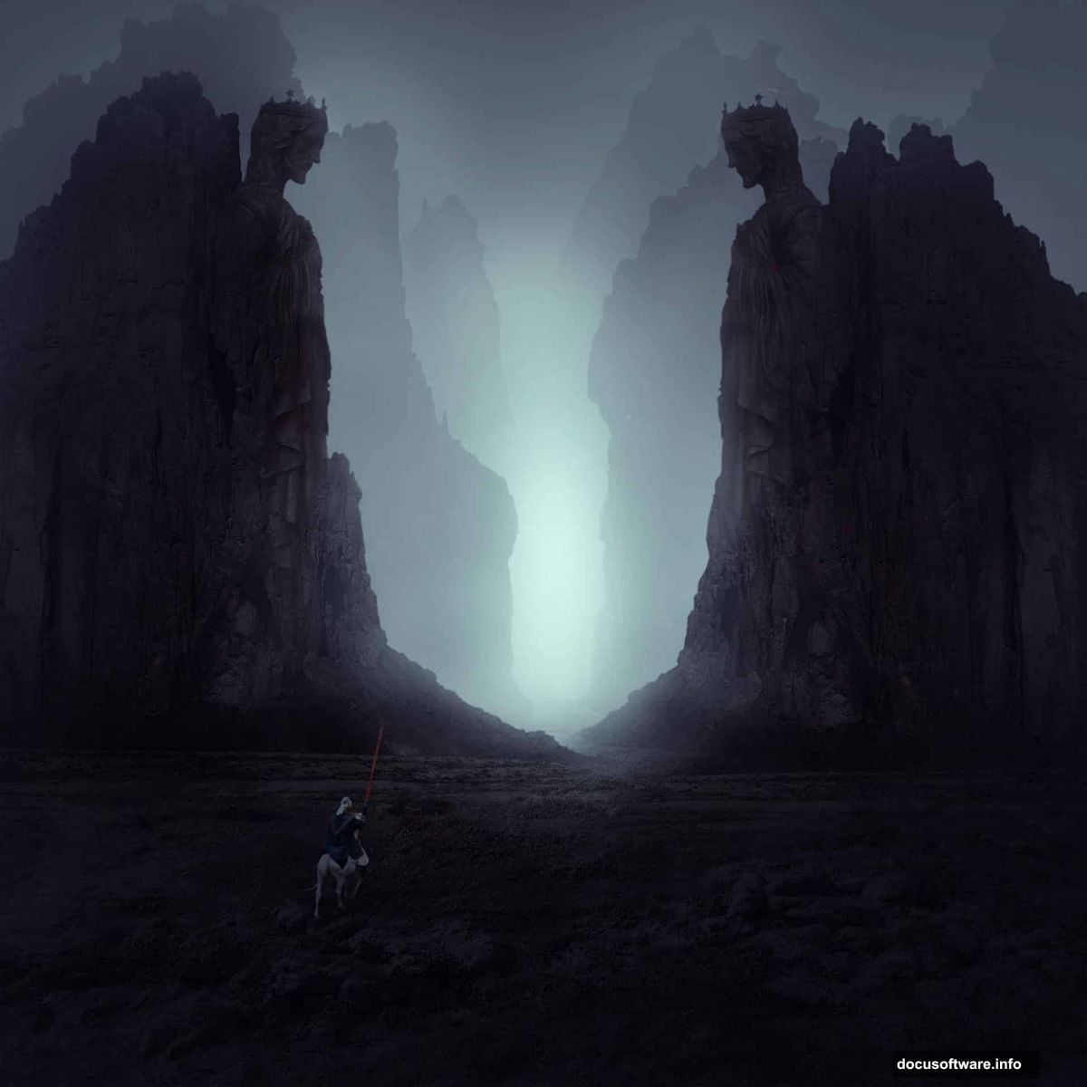
Think fantasy movie poster vibes. Rocky terrain, dramatic statue, lone knight figure. All wrapped in atmospheric mist that sells the mood.
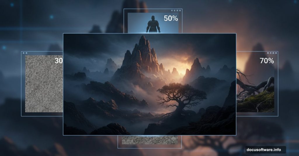
The key? Layering multiple rock photos at different opacities creates believable depth. Most beginners use one rock image and wonder why it looks flat. Instead, we’ll stack three different rock sources with varying transparency levels.
Then we’ll add that misty atmosphere everyone loves. It’s just a color fill layer with the right blend mode. Simple but effective.
Grab Your Source Images First
You’ll need five stock photos to follow along. A landscape base, three different rock images, and a statue photo. The tutorial also suggests a knight figure, though you can skip that element if needed.
Pro tip: Download everything before starting. Nothing kills creative momentum like hunting for images mid-workflow.
Make sure your rock images show different angles and textures. Variety matters when you’re building depth into a scene.
Setting Up Your Canvas

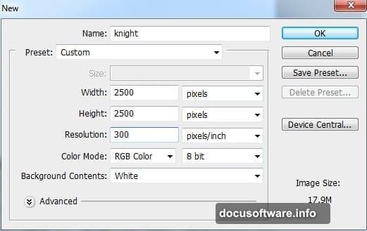
Create a new document at 2560 x 1440 pixels. That gives you room to work without fighting resolution issues later.
Start by dragging your landscape image onto the canvas. Position it so the ground fills the lower portion. Then mask out the sky and existing rocks using a soft brush on the layer mask.
Why mask instead of delete? Flexibility. You might want those pixels back later. Masking keeps your options open.
Desaturate and Color Grade the Ground
Now the fun begins. Add a Hue/Saturation adjustment layer with a clipping mask. Reduce saturation significantly to kill those vibrant colors.
Most fantasy landscapes lean toward muted, desaturated palettes. Bright colors break immersion in moody scenes. So we’re crushing that saturation early.
Next, add Color Balance to introduce subtle red tones. This warms the ground slightly without making it obviously colorful. Just a hint of warmth prevents the scene from looking dead.
Finally, use Curves to darken everything. Drop those midtones down. Dark landscapes need dark foundations. You can always brighten specific areas later with dodge tools.
Stack Your Rocks With Smart Opacity
Here’s where depth happens. Place your first rock image on the right side. Mask out the background completely.
Then duplicate that layer and flip it horizontally. Position the flipped version on the left. Instant symmetry without hunting for matching rock photos.

Now add your second rock image behind the first set. But here’s the trick: drop opacity to 50%. That pushes it into the background visually. Your brain reads lower opacity as greater distance.
Finally, mask the hard edges on that background rock layer. Soft, faded edges sell atmospheric perspective better than crisp ones.
Group and Adjust Your Rocks Together
Select all rock layers and hit Cmd/Ctrl+G to group them. Change the group blend mode from Pass Through to Normal at 100%.
Why? Pass Through means adjustment layers inside the group affect everything below. Normal mode contains those adjustments to just the group contents. You want control over what each adjustment affects.
Add Hue/Saturation inside the group to desaturate the rocks. Then use Curves to darken them significantly. Rocks in moody landscapes should feel heavy and ominous, not bright and inviting.

Add Your Statue and Knight Elements
Place the statue where it makes compositional sense. Usually off-center works better than dead-center placement. Use adjustment layers with clipping masks to match its lighting to your scene.
The knight figure adds scale and narrative. Position it small relative to the statue. That size difference tells viewers this world is vast and the character is exploring something ancient.
Blend both elements using the same techniques: adjustment layers for color matching, layer masks for edge refinement, and careful attention to light direction.
Create Atmospheric Mist
This step transforms everything. Add a Color Fill layer and set it to a dark blue-gray color. Then change the blend mode to Overlay or Soft Light.

Reduce opacity until you get subtle, atmospheric haze. Too much looks like a color wash. Too little has no effect. Aim for that sweet spot where the mist is visible but doesn’t obscure important details.
You can also mask the color fill layer to control where mist appears. Usually stronger near the horizon and lighter in the foreground works well.
Final Color and Contrast Adjustments
Add a Curves adjustment layer affecting the entire composition. Boost contrast by creating an S-curve. Lift highlights slightly, drop shadows deeper.
Then use Color Balance to fine-tune your overall palette. Dark doesn’t mean gray. Introduce subtle color shifts that support your mood. Blues for coldness, reds for warmth, or purples for mystery.
Consider adding a vignette by creating a black-filled layer, masking the center, and setting it to Multiply at low opacity. This draws attention toward your main subject.

Why This Technique Actually Works
Professional matte painters use these exact methods. Stacking images at varying opacities creates convincing depth without painting anything from scratch.
The adjustment layer workflow keeps everything non-destructive. You can tweak colors and contrast anytime without starting over. That flexibility matters when clients request changes or you want to try different moods.
Plus, this approach teaches you to think in layers. Not just Photoshop layers, but conceptual layers of depth, atmosphere, and lighting. Those mental models transfer to any digital art workflow.
Most importantly, these techniques produce results that look painted even though you’re just combining photos. The secret? Careful attention to how light, atmosphere, and depth actually work in real environments.
Once you understand these principles, you can apply them to any matte painting project. Fantasy landscapes, sci-fi cityscapes, or moody portraits all benefit from proper depth building and atmospheric effects.
Post Title: Dark Landscape Matte Painting Tutorial for Photoshop
Meta Description: [Photoshop](https://www.adobe.com/products/photoshop.html) matte painting sounds intimidating. But it’s really just smart photo combining with atmosphere tricks.