Want to create adorable retro tech illustrations? This Photoshop tutorial walks you through building a detailed vintage television icon from scratch.
No complex techniques required. Just layer styles, rounded rectangles, and some gradient magic. Plus, the finished result looks professional enough to use in actual design projects.
Let’s build something cute.
What You’ll Need Before Starting
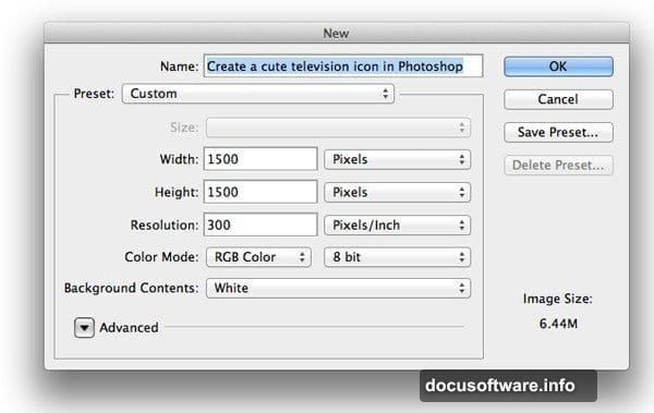
First, open Adobe Photoshop CS6 or newer. Create a new document with these settings:
- Width: 800px
- Height: 600px
- Resolution: 72 DPI
- Color Mode: RGB
This tutorial takes about 45 minutes to complete. It’s perfect for beginners who understand basic Photoshop tools. However, the layer style settings require attention to detail.
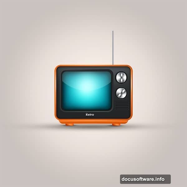
Make sure you’re comfortable with the Rounded Rectangle Tool and Layer Styles panel. Those two features do most of the heavy work here.
Building the TV Body
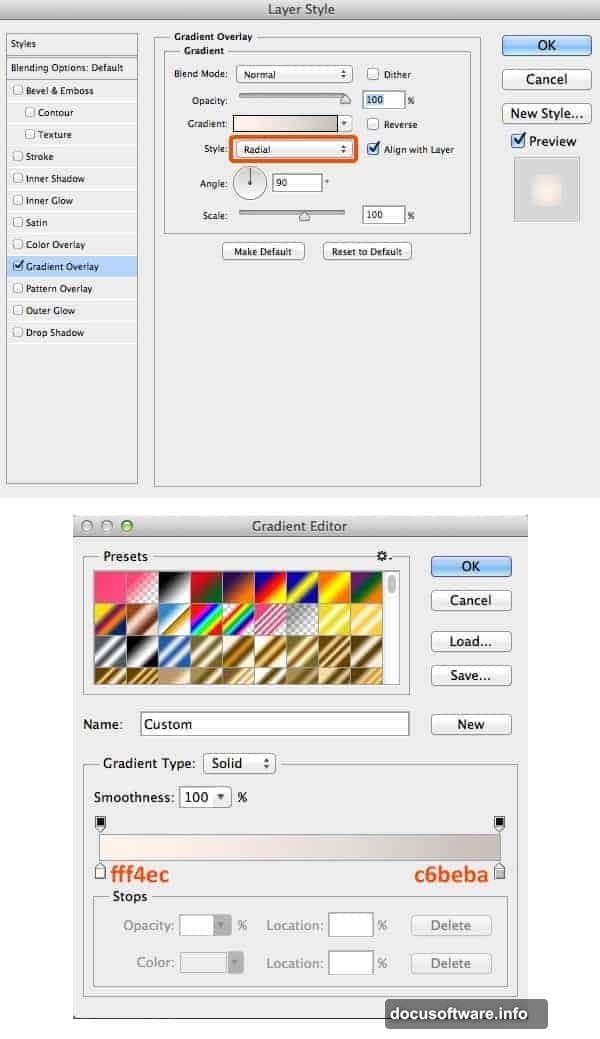
Start with the background. Fill it with white (hex #FFFFFF). Then apply a subtle gradient overlay to add depth.
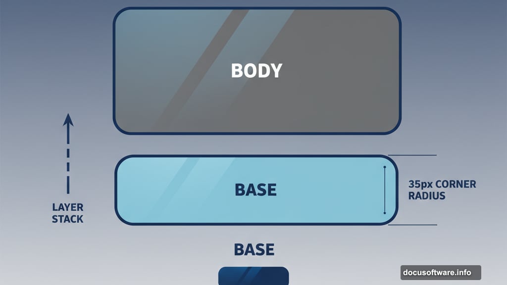
Now grab the Rounded Rectangle Tool (U). Set the corner radius to 35px. This creates those smooth, retro edges that make the TV look vintage.
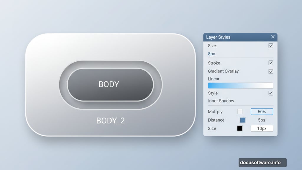
Draw your first rectangle. Name this layer “BODY”. This becomes the main television casing.
Right-click the layer and select Blending Options. Apply these layer styles:
- Stroke: 8px, positioned outside
- Gradient Overlay: Light to dark gray
- Inner Shadow: Subtle depth
The stroke gives your TV a defined edge. Meanwhile, the gradient makes it look three-dimensional instead of flat.
Creating the Screen Depth
Create another rounded rectangle layer. Name it “BODY_2”. Place this slightly smaller than your first rectangle.
Apply similar layer styles but adjust the stroke to 6px. Add an inner shadow with these settings:
- Blend Mode: Multiply
- Opacity: 50%
- Distance: 5px
- Size: 10px
This creates the illusion that the screen sits recessed into the TV body. The inner shadow suggests depth and dimensionality.
Place this layer above your original BODY layer. The overlapping effect starts making your TV look real.
Adding the Base Structure
Time to ground your television. Create a new layer called “BASE”. Place it underneath your BODY layer.

Draw another rounded rectangle with the same 35px radius. Make it slightly wider than your TV body. This becomes the bottom platform.
Copy the layer styles from your BODY layer. Right-click BODY, select “Copy Layer Style”, then paste onto BASE. However, reduce the stroke size to 3px so it doesn’t overpower the design.
The BASE should look like it’s supporting the television weight. Think of those chunky vintage TV stands from the 1960s.
Building the Feet
Create a new layer named “FOOT”. Place it under your BASE layer.
Draw a small rounded rectangle for the television foot. Apply an inner shadow to make it look like it’s touching the ground.
Use these inner shadow settings:
- Blend Mode: Multiply
- Opacity: 60%
- Distance: 3px
- Size: 8px
Now duplicate this FOOT layer. Position the copy on the opposite side. Your TV now has two feet, making it look stable and balanced.
These small details matter. They separate amateur icon designs from professional ones.
Adding Screen Realism
Create a layer called “SCREEN” at the top of your layer stack. Draw a rounded rectangle where your TV screen should appear.
Copy the layer styles from BODY_2 and paste them here. But increase the stroke to 10px. This makes the screen bezel look substantial.
For the screen interior, apply a dark gradient overlay. Use colors ranging from dark gray to black. This mimics how old cathode ray tube screens looked when turned off.
Add a subtle inner glow with a dark blue color. Set the opacity low, around 20%. This creates that authentic vintage screen appearance.
Creating the Glossy Finish
Nearly done. Create a new layer called “GLOSSY” at the very top.
Select the Brush Tool (B). Choose a large, soft brush. Click once with white color in the upper left area of your TV screen.
Change this layer’s blend mode to Overlay. Reduce opacity to 50%. This creates a realistic light reflection that makes your icon pop.
Real objects reflect light. So this simple touch adds believability. Without it, your TV looks flat and computer-generated.
Fine-Tuning Your Design
Take a moment to adjust layer opacities. Sometimes the initial settings look too strong or too weak.
Play with the gradient angles in your layer styles. A slight rotation can dramatically change how light appears to hit your television.
Consider adding small details like speaker grills or control knobs. These elements transform a basic shape into a recognizable vintage TV.
However, don’t overdo it. Sometimes simplicity creates stronger icons than excessive detail.
Why This Technique Matters
Learning to build icons from scratch teaches fundamental Photoshop skills. You master layer management, understand how light affects objects, and develop an eye for realistic shadows.
Plus, these techniques apply beyond television icons. The same principles work for creating buttons, badges, and interface elements.
Many designers jump straight to tracing photos or using pre-made shapes. But building from scratch gives you complete creative control. You’re not limited by existing assets.
Common Mistakes to Avoid
Watch your stroke positioning. Strokes positioned “inside” eat into your shape. Position them “outside” instead to maintain intended dimensions.
Don’t make every shadow the same. Inner shadows differ from drop shadows. Each serves a different purpose in creating depth.
Also, pay attention to gradient directions. Light typically comes from above. So your brightest gradient colors should be near the top of shapes.
Finally, name your layers properly. Working with “Layer 47” and “Layer 48” becomes confusing fast. Clear names save time when you need to make changes.
Taking This Further
Try creating variations once you finish the basic TV. Add antenna, change colors, or create different screen content.
You could build an entire set of retro electronics. A vintage radio, rotary phone, or cassette player would pair nicely with this television.
These icons work great for nostalgia-themed projects. Think retro gaming websites, vintage product packaging, or throwback social media graphics.
The best part? You built this entirely from basic shapes and layer effects. No illustration skills required. Just patience and attention to detail.
Some designers say Photoshop is only for photos. They’re wrong. Photoshop handles vector-style graphics beautifully when you understand its tools. Besides, Photoshop’s gradient controls beat Illustrator‘s for certain effects.
Use whatever software helps you create better work. Tools matter less than results.