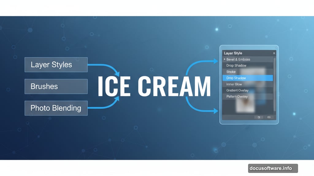
Want to make text look good enough to eat? This Photoshop tutorial shows you how to create delicious ice cream typography using layer styles, brushes, and smart photo blending.
No advanced techniques required. Just simple tools that pack serious visual punch. Plus, the same approach works for any food-themed design project you’re tackling.
What You’ll Need Before Starting
Grab these resources first. They make the difference between okay results and professional-looking text effects.
Required items:
- Photoshop CS5 or newer
- VAL font (free download)
- Bokeh stock image for lighting
- Food texture photos from CGtextures
Time investment: About 30-45 minutes for your first attempt. After that, you can knock out ice cream text in 15 minutes.
Most beginners skip the prep work. Then they wonder why their results look flat. Don’t make that mistake.

Setting Up Your Canvas and Background
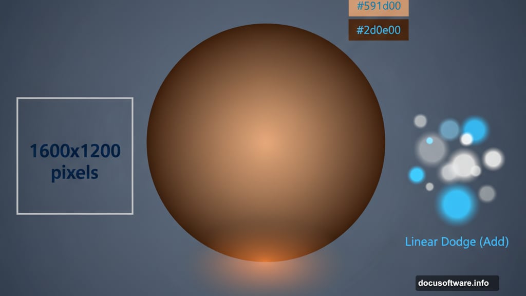
Start with proper foundations. Open Photoshop and create a new file at 1600×1200 pixels. That gives you enough resolution for web and print work.
Next, tackle the background gradient. Select your Background layer and grab the Gradient Tool (press G). Set it to Radial mode. Pick two brown tones: #591d00 and #2d0e00.
Why these specific colors? They mimic melted chocolate and create warmth. Plus, the darker edges draw attention to your text naturally.
Quick tip: Drag from the center outward when applying the gradient. That keeps the brightest point where you want it.
Adding Depth With Lighting Effects
Create a new layer (Shift + Ctrl + N). Switch to the Brush Tool and select #fea800 as your color. Choose a soft round brush at 1242 pixels.
Click once in the center of your canvas. You’ll see a large orange glow appear. Now change this layer’s blending mode to Screen and drop opacity to 20%.
What does this accomplish? It creates a subtle light source that makes everything feel dimensional. Without it, your text sits flat on the background.
But we’re not done with lighting yet. Import your bokeh stock image and place it over everything. Add a layer mask by clicking the mask icon.
Here’s the clever part. Hold Alt and click the mask thumbnail. Choose the Gradient Tool again with black-to-white radial selected. Draw from center outward to fade the bokeh edges smoothly.
Finally, set the bokeh layer to Linear Dodge (Add) blending mode. Suddenly those light spots interact with your background beautifully.
Adjusting Color and Contrast
Time to fine-tune the mood. Add a Hue/Saturation adjustment layer (Layer > New Adjustment Layer > Hue/Saturation).
Apply these settings:
- Hue: +175
- Saturation: -100
- Lightness: -76
If the adjustment affects your entire image, clip it to just the bokeh layer. Right-click the adjustment layer and choose “Create Clipping Mask.”
Now add another layer. Select #612200 and grab the Gradient Tool again. This time pick Linear mode with color-to-transparent. Draw a short line through the center.
Change this layer to Soft Light at 45% opacity. Notice how it adds richness without overwhelming the composition.
These adjustments might seem subtle individually. Together, they create depth that separates amateur work from professional results.
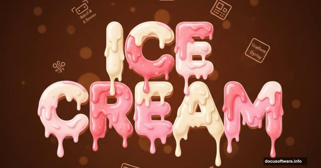
Creating the Ice Cream Text
Select the Type Tool and choose VAL font at 250 points. Set your text color to #5b1e00. Type whatever words you want.
The magic happens in layer styles. Right-click your text layer and choose “Blending Options.” Apply these settings carefully:
Inner Shadow:
- Blend Mode: Multiply
- Color: #000000
- Opacity: 75%
Inner Glow:
- Blend Mode: Screen
- Color: #612200
- Opacity: 5%
Bevel and Emboss:
- Style: Inner Bevel
- Technique: Smooth
- Size: 6px, Soften: 0px
- Highlight Mode: Screen, #fb9838 at 75%
- Shadow Mode: Multiply, #2b0c03 at 75%
Contour: Set to 50%
These combined effects create that glossy, dimensional ice cream appearance. Each setting serves a specific purpose in building the illusion.
Adding Realistic Bite Marks
Here’s where your text transforms from good to great. Add a layer mask to your text (click the mask icon at the bottom of the Layers panel).
Yes, masks work on text layers too. Many designers don’t realize this.
Select a 24-pixel hard round brush with black as your foreground color. Paint away sections of text to create bite marks and melting edges.
Pro technique: Vary your brush strokes. Real bite marks aren’t uniform. Some should be deep scoops, others gentle nibbles. Random imperfection sells the effect.
Take your time here. Rushed bite marks look obviously fake. Thoughtful ones make viewers do a double-take.
Fine-Tuning Your Final Result
Step back and evaluate your work. Does the text feel three-dimensional? Do the colors harmonize with your background?
Common issues and fixes:
If text looks too dark, increase the highlight opacity in your Bevel settings. If it feels flat, double-check that all layer blending modes match the tutorial.
Sometimes the bokeh feels too strong. Dial back its opacity until it enhances without overpowering. Background elements should support your text, not compete with it.
Color adjustments: Feel free to experiment with different hues in your adjustment layers. Mint green ice cream text? Change those brown tones to blues and greens. The technique adapts to any flavor you want.
Why This Technique Works
Layer styles create dimension without complicated 3D tools. Masking adds organic imperfection. Smart color choices establish mood.
Most importantly, this approach teaches you how different Photoshop features work together. Master these fundamentals and you’ll apply them to hundreds of future projects.
The ice cream text effect looks impressive. But the real value lies in understanding how lighting, texture, and color interaction create convincing visual effects.
Try this technique with different fonts, colors, and textures. Each variation teaches you something new about digital design fundamentals. That knowledge compounds faster than you’d expect.
Post Title: Ice Cream Text Effect in Photoshop: Easy Tutorial
Meta Description: Want to make text look good enough to eat? This [Photoshop](https://www.adobe.com/products/photoshop.html) tutorial shows you how to create delicious ice cream typography using