Want to create that dramatic burning text effect you see on movie posters? You know, where the letters look like they’re straight-up engulfed in flames?
I’ll walk you through the exact process. No fancy tricks. Just smart layering, stock images, and Photoshop‘s blending modes doing the heavy lifting.
This tutorial works in Photoshop CS5 or newer. Plus, you’ll pick up some useful techniques for backgrounds and texture work along the way.
What You’ll Need Before Starting
Grab these resources first so you don’t have to stop mid-tutorial:
Stock Images:
- Image 1, Image 10, and Image 12 from CGTextures (medium sizes work fine)
- Grunge vignette texture from Pixabay
- TrajanPro font from fontplace.com
Software:
- Adobe Photoshop CS5 or later
Got everything? Let’s build this effect from the ground up.
Build Your Canvas Foundation
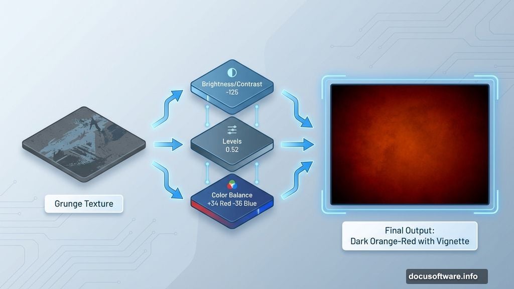
Start with a new file at 1280×1024 pixels. Hit Ctrl+N (or File > New) and punch in those dimensions.
Next, place your grunge texture. Go to File > Place, select “texture-318913”, and resize it to fill your canvas. Hit Enter to confirm placement.
Now here’s where it gets interesting. You’ll stack adjustment layers to transform this plain texture into something moody and dramatic.
Layer Up Those Adjustments
Create a Brightness/Contrast adjustment layer. Set Brightness to -125 and Contrast to -11. Right-click the layer and choose “Create Clipping Mask” so it only affects the texture below.
Add a Levels adjustment layer next. Move the middle slider to 0.52. This brightens your midtones without blowing out highlights. Clip it to the texture layer too.
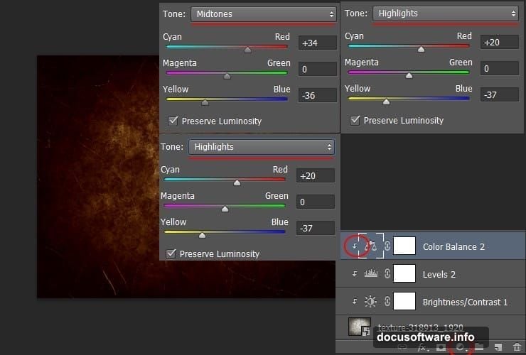
Then comes the Color Balance layer. This is where your background gets that warm, fiery glow:
Shadows:
- Cyan-Red: +13
- Magenta-Green: -3
- Yellow-Blue: -13
Midtones:
- Cyan-Red: +34
- Magenta-Green: 0
- Yellow-Blue: -36
Highlights:
- Cyan-Red: +20
- Magenta-Green: 0
- Yellow-Blue: -37
Clip this layer too. Your background should now have that orange-red warmth that screams “fire.”
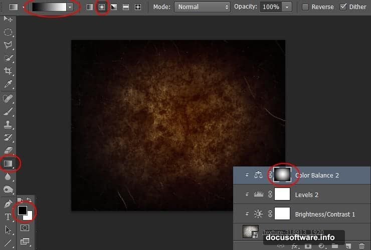
Add Gradient Masking for Depth
Click the white layer mask on your Color Balance layer. Grab the Gradient Tool (G) and switch to radial gradient mode.
Drag from the center of your canvas outward. This creates a subtle vignette effect where the color is strongest in the middle and fades toward the edges.
Now duplicate that Color Balance layer. Just drag it to the “Create a New Layer” button at the bottom of your layers panel. Drop its opacity to 50%. This adds extra richness without overwhelming the effect.
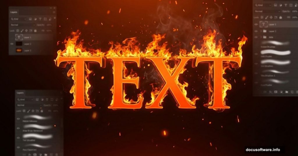
Create Your Burning Text
Hit the Type Tool and choose TrajanPro 3 Bold at 238.5px. Type your text. Use color #ff6c24 for that hot orange base.
Duplicate this text layer immediately. Keep the copy hidden for now. You’ll need it later for additional effects.
Right-click your visible text layer and choose “Blending Options.” Select Inner Glow from the list. Change the blending mode to Screen and use color #ffa024. Set the size to 10px.
This creates that initial heat glow around your letters. But we’re just getting started.
Apply Glass Distortion for Realism
Convert your text to a Smart Object first. This lets you edit it later without losing quality. Right-click the layer and choose “Convert to Smart Object.”
Now hit Filter > Filter Gallery > Distort > Glass. Set Distortion to 6 and Smoothness to 8. Pick the “Frosted” texture from the dropdown.
Why does this matter? Real fire distorts what’s behind it through heat waves. This glass filter mimics that effect perfectly. Your text now looks like it’s shimmering from intense heat.
Blend Fire Stock Images
Here’s where the magic happens. Place your fire stock images over the text. Use Image 1 from CGTextures first.
Set its blending mode to Screen. This makes the black parts transparent while keeping all the bright flames visible. Position it so flames wrap around your letters naturally.
Add Image 10 next. Same process: Screen blending mode, position carefully. Layer multiple fire images for complexity. Real fire isn’t uniform. It’s chaotic and layered.
Use Image 12 for additional texture. Vary the opacity of each fire layer between 70-100% depending on how intense you want specific areas.
Mask and Refine the Flames
Add layer masks to your fire images. Paint black on the mask to hide flames where they shouldn’t appear. Paint white to reveal more fire where you need extra intensity.
This manual masking gives you precise control. You’re basically sculpting with fire, deciding exactly which parts of your letters burn brightest.
Focus especially on the edges of letters. That’s where fire naturally licks upward and creates those signature flame shapes.
Add Final Color Grading
Create a Curves adjustment layer at the very top. Boost the reds slightly in the highlights. This unifies all your fire elements with a consistent warm tone.
Add a final Color Lookup adjustment if you want. Choose a cinematic LUT that enhances oranges and yellows. Keep it subtle though. You’ve already done the heavy lifting with your earlier color work.
Polish With Particle Effects
For extra drama, add some ember particles. Create a new layer and use a particle brush (or paint small dots manually). Set the blending mode to Linear Dodge (Add).
These floating embers suggest your text is actively burning, not just surrounded by static fire. Place them randomly around and above your letters. Make some larger and brighter than others for natural variation.
Lower the opacity on some ember particles. This creates depth, making some appear closer and others farther away.
Why This Effect Works
This technique creates believable burning text because it layers multiple elements just like real fire does. You’ve got the base heat glow, realistic flame textures, glass distortion for shimmer, and ember particles for movement.
Hollywood poster designers use similar approaches. They don’t rely on filters alone. Instead, they combine stock images, smart blending, and careful masking to build complex effects that photograph-realistic fire requires.
The key is patience. Don’t rush the masking and positioning phases. That’s where good effects become great ones. Take time to study how real fire behaves around objects and mimic that organic chaos.
This fiery text effect adapts to any font and size. Just adjust your stock image placement and masking to match your specific text. The principles stay the same whether you’re working with bold block letters or elegant scripts.