Photo manipulation isn’t just about technical skill. It’s about creating emotion through symbolism and composition.
Today you’ll learn how to build a haunting composite featuring a rose, ravens, and decay. Plus, you’ll discover masking techniques that go beyond basic brush work. This tutorial works in Photoshop CS5 or newer.
What Makes This Technique Different
Most tutorials teach you to mask with brushes. That’s fine for simple edits. But complex compositions need smarter approaches.
This method uses adjustment layers to create masks automatically. So you save time while achieving cleaner results. Moreover, you’ll learn how golden ratio principles guide viewer attention naturally.
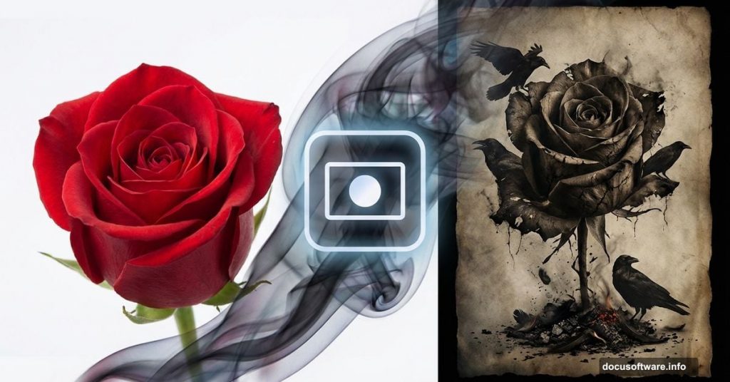
The final piece combines transformation symbols. Roses represent beauty fading. Ravens signal change. Ashes show endings. Together they create narrative through visual metaphor.
Stock Images You’ll Need
Gather these resources before starting:
Primary elements:
- Red rose photograph from RGBstock
- Foliage texture pack from designercandies.net
- Flying raven with alpha layer by Netzephyr
- Masked jackdaw stock by frankandcarystock
Texture and detail assets:
- Ashes stock by jennyraepip
- Feather brushes from dark-dragon-stock
- Vintage paper texture by klimek
- Hand drawn flower brushes
- Dead branches stock by jojo22
Additional brush sets:
- Debris brushes by zigabooooo
- Debris brushes by dacmaniac
Having everything organized saves frustration later. Download all assets to a single folder before opening Photoshop.
Build Your Canvas Foundation
Start fresh. Go to File > New and create a 1884 x 1480 pixel document. This gives you room for high-resolution output.
Drag your old paper texture stock into the canvas. This weathered base sets the entire mood. Position it to fill the frame completely.
Now add a Hue/Saturation adjustment layer. Access it through Layer > New Adjustment Layer or use the adjustment panel shortcut. Reduce saturation to push toward monochrome grunge aesthetic.
Then add a Brightness/Contrast layer. Increase contrast to emphasize paper texture. Drop brightness slightly for darker mood.
Optional Vintage Enhancement
Want that aged photograph look? Add a radial gradient fill layer.
Choose Layer > New Adjustment Layer > Gradient Fill. Set style to Radial. Position the center where you want focus. Use subtle dark edges that fade to lighter middle.
This vignette effect draws eyes inward naturally. Plus it amplifies that antique feeling. But skip this step if you prefer stark contrast instead.
Advanced Masking Without Brushes
Here’s where things get interesting. You’ll mask branches automatically using adjustment manipulation.
Place your dead branches stock onto the canvas. Duplicate this layer by dragging it onto the new layer icon. Right-click the duplicate and choose “Rasterize Layer.”
Navigate to Image > Adjustments > Brightness/Contrast. Crank brightness high and contrast extreme. You’re forcing the sky toward pure white.
Next go to Image > Adjustments > Levels. Push the highlights slider left until sky becomes completely white. Drag shadows right until branches turn deep black.
Now desaturate completely. Image > Adjustments > Hue/Saturation, then drag saturation to -100. You need pure black and white separation.
Add one more Brightness/Contrast adjustment. Max out both sliders. Any remaining gray should disappear into pure black or white.
Convert to Perfect Mask
Use the bucket tool to fill any remaining colored areas with white. Manual brush work cleans up stubborn sky bits the adjustments missed.
Then invert the entire layer. Image > Adjustments > Invert. Now branches are white on black background.
Select everything with Ctrl+A (or Command+A on Mac). Copy this selection with Ctrl+C.
Hold Alt and click the layer mask icon on your original branches layer. This reveals the mask editing canvas. Paste your copied selection with Ctrl+V.
The high-contrast layer becomes a precise mask automatically. No tedious brush painting required. This technique works brilliantly for any stock with clear sky backgrounds.
Understanding Golden Ratio Placement
The golden ratio (1.618) creates natural focal points. Your eye gravitates to these spots unconsciously.
When placing your rose, position it at golden ratio intersections. Divide your canvas width by 1.618. Do the same for height. Where these measurements cross marks your focal point.
Transform your rose by scaling and rotating. But keep the flower’s center near that calculated position. This mathematical approach ensures professional composition without guesswork.
Blend Ravens and Decay Elements
Ravens add movement and narrative tension. The flying raven stock includes alpha transparency, so placement works smoothly.
Position ravens following directional flow toward your rose focal point. Vary their sizes to create depth. Closer birds appear larger. Distant ones shrink appropriately.
Add feather brushes sparingly around ravens. These suggest motion and disintegration. But don’t overdo it. Restraint maintains elegance.
Scatter ash particles using your downloaded brush sets. Concentrate density near transformation points. Lighter ash distribution elsewhere suggests the decay spreading outward.
Layer Shadows Create Depth
Every element needs appropriate shadow work. Otherwise your composite looks flat and fake.
Create new layers set to Multiply blend mode beneath each major element. Use soft round brushes with black color. Paint shadows that respect your imagined light source direction.
Shadows should be darkest where objects contact the surface. They fade and blur as distance increases. This contact shadow principle separates amateur from professional compositing.
Vary shadow opacity between elements. Objects closer to the viewer cast darker, sharper shadows. Background elements get softer, lighter shadows.
Hand-Drawn Aesthetic Finishing
Raw photo composites often feel digital and cold. Add hand-drawn texture for organic warmth.
Apply a subtle Posterize adjustment. Layer > New Adjustment Layer > Posterize. Keep levels low, around 8-12. This simplifies tones slightly.
Then add a Find Edges filter to a duplicated merge layer. Filter > Stylize > Find Edges. Set this layer to Overlay or Soft Light at low opacity (10-20%). It suggests sketch lines without overwhelming the image.
Finally, apply a very light Gaussian Blur to specific areas. This mimics hand-drawn softness while maintaining photo-realistic core elements.
Final Color Grading
Your emotional tone comes from color treatment. For gothic melancholy, push toward desaturated earth tones with subtle cyan-red split.
Add a Color Lookup adjustment layer. Experiment with built-in LUTs or create custom curves. Deepen shadows toward blue. Push highlights slightly warm.
A Selective Color adjustment lets you target specific color ranges. Tweak reds in your rose without affecting the entire image. This precision control maintains focal point emphasis.
End with a final Curves adjustment for overall contrast refinement. Subtle S-curve adds punch while preserving detail in highlights and shadows.
Why Symbolism Matters
Technical execution means nothing without emotional resonance. Every element you chose carries meaning.
The rose represents beauty, love, but also impermanence. Its decay mirrors human mortality. Ravens symbolize transformation, death, but also intelligence and prophecy. Ashes show what remains after destruction.
Together these symbols tell a story without words. Viewers feel melancholy, reflection, the passage of time. That emotional connection separates memorable art from mere technical exercise.
Common Mistakes to Avoid
Don’t skip the masking technique. Manual brush masking takes hours and rarely achieves this precision. The adjustment-based approach saves time while delivering cleaner results.
Avoid overlighting effects. Beginning compositors add too many glows, particles, and light leaks. Restraint looks professional. Excess looks amateur.
Don’t forget shadow directionality. Every shadow must respect your established light source. Inconsistent shadows destroy believability instantly.
Skip the urge to over-blend. Some elements should maintain slight separation. Perfect seamlessness sometimes looks flat. Controlled contrast adds dimension.
Beyond This Tutorial
These techniques extend far beyond rose compositions. The masking method works for any high-contrast stock. Golden ratio placement improves every composition. Shadow principles apply universally.
Experiment with different symbolic elements. Butterflies replace ravens for transformation with hope. Flowers blooming instead of decaying reverse the emotional narrative entirely. Water and fire each carry distinct metaphorical weight.
The technical skills matter. But understanding why you make choices matters more. That’s what separates Photoshop operators from visual storytellers.
Your rose manipulation will communicate emotion through careful symbol selection and professional execution. Technical mastery serves artistic vision. Never the reverse.