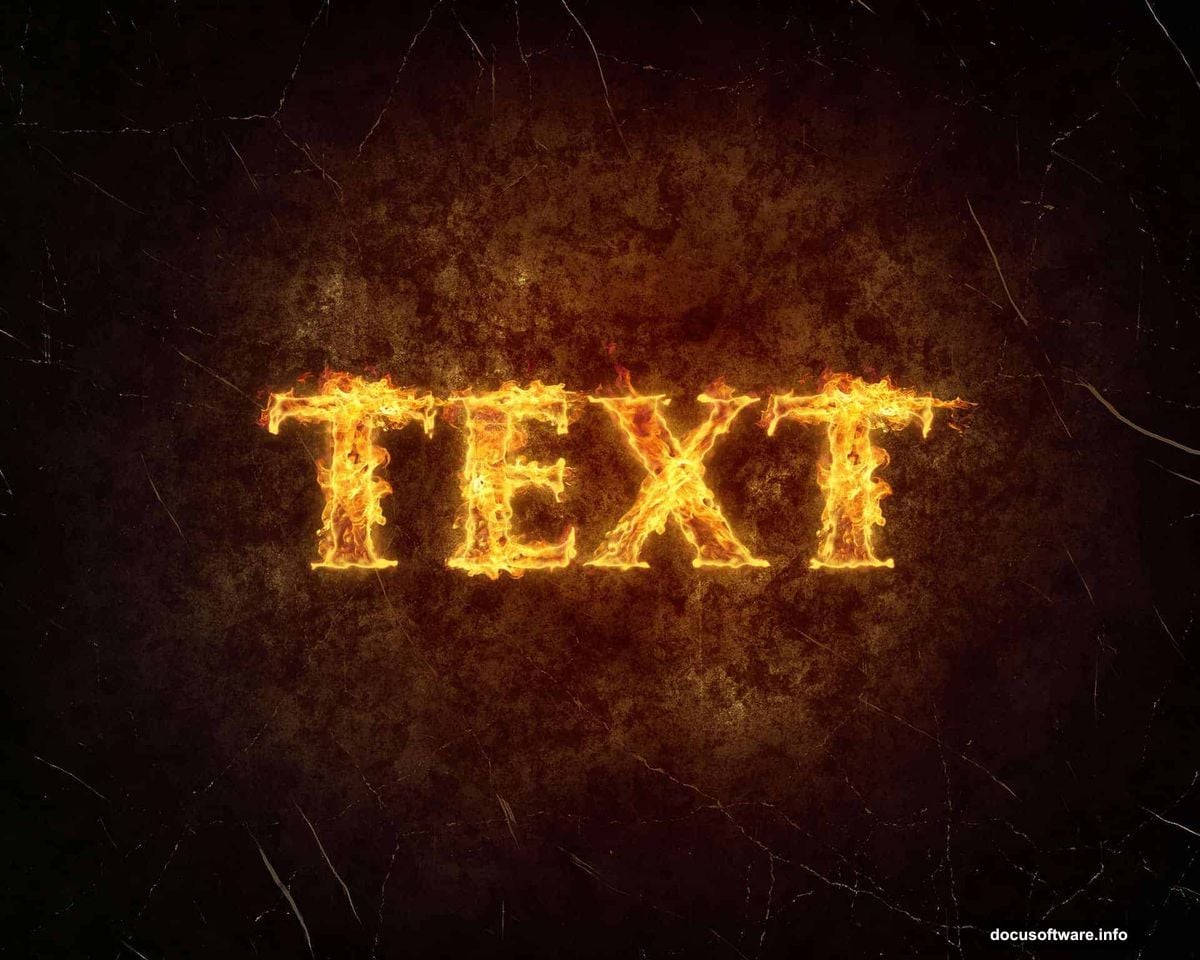
Photoshop‘s text effects can transform boring typography into eye-catching visuals. But most tutorials overcomplicate the process.
Here’s the truth. Creating professional fiery text takes just 9 simple steps. Plus, you probably already have the tools installed. Let’s skip the theory and jump straight into what actually works.
What You’ll Actually Need
First, grab these free resources before starting. You’ll save hours of frustration later.
Download three texture images from CGTextures: Image 1, Image 10, and Image 12 in medium resolution. Then snag the grunge vignette texture from Pixabay. Finally, install TrajanPro font from fontplace.com if you don’t have it already.
Make sure you’re running Photoshop CS5 or newer. Older versions won’t support some blending features we’ll use.
Setting Up Your Canvas
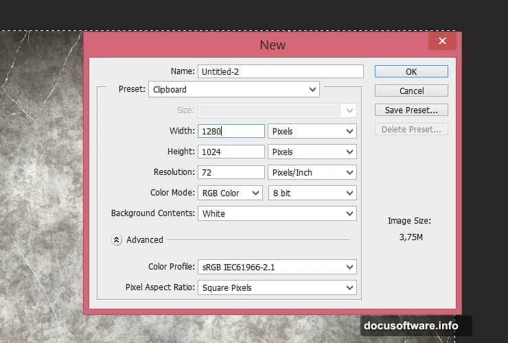
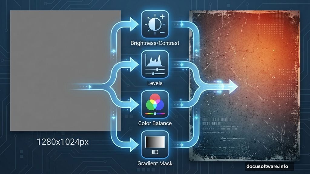
Create a new file at 1280×1024 pixels. Hit Ctrl+N (Cmd+N on Mac) to open the dialog box quickly.
Why this size? It works perfectly for web graphics and social media posts. Plus, it scales down cleanly without losing quality.
Building the Grunge Background
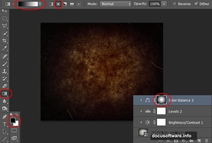
Now place your “texture-318913” stock image. Go to File > Place, select the texture, and transform it to fit your canvas. Hit Enter to confirm placement.
Here’s where it gets interesting. Create a Brightness/Contrast adjustment layer by hitting the adjustment layer icon. Set Brightness to -125 and Contrast to -11. Right-click the layer and choose “Create Clipping Mask.”
Next, add a Levels adjustment layer. Move the middle slider to 0.52. This subtle change adds depth without overdoing it. Again, clip this layer to the texture below.
Adding Color Warmth
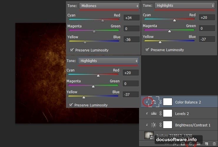
Time for color magic. Create a Color Balance adjustment layer and punch in these values:
Shadows:
- Cyan-Red: +13
- Magenta-Green: -3
- Yellow-Blue: -13
Midtones:
- Cyan-Red: +34
- Magenta-Green: 0
- Yellow-Blue: -36
Highlights:
- Cyan-Red: +20
- Magenta-Green: 0
- Yellow-Blue: -37
Don’t forget to clip this layer too. Then click the white layer mask thumbnail. Grab the Gradient Tool (press G) and select radial gradient. Drag from center to edge using the default black-to-white gradient.
This creates a natural vignette effect that draws eyes to your text. Pretty slick, right?
Boosting the Effect
Duplicate your Color Balance layer by dragging it to the New Layer button. Reduce opacity to 50% on this duplicate. This intensifies the warm glow without making it look fake.
Creating Your Text Layer
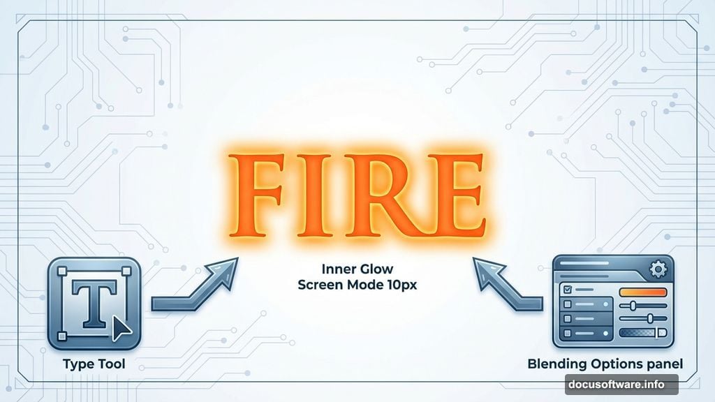
Select the Type tool and type your message. Use TrajanPro 3 Bold at 238.5px. Set the color to #ff6c24 for that perfect orange-red base.
Here’s a pro tip. Duplicate this text layer immediately and disable the copy. You’ll need it later for backup.
Adding Inner Fire
Right-click your active text layer and choose Blending Options. Select Inner Glow from the list.
Change the blend mode to Screen. Use color #ffa024 for the glow. Set the size to 10px. This creates that hot core effect that makes text look genuinely aflame.
Layering Fire Textures
Now comes the fun part. Place your fire stock images over the text. Use Image 1 first, then layer Image 10 and Image 12 on top.
Set each fire layer’s blend mode to Screen. This makes black areas transparent while keeping bright flames visible. Position each layer to cover different parts of your text.
Final Polish with Glass Distortion
Merge your fire layers into a smart object. Go to Filter > Filter Gallery > Distort > Glass. Set Distortion to 6 and Smoothness to 8. Choose the Frosted texture option.
This adds realistic heat distortion that sells the burning effect. Without it, your text looks flat and fake.
Testing Different Variations
Try adjusting the fire layer positions. Small movements create dramatically different looks. Also experiment with layer opacity to control flame intensity.
Some designers add extra smoke effects. Others incorporate embers or sparks. The base technique handles all these variations easily.
Common Mistakes to Avoid
Don’t skip the clipping masks. They keep adjustments locked to specific layers. Otherwise, your entire composition shifts color unexpectedly.
Also, resist cranking up the Inner Glow size past 15px. Bigger isn’t better here. It just creates muddy halos that look amateur.
Finally, watch your color values. Too much red makes text look like cheap clip art. Balance orange and yellow tones for realistic fire.
Why This Works
This technique combines multiple stock images with careful blending. Instead of relying on filters alone, you’re layering real fire photography. That’s why the result looks convincing.
Plus, the gradient background creates depth. Flat backgrounds make even perfect text effects fall flat. The vignette draws focus exactly where you want it.
Most importantly, you control every element. Hate the fire color? Swap it. Want more smoke? Add another layer. This flexibility beats one-click filters every time.
The whole process takes maybe 20 minutes once you practice. But the results rival effects that studios charge hundreds for. That’s the power of knowing your tools properly.