Photo manipulation separates good designers from great ones. But most tutorials skip the crucial details that actually matter.
This walkthrough breaks down a complete dance photo manipulation project. You’ll learn how to blend images seamlessly, add dramatic effects, and master several file-size tricks that keep projects manageable. Plus, we cover layer optimization techniques that professional designers use daily.
Let’s dive into the specific techniques that transform ordinary photos into portfolio-worthy artwork.
Start With Smart Objects to Keep Files Small
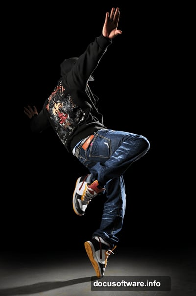
Opening your base image is straightforward. But the next step matters more than most designers realize.
When you add your cloud layer, use File > Place instead of copy-paste or drag-drop. This command automatically creates a smart object in Photoshop CS2 and newer versions.
Why does this matter? Smart objects dramatically reduce file size when you save without the maximize compatibility option. For complex manipulations with multiple layers, this trick alone can cut your file size by 40-50%.
Position and resize the clouds using the transform tool that appears. Press Enter when you’re satisfied with the placement.
Blend Modes Beat Layer Masks for Clouds
Here’s where most tutorials get it wrong. They tell you to mask out the sky manually.
Instead, use blending options. This approach keeps your file smaller and maintains flexibility for future edits.
Right-click the cloud layer and choose Blending Options. Drag the black input slider right until the sky disappears. Then hold Alt and split that slider by dragging the right half further right. This creates smooth transparency where clouds fade into sky.
But we’re not done yet. Click Color Overlay in the same window. Set it to white with Color blend mode. This desaturates your clouds non-destructively without adding another adjustment layer.
That’s two effects applied without increasing layer count or file size. Smart workflow choices like this separate efficient designers from those who create bloated documents.
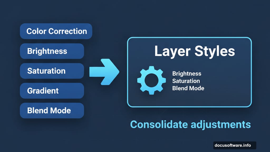
Layer Styles Replace Multiple Adjustment Layers
Traditional photo manipulation piles on adjustment layers. Color correction here, brightness there, saturation somewhere else. Before you know it, you’ve got 30 layers for a simple composite.
Layer styles consolidate these adjustments. You can apply color overlays, gradients, and blending modes all within one layer’s properties.
For this dance manipulation, each major element gets its own set of layer styles. The dancer needs different treatment than the background or effect elements. So organize your thinking by subject, not by adjustment type.
This mental shift makes your workflow faster and your files cleaner. Plus, you can copy layer styles between layers instantly. Try that with five separate adjustment layers.
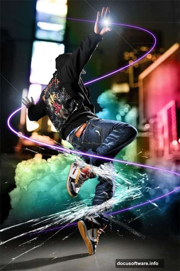
Stroke Paths Create Dynamic Light Streaks
Abstract light effects make or break dance manipulations. But creating them manually takes forever and looks amateurish.
Instead, use the pen tool to draw flowing curves around your dancer. These paths should follow the motion and energy of the pose. Then stroke those paths with brush settings that create the light effect you want.
Here’s the specific technique. Select your pen tool and draw smooth curves. Switch to your brush tool and configure size, hardness, and color. Then right-click your path in the Paths panel and choose Stroke Path.
Select Brush from the dropdown and check Simulate Pressure. This creates tapered strokes that look hand-painted rather than mechanical. You can stroke the same path multiple times with different brush settings to build up complex effects.
The key is drawing good paths first. Spend time getting the curves right. Beautiful strokes come from beautiful paths.
Gun Blast Effects Add Dramatic Impact
Unexpected elements make compositions memorable. For this piece, adding a gun blast creates energy and narrative tension.
Find a stock photo of a gun firing. Place it as a smart object using the technique from earlier. Then blend it using the same layer style tricks we used for clouds.
The hard part is making the blast feel integrated rather than pasted on. Match the lighting direction and intensity. Add subtle color overlays that tie the blast’s color palette to your main subject. Use blur sparingly to suggest motion.
Sometimes the most effective composites include elements that surprise viewers. Don’t limit yourself to obvious additions. Think about what adds energy, story, or visual interest.
Glass Shard Overlays Need Careful Balance
Shattered glass became a photo manipulation cliché years ago. But used thoughtfully, it still creates compelling tension.
The trick is restraint. Don’t cover your entire composition in glass shards. Instead, place them strategically where they enhance the action or create depth.
Blend mode matters enormously here. Screen mode works for bright compositions. Lighten preserves more detail. Overlay creates contrast. Test several options before committing.
Also vary the opacity. Not every glass shard needs 100% opacity. Creating depth through transparency makes the effect feel more realistic and less heavy-handed.
Color Grading Unifies Disparate Elements
You’ve combined images from different sources with different lighting and color temperatures. Now everything looks disjointed.
Color grading solves this problem. But avoid the temptation to oversaturate or push colors into unrealistic territory.
Start with a Curves adjustment layer at the top of your layer stack. Make subtle adjustments to each color channel individually. The goal is creating harmony, not making every color pop.
Then add a Color Lookup adjustment layer. Browse the presets to find something close to your vision. Don’t use it at 100% opacity. Dial it back to 30-50% for a subtle shift that feels natural rather than Instagram-filtered.
Remember, viewers should notice your overall mood and atmosphere. They shouldn’t notice your color grading specifically.
Lighting Effects Make or Break Realism
Photoshop’s built-in lighting effects get overlooked. But they’re powerful tools for creating three-dimensional depth.
After you’ve placed all your elements, add a new layer set to Overlay blend mode. Paint with soft white and black brushes to suggest directional lighting. White brightens, black darkens.
This simulates how light would actually hit the various surfaces in your composition. It’s subtle work that makes everything feel like it exists in the same space rather than floating in separate layers.
Pay special attention to edges where different elements meet. A slight highlight or shadow at these boundaries creates the illusion of depth and contact.

Save Multiple Versions as You Progress
Here’s a workflow tip that saves headaches later. As you complete major steps, save numbered versions of your document.
Not just “Save As” with a new name. Actually save completely separate files. Name them logically: “dancemanipulation01base.psd”, “dancemanipulation02effects.psd”, and so on.
Why bother? Sometimes you’ll make changes that seemed brilliant at midnight but look terrible in morning light. Having previous versions lets you backtrack without losing hours of work.
Plus, clients often request changes that mean returning to earlier stages. Having those stages already saved as separate files makes revisions painless.
Small Details Add Big Impact
When you think you’re done, zoom out. Look at the overall composition with fresh eyes. Then zoom back in and scan every section carefully.
You’re looking for small inconsistencies that break the illusion. Maybe the dancer’s foot shadow doesn’t match the background shadows. Perhaps some glass shards need different opacity. Possibly the light streaks don’t quite follow the motion.
These tiny fixes separate good work from great work. Most viewers won’t consciously notice them. But they’ll feel the difference between a polished composition and a rushed one.
Spend this refinement time wisely. It’s where average manipulations become portfolio pieces.
Practice These Techniques on Your Own Photos
This tutorial walked through one specific manipulation. But the real value comes from understanding the underlying principles.
Smart objects reduce file size. Layer styles consolidate adjustments. Blending modes create seamless composites. Careful refinement elevates the final result.
Take these concepts and apply them to your own projects. Start simple. Combine two images before attempting complex multi-element scenes. Master each technique individually before combining them all.
Photo manipulation skills compound over time. Each project teaches lessons that make the next one easier. So start creating. Your first attempts won’t match this example. That’s fine. They’ll be better than nothing, which is what you’ll have if you never start.
The tools are free or affordable. Stock photos cost a few dollars. The only real investment is your time. So stop reading tutorials and start manipulating photos.