
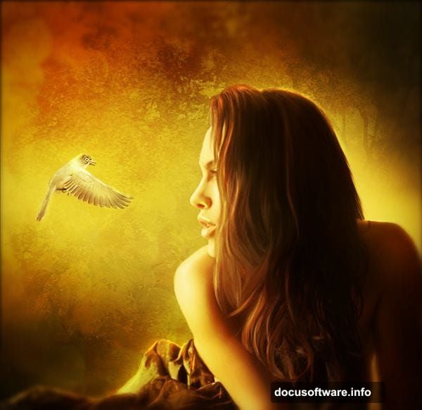
Want to create stunning autumn portrait artwork in Photoshop? This technique transforms ordinary photos into warm, dreamy scenes that capture fall’s golden magic.
I’ve broken down a professional portrait editing workflow into simple steps anyone can follow. Plus, you’ll learn layer blending tricks that work for any season or style. These techniques apply whether you’re editing portraits, landscapes, or creative composites.
Let’s dive into the process that takes your photos from basic to breathtaking.
Prepare Your Canvas Foundation
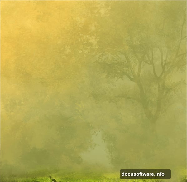
Start by selecting a background that sets your autumn mood. Flip and crop the image to compose your scene exactly how you want it.
Then duplicate your background layer twice. Set the first copy to Screen mode to brighten highlights. Set the second to Multiply mode to deepen shadows.
This simple trick instantly adds dimension and contrast. Your background now has depth instead of looking flat and boring.
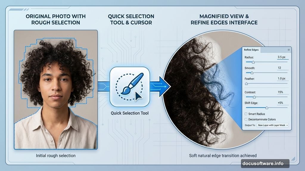
Extract Your Subject Cleanly
Use Photoshop’s Quick Selection Tool combined with Refine Edges to separate your subject from their original background. Every photographer has their preferred extraction method, so use whatever works best for you.
The key is clean edges, especially around hair. Soft, natural-looking edges make the difference between amateur composites and professional results.
Place your extracted subject on a new layer above your background layers. Now the real magic begins.
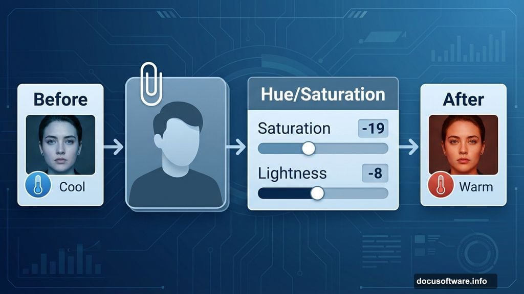
Blend Subject With Background Colors
Your subject probably doesn’t match the background’s color temperature yet. Fix this with a Hue/Saturation adjustment layer clipped to your subject layer only.
Reduce saturation by 19 points. Drop lightness by 8 points. This subtle shift makes your subject feel like they actually exist in the autumn scene.
Too many people skip this step. Then they wonder why their composites look fake and pasted together.
Add Warm Autumn Color Tones
Create a Color Balance adjustment layer clipped to your subject. Adjust each tonal range separately for natural results:
Shadows: Push toward red (+14), yellow (+7), and away from blue (-16)
Midtones: Add red (+11), yellow (+7), keep blue neutral (0)
Highlights: Subtle red (+10), yellow (+5), slight warmth (-5 blue)
These adjustments wrap your subject in autumn’s warm embrace. The colors now harmonize instead of clashing.
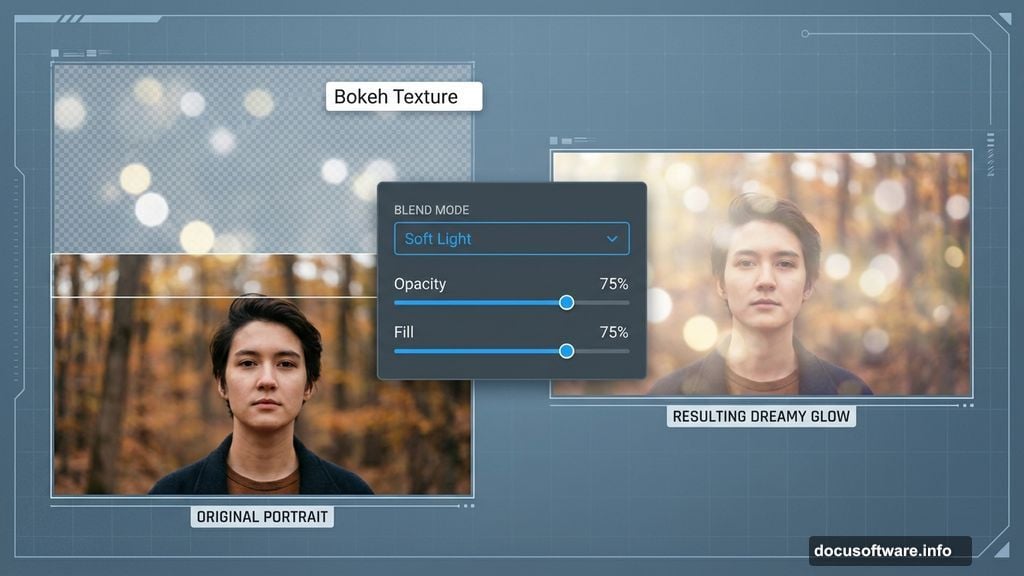
Layer Bokeh for Dreamy Atmosphere
Add a bokeh texture layer above everything. Rotate it to match your composition’s flow and perspective.
Set the bokeh layer to Soft Light blend mode. Reduce both opacity and fill to 75%. This creates soft, glowing light spots that add romance and depth.
Bokeh layers work like Instagram filters, but with way more control. You decide exactly how much dreamy haze to add.
Apply Gradient Maps for Color Harmony
Gradient maps are secret weapons for unified color palettes. Add your first gradient map using a warm autumn preset from Photoshop’s library.
Set it to Soft Light mode with 80% opacity and fill. This gently tints everything toward cohesive autumn tones.
Then add a second gradient map with slightly different warm colors. Also set to Soft Light at 80%. Two gradient maps create richer, more complex color relationships than one alone.
Enhance Shadows and Highlights Strategically
Add a Brightness/Contrast adjustment layer clipped to just your background layers. Drop brightness significantly (around -54) and boost contrast (+48).
This darkens the background while keeping your subject bright and prominent. Your eye naturally goes to the brightest part of an image, so this draws attention exactly where you want it.
Create a new layer below your subject and paint with soft white beneath them. Extend slightly beyond their edges to create a subtle glow that blends them into the scene.
Add Atmospheric Light Sources
Paint warm light on a new layer using a soft brush with low opacity. Focus light where it would naturally hit your subject’s face, shoulders, and hair.
Set this layer to Screen or Linear Dodge for glowing highlights. Adjust opacity until it looks natural, not overdone.
Then create another layer for rim lighting. Paint thin lines of bright color along your subject’s edges where autumn sunlight would catch them. This separates them from the background while maintaining that dreamy, backlit look.
Introduce Flying Elements
Add birds, leaves, or other autumn elements on separate layers. Scale and position them throughout the composition for depth and movement.
Place some elements in front of your subject, others behind. This creates layers of depth that make the scene feel three-dimensional instead of flat.
Adjust each element’s opacity and blur slightly to match its perceived distance. Closer objects stay sharp, distant ones soften.
Fine-Tune Overall Color Grading
Add a final Curves adjustment layer affecting everything. Lift shadows slightly in the RGB curve for that lifted, film-like quality.

Then adjust individual color channels. Boost warm tones in highlights, add complementary cool tones in shadows for sophisticated color contrast.
Small curve adjustments create big mood shifts. Experiment until you nail the exact autumn feeling you want.
Polish With Selective Sharpening
Create a merged copy of all visible layers at the top of your stack. Apply Smart Sharpen filter with moderate settings.
Then mask out areas that should stay soft like backgrounds and out-of-focus elements. Keep sharpness on your subject’s eyes, face, and important details.
This final step makes your artwork pop without looking over-processed. Sharp where it matters, soft where it enhances the dreamy atmosphere.
The Color Psychology Behind Autumn Edits
Warm colors trigger emotional responses. Reds, oranges, and yellows feel cozy, nostalgic, and romantic. That’s why autumn-toned portraits resonate so strongly.
But here’s what separates good autumn edits from great ones. Great edits balance warm tones with subtle cool accents. All warmth feels overwhelming and monotonous. Strategic cool shadows in the right places make warm highlights glow even brighter.
This complementary color contrast creates visual interest that keeps viewers engaged. Your eye travels through the image instead of seeing everything at once.
Beyond Autumn: Adapt This Workflow
These techniques work for any seasonal portrait style. Swap autumn colors for cool winter tones, fresh spring greens, or vibrant summer brights.
The process stays the same. Blend modes, adjustment layers, strategic lighting, and thoughtful color grading create professional results regardless of season.
Master this workflow and you’ve mastered portrait compositing fundamentals. Everything else is just changing the color palette and atmospheric elements.
So grab some photos and practice these techniques. Your autumn portrait masterpieces await.