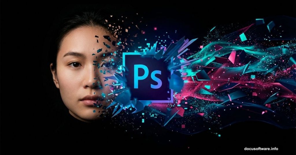
Creating abstract portrait art in Photoshop sounds intimidating. But it’s actually more straightforward than most tutorials make it seem.
I’ve walked through dozens of portrait manipulation techniques over the years. The disintegration effect remains one of the most striking visual styles you can master. Plus, once you understand the core mechanics, you’ll apply these skills across countless projects.
This guide breaks down the exact process for transforming ordinary portraits into eye-catching abstract artwork. No fluff, no overcomplicated steps. Just practical techniques that work.
Why the Disintegration Effect Works So Well
The disintegration effect creates visual drama instantly. Your subject appears to fragment or dissolve, which grabs attention in ways standard portraits can’t match.
Moreover, this technique teaches you fundamental Photoshop skills. You’ll work with layer masks, brushes, blending modes, and adjustment layers. So even if abstract portraits aren’t your end goal, these methods transfer to other creative work.
And here’s the best part. You don’t need a drawing tablet or advanced artistic skills. The tutorial uses standard Photoshop tools available in CS3 and newer versions.
Setting Up Your Canvas Properly
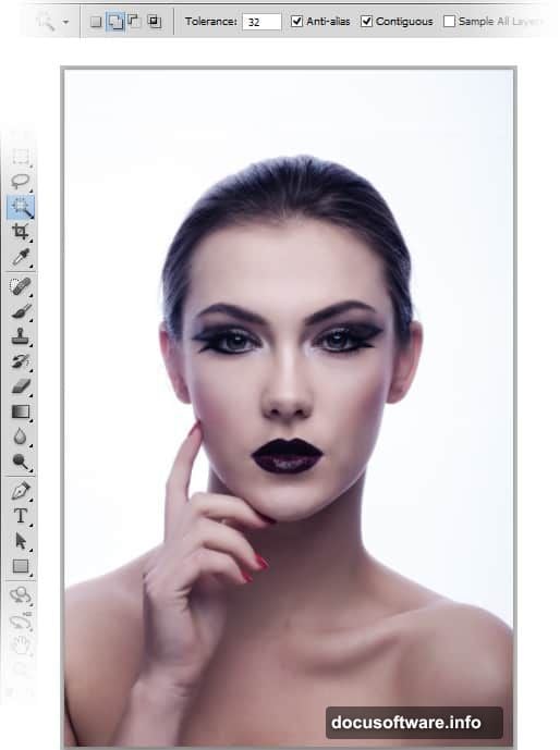
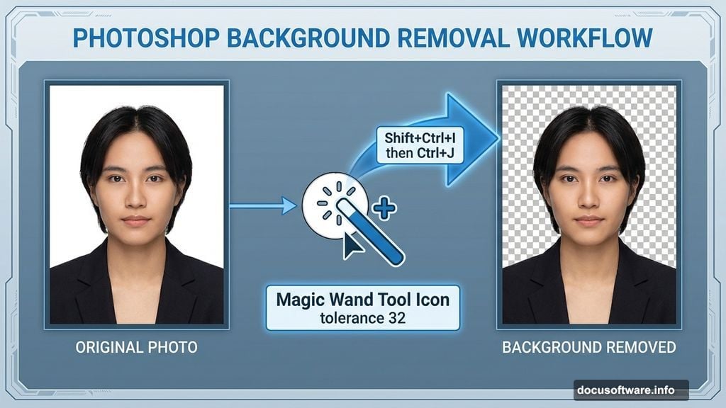
Start by opening your portrait image in Photoshop. Choose a high-resolution photo with clean lighting and simple backgrounds. This makes extraction easier.
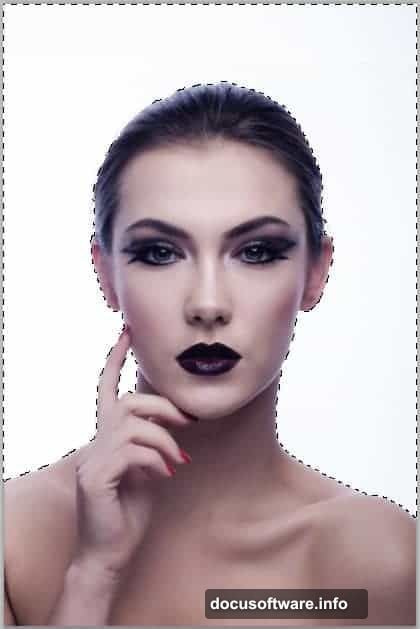
Grab the Magic Wand tool from the toolbar. Set tolerance to 32 for most images. Click the background to select it, then inverse your selection with Shift+Ctrl+I. Hit Ctrl+J to duplicate just the subject onto a new layer.
Next, hide the original background layer. You’ll work exclusively with the extracted subject from here.
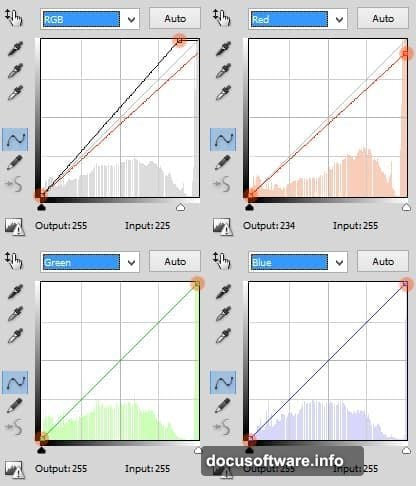
Now comes the critical part most beginners skip. You need to adjust the portrait’s tone before applying effects. Otherwise, your final artwork looks flat and unconvincing.
Color Adjustment Secrets That Make or Break Your Portrait
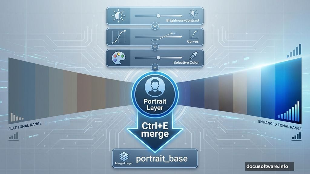
Create three adjustment layers while the extracted portrait layer stays active. Go to Layer > New Adjustment Layer and add these in order:
First, add Brightness/Contrast. Boost contrast slightly to make features pop. Then add a Curves adjustment. This gives you precise control over tonal ranges. Finally, add Selective Color to refine specific color channels.
Here’s why this matters. Abstract effects amplify existing tones in your image. So if your base portrait looks washed out or muddy, those problems multiply when you add disintegration effects.
After applying adjustments, select all adjustment layers plus your portrait layer. Hit Ctrl+E to merge them into one clean layer. Name it something obvious like “portrait_base” so you stay organized later.
Building the Main Composition Canvas
Hit Ctrl+N to create your final canvas. Don’t work directly on the portrait file. Instead, build a new document sized for your intended output.
For web use, try 1920×1080 pixels at 72 DPI. For print projects, go larger at 300 DPI. The key is planning your canvas size before you start manipulating elements.
Drag your prepared portrait into this new document. Convert it to a Smart Object immediately by going to Layer > Smart Objects > Convert to Smart Object. This preserves quality when you scale or transform the image later.
Use Free Transform (Ctrl+T) to position and resize your portrait. Leave breathing room around the edges where disintegration effects will extend beyond the original boundaries.
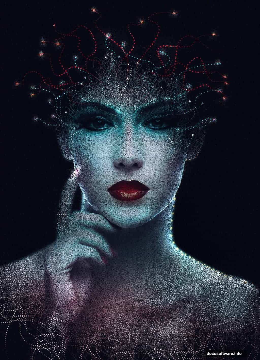
Creating the Disintegration Effect Foundation
The disintegration effect requires careful brush work. But don’t worry about artistic talent here. You’re creating texture, not painting.
Add a layer mask to your portrait layer. Select a hard-edged brush with scattering enabled. In the brush settings panel, increase scatter to 150-200%. This creates the fragmented look.
Now paint black on the mask around edges where you want disintegration. Start subtly. You can always add more later, but removing too much forces you to start over.
Focus on areas that naturally break apart. Hairlines, shoulders, and facial contours work best. Avoid the eyes initially unless you want a dramatic effect. Remember, eyes anchor viewer attention, so destroying them changes the entire mood.
Adding Texture for Realistic Fragmentation
Flat disintegration looks digital and fake. Adding texture makes fragments feel three-dimensional and physical.
Create a new layer above your portrait. Load grungy textures like concrete, rust, or paper. Free stock sites like Pixabay offer thousands of options. Drag your chosen texture onto the canvas.
Set the texture layer’s blend mode to Multiply or Overlay. Experiment to see which preserves your portrait’s details while adding surface interest. Then reduce opacity to 30-50% so the texture enhances rather than overwhelms.
Use layer masks on the texture too. Paint away texture from facial features you want to keep sharp. This selective application creates depth and focal points in your composition.
Lighting Effects That Elevate Abstract Portraits
Lighting sells the illusion that fragments are actually breaking away from the subject. Without it, your portrait looks flat despite all the texture work.
Create a new layer set to Screen or Linear Dodge blend mode. Select a soft white brush with low flow around 10-15%. Paint highlights along the edges of fragments where light would naturally catch.
Then create another layer set to Multiply. Use a soft black brush to add shadows beneath fragments. This suggests depth and separation from the original form.
The lighting should feel directional. Pick a light source position and stay consistent. Fragments on the lit side get highlights, fragments on the shadow side stay dark.
Color Grading for Mood and Impact
Color transforms good abstract portraits into stunning ones. The right grade unifies all your elements and sets emotional tone.
Add a Color Balance adjustment layer. Push shadows toward cooler tones (more cyan and blue). Shift highlights toward warmer tones (more yellow and red). This creates dimension through color temperature contrast.
Next, add a Hue/Saturation layer. Reduce overall saturation by 10-20%. Overly saturated abstract art looks amateurish. Subtle, refined color always wins.
Finally, add a Curves adjustment for final tonal refinement. Create a gentle S-curve to boost contrast without crushing blacks or blowing out highlights.
Common Mistakes That Ruin Abstract Portraits
I’ve seen talented designers sabotage their work with a few recurring errors. Let’s address them directly.
First mistake: over-disintegrating. Beginners get excited and fragment too much. Then the subject becomes unrecognizable. Always preserve enough of the original portrait that viewers immediately understand what they’re seeing.
Second mistake: inconsistent lighting. Adding highlights randomly without considering light direction makes effects look pasted on rather than integrated. Pick a light source and commit.
Third mistake: ignoring composition basics. Abstract doesn’t mean chaotic. Apply rule of thirds, leading lines, and balance just like traditional photography. The abstract effects should enhance good composition, not replace it.
Working Non-Destructively Saves Hours
Everything in this tutorial uses non-destructive techniques. Smart Objects, adjustment layers, and layer masks let you revise decisions without starting over.
Always create new layers for effects rather than painting directly on your portrait. Yes, it creates more layers. But you’ll thank yourself when you need to adjust an effect three steps back in your process.
Group related layers into folders. Name everything clearly. “Layer 37” tells you nothing when you return to the project tomorrow. “Fragment_shadows” makes sense instantly.
This organizational discipline pays off massively on complex projects. You’ll move faster and iterate more freely when your layers panel stays readable.
Advanced Variations Worth Exploring
Once you master the basic technique, try these variations. They use the same core skills with different visual outcomes.
Try geometric fragmentation instead of organic. Use Photoshop’s shape tools to create angular fragments. This creates a more futuristic, digital aesthetic compared to the natural disintegration look.
Experiment with color. Instead of maintaining realistic skin tones, push colors into surreal territory. Vibrant blues, purples, or greens can create striking stylistic portraits.
Add motion blur to fragments. Select individual fragment areas and apply directional blur. This suggests movement and energy, making static portraits feel dynamic.
These techniques work in CS3 through current Creative Cloud versions. The tools haven’t changed significantly, though newer versions offer minor workflow improvements.
Start with the basic process outlined here. Master it completely. Then push boundaries with your own creative variations. That’s when abstract portrait work gets really interesting.