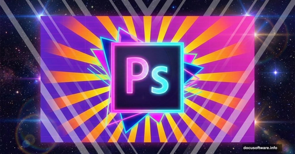
Retro design never goes out of style. Bold colors, geometric shapes, and nostalgic vibes continue to dominate modern graphic design.
This guide walks you through creating a vibrant retro-style poster in Photoshop. You’ll learn professional techniques for building dynamic backgrounds, layering geometric elements, and adding those signature glowing effects that make retro designs pop.
No complicated jargon. Just straightforward steps that work.
Gather Your Design Assets First
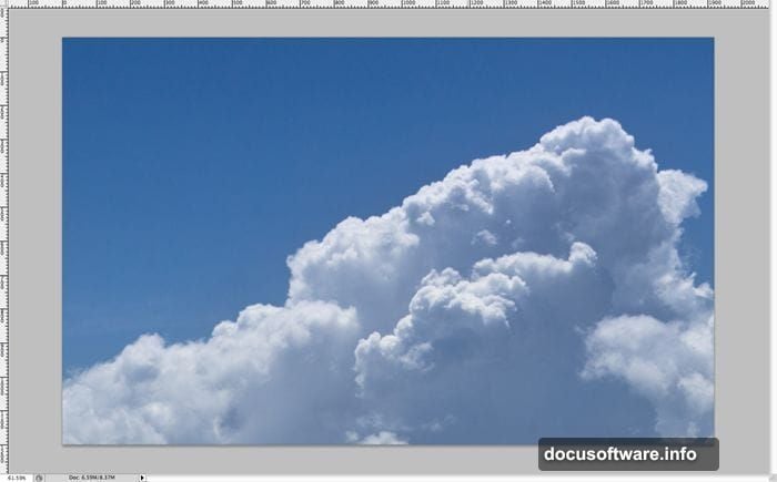
Before diving into Photoshop, collect your materials. You’ll need a high-resolution clouds or mountain background image and a lens flare brush pack.
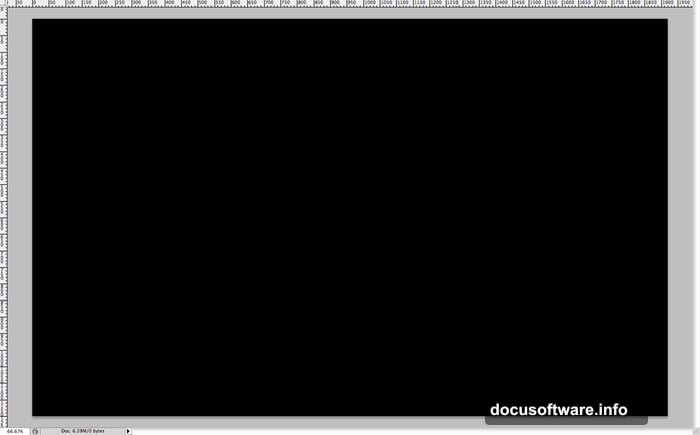
Start by creating a new document at 1920×1200 pixels. This standard HD wallpaper size works perfectly for desktop backgrounds and presentation slides. Fill your canvas with pure black to establish the foundation.
Why black? Dark backgrounds make bright colors and light effects stand out dramatically. Plus, it’s easier to build contrast when you start dark and add light rather than the reverse.
Build Your Background Layer
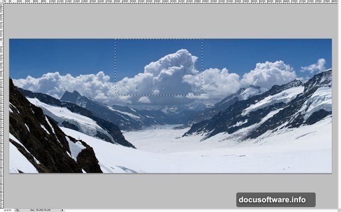
Open your clouds or mountain image in a separate window. Select the portion you want using the Marquee tool. Focus on areas with interesting cloud formations or dramatic sky elements.
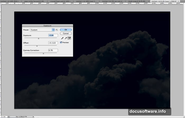
Copy and paste your selection into the main document. Then navigate to Image > Adjustments > Exposure. Reduce both exposure and offset while slightly increasing gamma correction.
This adjustment creates punchy contrast. Your background should look moody and dark, not washed out. The darker tones let your foreground elements really shine later.
Create the Geometric Base Pattern
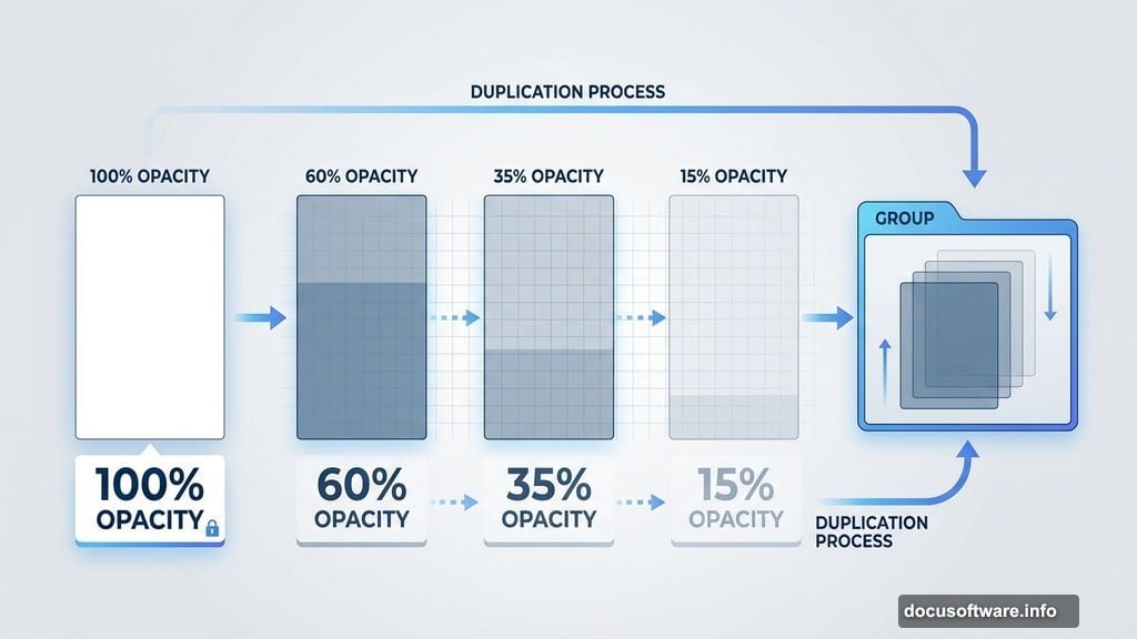
Now comes the fun part. Create a new layer and use the Rectangle Marquee tool to draw a white rectangle. Keep it relatively narrow and tall.
Duplicate this layer 10-20 times. Here’s the key technique: randomly adjust the opacity of each duplicated layer between 10% and 100%. This creates varied transparency that adds visual depth.
Group all these rectangle layers together by selecting them and pressing Ctrl/Cmd+G. Then duplicate the entire group 2-3 times. Spread these groups across your canvas randomly.
Why this approach? Creating multiple opacity variations manually would take forever. By grouping and duplicating, you save significant time while maintaining that organic, hand-crafted look.
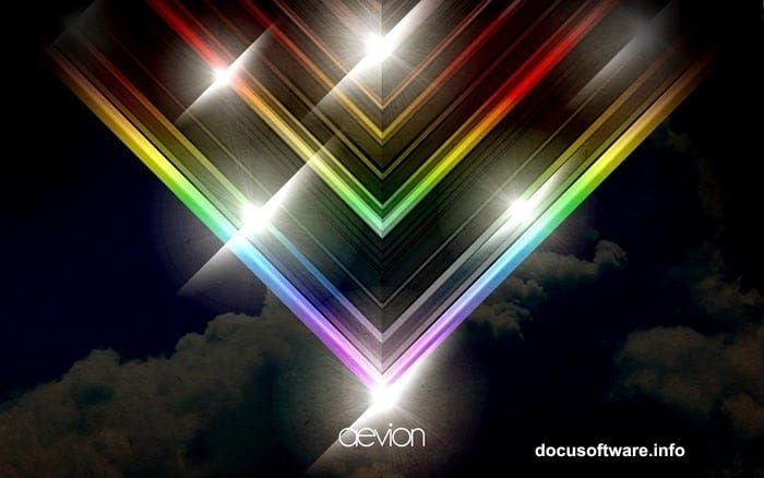
Form the Signature V-Shape Design
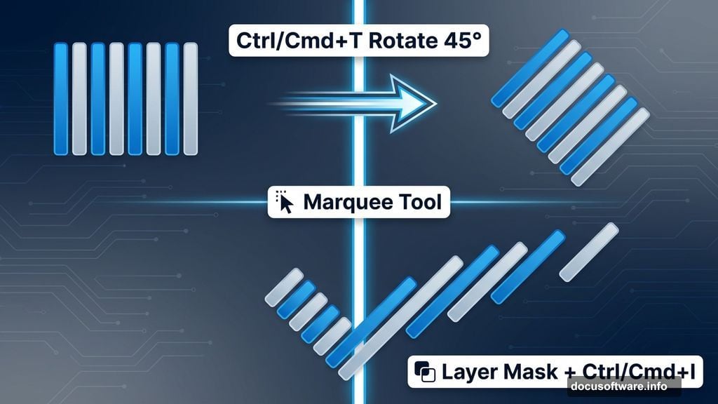
Select all your rectangle groups and merge them into one master group. Press Ctrl/Cmd+T to activate Free Transform. Rotate the entire collection 45 degrees to one side.
Now create the distinctive V-shape. Use the Marquee tool to select exactly half your canvas—opposite the direction you rotated. Add a layer mask to hide this section.
Then invert the mask by pressing Ctrl/Cmd+I. This reveals the triangular pattern while keeping clean edges.
This V-shape creates dynamic movement. Your eye naturally follows the diagonal lines, making the design more engaging than static horizontal or vertical layouts.
Duplicate and Mirror for Symmetry
Here’s where the design really comes together. Duplicate your masked triangle layer. Flip it horizontally using Edit > Transform > Flip Horizontal.
Position this mirrored copy on the opposite side of your canvas. The two triangles should meet in the middle, forming a complete V-shape.
Merge both triangle layers together. This unified element becomes the foundation for all your lighting effects.
Add Initial Glow Effects
Create a new layer above your V-shape. Set the blending mode to Screen. This mode brightens underlying colors, perfect for creating glowing effects.
Use a soft white brush at 50% opacity. Paint along the center seam where your triangles meet. Build up the brightness gradually with multiple brush strokes.
Then add a subtle Gaussian Blur (Filter > Blur > Gaussian Blur). Use a radius of 20-30 pixels. This softens the glow and makes it look more natural.
Screen mode prevents your whites from looking harsh. Instead, they blend beautifully with underlying colors, creating that dreamy retro atmosphere.
Layer Multiple Light Sources
Duplicate the glowing layer you just created. Remove any layer styles by going to Layer > Layer Style > Clear Layer Styles. You want pure white without effects.
Change the blending mode to Linear Dodge (Add). This mode creates even more intense highlights than Screen mode.
You should now see major bright spots forming along your design’s center. These concentrated highlights mimic the look of vintage photography and old film posters.
Apply Color Gradient Overlays
Create another new layer. Set it to Overlay blending mode. Use the Gradient tool to apply a rainbow spectrum gradient diagonally across your canvas.
Overlay mode preserves underlying brightness while adding color. Your blacks stay black, your whites stay bright, but everything gains vibrant color tones.
Adjust the layer opacity to taste. Usually 40-60% works best. Too high makes colors garish; too low looks washed out.
Play with different gradient combinations. Warm tones (red, orange, yellow) create energetic vibes. Cool tones (blue, purple, cyan) feel more futuristic.
Add Lens Flare Accents Strategically
Import your lens flare brushes into Photoshop. Create a new layer set to Screen mode. Use white as your foreground color.
Click strategic points along your design’s bright areas. Focus on the center seam and any prominent corners. Vary the flare sizes by adjusting brush diameter.
Less is more here. Two or three well-placed lens flares create impact. Ten lens flares just look messy and overdone.
Lens flares add that authentic vintage photography feel. They suggest light sources beyond the frame, making your flat design feel more dimensional and real.
Build Depth with Shadow Layers
Your design probably looks flat right now despite all the glowing effects. Time to add depth through strategic shadows.
Create a new layer below your main V-shape elements. Set it to Multiply blending mode. Use a large soft black brush at 20-30% opacity.
Paint shadows along the outer edges of your canvas. Leave the center bright but darken the corners and sides. This vignette effect draws the eye inward.
Multiply mode darkens without completely obscuring underlying details. It creates rich, layered shadows that add sophistication to your composition.
Fine-Tune Final Adjustments
Almost done. Create a new adjustment layer: Curves. Add a slight S-curve to boost overall contrast. This makes your brightest highlights pop even more while deepening shadows.
Then add a Vibrance adjustment layer. Increase vibrance by 20-30 points. Unlike saturation, vibrance intelligently boosts muted colors while protecting already-saturated areas from becoming oversaturated.
Finally, apply a subtle Smart Sharpen filter (Filter > Sharpen > Smart Sharpen). Use an amount of 50-75% with a radius of 1-2 pixels. This adds crisp definition to all your layered elements.
These final adjustments transform a good design into a professional one. Small refinements in contrast, color, and sharpness make huge visual differences.
Common Mistakes to Avoid
New designers often overdo the effects. More lens flares don’t make better designs. More colors don’t create better compositions.
Restraint matters. Pick 2-3 dominant colors maximum. Use 2-3 lens flares, not 10. Let negative space breathe.
Another frequent error: forgetting about composition balance. Your brightest elements should guide the eye through the design intentionally, not randomly scatter attention.
And watch your layer organization. Name your layers. Group related elements. Future-you will thank present-you when you need to make edits later.
Take This Further
This tutorial covers fundamental retro poster techniques. But don’t stop here.
Try different geometric shapes beyond rectangles—circles, triangles, hexagons all work beautifully. Experiment with photo overlays set to various blending modes. Add texture using grain or halftone patterns.
The retro aesthetic embraces experimentation. Those vintage designers didn’t have digital tools, so they improvised constantly. Honor that spirit by pushing beyond these basic steps.
Your unique style emerges through practice and personal tweaks. Create your own variations. Break the rules intentionally once you understand them.