Vintage poster design isn’t just slapping a sepia filter on modern graphics. It requires specific techniques that blend texture work, shape building, and careful composition.
This walkthrough breaks down exactly how to craft authentic vintage-style posters in Photoshop. Plus, we’ll use Illustrator for a few quick operations. The process works in any Photoshop version from CS3 forward, though I’m demonstrating with CS6.
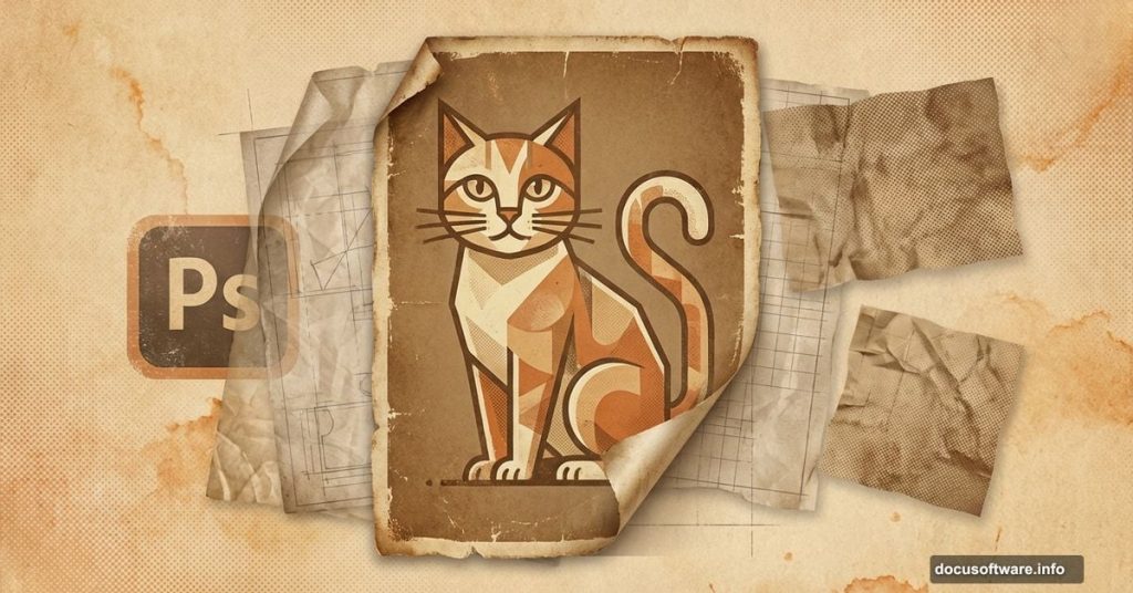
What You’ll Actually Build
We’re creating a cat-themed vintage poster that looks genuinely aged. The workflow covers background preparation with paper textures, character creation using shape tools, and overlay techniques that deliver that authentic worn look.
First, you’ll need these textures ready to go. Download them before starting so you’re not hunting mid-project.
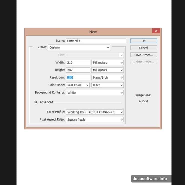
Set Up Your Canvas Properly
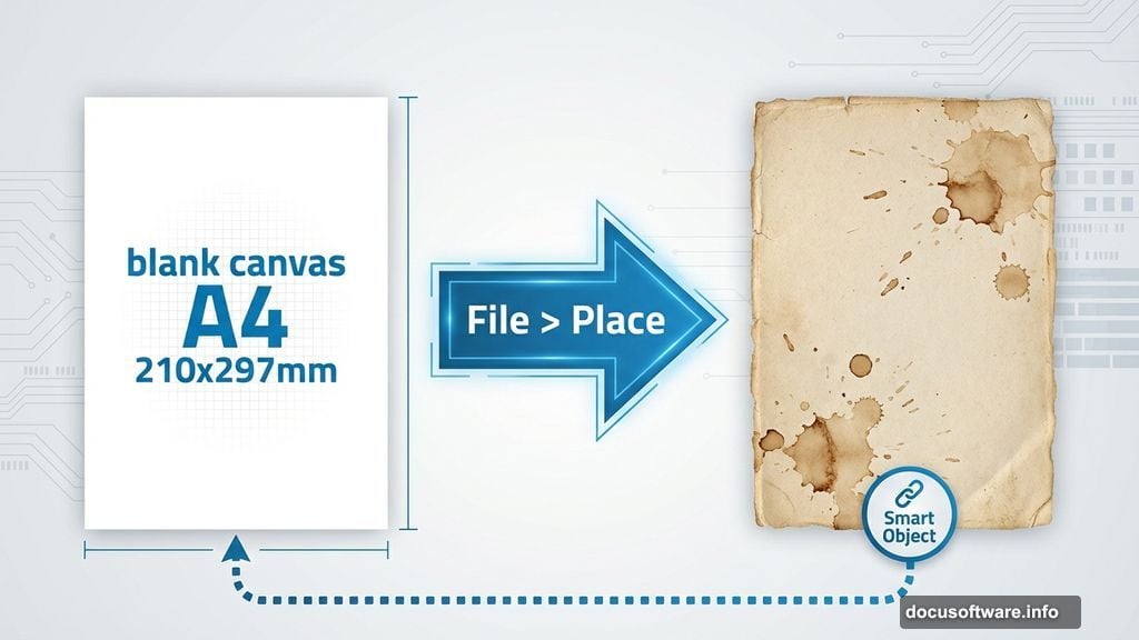
Start with an A4 document at 210mm by 297mm. For screen-only work, 150 PPI works fine. Print projects need 300 PPI minimum.
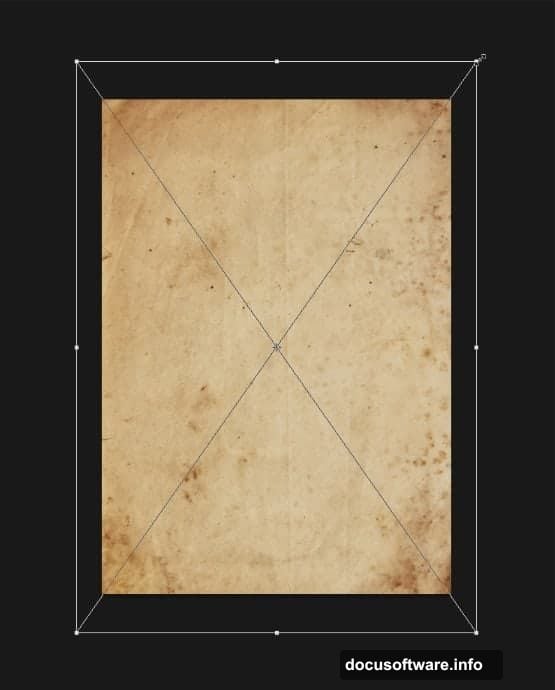
Then immediately add texture to that blank white canvas. Use File > Place to import your old paper texture as a smart object. This preserves quality and lets you resize without degradation.
Scale the texture until it completely fills your canvas. Hit Enter to confirm the transformation when it looks right.
Layer Your Paper Textures Strategically
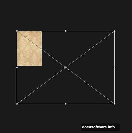
Next, bring in the brown vintage wallpaper using that same Place command. This texture arrives massive, so scale it down to roughly 47% of original size.
Position it carefully. Align the top left corner of the texture with your canvas’s top left corner. Perfect alignment matters here.
Now import another paper texture layer. You can duplicate your first one if you prefer. Resize this new layer as shown in the reference images.
Here’s where masking gets interesting. CTRL+Click the layer thumbnail to load a selection around it. Then turn off that layer’s visibility in the palette.
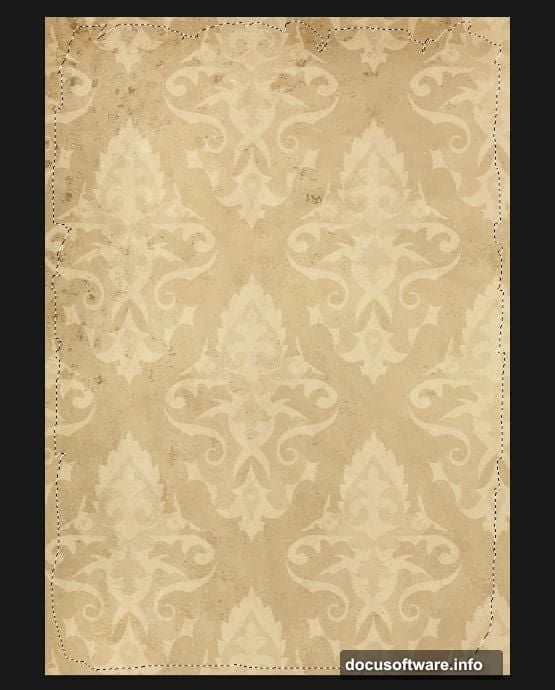
Apply Clean Edge Masks
Use that selection to create a layer mask on your vintage pattern layer. Click the pattern layer, then hit “Add a Mask” at the bottom of the layers palette.
The edge cuts beautifully with this method. No manual erasing needed.
Place your next old paper texture into the document. Scale it up until the entire visible area gets covered. No gaps allowed.
Then rasterize this layer by right-clicking and choosing “Rasterize Layer.” This converts it from a smart object to regular pixels, which you’ll need for the next steps.
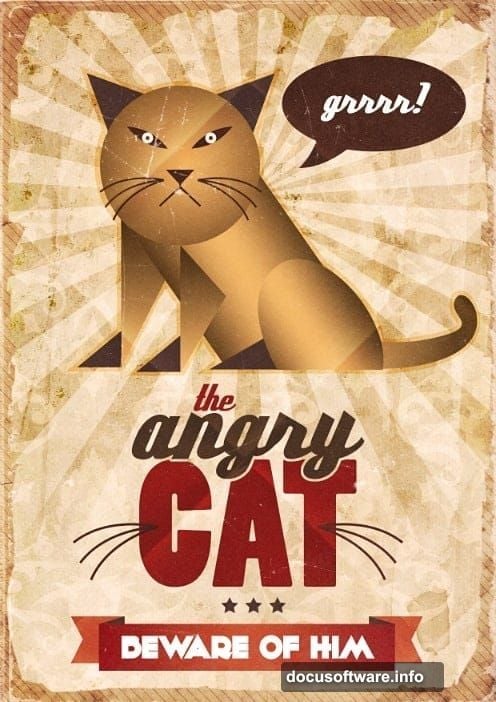
Build the Cat Character With Shapes
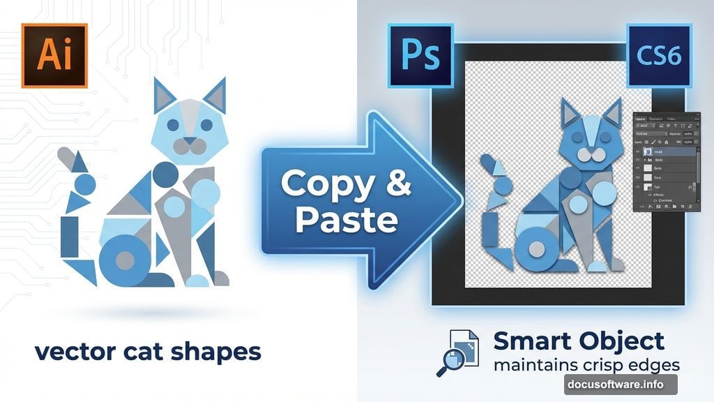
Switch over to Illustrator briefly for the cat construction. Shape tools work better there for precise vector work.
Create basic geometric shapes for the cat’s head, body, and features. Circles for the head and ears. Triangles for inner ear details. Keep it simple and stylized.
Once you’ve built the cat character, copy it and paste into your Photoshop document as a smart object. This maintains crisp edges at any size.
Position the cat prominently in your composition. Vintage posters typically feature bold, centered subjects. Don’t overcomplicate the placement.
Add Authentic Aging Effects
Now comes the fun part. Create a new layer and fill it with a neutral gray tone. Change the blend mode to Overlay or Soft Light.
Then grab a soft brush and paint subtle shadows around the edges. This creates natural vignetting that vintage posters always show.
Add another texture layer on top using one of your scratch or worn paper textures. Set this to Multiply blend mode at reduced opacity, maybe 40-50%.
This builds up those authentic aging marks. Creases, stains, and worn spots appear naturally when you layer textures this way.
Create Border Details That Matter
Vintage posters almost always feature decorative borders. Draw thin rectangles using the shape tool, positioned just inside your canvas edges.
Apply a stroke to these rectangles in a cream or off-white color. Keep the stroke thin, maybe 2-3 pixels maximum.
For corner decorations, create small ornamental shapes in Illustrator. Simple flourishes work best. Nothing too elaborate or modern-looking.
Paste these corner elements into your Photoshop file. Position one at each corner, rotating as needed to maintain symmetry.
Fine-Tune Color Grading
Add a Curves adjustment layer to shift the overall color palette toward vintage warmth. Lift the shadows slightly and add yellow to the midtones.
Then create a Color Balance adjustment layer. Push the highlights toward yellow and red. Pull the shadows toward blue for that classic aged paper contrast.
These color shifts make or break vintage authenticity. Modern, clean colors immediately destroy the illusion. Warm, slightly faded tones sell the aged look.
Typography Completes the Design
Choose period-appropriate fonts. Avoid anything digital or modern. Serif fonts from the early 20th century work perfectly.
Bold, condensed typefaces dominated vintage poster design. Look for fonts with character and weight, not delicate or minimal styles.
Position your text prominently. Vintage posters weren’t subtle. They competed for attention on crowded walls and bulletin boards.
Common Mistakes to Dodge
Don’t oversaturate your colors. Vintage paper fades over time. Bright, punchy colors look completely wrong.
Also, avoid perfectly clean edges. Real vintage posters show wear along borders and corners. Add small tears or worn spots for believability.
Finally, skip the heavy-handed texture overlays. Less works better. Multiple subtle layers beat one aggressive texture every time.
Why This Technique Works
This approach builds vintage authenticity through layers. Each texture, color adjustment, and design choice reinforces the aged aesthetic.
Plus, working with smart objects maintains flexibility. You can resize and adjust without destroying quality. That matters for projects with changing requirements.
The combination of Photoshop’s compositing power and Illustrator’s precise shapes delivers professional results. Neither tool alone handles vintage poster creation quite as well.
Try this workflow with different subjects and color schemes. The techniques adapt easily to any vintage poster style, from travel advertisements to concert announcements.