
Want to create whimsical fantasy scenes that make viewers smile? Photoshop makes it easier than you think.
This tutorial walks through building a complete fantasy photo manipulation. You’ll learn how to blend multiple images, adjust lighting across layers, and create believable composite scenes. Plus, these techniques work for any fantasy photo project, not just flying kittens.
Set Up Your Canvas for Success
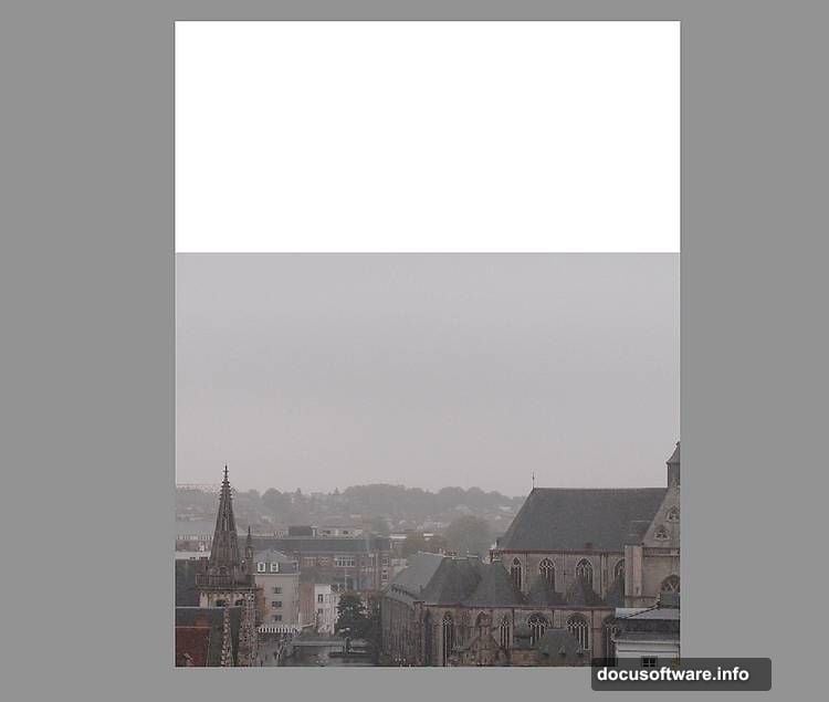
Start with a new 1800×2300 px document in Photoshop. Fill it with white as your base layer.
This canvas size gives you plenty of room to work. Plus, the vertical orientation suits fantasy scenes with sky elements. You can always crop later if needed.
Open your city image and drag it onto the canvas using the Move Tool (V). Convert it to a Smart Object before positioning it in the lower section. Smart Objects let you resize without quality loss, which matters for complex composites.
Blur the Background for Depth
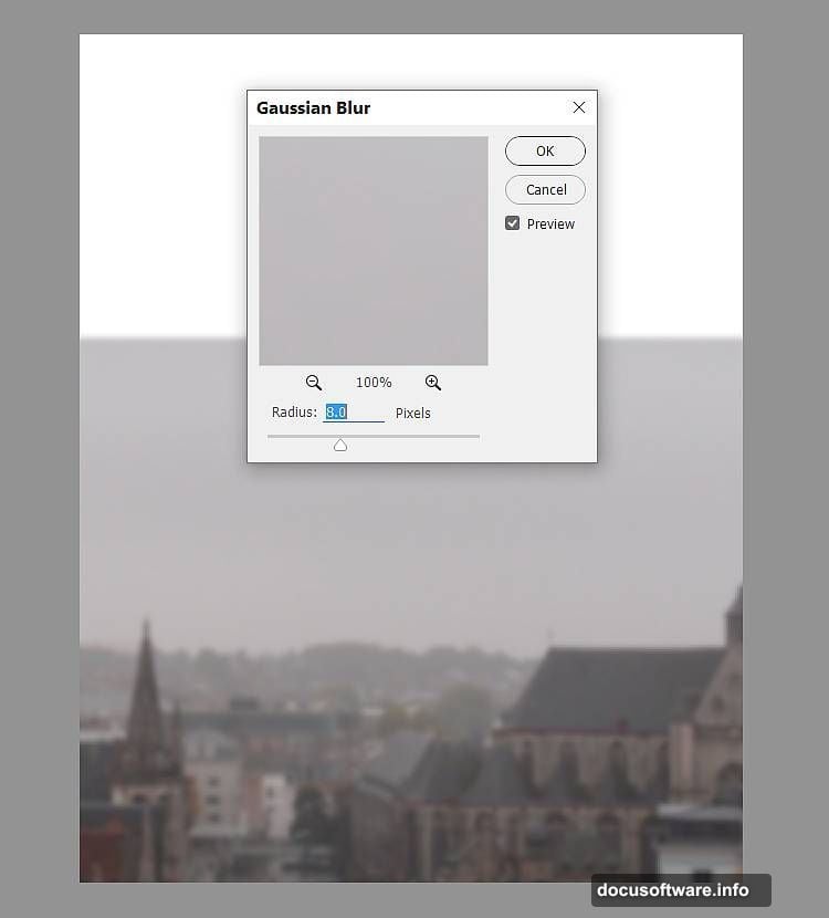
Apply Filter > Blur > Gaussian Blur with an 8 px radius to your city layer.
Why blur the background? It creates depth of field. Real cameras can’t keep everything sharp at once. So blurring distant elements makes your composite look more natural and draws focus to your main subjects.
The 8 px radius works well for mid-distance backgrounds. Adjust higher for objects farther away, lower for closer elements.
Balance Colors Between Layers
Create a Color Balance adjustment layer and set it as a Clipping Mask. Adjust the Midtones to match your sky’s color temperature.
Color matching makes or breaks photo composites. Each source image has different lighting conditions. So you need to unify them or the result looks obviously fake.
Midtones contain most visible color information. That’s why adjusting them first gives the biggest impact. You can fine-tune Shadows and Highlights later if needed.
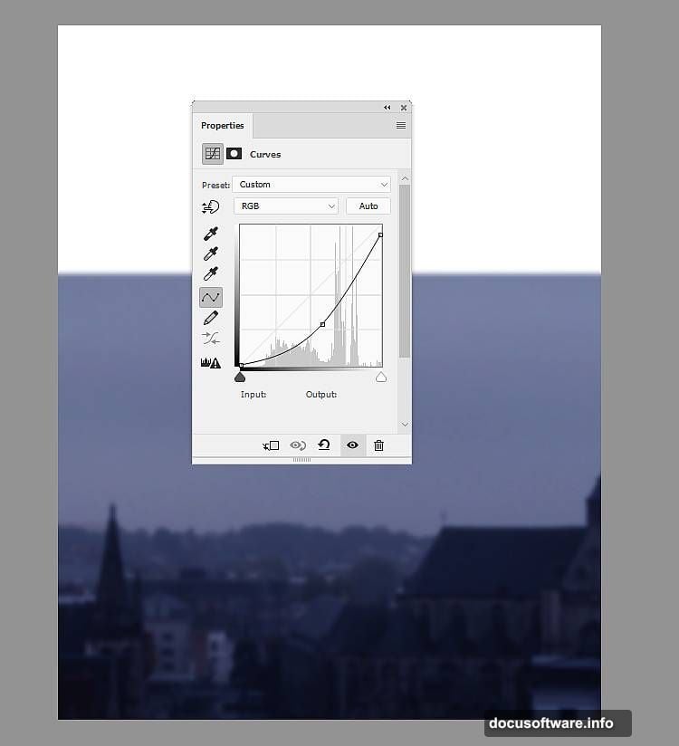
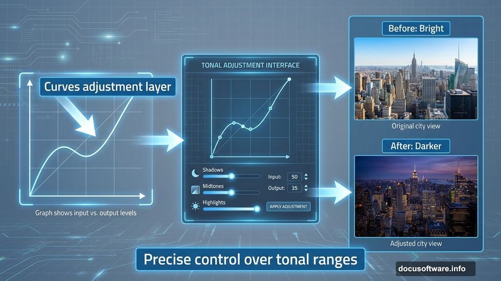
Reduce City Brightness with Curves
Add a Curves adjustment layer as a Clipping Mask. Pull down the curve to darken the city layer.
Background elements should recede visually. Darker backgrounds push forward lighter subjects. This creates natural visual hierarchy in your composition.
Use Curves instead of basic brightness adjustments. Curves give precise control over specific tonal ranges without crushing shadows or blowing highlights.
Blend Multiple Sky Layers
Place your sky image onto the canvas and convert it to a Smart Object. Apply a 3 px Gaussian Blur.
Add a layer mask and use a soft black brush to remove the bottom edge. This blends the new sky with your existing background seamlessly.
Soft transitions beat hard edges every time. The gradual fade from your new sky to the original creates a believable atmospheric effect. Hard edges scream “this is fake.”
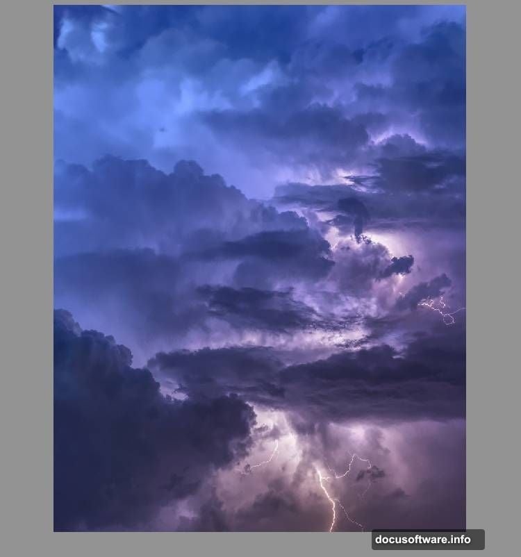
Match Sky Color Temperature
Create another Color Balance adjustment layer for the sky. Again, focus on Midtones first.
Sky colors shift throughout the day. Morning light leans blue, evening light goes orange. So matching color temperature between your sky and ground elements sells the illusion that they exist in the same moment.
Test your adjustments by squinting at the screen. If something looks wrong when blurred, the colors don’t match yet.
Control Overall Scene Brightness
Add a Curves adjustment layer above all other layers. This affects the entire composition at once.
Global adjustments unify disparate elements. Even perfect color matching can look off if brightness relationships don’t make sense. So a final Curves layer brings everything together.
Pull down slightly to darken. Fantasy scenes often benefit from moodier lighting. Plus, darker backgrounds make your main subjects pop more.
Add Atmosphere with Gradient Maps
Create a Gradient Map adjustment layer using colors #0a5952 and #ff9672. Set the blend mode to Soft Light at 100%.
Gradient Maps recolor your image based on tonal values. Darks get one color, lights get another. This creates cohesive color grading across all layers.

Soft Light mode blends the effect naturally. It preserves original colors while adding your chosen tint. Hard Light or Overlay modes work too but affect colors more aggressively.
Layer Multiple Color Grades
Add a second Gradient Map with colors #e10019 and #00601b. Lower opacity to 20%.
Why two gradient maps? Layering subtle color effects creates depth. One strong adjustment looks artificial. Multiple gentle adjustments look natural.
The 20% opacity keeps this layer’s effect minimal. It adds complexity without overwhelming your primary color grade. Think of it like seasoning food—a little goes far.
Fine-Tune Color Balance One Last Time
Create a final Color Balance adjustment layer. Adjust both Midtones and Highlights this time.
Highlights affect the brightest parts of your image. Adjusting them separately from Midtones gives you precise control. Maybe your sky needs warmer highlights while midtones stay neutral.
Test your adjustments on different screen brightness levels. What looks good on a bright screen might look muddy on a dim one.
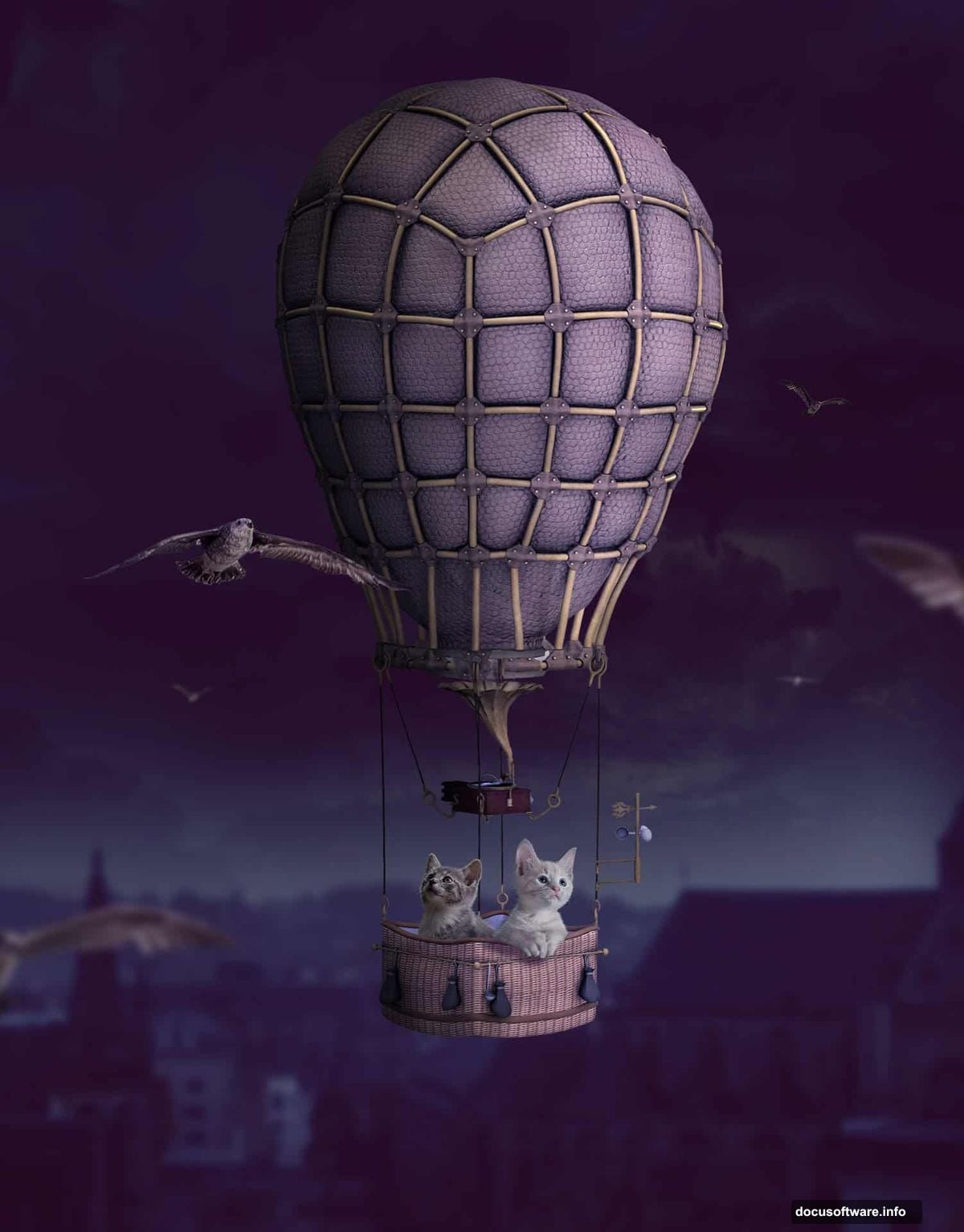
Break Down Complex Objects
Open your hot air balloon image. Use the Lasso Tool (L) to select just the balloon envelope, leaving the basket behind.
Why separate elements? It gives you flexibility. You can scale the balloon without making the basket look wrong. Plus, you can add your kittens to the basket later.
Place the envelope in the top middle of your canvas. Use Free Transform (Ctrl+T) with Warp mode to adjust the balloon’s shape slightly. Real balloons flex and bend in wind, so perfect symmetry looks stiff.
Building Believable Fantasy Takes Patience
Photo manipulation requires more than technical skills. You need to understand how light, atmosphere, and perspective work together.
Each adjustment layer plays a specific role. Color Balance unifies temperature. Curves control brightness relationships. Gradient Maps add cohesive color grading. Skip any step and your composite looks off even if viewers can’t articulate why.
The best composites fool the eye completely. Viewers shouldn’t see layer boundaries or color mismatches. They should just see a whimsical scene of kittens floating through the sky. That’s the goal worth pursuing.