
Photoshop‘s photo manipulation tools let you create impossible scenes. But most tutorials skip the fundamentals that make composites look believable.
This guide walks through creating a surreal scene from scratch. You’ll learn non-destructive editing techniques that professionals actually use. Plus, these methods work for any composite project, not just this specific image.
You’ll need Photoshop CS5 or newer. Older versions lack some adjustment layer features we’ll use throughout.
Set Up Your Canvas Correctly
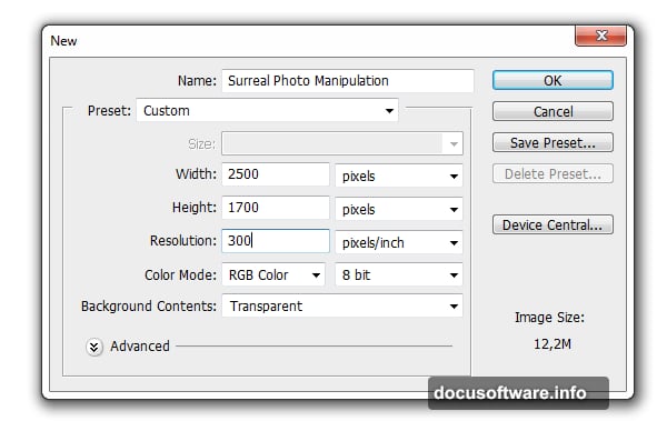
Start with the right dimensions. Create a new file with these exact settings:
- Width: 2500 pixels
- Height: 1700 pixels
- Resolution: 300 DPI
- Color Mode: RGB, 8-bit
Why these numbers? The 300 DPI resolution ensures print quality if you want physical copies later. Meanwhile, the 2500×1700 dimensions give you room to work without creating a massive file that slows down your computer.

RGB color mode works best for screen display. If you’re printing professionally, switch to CMYK later.
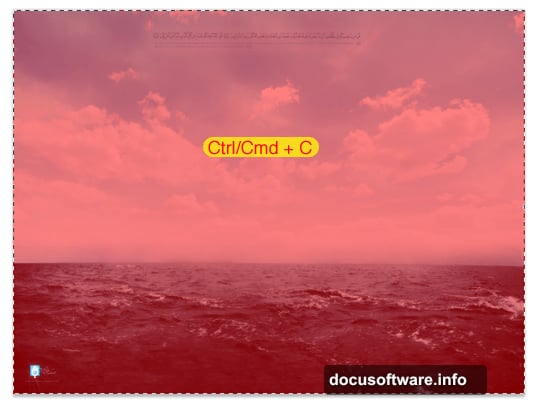
Import and Resize Your Base Image
Open your ocean background image in Photoshop. Select the entire image with Ctrl/Cmd+A, then copy and paste it into your project file.
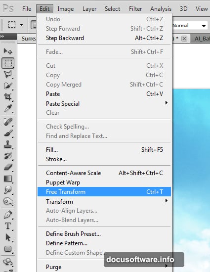
The pasted image will likely dwarf your canvas. No problem. Press Ctrl/Cmd+T to activate Free Transform. Then press Ctrl/Cmd+0 to zoom out and see the entire transform box.
Hold Shift while dragging a corner handle. This maintains the image’s aspect ratio. Resize until the width matches your canvas, then position it properly.
Here’s a pro tip: Always hold Shift when transforming. Otherwise you’ll accidentally distort proportions and create weird-looking composites.
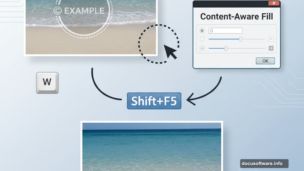
Remove Unwanted Elements Fast
Most stock photos include watermarks or logos. Photoshop’s Content-Aware Fill makes removal easy.
Grab the Quick Selection Tool (press W). Make a rough selection around the watermark. Don’t worry about precision—Photoshop will handle the details.
Press Shift+F5 to open the Fill dialog. Choose Content-Aware from the dropdown, then click OK. Photoshop analyzes surrounding pixels and fills the selection intelligently.
For trickier areas, use the Clone Stamp Tool (press S). Set brush size to 500 pixels with 0% hardness. Alt/Option+click to sample clean areas, then paint over unwanted elements.
This two-tool approach handles 95% of cleanup work. Save fussy selection tools for truly complex removals.
Apply Lens Correction for Realism
Raw photos rarely look perfect straight from the camera. Lens distortion affects every photograph, especially wide-angle shots.
Go to Filter > Lens Correction. Click the Custom tab. Adjust these three settings:
- Amount: -25 (adds vignette darkness at edges)
- Remove Distortion: +25 (corrects barrel distortion)
- Horizontal Perspective: -10 (fixes tilt)
These adjustments make your base layer feel more cinematic. The vignette naturally draws eyes toward the center. Plus, the perspective correction eliminates that “fisheye” look common in landscape photos.
Small adjustments make huge differences. Don’t overdo it—subtle always wins in compositing.
Work Non-Destructively From the Start
Here’s the most important concept in this entire tutorial: non-destructive editing preserves your original images.
Never apply adjustments directly to image layers. Instead, click the “Create new fill or adjustment layer” button at the bottom of your Layers panel. It looks like a half-filled circle.
This approach lets you tweak settings anytime. Made a color adjustment three hours ago that now looks wrong? No problem. Double-click the adjustment layer and change it.
Destructive editing forces you to start over when mistakes happen. Non-destructive editing means mistakes don’t exist—only adjustments that need refinement.
Blend Multiple Elements Seamlessly
Surreal composites live or die by how well elements blend together. Poor blending screams “fake” immediately.

Start with layer masks. Select your new element layer, then click the “Add Layer Mask” button. Paint with black to hide portions, white to reveal them. Gray creates transparency.
Set your brush to 0% hardness. Soft edges blend naturally. Hard edges look cut-and-pasted.
Here’s the technique professionals use: Paint with a large, soft brush at low opacity (20-30%). Build up the blend gradually with multiple strokes. This creates natural transitions between elements.
Also, match the lighting direction across all elements. If light hits your background from the left, it must hit foreground objects from the left too. Inconsistent lighting destroys believability instantly.
Adjust Colors to Match the Scene
Every photo you import carries its own color temperature and contrast. These differences become obvious when elements sit side by side.
Use Hue/Saturation adjustment layers to shift colors. Curves adjustment layers control contrast and brightness. Color Balance layers warm up or cool down specific elements.
The key? Make all adjustments via adjustment layers, never directly on images. Clip adjustment layers to specific image layers by Alt/Option+clicking between them in the Layers panel.
This lets you color-correct one element without affecting others. Precision matters in complex composites.
Create Depth With Atmospheric Perspective
Real scenes fade and desaturate with distance. Objects far away appear lighter, bluer, and less detailed than nearby objects.
Replicate this effect in your composite. Add slight blue tints to distant elements using Color Balance layers. Reduce contrast on background elements with Curves adjustments.
Also, add subtle blur to distant objects using Gaussian Blur. Keep foreground elements sharp. This depth cue tricks viewers into perceiving realistic space.
Even subtle atmospheric perspective makes impossible scenes feel plausible. It’s the difference between “cool edit” and “could be real.”
Add Light Sources and Shadows
Light makes or breaks composites. Every element needs consistent lighting and appropriate shadows.
Create shadows on a new layer above your element. Paint soft black shapes where shadows would fall naturally. Set the layer blend mode to Multiply and reduce opacity to 30-40%.
For highlights, create another layer. Set its blend mode to Screen. Paint with white where light would hit surfaces most directly.
Don’t guess at shadow angles. Draw imaginary lines from your light source through each object. Shadows must align with those lines or your composite falls apart.
Unify the Scene With Color Grading
Color grading ties disparate elements into a cohesive whole. This step comes near the end, after all elements are positioned and blended.
Add a Curves adjustment layer affecting your entire composition. Create a subtle S-curve to increase contrast. Then add a Color Lookup adjustment layer for stylized color treatments.
Alternatively, add a Gradient Map set to low opacity (10-20%). This applies a color wash across everything, creating visual unity.
Professional composites all share one trait: unified color schemes. Your eye shouldn’t notice different color temperatures between elements.
Refine Details Until It Feels Right
Good composites require iteration. Step away from your screen for ten minutes, then return with fresh eyes.
Look for these common issues:
- Edge halos (caused by poor masking)
- Inconsistent shadows
- Mismatched lighting directions
- Elements that seem to float instead of sit
- Color temperatures that don’t match
Fix each issue systematically. Zoom to 100% and check edges. Adjust layer masks. Refine shadows. Keep polishing until the scene convinces you.
Nobody creates perfect composites in one pass. The difference between amateur and professional work? Professionals invest time in refinement.
Creating believable photo manipulations takes practice. Don’t expect your first composite to match professional work. Instead, focus on mastering these core techniques one at a time.
Start with simple two-element composites before attempting complex scenes. Build your skills gradually. Soon you’ll create impossible scenes that look completely real.