Want to create professional weather icons in Photoshop? Most tutorials overcomplicate the process. This guide breaks down the essential techniques you actually need.
Weather icons seem simple. But getting clean edges, perfect alignment, and consistent styling takes specific skills. Plus, understanding vector shapes and layer styles makes the difference between amateur and professional results.
I’ve tested these methods across dozens of icon projects. They work for beginners and save time for experienced designers. So let’s dive into the practical steps that matter.
Set Up Your Workspace Right
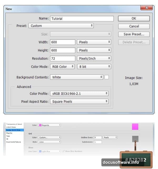
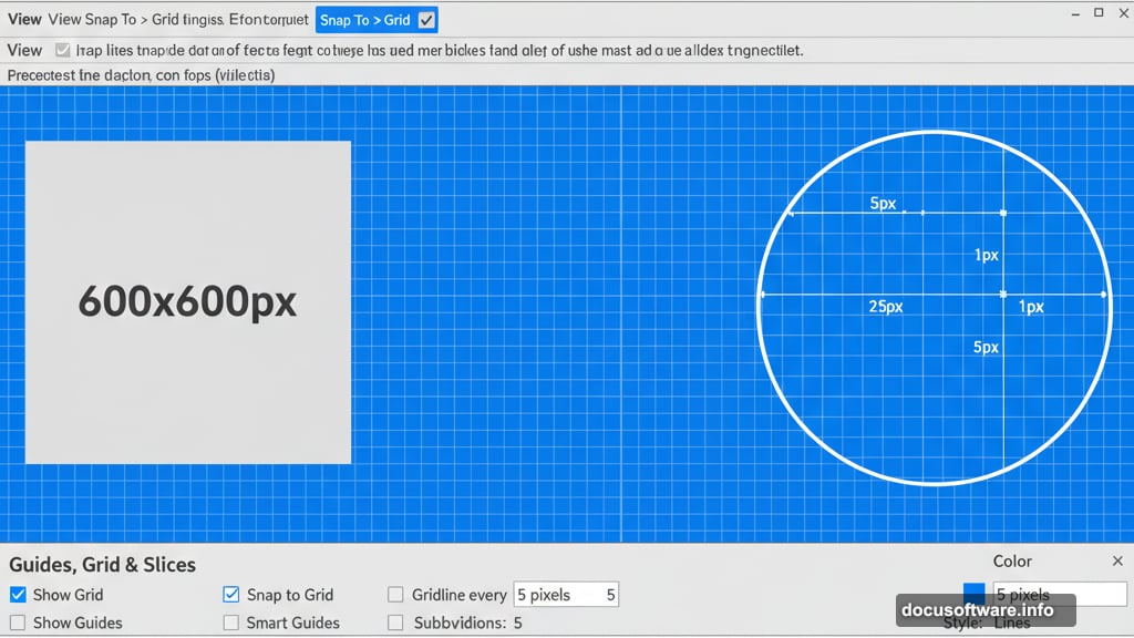
Start with a 600x600px document. Sounds basic. But proper setup prevents alignment headaches later.
Go to View > Show > Grid to enable the Grid feature. Then select View > Snap To > Grid. These tools act like invisible rulers that keep your shapes perfectly aligned.
Next, hit Control + K to open Preferences. Navigate to Guides, Grid & Slices. Set your grid to 5px intervals with 1 subdivision. This spacing works perfectly for icon design at this scale.
Why does this matter? Grid snapping eliminates pixel-perfect placement guesswork. Your shapes automatically align to grid points. That means consistent spacing without manual measurement.
Build the Foundation Layer
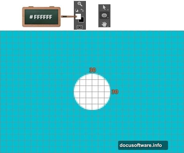
Fill your foreground color with #02C0D1. Select the Paint Bucket Tool from your Toolbar. Click anywhere on your canvas to establish the background color.
This blue background helps you see white shapes clearly. Plus, it creates a cohesive look for your final icon set.
Now change your foreground color to #FFFFFF. You’re ready to start building actual icon elements.
Create Your First Cloud Shape
Using the Ellipse Tool, create four circles with these exact sizes: 30x30px, 30x30px, 35x35px, and 20x20px. Hold the Shift button while dragging to maintain perfect circular proportions.
Arrange these circles to form a cloud-like cluster. Overlap them slightly so they feel like one unified shape rather than separate bubbles.

Here’s where it gets interesting. Use the Rectangle Tool to add a 15x35px shape at the bottom. This creates the cloud’s flat base.
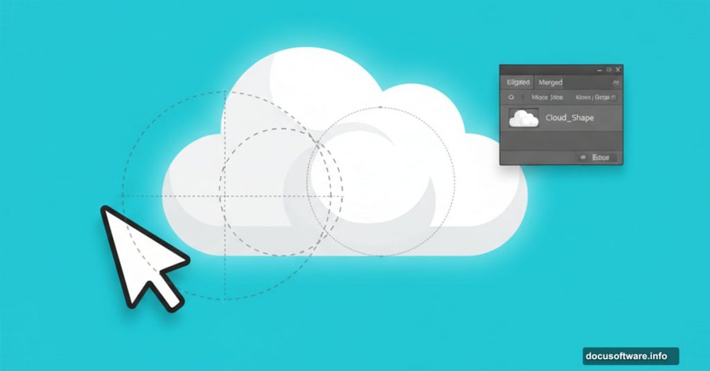
Open your Layers panel. Select all five shapes you just created. Right-click and choose Merge Shapes. Boom. You’ve got one clean cloud vector.
Add Professional Depth
Double-click your merged cloud shape in the Layers panel. Rename it “Cloud” for easy organization.
Now double-click again to open the Layer Style window. This is where basic shapes transform into polished icons.
Apply a subtle Drop Shadow. Set the opacity around 20-30%. Distance should be 3-5 pixels. This creates gentle depth without overwhelming the design.
Add an Inner Shadow for dimension. Keep it subtle. Around 10% opacity with 2-3 pixel distance works well.
Finally, apply a 1-pixel Stroke in a slightly darker shade of white. This defines edges without harsh lines.
Place your finished cloud in the upper left corner. Leave about 50 pixels of padding from canvas edges.
Build the Sun Element
Change your foreground color to #FCD524. That’s a warm, cheerful yellow perfect for sun icons.
Create a 35x35px circle using the Ellipse Tool. Remember to hold Shift for a perfect circle.
Rename this shape “Sun” in your Layers panel. Consistent naming saves headaches when you’re managing multiple icons.
Position your sun so it peeks out from behind the cloud. This overlap creates visual interest and suggests partly cloudy weather.
Add Sun Rays for Impact
Sun rays separate good icons from great ones. They’re trickier than you’d think.
Create a thin rectangle using the Rectangle Tool. Make it about 4 pixels wide and 15 pixels tall. This becomes your first ray.
Duplicate this ray seven more times. Arrange them in a circular pattern around your sun. Aim for even spacing between rays.
Here’s a pro tip: Select all ray shapes. Right-click and choose Convert to Smart Object. Then you can rotate the entire group as one unit for perfect symmetry.
Apply the same layer styles you used on the sun circle. This maintains visual consistency across your icon.
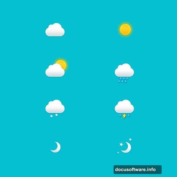
Create Additional Weather States
Once you’ve mastered the sunny cloud icon, apply these same techniques to other weather conditions.
For a rainy icon, add small teardrop shapes below your cloud. Use the Ellipse Tool to create ovals, then apply a slight blur for motion effect.

Snow works similarly. Create small circles or asterisk shapes. Make them slightly transparent so they feel light and airy.
Thunder icons need jagged lightning bolts. Use the Polygon Tool to create angular shapes. Apply a bright yellow or white color with an outer glow effect.
Master Layer Style Consistency
Consistency makes or breaks icon sets. Every icon should feel like it belongs to the same family.
Keep your drop shadow settings identical across all icons. Same distance, same opacity, same angle. This creates cohesive lighting that ties everything together.
Use the same stroke width on all shapes. One pixel works well for this size. Thicker strokes look cartoony. Thinner ones disappear at small sizes.
Copy and paste layer styles between shapes. Right-click a styled layer and choose Copy Layer Style. Then paste it onto new shapes. This ensures perfect consistency without memorizing settings.
Optimize for Real-World Use
These icons look great at 600px. But you’ll need smaller versions for actual projects.
Save your master file as a PSD with all layers intact. This becomes your source file for future edits.
Export individual icons at multiple sizes. Create versions at 512px, 256px, 128px, 64px, and 32px. Test each size to ensure details remain clear.
For web use, export as PNG with transparency. For print, save as PDF to preserve vector quality.
Consider creating dark mode versions. Simply invert your background and adjust colors accordingly. Modern apps need both light and dark icon variants.
Common Mistakes to Avoid
Don’t skip the grid setup. Manual alignment always looks slightly off. Your eye catches those tiny inconsistencies even if you don’t consciously notice them.

Avoid using too many layer effects. More isn’t better. Stick to 2-3 effects per icon element. Otherwise, your icons feel cluttered and unprofessional.
Never use low-resolution backgrounds. Starting at 600px means your icons scale down cleanly. Starting smaller and scaling up creates blurry, pixelated results.
Take Your Skills Further
These techniques work for any icon set. Weather icons teach the fundamentals. But you can apply these same methods to create navigation icons, social media buttons, or app interfaces.
Experiment with different color palettes. The techniques remain the same. But changing colors creates entirely different moods and styles.
Study professional icon sets from Apple, Google, and Microsoft. Notice how they use consistent shapes, spacing, and effects. Then apply those observations to your own work.
Practice regularly. Icon design improves with repetition. Create a new set each week. You’ll develop faster workflows and better design instincts.
Start simple. Master these weather icons first. Then tackle more complex subjects as your skills grow. Quality always beats quantity in portfolio work.
Post Title: Weather Icons in Photoshop: 11 Essential Design Tips
Meta Description: Want to create professional weather icons in [Photoshop](https://www.adobe.com/products/photoshop.html)? Most tutorials overcomplicate the process. This guide breaks down the