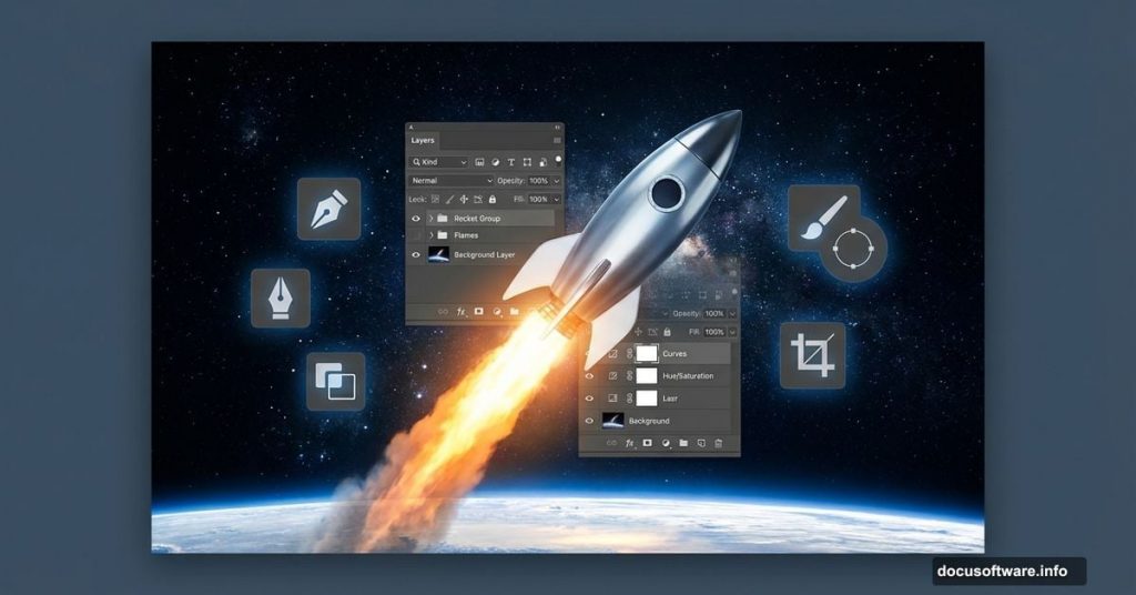
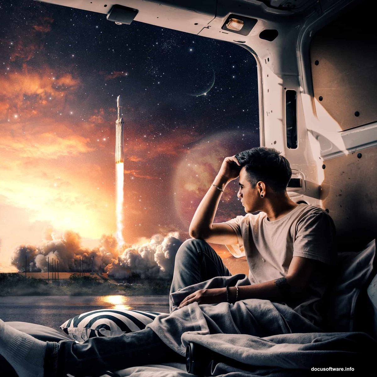
Ever wanted to design something epic? Building a photorealistic rocket launch scene pushes your Photoshop skills to the next level.
This tutorial walks you through compositing multiple elements into one dramatic image. You’ll learn professional techniques for blending subjects, adjusting atmosphere, and creating depth. Plus, these methods work for any photo manipulation project.
Let’s build something spectacular.
What You’ll Need Before Starting
Gather your resources first. You’ll need several high-quality stock images and specific Photoshop tools.
Required images:
- Model photo for the astronaut figure
- Rocket image with transparent background
- Sky texture for atmosphere
- Planet render for background drama
- Moon surface photo
- Star field overlay
- Cloud textures for depth
Essential Photoshop tools:
- Pen Tool for precise selections
- Layer masks for non-destructive editing
- Adjustment layers for color grading
- Brush Tool for manual refinements
- Camera Raw filter for final polish
Make sure you’re working with high-resolution images. Low-quality sources create muddy final results. Aim for at least 3000×3000 pixels at 300 DPI for print-quality output.
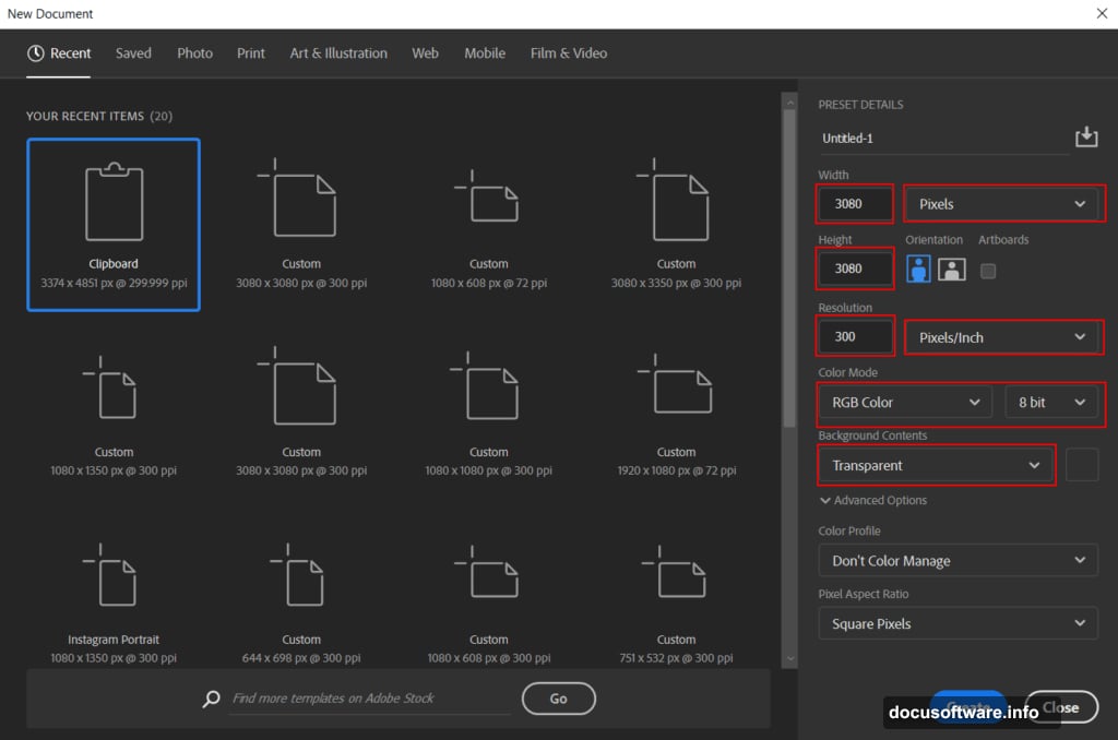
Setting Up Your Canvas
Start with proper document settings. This prevents headaches later.
Create a new file with these specifications:
- Width: 3080 pixels
- Height: 3080 pixels
- Resolution: 300 DPI
- Color mode: RGB 8-bit
- Background: Transparent
Why these dimensions? Square format works perfectly for social media. Plus, 3080 pixels gives you flexibility to crop or resize later without losing quality.
Keep your background transparent during composition. This lets you see exactly how elements blend together. You can always add a solid background later if needed.
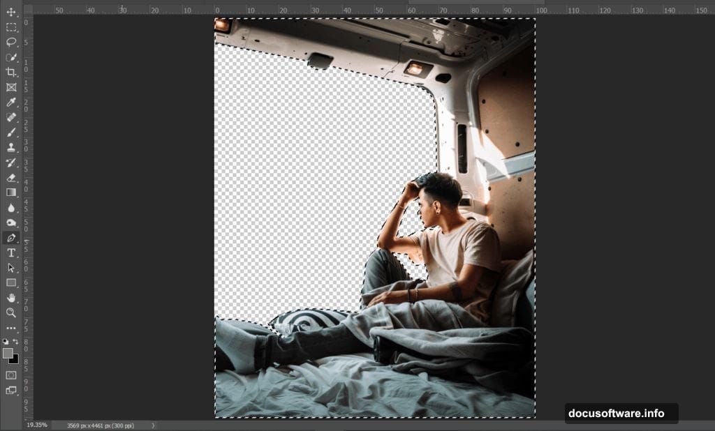
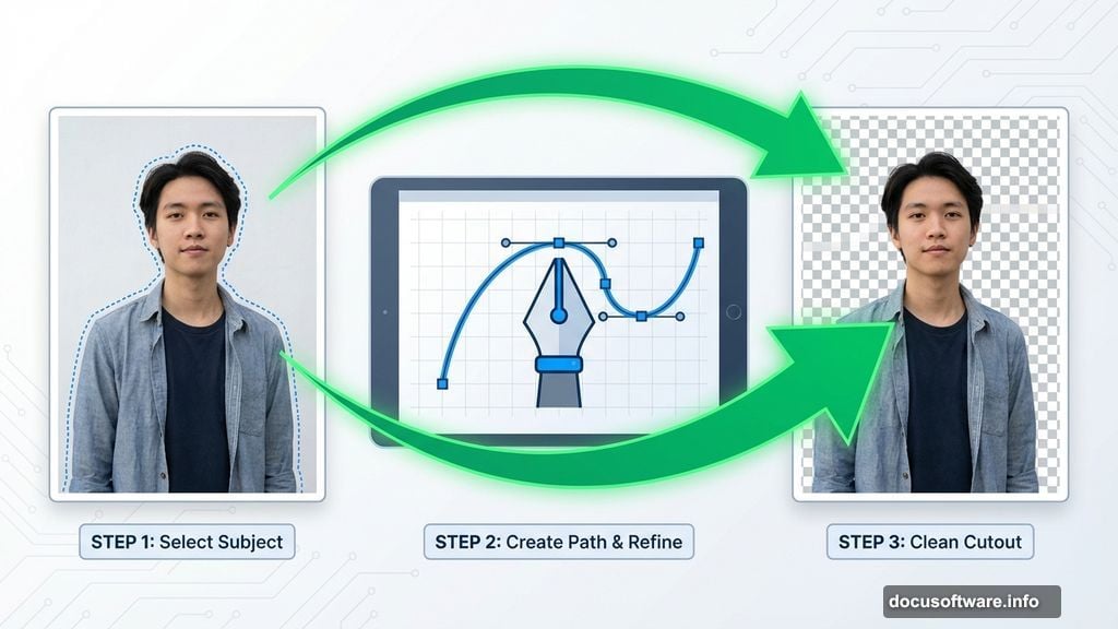
Extracting Your Subject Cleanly
The Pen Tool creates the cleanest selections. It takes practice but delivers professional results.
Here’s how to select your model:
Open your model image in Photoshop. Select the Pen Tool from the toolbar. Click to place anchor points around your subject’s outline. The more points you add, the more accurate your selection becomes.
For straight edges, simply click to add points. For curves, click and drag to create direction handles. These handles control the curve’s shape between anchor points.
Work your way completely around the subject. Then click your first anchor point to close the path. Right-click inside the path and choose “Make Selection.”
Set Feather Radius to 0 pixels for sharp edges. Check the Anti-aliased box to smooth out jagged pixels. Click OK to convert your path into a selection.
Now copy your selected subject and paste it onto your main canvas. Use Transform (Ctrl/Cmd + T) to scale and position. Hold Alt while dragging corners to resize from the center.
Pro tip: In older Photoshop versions, hold Alt + Shift together when resizing. In Photoshop CC, just Alt works fine.
Balancing Light with Levels
Your subject needs to match the scene’s lighting. Levels adjustment helps balance overall brightness.
Add a Levels adjustment layer above your model. Clip it to affect only the model layer by holding Alt and clicking between layers. Or right-click the adjustment layer and choose “Create Clipping Mask.”
Adjust the input sliders to control shadows, midtones, and highlights. Move the black point slider right to deepen shadows. Shift the white point left to brighten highlights. The middle slider controls overall brightness.
Watch your image as you adjust. You want the subject to feel naturally lit by the scene’s light sources. Too much adjustment looks fake.
Sculpting Highlights with Curves
Curves give you precise control over specific tonal ranges. This technique adds dimension.
Create a Curves adjustment layer and clip it to your model. Then invert the layer mask by pressing Ctrl/Cmd + I. This hides the effect completely.
Select a soft round Brush Tool with white as your foreground color. Paint on areas where light naturally hits your subject. The face, shoulders, and raised surfaces catch light first.
Build up the effect gradually with low opacity strokes. Multiple light passes look more natural than one heavy application. Think about where your scene’s light sources are positioned.
This manual painting creates realistic lighting that automated adjustments can’t match. Take your time here. Good lighting separates amateur composites from professional work.
Deepening Shadows Strategically
Shadows anchor your subject in the scene. Without them, everything floats.
Add another Curves adjustment layer and invert its mask again. This time, adjust the curve to darken the image. Then paint white on your mask to reveal shadows selectively.
Focus on areas turned away from light sources. Under the chin, beneath arms, and along the body’s shadowed side all need darkening. Also consider cast shadows from other scene elements.
Match shadow density to your scene’s overall contrast. Dramatic lighting needs deep shadows. Soft diffused light creates subtle shadow transitions.
Real shadows have soft edges where light wraps around objects. Use a soft brush with low opacity to feather shadow edges naturally.
Adjusting Color Balance
Color balance creates mood and ties elements together visually. Every element needs color harmony.
Add a Color Balance adjustment layer clipped to your model. Adjust shadows, midtones, and highlights separately for nuanced control.
For a space scene, push toward cool tones. Add cyan and blue to shadows and midtones. Warm up highlights slightly with yellow and red to simulate distant light sources.
But don’t go overboard. Subtle shifts feel realistic. Extreme color grading looks stylized unless that’s your goal.
Watch how color changes affect skin tones. Human subjects need believable flesh colors even in fantasy scenes. Push too far and people look like aliens.
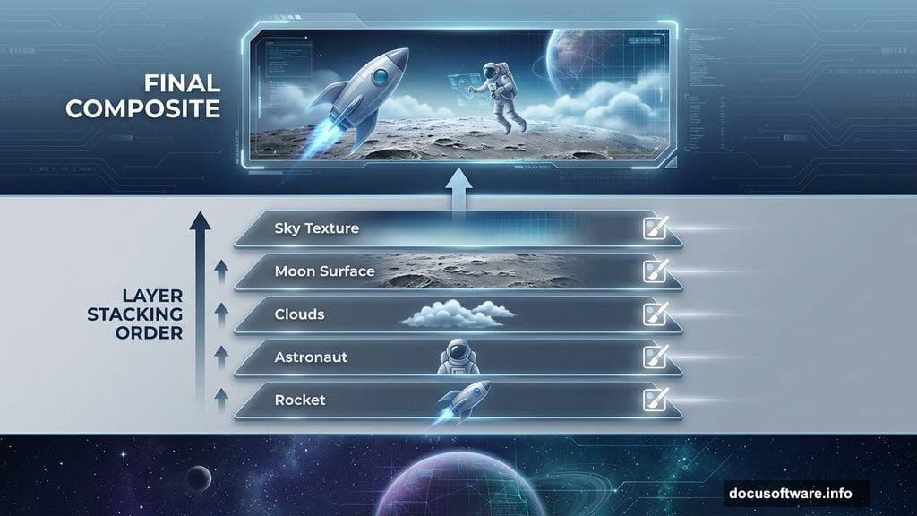
Compositing Your Sky Background
The sky establishes your scene’s atmosphere and depth. Choose one that supports your composition.
Place your sky image below all other layers. This becomes your base layer. Use Transform to scale and position until the composition feels balanced.
Consider the sky’s directional light. Where’s the sun or main light source? Your subject’s lighting should match this direction. Mismatched lighting screams “fake composite.”
If your sky needs adjustment, add Levels or Curves layers above it. Brighten or darken to match your desired mood. You can also adjust color balance to shift overall atmosphere.
Blend modes sometimes help integrate sky elements. Try Multiply for darker integration or Screen for lighter effects. But most of the time, Normal mode with opacity adjustments works best.
Adding Planetary Drama
Planets in the background create scale and science fiction atmosphere. Place them strategically for visual impact.
Import your planet image and position it in the composition. Usually mid-distance placement works best. Too close feels overwhelming. Too far becomes invisible.
Adjust the planet’s size to suggest distance. Massive planets should appear closer. Smaller planets read as farther away. Think about realistic scale relationships.
Add atmospheric perspective by slightly blurring distant planets. A subtle Gaussian Blur makes them feel farther back in space. Also reduce contrast and saturation on distant elements.
Layer your planet behind the main subject but in front of the sky. This creates proper depth layering. Use adjustment layers to match the planet’s color and brightness to your scene.
Consider adding a soft glow around the planet’s lit edge. This simulates atmospheric scattering and helps separate the planet from the background.
Integrating Moon Surface Details
Moon textures add foreground interest and ground your composition. They also provide visual weight at the bottom.
Place your moon surface image at the canvas bottom. Scale it large enough to fill the lower third of your composition. This creates a “standing on the moon” perspective.
Blend the moon surface edges into darkness using layer masks. Paint black on the mask with a soft brush around the edges. This prevents hard cutoff lines.
Add atmospheric haze where the surface meets the sky. This simulates the thin lunar atmosphere and adds depth. Use a soft white brush at low opacity on a new layer set to Screen blending mode.
Adjust the moon surface’s brightness to match your scene’s lighting. If your light source is bright, the surface should be well-lit. Dim lighting needs darker surfaces.
Scattering Stars Across Space
Star fields add realism to space scenes. But they’re easy to overdo.
Import your star field image above the sky but below your main subjects. Set the blend mode to Screen or Lighten. This makes black areas transparent while keeping bright stars visible.
Adjust layer opacity to control star intensity. Too many bright stars distract from your main subject. Dial them back until they support rather than compete.
Consider adding multiple star layers at different opacities. This creates depth with brighter foreground stars and dimmer background stars.
Use a layer mask to fade stars near your main light sources. Bright light washes out nearby stars. This subtle detail adds realism.
You can also manually paint additional stars using a small hard brush with white color. Vary the size and opacity for natural variation.
Building Depth with Cloud Layers
Clouds create atmosphere and separate depth planes. They’re essential for realistic space scenes.
Import cloud textures on separate layers throughout your composition. Place some in the foreground, middle ground, and background. This creates multiple depth layers.
Set cloud layers to Screen or Lighten blend modes. Adjust opacity to make them subtle and atmospheric. Heavy clouds block too much of your composition.
Use layer masks to selectively reveal clouds. You want wisps and suggestions of atmosphere, not solid walls of vapor. Paint black on masks to hide unwanted cloud areas.
Add motion blur to distant clouds. This simulates atmospheric perspective and movement. Foreground clouds can be sharper for contrast.
Color-match your clouds to the scene. Cool blue tones work for distant atmosphere. Warmer tones suggest proximity to light sources.
Applying Gradient Map Magic
Gradient maps create cohesive color grading across your entire composition. This professional technique ties everything together.
Add a Gradient Map adjustment layer at the top of your layer stack. Choose a gradient that matches your desired mood. Blue to orange works great for space scenes.
Set the Gradient Map’s blend mode to Soft Light or Overlay. These modes preserve underlying colors while adding tonal unity. Adjust layer opacity to taste.
You can create custom gradients to match specific color palettes. Sample colors from your scene using the Eyedropper Tool. Then build a gradient using those colors.
Multiple Gradient Maps with different blend modes create complex color grading. Stack them and adjust opacities to dial in exactly the look you want.
This technique mimics film color grading and gives your work a polished, professional appearance.
Final Polish with Camera Raw
The Camera Raw filter adds finishing touches no other tool matches. It’s like developing a digital negative.
Flatten your composition or create a merged copy of all visible layers (Ctrl/Cmd + Alt + Shift + E). Then apply the Camera Raw filter from the Filter menu.
Start with basic adjustments. Tweak exposure, contrast, highlights, shadows, whites, and blacks. These global controls balance your overall image.
Move to the tone curve for more precise control. Adjust the curve to refine contrast in specific tonal ranges. S-curves add punch. Flattened curves create matte effects.
The HSL panel lets you adjust individual colors. Shift hue, saturation, and luminance for each color range independently. This fine-tunes color relationships throughout your image.
Add grain in the Effects panel for film-like texture. Subtle grain adds character. Too much looks noisy. Around 15-25 usually works well.
Finally, apply subtle vignetting to draw attention toward the center. Darken edges slightly using the Vignetting slider. This classic technique focuses viewer attention.
Common Mistakes to Avoid
Several pitfalls trip up beginners in photo manipulation work. Here’s what to watch for.
Mismatched lighting direction destroys realism. Every element must share consistent light source direction. If the sky shows sunlight from the right, your subject needs right-side lighting too.
Over-saturated colors look cartoonish. Real photos have subtle color. Crank saturation too high and everything screams “fake.” Keep adjustments subtle.
Hard selection edges reveal compositing. Always feather edges slightly and refine with layer masks. Perfect hard edges don’t exist in nature.
Flat lighting lacks dimension. Sculpt your subject with highlights and shadows. This creates form and makes elements feel three-dimensional.
Inconsistent atmospheric perspective breaks depth. Distant elements should have less contrast, less saturation, and slight blur. Ignoring this makes everything feel flat.
Watch these details and your composites will look professional rather than amateur.
Taking Your Work Further
You’ve got the technical skills now. But great compositions need more than technique.
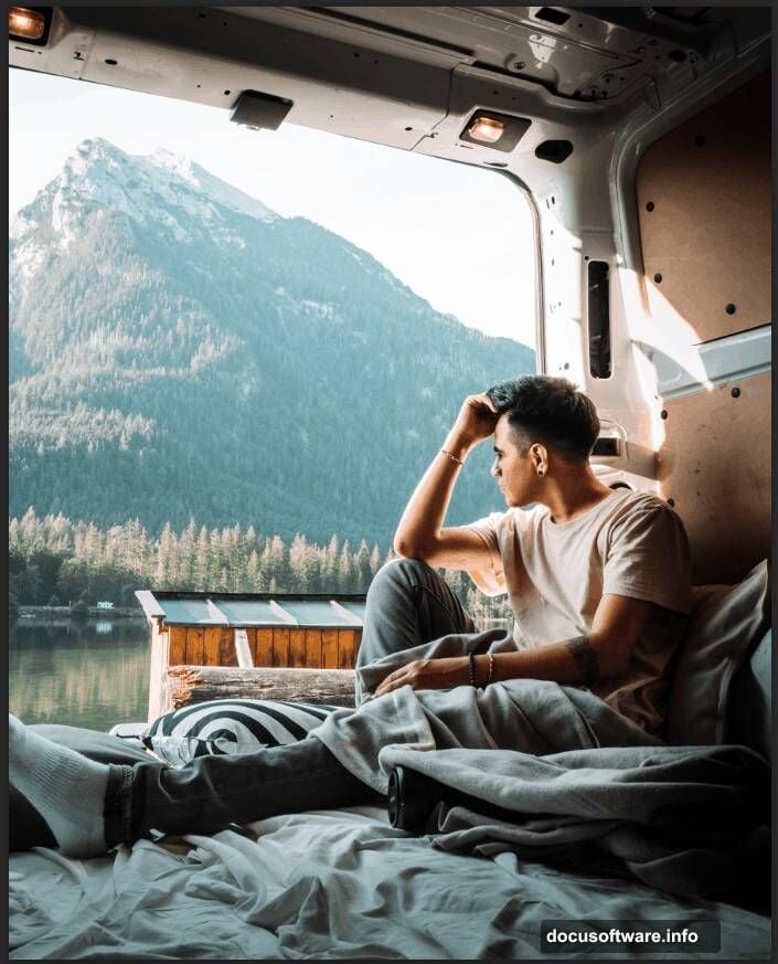
Study real rocket launches. Watch videos and examine photos. Notice how smoke behaves, how light interacts with exhaust, how atmospheric haze affects visibility. Real reference makes imagined scenes believable.
Experiment with different compositions. Move elements around before committing. Try vertical formats. Test various color palettes. The first idea isn’t always the best idea.
Share your work and get feedback. Post to communities like Reddit’s r/photoshop or Behance. Constructive criticism identifies blind spots in your work.
Build a reference library of high-quality stock images. Good sources save hours of searching. Sites like Unsplash, Pexels, and NASA’s image library offer excellent free resources.
Most importantly, keep creating. Every project teaches something new. Your tenth composite will crush your first. Consistency beats perfection.