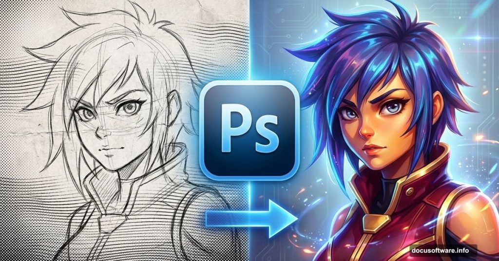
Drawing anime characters sounds intimidating. But with the right Photoshop techniques, you can transform a basic pencil sketch into a professional-looking digital painting.
This guide breaks down the exact process professional anime artists use. You’ll learn how to properly set up your outline, add realistic shadows, and create dramatic lighting effects. Plus, you’ll discover why certain tools work better than others for specific tasks.
Let’s start with the foundation.
Getting Your Outline Ready for Digital Painting
Your pencil sketch needs proper preparation before you start coloring. Most artists scan their paper drawings, but the raw scan looks washed out and gray.
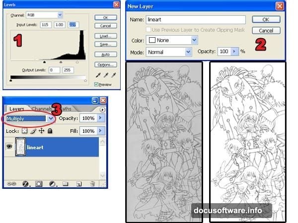
First, open your scanned outline in Photoshop. Navigate to Image > Adjustments > Levels. Move the black and white input sliders toward the center of the histogram. This forces your background to pure white and your lines to pure black.
Here’s the critical part: Check for broken lines before moving forward. Any gaps in your outline will cause problems later when you’re selecting areas to color. The Magic Wand tool struggles with incomplete outlines.
Now unlock your Background layer by double-clicking it in the Layers palette. Change the blending mode to Multiply. This makes the white background transparent while keeping your black lines visible.
Separating Outlines Without Jagged Edges
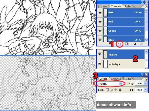
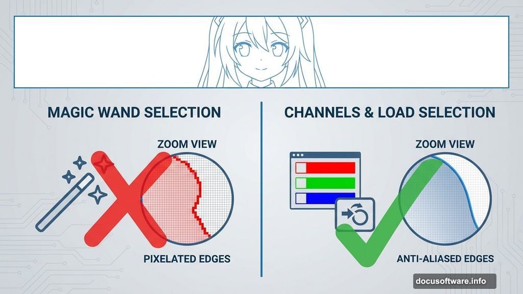
Most beginners use the Magic Wand tool to separate their outline from the background. Bad idea. This creates jagged, pixelated edges that look terrible on colored backgrounds.
Instead, use the Load Selection from Layer command. Open your Channels palette (Window > Channels) and click the load channel as selection button. This creates a selection based on tonal information rather than pixel edges.
Press Delete to remove the white background. Add a new layer below your outline layer and fill it with white. Change this new layer’s blending mode to Multiply.
The difference becomes obvious when you zoom in. Load Selection produces smooth edges that blend naturally with any background color. The Magic Wand method leaves visible stair-stepping that screams “amateur work.”
Base Colors: The Foundation Layer
Add a new layer below your white layer. This becomes your base color layer.
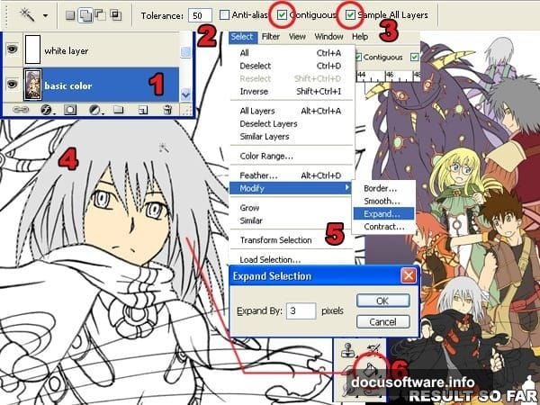
Select the Magic Wand tool and set Tolerance to 50 in the options bar. Check both Contiguous and Sample All Layers options. Click inside any area you want to color.
Before filling with color, expand your selection by 3 pixels using Select > Modify > Expand. On Windows, you can press Alt+S+M+E as a shortcut. This slight expansion prevents white gaps between your outline and colors.
Use the Paint Bucket tool to fill the selected area. Repeat this process for every section of your character. Hair, skin, clothing—each gets its own base color on the same layer.
Adding Shadows That Look Three-Dimensional
Create a new layer between your white layer and base color layer. This becomes your shadow layer.
Select the Magic Wand tool again, but this time set Tolerance to 1. Uncheck Contiguous and Sample All Layers. This lets you select all instances of a single color across your entire image.
Switch to the Brush tool with 100% hardness for sharp shadow edges. Open the Color Picker and select your base color. Then move the selector slightly down and right to darken it while keeping the same hue.
Paint your shadows while paying attention to your light source. Shadows fall opposite the light direction. Keep your light source consistent across the entire character or the image looks disjointed.
Creating Smooth Gradients With Dodge and Burn
Flat colors look boring. Professional anime art uses subtle gradients to create depth.
Duplicate both your base color and shadow layers. Position the duplicates above the originals. You’ll edit the duplicates while using the originals for making selections.
Select your duplicated base color layer. Use the Magic Wand tool to select an area—let’s say the hair. Open the Brushes palette (Window > Brushes) and turn on Other Dynamics.
Set your Dodge and Burn tools to Midtones range with 0% hardness. Select your top shadow layer first. Use the Burn tool with smooth strokes on the lower part of shadows. Then switch to the Dodge tool and lighten the upper part.
Move to your duplicated base color layer. Dodge the upper areas and burn the lower areas. This creates a natural gradient from light to dark.
Reflected Light Brings Characters to Life
Ambient light bounces off surrounding objects and illuminates areas that would otherwise be completely dark. Adding this reflected light makes your character look more realistic.
Keep your Magic Wand and Brush settings from the previous step. Set brush hardness to 0% for soft edges.
For this technique, use dark purple to shade areas receiving no reflected light. Based on the light source position, paint the side opposite your main light with dark purple.
Then use light yellow to shade areas facing the ambient light. This creates a subtle glow that suggests light bouncing from the environment. The contrast between dark purple and light yellow adds depth without being obvious.
Coloring the Outline for Extra Detail
Black outlines work fine for simple drawings. But colored outlines add professional polish.
Select your outline layer in the Layers palette. Click the lock transparent pixels button—it looks like a checkerboard. This prevents you from painting outside the existing lines.
Use the Brush tool to color the outline. Here’s the trick: Use the Eye Dropper tool constantly to sample colors near each section of outline. Hair outlines should be a darker version of the hair color. Skin outlines should be a darker skin tone.
This subtle change makes a huge difference in the final image quality. The character feels more integrated rather than looking like a coloring book page.
Building Realistic Smoke Effects
Smoke adds atmosphere and movement to your artwork. Creating it from scratch takes only a few minutes.
Create a new layer for smoke. Use the Brush tool with 100% hardness and paint zigzag shapes. These don’t need to look like smoke yet.
Select the Smudge tool and smudge your zigzags in flowing motions. Follow the direction you want the smoke to move. The Smudge tool transforms your rough shapes into wispy smoke tendrils.
Use Dodge and Burn tools to add volume. Dodge the areas where light hits the smoke. Burn the shadowy areas. This makes flat smoke look three-dimensional.
Load the selection of your smoke layer (Select > Load Selection). Contract the selection to about half its original size using Select > Modify > Contract. You might need to undo and adjust the value several times.
Create a new layer for highlights. Paint inside the contracted selection with yellow-orange. Select the Move tool and press the up arrow key to nudge this layer upward. This creates a highlight effect that makes smoke look translucent.
Cloudy Skies in Minutes
Background skies use a similar technique to smoke but with broader strokes.

Create a new layer named “sky.” Use the Gradient Tool to create a blue gradient from light to dark. Add another layer above it named “clouds.”
Paint loose cloud shapes with the Brush tool using white or light blue. Use the Smudge tool to stretch and blend these shapes until they look like clouds.
Load the selection of your clouds layer. Contract it like you did with the smoke—about half the original size. Create a new layer called “clouds 2” and position it above the clouds layer.
Select a slightly darker version of your cloud color. Paint the contracted selection with this color. Use Dodge and Burn to add volume and dimension.
Duplicate your clouds layer and enlarge it using Free Transform (Edit > Free Transform). Set the opacity to 75%. This creates depth by suggesting distant clouds. Finally, use Dodge and Burn on the sky layer itself to create a visible light source.
Adding Dramatic Lighting Effects
Light sources transform good artwork into great artwork. This step pulls everything together.
Create a new layer named “light” and move it to the very top of your layer stack. Select the Brush tool and open the Brushes palette. Make sure Other Dynamics is checked and set hardness to 0%.
Select white as your foreground color. Paint where you want light to appear—around your main light source, on reflective surfaces, and where light hits your character directly.
Don’t overdo it. Light should enhance your existing shading, not replace it. Focus on areas where light would naturally accumulate or reflect.
Color Grading With Gradients
Professional anime art uses color temperature to create mood and realism. Warm colors suggest light, cool colors suggest shadows.
Create a new layer above all other layers. Load the selection of your characters using the Magic Wand or by Ctrl+clicking the layer thumbnails. Use the Gradient tool to create an orange-to-blue gradient.
Since the light source comes from the left in this example, draw the gradient from left to right. This warms the left side (closer to light) and cools the right side (farther from light).
Change the layer blending mode to Color. Lower the opacity to 10-20%. This subtle color shift makes your lighting more believable. Areas near the light source feel warm. Areas in shadow feel cool. The viewer’s brain registers this as more realistic even though the effect is barely visible.
Test different opacity levels. Too much looks artificial. Too little has no effect. Find the sweet spot where the color temperature shift enhances without overwhelming your work.