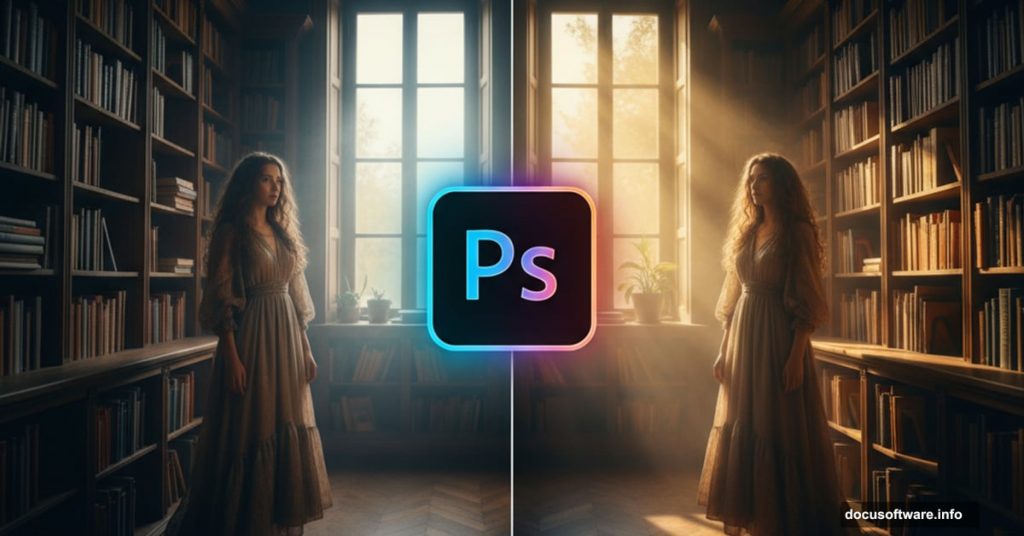
Creating convincing light in fantasy photo manipulations separates amateur work from professional results. Most tutorials skip the hard parts. This one won’t.
You’ll learn how to blend semi-transparent fabrics, add realistic light rays, and make different photo elements look like they belong in the same scene. Plus, you’ll discover why saturation control matters more than most people realize.
Let’s build something dramatic.
What You Need Before Starting
Grab these resources first. You can’t fake good source material.
Stock Photos:
- Library interior shot (architectural background)
- Woman in flowing dress (main subject)
- Mist brush pack for atmosphere
- Sun ray brushes for light beams
- Dust and light textures for depth
The quality of your sources determines your final result. So choose high-resolution images with similar lighting angles when possible.
Set Up Your Canvas Right
Create a new Photoshop document at 600×900 pixels. Set resolution to 72 PPI for web use.
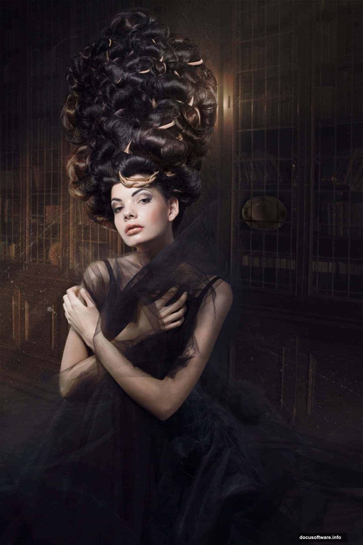
Fill the background with dark blue (#2b2b32). This establishes your color palette early. Moreover, it gives you a foundation that supports the moody atmosphere you’ll build.
Why dark blue instead of black? It adds subtle color temperature. Pure black creates harsh contrast. Dark blue feels more natural and gives you room to adjust shadows later.
Build Your Background Layer
Import your library photo. Drag it into your document and name the layer LIBRARY.
Hit Ctrl+T to activate Free Transform. Hold Shift while resizing to maintain proportions. Scale the image to fill your canvas. Press Enter to apply changes.
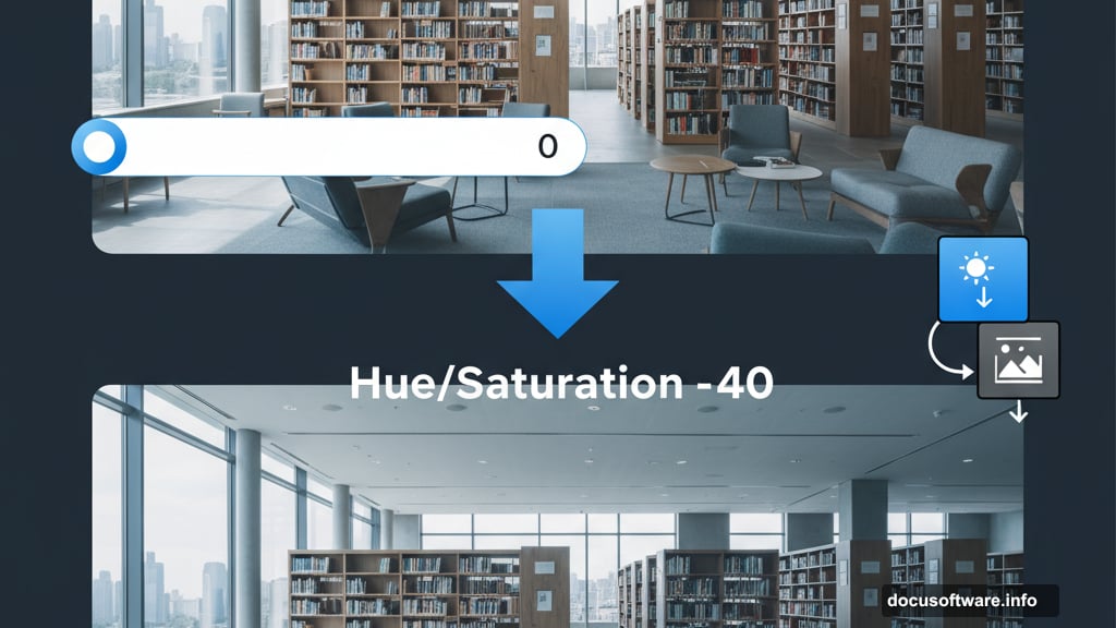
Now here’s the critical part most tutorials ignore. That library photo probably looks too saturated against your dark blue background. Fix it immediately.
Add a Hue/Saturation adjustment layer. Set Saturation to -40. But don’t let it affect your entire image. Create a clipping mask by clicking the small square icon at the bottom of the properties panel.
This targets only the LIBRARY layer. The rest of your composition stays unaffected.
Handle the Floor Problem
You’ll place your subject in the bottom left corner. That means you don’t need floor there. But the bottom right corner would show empty space.
Click on your LIBRARY layer. Grab the Lasso Tool (L). Select a section of the floor from your library photo. Press Ctrl+J to duplicate that selection onto a new layer.
Name this layer FLOOR. Use the Move Tool (V) to position it in the bottom right corner. Fill that empty space naturally.
Add another Hue/Saturation adjustment layer above FLOOR. Set Saturation to -40 again. Create a clipping mask to affect only the floor layer.
Why match saturation across elements? Because your eyes notice color intensity differences immediately. Unified saturation makes separate photos look like one cohesive scene.
Import Your Main Subject
Open your woman stock photo. You need clean selection here. No shortcuts.
Use the Pen Tool (P) for precise edges on the body and face. For the flowing dress and hair, try Select and Mask with Refine Edge. Semi-transparent fabric requires special attention.
Here’s what works: Sample the background color where the fabric overlaps. Then use layer masks with soft brushes to blend edges. Don’t try to cut perfectly. Instead, let some background show through the sheer parts.
Copy your selection. Paste it into your main document. Name this layer WOMAN. Position her in the bottom left corner.
Scale as needed with Free Transform (Ctrl+T). But watch the proportions. She should look natural against the library architecture.
Match Colors Between Elements
Your woman probably came from different lighting than the library. Fix that now.
Add a Hue/Saturation adjustment layer above WOMAN. Create a clipping mask. Adjust the Hue slider until her skin tones match the blue-tinted library environment.
Then add a Curves adjustment layer. Clip it too. Push the shadows darker. Pull the midtones toward blue. Make her look like she belongs in that space.
Color matching takes patience. Keep comparing her to the background. Zoom out frequently. If she still looks pasted in, adjust more.
Create Base Atmosphere
Import your mist brush pack. Create a new layer above all others. Name it MIST BASE.
Set foreground color to light blue (#a8b5c7). Paint mist along the floor and around the bookcases. Use low opacity (20-30%). Build up gradually with multiple strokes.
Why multiple low-opacity strokes? Because atmosphere has depth. Single high-opacity strokes look flat. Layered strokes create volume and realism.
Now add a second mist layer. Name it MIST DETAIL. Use smaller brush sizes. Paint wisps of fog catching light. Focus on areas where light will travel through the scene.
Add Your Main Light Source
This step makes or breaks your composition. Light direction must stay consistent throughout.
Create a new layer. Name it SUN RAYS. Use your sun ray brushes. Paint light beams coming from the upper right corner. That’s your key light position.

Set this layer to Screen blending mode. Reduce opacity to 60-70%. The rays should be visible but not overwhelming.
Add a layer mask to SUN RAYS. Use a soft black brush to erase rays where they’d be blocked by bookcases or architecture. Light doesn’t pass through solid objects.
This masking step separates amateur work from professional results. Real light interacts with the environment. Yours should too.
Build Secondary Light Sources
Create another layer. Name it AMBIENT LIGHT. Set blending mode to Screen.
Use a large soft brush with warm orange color (#ff9a4d). Paint subtle glows on book spines and wooden surfaces. These are bounced light reflections.
Keep opacity very low (10-15%). Ambient light suggests rather than announces. Too much looks fake.
Then create HIGHLIGHT DETAIL layer. Use a small hard brush. Paint tiny bright spots where light hits metal, glass, or polished wood. These specular highlights add realism.
Light Your Subject Correctly
Your woman needs lighting that matches the scene. Create a new layer above WOMAN. Name it SUBJECT LIGHT. Create clipping mask.
Set blending mode to Screen. Use a soft brush with warm light color. Paint light falling on her face, shoulder, and dress from the upper right direction.
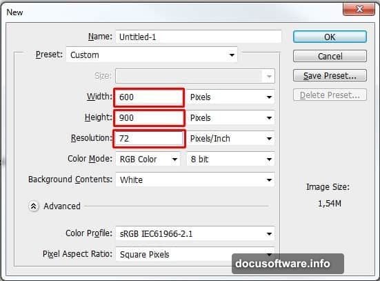
Here’s the tricky part with the dress. Semi-transparent fabric both reflects and transmits light. Paint subtle glow behind thin fabric areas. Then add highlights on the front surface.
Use separate layers for this. One for transmitted light (soft, glowing). Another for surface reflections (brighter, more defined). Blend them carefully with opacity adjustments.
Add Rim Lighting
Rim light creates separation from the background. It’s essential for depth.
Create new layer. Name it RIM LIGHT. Clip to WOMAN layer. Set blending mode to Screen.
Use a small soft brush with bright blue-white color (#d4e8ff). Paint along the edges of her silhouette opposite your main light source. This simulates light bouncing from the blue environment.
Keep it subtle. Rim light should accent edges, not overpower the subject.
Layer Dust and Particles
Import your dust texture. Drag it into your document. Place it above all layers. Name it DUST.
Set blending mode to Screen. Adjust opacity to 30-40%. The dust should be barely visible. It adds atmospheric depth without calling attention to itself.
Add a layer mask. Paint away dust from areas where it doesn’t make sense. Heavy dust presence near light sources. Less in shadows.
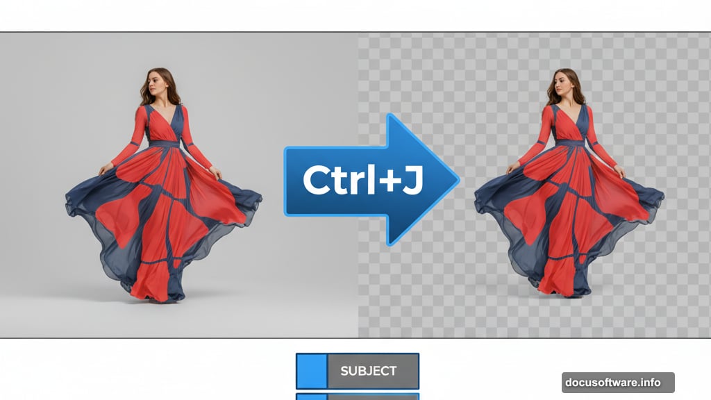
Create another layer. Name it PARTICLES. Use a small hard brush with light color. Manually paint individual dust particles catching light. Vary size and opacity for realism.
Unify Your Color Palette
Almost done. Now you need to tie everything together with color grading.
Add a Color Lookup adjustment layer at the top. Try different presets. Find one that enhances your blue-orange contrast. Reduce opacity if the effect is too strong.
Then add a Curves adjustment layer. Push the overall image slightly toward blue in the highlights. Add warmth to the shadows. This creates color harmony across all elements.
Finally, add a Hue/Saturation adjustment layer. Reduce overall saturation by 10-15%. Overly saturated images look digital. Slight desaturation feels more cinematic.
Polish With Final Adjustments
Create a new layer at the very top. Name it DODGE BURN. Fill it with 50% gray. Set blending mode to Overlay.
Use the Dodge Tool (O) to brighten light-catching areas slightly. Use Burn Tool to deepen shadows. This adds micro-contrast that makes the image pop.
Be conservative. Overdoing dodge and burn creates an obvious, processed look.
Add a final Levels adjustment layer. Adjust the black point to crush shadows slightly. This adds drama and hides any remaining blending imperfections.
The Truth About Fantasy Lighting
Here’s what professionals know. Realistic light in fantasy scenes requires contradicting reality.
Real light behaves according to physics. But fantasy images need exaggerated light for emotional impact. So you balance physical accuracy with artistic license.
Your light should feel plausible without being photographically correct. Push colors warmer and cooler than reality. Make contrast stronger than natural. Add atmospheric effects that wouldn’t exist in a real library.
The goal isn’t realism. It’s believability. Your viewer should accept the scene without questioning it.
Where Most People Fail
Three common mistakes ruin fantasy lighting:
First, inconsistent light direction. Every element must respond to the same light sources. One misplaced shadow destroys believability.
Second, flat atmosphere. Real environments have depth through atmospheric haze and particles. Missing this makes composites look cut-and-paste.
Third, over-processing. Too many adjustment layers with high opacity values creates a muddy, overworked look. Subtlety requires discipline.
Master these fundamentals. Then your fantasy composites will convince even critical viewers.
