
Want to create stunning aurora landscapes? This step-by-step tutorial shows you exactly how. No guesswork. Just clear instructions.
You’ll combine multiple images, create realistic lighting effects, and blend everything seamlessly. Plus, I’ll show you the layer mask tricks that make or break these compositions.
Let’s build something beautiful.
Gather Your Stock Images First
Before touching Photoshop, collect these elements:
- Starry night sky background
- Aurora borealis footage or photo
- Winter landscape foreground
- Mountain silhouettes (left and right)
- Tree silhouettes
- Wildlife subject (optional but adds drama)
Free stock sites like Unsplash and Pexels work great. Or shoot your own elements. Either way, make sure images share similar lighting conditions.
Set Up Your Canvas
Start with a new document at 1300×800 pixels. White background works fine. You’ll cover it completely anyway.
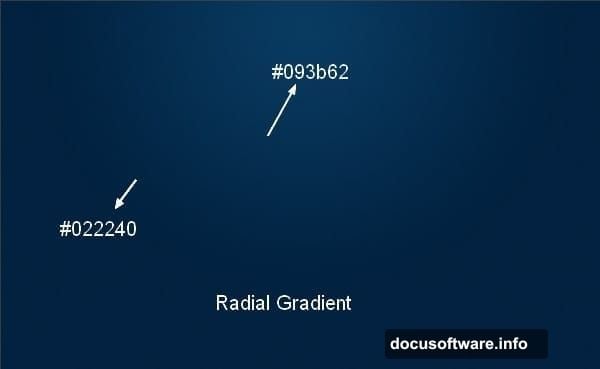
Create a new layer immediately. Hit G for the Gradient Tool. Select Radial Gradient mode. Choose two blue tones: #022240 for darker areas and #093b62 for lighter zones.
Drag from top center downward. This creates your base sky gradient. The radial setting gives you that natural light falloff effect.
Why these specific colors? They match the cool tones found in actual northern lights photography. Using warm colors here looks fake instantly.
Build Your Starfield Layer
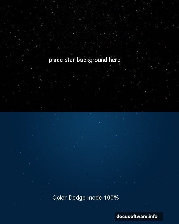
Drag your starry sky image onto the canvas. Use the Move Tool (V) to position it properly.
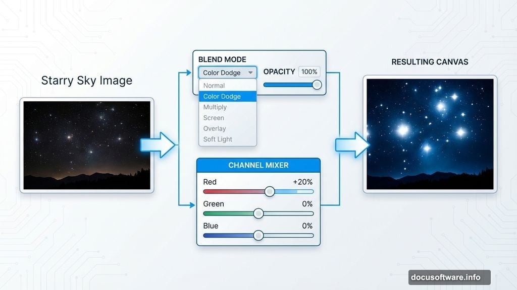
Here’s the crucial part: Change the blend mode to Color Dodge at 100%. This makes stars punch through while keeping the background dark. Screen mode works too, but Color Dodge creates brighter, more dramatic stars.
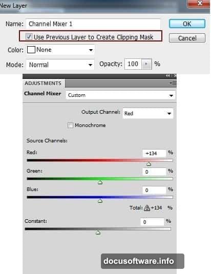
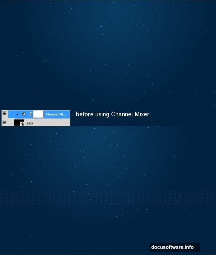
Now adjust star colors. Click Layer > New Adjustment Layer > Channel Mixer. Make sure to clip this adjustment to your stars layer only. Tweak the red channel slightly upward. This creates those subtle orange-tinted stars you see in real astrophotography.
Don’t overdo it. Just a hint of warmth separates amateur composites from professional work.
Add the Aurora Effect
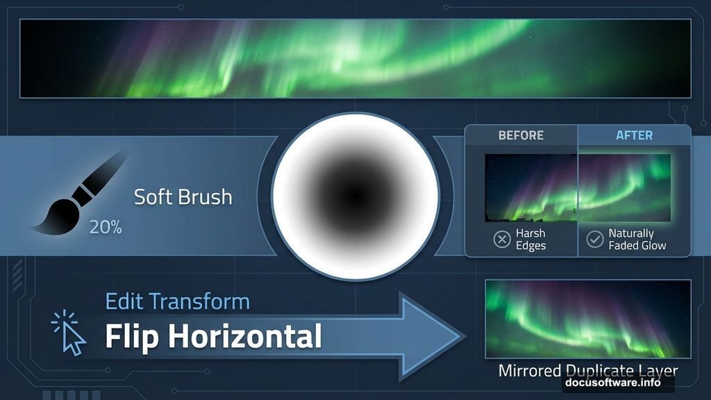
Place your aurora image above the stars layer. Set blend mode to Screen at 100%. This lets the aurora glow naturally against the dark sky.
Immediately add a layer mask. Grab a soft black brush at 20% opacity. Gently paint away harsh edges and overly bright spots. The goal? Make the aurora fade naturally into darkness.
Check your mask thumbnail. It should show gradual transitions, not hard edges. Hard edges scream “bad Photoshop job.”
Duplicate the aurora layer. Flip it horizontally via Edit > Transform > Flip Horizontal. Position this copy on the opposite side of your canvas. Mask away overlapping areas and blend the edges.
This mirroring technique creates a wider, more expansive aurora display. Real northern lights often span huge sections of sky.
Group and Adjust Aurora Layers
Select all aurora layers. Hit Cmd/Ctrl+G to group them together.
Critical step: Change the group blend mode from Pass Through to Screen 100%. This maintains your aurora effects while allowing group-wide adjustments.
Add a Curves adjustment layer inside this group. Drag the curve slightly downward to reduce overall brightness. Aurora should glow, not blind viewers.
Why adjust as a group? Consistency. Individual layer adjustments often create mismatched lighting that looks unnatural.
Enhance Sky Atmosphere
Create a new layer above everything. Grab the Rectangular Marquee Tool. Select the upper portion of your canvas where sky meets horizon.
Choose a soft brush. Pick two colors: #f79ead (soft pink) and #acbbc5 (cool blue-gray). Paint along the selection edges. Alternate between colors for natural variation.
Convert this layer to a Smart Object. Go to Filter > Blur > Motion Blur. Set the angle to match your light source direction. Adjust distance until the glow spreads naturally.
This mimics atmospheric light scatter. Real auroras create this soft glow effect across the sky.
Add Foreground Landscape
Drag your foreground landscape image into the composition. Position it at the bottom. Use a layer mask to blend the horizon line seamlessly with your sky.
Pay attention to the light direction in your foreground image. It should match your aurora placement. If the stock photo has sunlight from the right but your aurora glows on the left, flip the landscape horizontally.
Mismatched lighting directions ruin otherwise perfect compositions.
Position Mountain Silhouettes
Place your left mountain image. Set blend mode to Multiply or Normal, depending on the original image brightness. Use Levels (Cmd/Ctrl+L) to darken it into a silhouette.
Repeat with the right mountain. Vary the heights slightly for visual interest. Real mountain ranges rarely have perfectly matched peaks.
Add layer masks. Blend the mountain bases into your foreground landscape. Use a soft brush at low opacity for gradual transitions.
Mountains should feel like they’re receding into distance, not pasted on top.
Add Tree Silhouettes
Drag tree images into your scene. Position them along the foreground edges. Trees frame your composition and add depth.
Darken them into silhouettes using Levels or Curves. Trees in night scenes appear as dark shapes against lighter skies. Any visible detail breaks the illusion.
Vary tree sizes. Closer trees should be larger and darker. Distant trees fade slightly and appear smaller. This creates atmospheric perspective.
Insert Your Subject
Place your wildlife subject (bear, wolf, or whatever you chose). Position it in the foreground or middle ground.
Darken it into a silhouette to match your trees and mountains. Real wildlife photographed against bright northern lights appears as dark shapes.
Add a subtle rim light if desired. Create a new layer, clip it to your subject, and paint a thin highlight along one edge using the aurora’s predominant color. This suggests reflected light.
Keep rim lights subtle. Too much makes subjects look cut out and pasted.
Create Reflected Ground Glow
The aurora illuminates snow and ground. Create this effect with a new layer below your subject.
Use a large, soft brush at low opacity. Choose the aurora’s main color (usually green or blue-green). Paint gentle highlights on snow surfaces and ground areas.
Concentrate glow directly beneath the brightest aurora sections. Light intensity decreases with distance from the source.
Change layer blend mode to Overlay or Soft Light. Reduce opacity to 30-40%. The glow should enhance, not overpower.
Add Atmospheric Haze
Create a final new layer at the top. Fill a large, soft brush with white at 5% opacity. Paint gentle haze across the middle ground.
This mimics the moisture and particles in cold air that scatter light. Northern regions often have visible atmospheric haze, especially in winter.
Keep it subtle. Too much haze makes your image look foggy instead of atmospheric.
Final Color Grading
Flatten your visible layers or create a merged layer at the top (Cmd/Ctrl+Alt+Shift+E).
Add a Color Lookup adjustment layer. Choose a preset that enhances cool tones. “Moonlight” and “Teal and Orange” presets often work well for aurora scenes.
Adjust opacity until the effect feels natural. Full-strength LUTs usually look too heavy-handed.
Add a final Curves layer. Create a slight S-curve to boost contrast. This makes your aurora pop against the dark sky.
Common Mistakes to Avoid
Most aurora composites fail because creators skip the atmospheric elements. The glow on ground surfaces. The subtle haze. The proper silhouettes.
Another frequent error? Overly bright auroras. Real northern lights glow beautifully but don’t light up the landscape like stadium floodlights.
Also, watch your blend modes. Using Screen or Color Dodge on non-luminous elements (like landscapes or subjects) creates transparent, ghostly effects that look wrong.
When to Stop
You’ll be tempted to keep adding effects. Don’t. Photoshop compositions improve up to a point, then get worse with more adjustments.
Step back regularly. View your image at 50% zoom. Ask yourself if it looks believable. If you’re questioning whether an effect is too much, it probably is.
The best composites look almost real. Viewers should think “that’s a great photo” before realizing it’s a composite.