
Ever wondered how digital artists blend reality into dreamlike compositions? This technique transforms ordinary photos into surreal art that stops viewers mid-scroll.
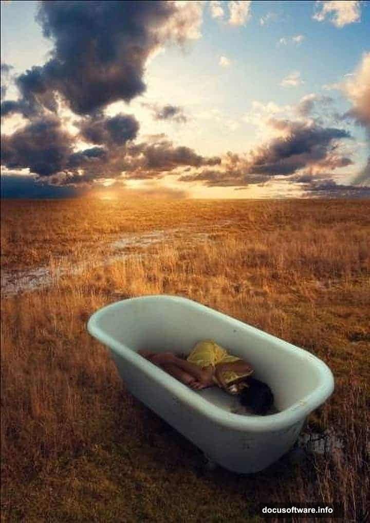
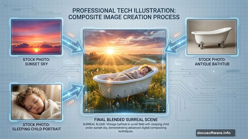
Today, we’re building a scene where a sleeping girl rests in a vintage bathtub placed on a sunlit field. Sounds impossible? That’s exactly what makes photo manipulation magical. By the end, you’ll know how to seamlessly merge multiple images, create convincing lighting, and add that dreamy quality professional composites possess.
What You’ll Master in This Tutorial
This walkthrough covers essential Photoshop skills every compositor needs. First, you’ll learn precise image blending that makes impossible scenes look photograph-real. Then we’ll tackle lighting techniques that sell the illusion.
Plus, we’ll explore perspective tricks that pull viewers into the scene. The brush tool becomes your light source. Color correction makes everything cohesive. And strategic blur adds that professional dreamy finish.
Gather Your Stock Photos First
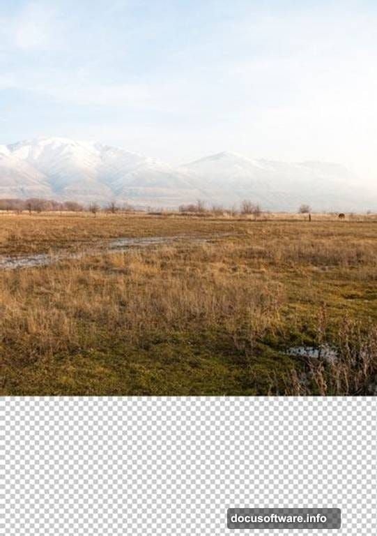
Before opening Photoshop, collect these images. You’ll need a landscape photo for your field background. Grab a sunset sky image too. Find a vintage bathtub shot and a photo of a sleeping child.
Stock photo sites offer these elements easily. Just search for “field landscape,” “sunset sky,” “antique bathtub,” and “sleeping child portrait.” Download high-resolution versions for best results.
Pro tip: Choose images with similar lighting conditions. That makes blending much easier later.
Set Up Your Canvas Properly
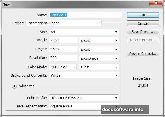
Launch Photoshop and create a new document. Go to File > New in the menu bar. Set your dimensions to 2480 x 3508 pixels at 300 DPI resolution.
Why these specific numbers? They match standard A4 international paper size. That gives you flexibility for printing or digital display. Plus, the higher resolution preserves detail quality.
Choose RGB color mode with 8-bit depth. Set your background to white. This clean slate lets you build your composition from scratch.
Build the Field Foundation
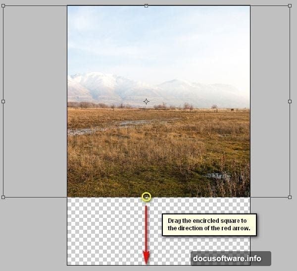
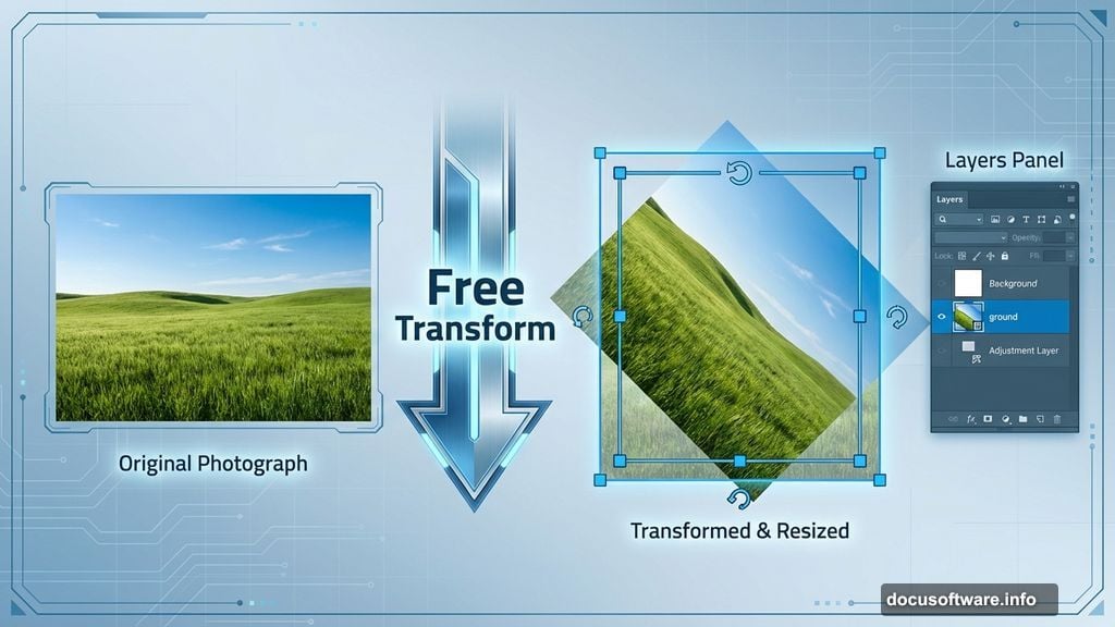
Open your landscape stock photo. Activate the Move tool by pressing V on your keyboard. Click and drag that landscape onto your blank canvas.
You’ll probably notice the image doesn’t fit perfectly. That’s normal. We’ll fix it next.
Rename this layer to “ground” by double-clicking the layer name in your Layers panel. Good organization saves headaches later when you’re juggling multiple elements.
Now press Ctrl/Cmd + T to activate Free Transform. Resize the landscape to cover your entire canvas. Drag the corner handles while holding Shift to maintain proportions.
Fix Perspective Distortion
Notice how the landscape looks slightly tilted? Real photos rarely sit perfectly level. But in composites, wonky angles break the illusion.
With Transform still active, right-click anywhere on the canvas. Choose Rotate from the contextual menu. Gently rotate your landscape until the horizon line sits straight.
This small adjustment makes a huge difference. Viewers might not consciously notice, but their brains register when something feels “off.” Getting perspective right early prevents problems later.
Add Your Sunset Sky
Import your sunset sky image using the same Move tool technique. Drag it onto your canvas above the ground layer. This layering order matters for realistic depth.
Position the sky so the horizon matches your landscape’s horizon. If they don’t align perfectly, your scene will look obviously fake. Take time getting this right.
Use Free Transform again to resize as needed. The goal is seamless blending where field meets sky. Don’t worry about perfection yet—we’ll blend these layers properly in the next steps.
Blend Sky and Ground Seamlessly
Here’s where magic happens. Add a layer mask to your sky layer. Click the layer mask icon at the bottom of your Layers panel—it looks like a rectangle with a circle inside.
Select a soft brush by pressing B. Make sure black is your foreground color. Paint along the horizon line where sky meets field. Black on a layer mask hides pixels, revealing the layer beneath.
Use a large, soft brush with reduced opacity around 30%. This creates gradual transitions instead of harsh edges. Paint gently, building up the effect slowly. That patience creates convincing blends.
Position the Bathtub
Import your bathtub image. Place it in the lower third of your composition. Why there? It creates natural eye flow and suggests the viewer is looking down slightly.
Use Free Transform to scale the bathtub appropriately. Too large feels overwhelming. Too small loses impact. Aim for the bathtub filling about 25% of your canvas height.
The bathtub needs to sit convincingly on the grass. We’ll add shadows next to anchor it to the ground.
Create Realistic Ground Shadows
Make a new layer beneath your bathtub layer. Name it “bathtub shadow.” Grab your Brush tool and choose black. Lower the opacity to around 20%.
Paint shadow directly under and around the bathtub’s base. Think about where your light source (the setting sun) sits. Shadows stretch away from light sources.
Build shadow intensity gradually with multiple brush strokes. Real shadows have soft edges and varying darkness. Hard, uniformly dark shadows scream “fake.”
Add the Sleeping Figure
Import your sleeping child photo. Use the Pen tool (P) or Quick Selection tool (W) to carefully cut out the figure. Take your time here—clean selections separate amateur from professional work.
Position the figure in the bathtub naturally. The body should nestle into the tub’s curves. If limbs stick out awkwardly, use Transform’s Warp mode to adjust positioning subtly.
Match the figure’s size to the bathtub scale. A too-large person breaks believability instantly. When in doubt, slightly smaller usually looks more natural than slightly bigger.
Match Skin Tones to Environment
The figure probably doesn’t match your scene’s lighting yet. Create a Curves adjustment layer clipped to your figure layer. Click the adjustment layer icon, choose Curves, then Alt-click between layers to clip it.
Warm up skin tones to match the sunset lighting. Drag the curve up slightly in the red and yellow channels. Real sunset light bathes everything in golden warmth.
Also add subtle orange and pink tints. Sample colors from your sky using the Eyedropper tool. Then paint those colors onto the figure using a Color blend mode layer at low opacity.
Paint Directional Lighting
Create a new layer above your figure. Set blend mode to Overlay. Choose a soft brush with warm orange color sampled from your sunset sky.
Paint light on the figure’s face, arms, and any surfaces facing your light source. This rim lighting creates dimensional depth. Lower your brush opacity to 15-20% for subtle effects.
Conversely, add cool shadows on surfaces facing away from light. Use soft blue-purple tones. This contrast between warm highlights and cool shadows makes everything pop.
Add Atmospheric Depth
Real photos have atmospheric haze—distant objects appear slightly hazy and desaturated. Recreate this effect for realism. Create a new layer above everything.
Fill it with white. Lower opacity to around 5-10%. This subtle haze unifies all elements and adds dreamy softness.
Alternatively, apply a very slight Gaussian Blur to background elements. Keep foreground subjects (the bathtub and figure) sharp. This mimics how camera lenses naturally work and draws focus exactly where you want it.
Enhance Colors for Impact
Almost finished. Now we punch up colors to make everything vivid. Add a Vibrance adjustment layer at the top of your layer stack.
Increase Vibrance slider to around +20 or +30. This intensifies colors without oversaturating skin tones. Vibrance is smarter than Saturation—it protects already-saturated colors from clipping.
Also try a Photo Filter adjustment layer. Choose Warming Filter (85) to enhance that golden-hour glow. Adjust density to taste, usually around 25% works well.
Apply Strategic Sharpening
Your composite needs selective sharpening. Too much looks artificial. Too little appears muddy. Find the sweet spot.
Merge all layers into a new layer by pressing Ctrl/Cmd + Alt/Opt + Shift + E. This creates a composite copy without destroying your original layers.
Apply Filter > Sharpen > Unsharp Mask. Use these settings: Amount 80%, Radius 1.0 pixels, Threshold 0. This enhances edge definition without creating halos.
Then add a layer mask to your sharpened layer. Paint black over background areas. Only foreground subjects need sharp detail. Soft backgrounds enhance that dreamy aesthetic we’re chasing.
Fine-Tune the Final Image
Step back and evaluate your composition with fresh eyes. Does anything feel off? Trust your instincts. Small adjustments often make big differences.
Check if all shadows point in consistent directions. Verify that lighting on all elements matches. Ensure color temperatures feel cohesive throughout.
Make final tweaks to brightness, contrast, and saturation. Sometimes reducing overall saturation by 5-10% paradoxically makes images feel more professional and less “overcooked.”
Why This Technique Matters
Photo manipulation teaches core compositing skills used across creative industries. Film VFX, advertising, book covers, and concept art all rely on these techniques.
Beyond technical skills, you’re learning visual problem-solving. How do you make impossible scenarios believable? That creative thinking transfers to every design challenge.
Plus, there’s pure satisfaction in creating something surreal yet convincing. That’s the hook that keeps digital artists coming back.
This specific tutorial builds on fundamental techniques while introducing intermediate concepts. You’re not just following steps—you’re understanding the why behind each decision. That knowledge lets you adapt these skills to your own creative visions.
Start with this guided project. Then experiment. Swap in different elements. Try various lighting scenarios. Break rules once you understand them. That’s how you develop your unique artistic voice.