Photo manipulation sounds intimidating. But break it into steps and suddenly it’s manageable.
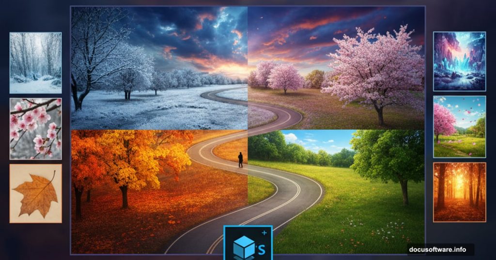
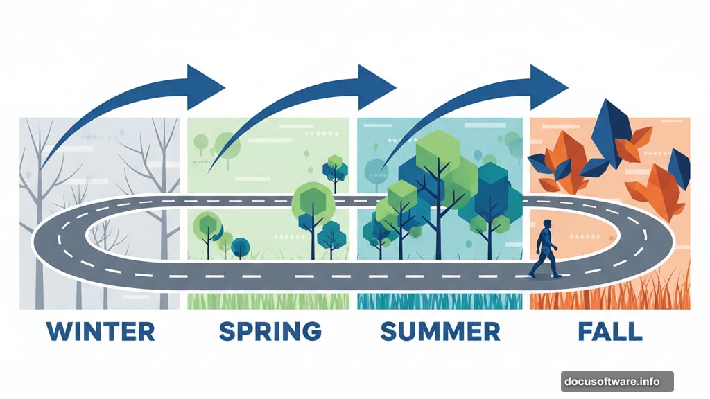
This tutorial walks you through creating a conceptual “journey of life” image. You’ll build a winding road through different seasons, each representing a life stage. Plus, you’ll learn core compositing techniques that work for any project.
No advanced skills required. Just follow along.
What You’ll Learn
This project teaches fundamental photo manipulation techniques. Sky replacement, perspective matching, color grading, and seamless blending all come into play.
By the end, you’ll understand how professional composites work. More importantly, you’ll know how to plan and execute your own conceptual images.
The scene combines multiple stock photos into one cohesive artwork. Sky, rocks, grass, trees, branches, and a solitary figure all merge together. Then we’ll add seasonal changes to show the passage of time.
Gather Your Resources First
You’ll need several stock images. A dramatic sky works as the background. Rock textures create the path’s foundation. Grass adds natural detail.
For the conceptual elements, grab images of an old man, bare branches, a full tree, and autumn leaves. These represent different life stages.
Make sure your images are high resolution. Low quality sources create muddy final results. Better to start with more pixels than you need.
Set Up Your Canvas
Create a new document at 2800×2000 pixels. Fill the background with white. This gives you plenty of room to work and maintains quality for printing.
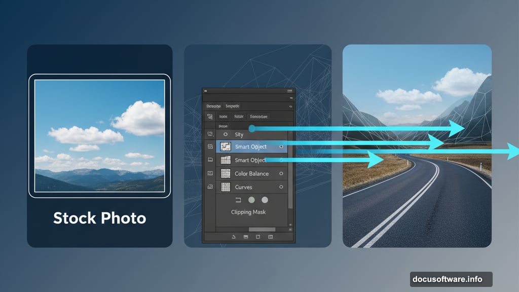
Drag your sky image onto the canvas. Use the Move Tool to position it. Hit Ctrl+T to open Free Transform and scale it to cover the entire document.
Convert the sky layer to a Smart Object. This protects the original image quality when you apply filters later. Right-click the layer and choose “Convert to Smart Object.”
Soften the Sky for Realism
Real skies rarely look razor sharp in photos. So we’ll add subtle blur to match that natural softness.
Go to Filter > Blur > Gaussian Blur. Set the radius to 8 pixels. Not too much—just enough to take the edge off.
Because you’re working with a Smart Object, this blur stays editable. You can always adjust it later if needed.
Grade the Sky Color
Now let’s shift the color tone. Create a Color Balance adjustment layer and set it as a Clipping Mask. This applies the adjustment only to the sky below.
In the Midtones slider, push toward cyan and blue. Don’t go overboard. Subtle shifts look more natural than dramatic color changes.
This creates a cooler, more atmospheric mood. It also helps tie all your elements together later.
Shape the Light and Shadows
Add a Curves adjustment layer to darken the overall scene. Then grab the Brush Tool with a soft, black brush. Paint on the layer mask to remove darkness from the right and top areas.
This creates directional lighting. The bright area suggests where light hits the scene.
Create another Curves layer, but this time brighten instead of darken. On its mask, paint away the brightness from the left and bottom. Now you have contrast—light on one side, shadow on the other.
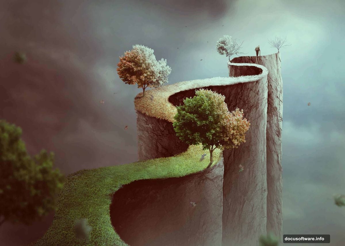
Build the Zigzag Path
Time to create the road itself. Make a new layer and grab the Pen Tool. Draw a winding, zigzag path shape that cuts through your canvas.
Hit Ctrl+Enter to convert the path into a selection. Fill it with medium gray (#959698). This becomes your road’s base shape.
The zigzag creates visual interest. Plus, it symbolizes life’s unexpected turns—perfect for this concept.
Add Rock Texture
Open your rock texture image and drag it into the document. Convert it to a Smart Object for flexibility.
Press Ctrl+T and rotate the rock texture to match your path’s perspective. Don’t worry about the edges yet.
Hold Ctrl and click your path layer’s thumbnail. This loads the zigzag selection. Then click the mask icon at the bottom of the Layers panel. Your rock texture now fits inside the path shape.
Refine Those Edges
Hide your original gray path layer. You don’t need it anymore—the rock texture replaces it.
Grab a hard-edged brush, size around 30-40 pixels. Set the foreground color to black. On the rock texture’s layer mask, paint along the edges to create irregular, natural-looking borders.
Perfect edges look fake. Rough, varied edges sell the illusion that this path exists in real space.
Add Grass Along the Road
Open your grass texture and place it on the canvas. Position it alongside the rock path.
Use layer masks to blend the grass naturally into the rocks. Paint with a soft brush where textures meet. Let them overlap slightly for smooth transitions.
Repeat this process on both sides of the path. Vary the grass placement so it doesn’t look symmetrical or artificial.
Place Your Subject
Drag in the image of the old man. Position him on the path, walking toward the light area you created earlier.
Scale him appropriately. He should look like he’s actually standing on that road, not floating above it or sinking into it. Match the perspective carefully.
Add a subtle shadow beneath his feet. Use a soft black brush on a new layer, then reduce opacity to 30-40%. This grounds him in the scene.
Build the Seasonal Trees
Here’s where the concept comes together. You’ll add trees and branches in different states to represent life stages.
Place bare branches on one section of the path. These symbolize winter or the end of life—stark and stripped down.
Add your full tree image to another section. This represents spring or summer—full of life and growth.
Use layer masks to blend the tree bases into the grass. Make sure the lighting matches the rest of your scene.
Add Autumn Leaves
Drag in your falling leaves image. Scatter individual leaves across the scene, especially around the full tree.
Use the Free Transform tool to rotate and resize leaves individually. Vary their positions and angles. Nature never creates perfect patterns.
Lower the opacity slightly on some leaves. This creates depth—some leaves look closer, others further away.
Match Colors Across Elements
Now comes the critical part. All your elements need unified color and tone.
Create a Color Balance adjustment layer for the entire document. Don’t clip it to any specific layer. Adjust until all elements feel like they belong in the same photograph.
Add a Curves adjustment layer. Fine-tune the contrast and brightness until nothing looks pasted in.
These global adjustments pull everything together. They’re the difference between a collection of images and a cohesive composite.
Final Color Grading
Create a Hue/Saturation adjustment layer. Reduce saturation slightly across the board. Overly saturated composites look amateurish.
Add another Curves layer for micro-adjustments. Look at your image as a whole. Does anything stand out awkwardly? Fix it with targeted masking.
This is where you develop your eye. Step back from the screen. Squint at your image. If something catches your attention in a bad way, address it.
Add Atmospheric Depth
Create a new layer set to Soft Light blend mode. Use a large, soft brush with low opacity white. Paint subtle light rays coming from your main light source.
This adds atmosphere and reinforces the lighting direction. Don’t overdo it—subtlety wins here.
On another layer, add slight fog or haze in the distance. Lower opacity way down. You want the barest hint of atmospheric perspective.
Polish With Final Adjustments
Zoom in and check your edges. Any visible seams or obvious masking mistakes? Fix them now.
Add a final sharpening layer if needed. But don’t sharpen everything equally. Focus sharpness on your main subject—the old man. Let peripheral elements stay softer.
Consider adding a subtle vignette. Darken the corners slightly to draw the eye toward the center path.
What This Teaches You
This tutorial isn’t just about creating one specific image. It teaches you the workflow for any photo manipulation project.
You learned to plan a composite, blend multiple sources, match lighting and color, and polish the final result. These skills transfer to product mockups, concept art, or creative portraits.
The zigzag path concept works because it combines technical skill with storytelling. Your composites should do both—look convincing AND communicate something meaningful.
Common Mistakes to Avoid
Don’t rush the masking. Sloppy edges ruin otherwise good work. Take time with that brush. Zoom in. Get it right.
Watch your lighting direction. If the sun hits your subject from the left but lights your trees from the right, viewers notice. Keep it consistent.
Avoid over-processing. Beginners often go too far with adjustment layers. When in doubt, dial it back 20%.
Keep Practicing This Technique
Try this project with different seasonal themes. Make it all winter, or vibrant spring. Change the path from rocky to wooden planks.
Replace the old man with different subjects. A child suggests different symbolism than an elderly person. Experiment with meaning.
The technical steps stay the same. But your creative choices make each version unique. That’s the power of photo manipulation—infinite possibilities from similar techniques.