Ever wondered how pro designers create those mind-bending abstract composites? The ones with glowing spheres, lightning effects, and that immersive 3D depth?
Turns out you don’t need dozens of resources or expensive plugins. Just three images and some smart Photoshop techniques can produce stunning results. Plus, this tutorial teaches reusable skills you’ll use in every future project.
Let’s build something that looks impossibly complex but breaks down into simple, logical steps.
What You’re Actually Making
This isn’t just another photo manipulation tutorial. You’re learning a complete workflow for abstract composite creation.
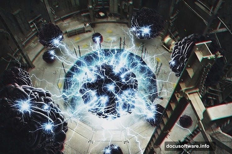
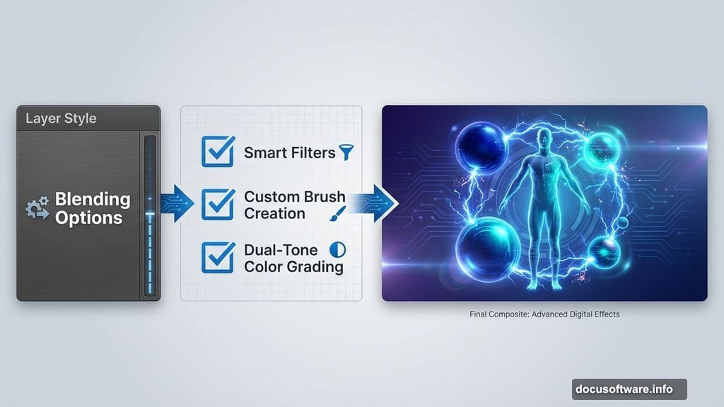
The final piece features a figure surrounded by glowing spheres, explosive lightning effects, and genuine 3D depth. But more importantly, you’ll master techniques like smart filters, custom brush creation, and dual-tone color grading.
These skills transfer directly to commercial work, personal projects, and client commissions.
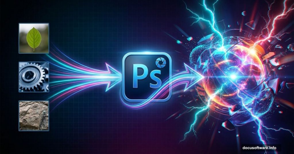
Gather Your Resources First
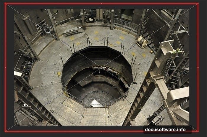
You need exactly three things to start. An altitude chamber background photo provides the industrial atmosphere. A 3D sphere image gives you the glowing orbs. Lightning brush presets create the energy effects.
Download these before opening Photoshop. Having everything ready prevents workflow interruptions and keeps creative momentum flowing.
The specific resources work great. But honestly? You can substitute similar images and still nail this technique. The process matters more than exact assets.
Set Up Your Canvas Properly
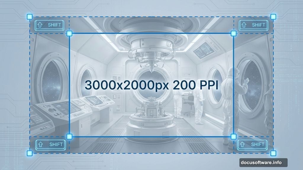
Create a new document at 3000×2000 pixels with 200 PPI resolution. That size gives you flexibility for prints, web use, or portfolio pieces.
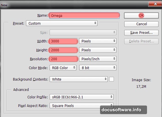
Name it something memorable. Working files multiply fast. Good naming habits save frustration later when you’re hunting for that one composite from three months ago.
This canvas size also provides room to experiment. You can crop tighter later if needed. Starting large beats starting small every single time.
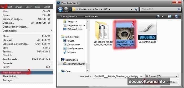
Build the Foundation Layer
Place your altitude chamber background and resize it larger than the canvas. Yes, larger. Let parts extend beyond the working area.
This creates a mesh effect with the foreground elements. It also gives you flexibility to reposition later without exposing canvas edges.
Use Free Transform to scale up. Hold Shift while dragging corners to maintain proportions. This prevents distortion that makes photos look amateurish.
Create Real 3D Depth
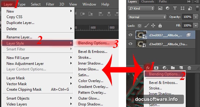
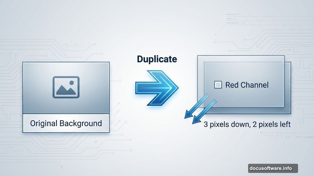
Here’s where things get interesting. Duplicate your background layer and open Blending Options in the Layer Style panel.
Uncheck the red channel. Seriously, that’s it. This simple trick splits color channels and creates genuine stereoscopic depth.
Now grab the Move tool and nudge the duplicated layer down three times and left twice using arrow keys. Boom. Instant 3D effect without plugins or complicated filters.
Add the Spheres Strategically
Place your 3D sphere image and position it where you want focus. Most compositions work best with asymmetric placement rather than dead center.
Duplicate the sphere layer several times. Vary the sizes and positions to create depth hierarchy. Larger spheres feel closer. Smaller ones recede into the background.
Use Free Transform with Shift held down to resize proportionally. Random sizing looks organic. Perfectly scaled copies look artificial and boring.
Smart Filters Save Your Life
Convert your sphere layers to Smart Objects before applying filters. Right-click the layer and choose “Convert to Smart Object.”
Why bother? Smart filters remain editable forever. Regular filters bake changes permanently. Smart Objects let you adjust settings later without starting over.
This workflow saves hours on complex projects. You’ll thank yourself when the client asks for “just one small change” after you thought everything was finished.
Build a Lightning Brush
Load your lightning brush presets. Open the Brush panel and find one that looks dynamic and energetic.
Now here’s the trick. Vary brush size, opacity, and angle with each stroke. Mechanical repetition screams amateur work. Organic variation looks professional and intentional.
Layer multiple lightning strokes at different opacities. This creates depth and complexity that single strokes can’t achieve. Think of it like real lightning with multiple branches and forks.
Create Radiation Texture Effects
Add a new layer and fill it with clouds. Go to Filter > Render > Clouds. This generates random texture patterns.
Change the blend mode to Screen or Lighten. Adjust opacity until it adds atmosphere without overpowering the composition.
Then apply a radial blur from the center point. This creates that radiation or energy emanation effect. It’s subtle but makes everything feel more dynamic and alive.
Master Two-Tone Color Grading
Here’s where your composite transforms from good to stunning. Add a Gradient Map adjustment layer.
For a dark, moody version, use deep blues transitioning to warm oranges. This creates contrast and draws the eye through the composition.
Want something brighter? Try cyan to yellow gradients. This gives a more energetic, positive vibe while maintaining visual interest.
Fine-Tune With Dodge and Burn
Create a new layer set to Overlay blend mode. Grab a soft brush at low opacity.
Paint white on areas you want to highlight. Paint black where you want deeper shadows. This technique adds dimension and guides viewer attention.
Don’t overdo it. Subtle dodge and burn looks professional. Heavy-handed application looks like a bad Instagram filter from 2012.
Balance the Overall Composition
Step back and evaluate your work. Does your eye flow naturally through the piece? Or does it get stuck in one spot?
Adjust layer opacities to balance visual weight. Stronger elements need lower opacity. Weaker areas might need boosting.
This iterative refinement separates finished work from abandoned projects. Professional composites go through multiple adjustment rounds before reaching final form.
Two Color Options, One Composite
The tutorial shows both dark and bright color treatments. Try them both. Save separate versions.
Different clients prefer different moods. Having options makes you more marketable. It also helps you develop a signature style based on what resonates with your audience.
Plus, experimenting with color teaches you how tones affect emotional response. That knowledge improves every future project.
Why This Workflow Matters
You just learned techniques that scale to any composite project. Smart filters, custom brushes, channel manipulation, and color grading all transfer directly to client work.
These aren’t gimmicks. They’re fundamental professional workflows that working designers use daily. Master them now and you’ll work faster and produce better results for years.
The three-resource constraint also teaches creative problem-solving. Limitations force innovation. Unlimited options lead to paralysis and mediocrity.
So grab those images and start building. The skills you develop here pay dividends on every project that follows. Plus, you’ll have a killer portfolio piece when you’re done.