Want to create stunning landscape art without hiking to actual mountains? Matte painting lets you build impossible scenes from stock photos.
This guide shows you exactly how to blend multiple images into one cohesive mountain scene. You’ll learn layer masking techniques, adjustment layer workflows, and tricks for adding atmospheric effects like waterfalls and mist. Plus, I’ll walk you through common problems and how to fix them.
No fluff. Just practical Photoshop techniques that work.
Set Up Your Canvas and Sky Foundation
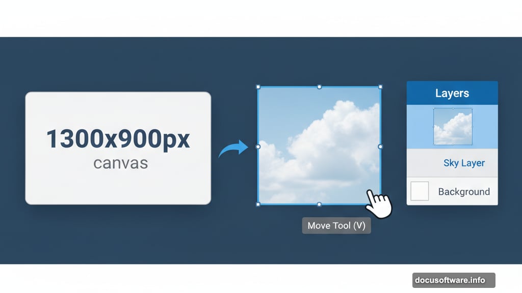
First, create a new document at 1300×900 pixels. Fill it with white or any light color as your base.
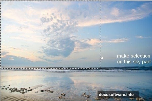
Now grab your sky image. Use the Rectangular Marquee Tool (M) to select just the sky portion. Then switch to Move Tool (V) and drag that selection onto your canvas.
This sky becomes your lighting reference. Everything else you add needs to match its color temperature and brightness. So choose carefully.
Blend Background Mountains Seamlessly
Open your background mountain stock image. Select only the misty mountain range and place it over your sky layer. Don’t resize it yet.
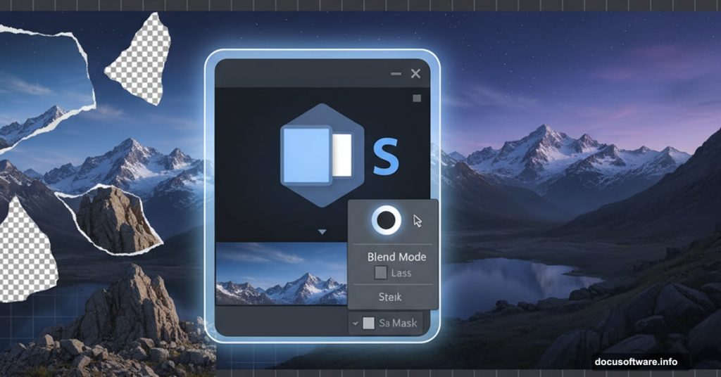
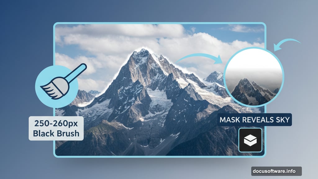
Here’s the critical step most tutorials skip. Click the layer mask button at the bottom of your Layers panel. Then grab a soft black brush around 250-260 pixels.
Paint along the top edge of the mountains where they meet the sky. This reveals your sky layer underneath and creates a natural transition. No hard edges. No obvious compositing lines.
The mask gives you non-destructive editing. Made a mistake? Switch to white brush and paint it back.
Match Mountain Colors to Sky Light
Raw stock photos never match perfectly. So you need adjustment layers with Clipping Mask to harmonize colors.
Right-click your mountain layer and select “Create Clipping Mask.” Then add these adjustments:
Hue/Saturation adjustment reduces color intensity. Mountains in distance appear less saturated due to atmospheric perspective. Drag the Saturation slider left until colors feel muted but not gray.
Curves adjustment increases overall brightness. Click the center of the curve line and drag upward slightly. This simulates light from your sky bouncing onto the mountains.
Both adjustments only affect the mountain layer below. That’s the power of Clipping Masks.
Position and Mask Mid-Ground Rocks
Open your mid-ground rock stock. Extract the rocks using your preferred selection method and place them in the middle section.
Right-click the layer and choose “Convert to Smart Object.” This preserves quality when resizing. Then press Cmd/Ctrl+T to transform and scale the rocks to fit your composition.
Need to remove unwanted parts? Add a layer mask. Use the Polygonal Lasso Tool (L) to select areas you want gone. Then paint those selections black on the layer mask.
Why use masks instead of erasing? You can always bring parts back by painting white. Flexibility matters in complex composites.
Darken and Color Grade Foreground Rocks
Foreground elements need stronger contrast and saturation. That’s how depth perception works.
Add these adjustment layers as Clipping Masks to your rock layer:
Hue/Saturation can shift color tone if needed. But mainly use it to boost Saturation slightly for foreground prominence.
Curves creates shadow depth. Pull down the left side of the curve to deepen blacks. This adds drama and weight to your rocks.
Color Balance unifies the color palette. Push shadows toward blue to match your sky’s cool tones. Add slight warmth to highlights for dimension.
Here’s a pro trick: After applying Curves, grab a soft black brush at 40% opacity. Paint on the Curves layer mask along the top edges of rocks. This lets more light through, simulating skylight hitting the peaks.
Build Depth with Shadow Layers
Create a new layer set to Clipping Mask above your rocks. Change blend mode to Multiply at 80% opacity.
Now select a soft brush with color #7a7e7e (a neutral gray). Paint along the front-facing surfaces of your rocks. Avoid the tops and middle sections where light would naturally hit.
This technique is called “painting with light and shadow.” It’s how you make flat stock photos feel three-dimensional. The Multiply blend mode darkens underlying colors while preserving texture detail.
Don’t go overboard. Subtle shadows look natural. Heavy-handed shadows look like you attacked the image with a burn tool.
Add Atmospheric Perspective with Trees
Trees break up your composition and add scale reference. But placement matters tremendously.
Smaller trees go in the background. Larger trees anchor the foreground. This size variation creates depth even in a flat 2D image.
Extract each tree stock image and position them on separate layers. Why separate? Because you’ll adjust each one differently based on its distance from the camera.
Background trees need reduced saturation and lighter values. Foreground trees stay vibrant with strong contrast. Use the same adjustment layer workflow you applied to mountains and rocks.
Create Realistic Waterfalls
Waterfalls add movement and interest. But poorly blended waterfalls scream “fake composite.”
Open your waterfall stock images. Select just the flowing water using Quick Selection Tool (W). Place each waterfall where it makes geological sense. Water flows downward. Obvious, right? Yet many beginners ignore natural physics.
Add layer masks and paint out hard edges where water meets rock. The transition should feel soft and natural.
Then create a new Hue/Saturation adjustment layer. Reduce saturation significantly. Distant waterfalls appear whiter and less colorful due to atmospheric haze.
Finally, lower the waterfall layer opacity to 70-85%. This lets underlying rock texture show through slightly, making the water feel translucent rather than painted on.
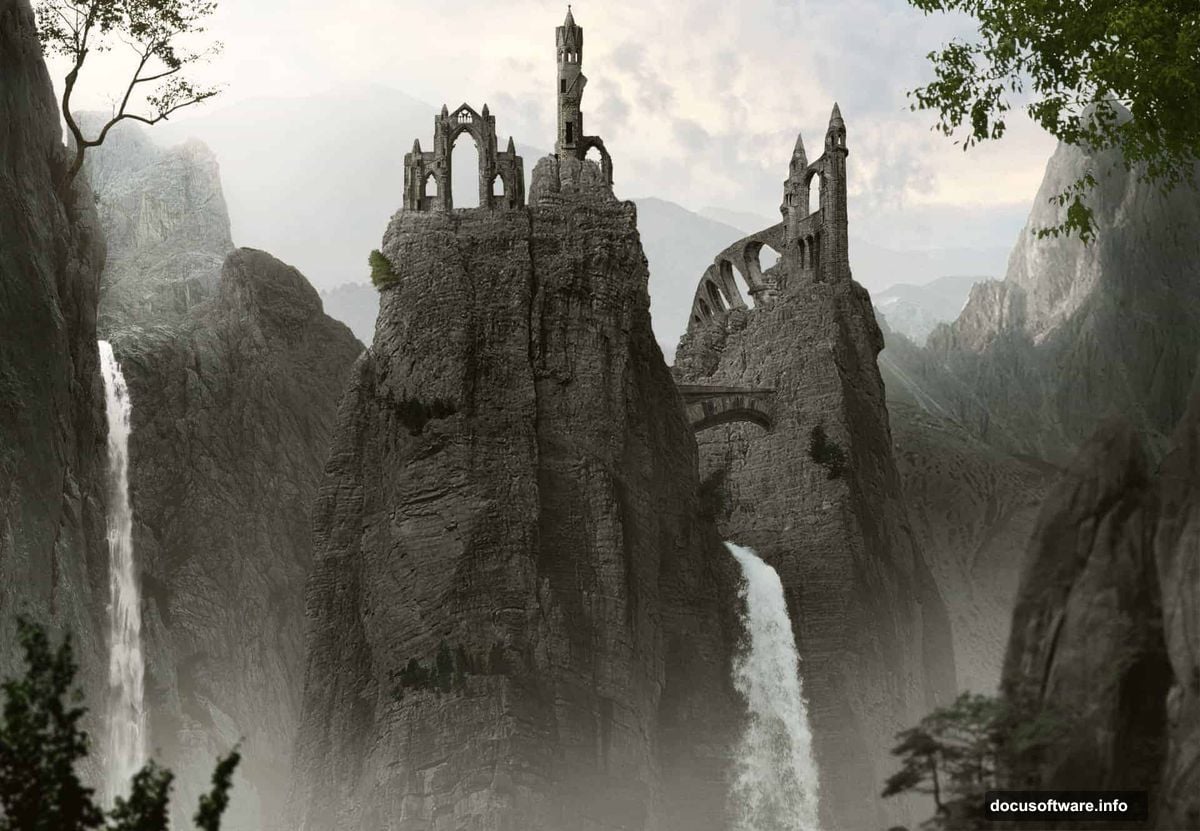
Integrate Architectural Elements
Ancient ruins and stone arches tell a story. They transform a landscape into a scene.
Import your architecture stocks and position them thoughtfully. Don’t just drop them anywhere. Consider sight lines and focal points.
Use the same workflow: layer masks to blend edges, adjustment layers to match lighting and color. But add one extra step for architecture.
Create a subtle shadow beneath each structure. New layer, Multiply blend mode, soft black brush at low opacity. Paint a gentle shadow where the structure meets the ground. This single detail sells the illusion that your added elements actually exist in the space.
Paint Atmospheric Mist for Realism
Mist is the secret ingredient that ties everything together. It adds atmosphere, depth, and forgives small compositing errors.
Download custom mist brushes or use soft brushes at very low opacity (15-20%). Create a new layer above your main composition.
Set foreground color to white or light blue-gray. Then paint mist in valleys, behind mid-ground elements, and along the base of mountains.
Here’s the key: Mist accumulates in low areas and behind objects. It doesn’t float randomly. Think about how fog behaves in real life.
Lower layer opacity to 30-50% after painting. Mist should feel subtle and atmospheric, not like you spilled white paint everywhere.
Final Color Grading for Unity
Even with careful adjustment layers on individual elements, your composite probably still feels slightly disjointed. Final color grading solves this.
Add a Curves adjustment layer at the top of your layer stack. Don’t clip it to anything. This affects your entire composition.
Make small adjustments to the RGB curve. Lift shadows slightly for an ethereal feel. Or push midtones for more contrast and drama.
Then add a Color Balance adjustment layer. Push your entire image toward cooler tones for misty mountain atmosphere. Or add warmth for golden hour lighting.
These global adjustments unify all your separate stock images into one cohesive scene.
Common Problems and Quick Fixes
Hard edges between elements: Use softer brushes on layer masks. Feather selection edges before masking (Select > Modify > Feather).
Colors don’t match: Add more adjustment layers. Match saturation levels first, then hue, then brightness.
Flat depth: Increase contrast on foreground elements. Reduce saturation and lighten values on distant elements.
Fake-looking waterfalls: Lower opacity and reduce saturation. Real water is often whiter and more translucent than stock photos suggest.
Inconsistent lighting: Identify your main light source (usually the sky). Everything should receive light from that direction. Add subtle shadows on opposite sides.
Make It Your Own
This tutorial gives you the technical foundation. But art happens when you break rules intentionally.
Try different color grades. Add more dramatic mist. Include fantasy elements like floating rocks. The techniques stay the same regardless of your creative vision.
Stock images are just raw ingredients. Your composition choices, color decisions, and detail work transform them into art.
Save your work frequently. Use layer groups to organize your document. Label your layers descriptively. Future you will thank present you.
Now go build impossible worlds. You’ve got the tools and techniques. The only limit is your imagination.