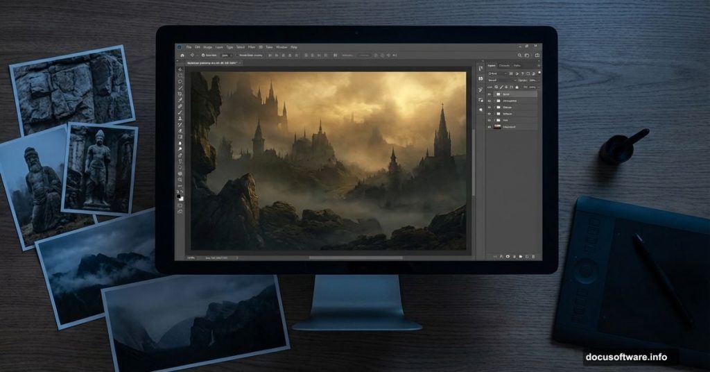
Ever stared at a fantasy movie scene and wondered how they built those haunting worlds? Most aren’t real locations. They’re matte paintings crafted in Photoshop.
Today, I’ll walk you through creating your own dark, mysterious landscape. We’ll combine stock photos, add atmospheric mist, and manipulate lighting to build something that looks straight out of a fantasy film. No advanced skills required. Just Photoshop and patience.
What You’re Building
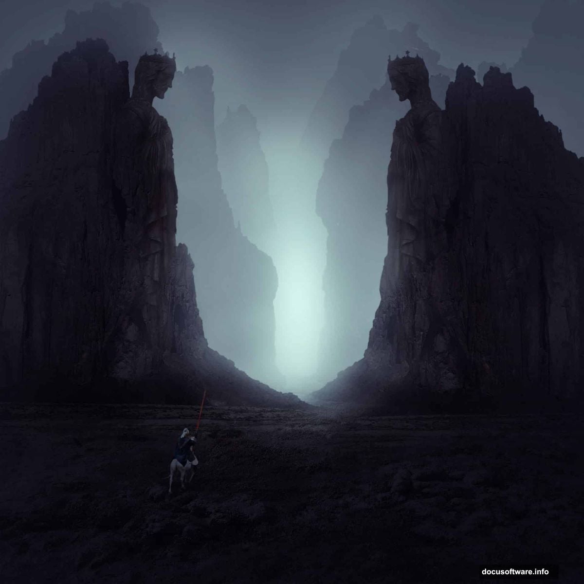
Picture this: rocky terrain shrouded in fog. A weathered statue stands guard. A knight surveys the misty landscape. It sounds complex. But we’ll break it down into manageable steps.
This tutorial teaches core matte painting techniques. You’ll learn to blend multiple images seamlessly. Plus, you’ll master depth effects that make flat photos feel three-dimensional. These skills transfer to any composite project you tackle later.
Gather Your Materials First
Before touching Photoshop, collect your stock images. You need a landscape base, several rock photos for variety, a statue, and a knight figure. Having alternatives ready saves frustration mid-project.
Make sure your images match in lighting quality. Mixing bright daylight shots with overcast photos creates obvious seams. Professional matte painters spend hours finding compatible source material. So should you.
Build Your Rocky Foundation
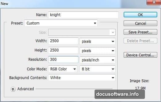
Start with a new 2000×1333 pixel document at 72 DPI. That gives enough resolution for detail work without slowing your computer.
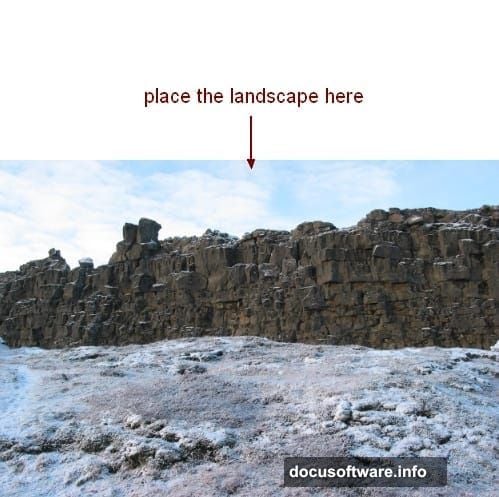
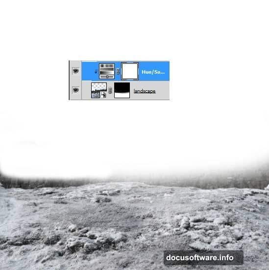
Drag your landscape image onto the canvas. Then grab the mask tool. Paint black over the sky and existing rocks. This leaves clean ground as your base.
Why remove the original rocks? Because you’re replacing them with better angles that fit your composition. Always work destructively when building composite scenes. It maintains creative control.
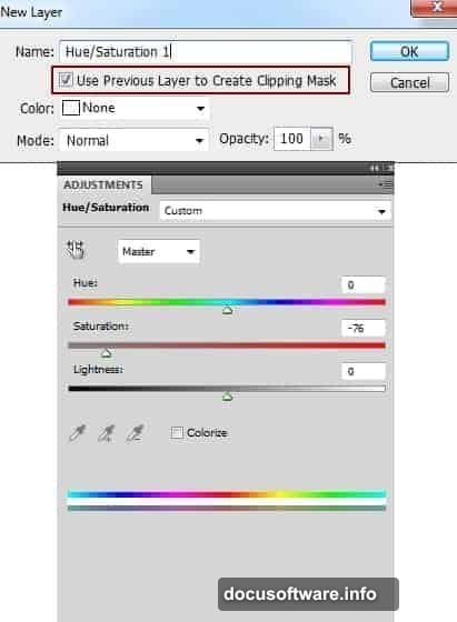
Now desaturate that ground using a Hue/Saturation adjustment layer. Lower the saturation slider until colors look muted and moody. Fantasy landscapes rarely pop with vibrant colors.
Add Dimension With Rock Layers
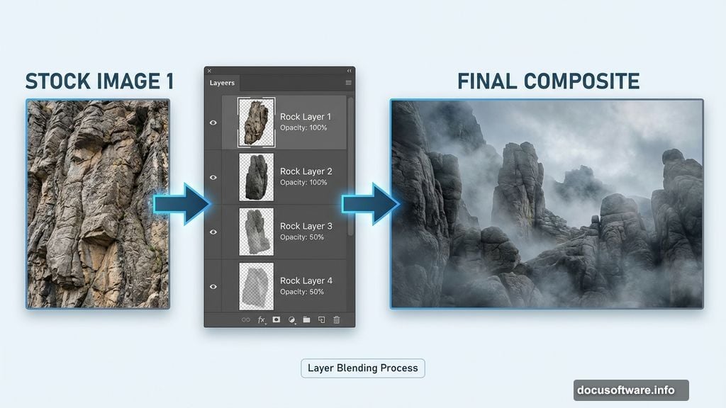
Here’s where depth magic happens. Place your first rock image on the right side. Mask out its background completely.
Then duplicate that rock layer. Flip it horizontally and move it left. Instant symmetry with half the work.
But don’t stop there. Place your second set of rocks behind the first. Lower their opacity to 50%. This creates atmospheric perspective. Distant objects naturally appear hazier and lighter.
Use masks to soften any hard edges. Real landscapes don’t have crisp cutouts. Everything bleeds together slightly through atmosphere and lighting.
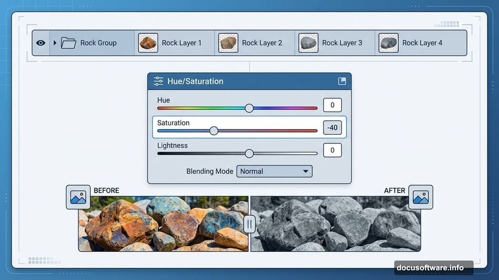
Group and Adjust Rock Tonality
Select all rock layers. Press Cmd/Ctrl+G to group them. Change the group blending mode from Pass Through to Normal at 100%. This prevents adjustment layers from affecting elements outside the group.
Add a Hue/Saturation adjustment layer inside the group. Desaturate the rocks heavily. Then apply Curves to darken them significantly.
Why so dark? Because your foreground elements anchor the composition. They establish your darkest values. Everything else builds from there. This creates dramatic contrast when you add your focal points later.
Position Your Hero Elements
Time to add the statue. Place it prominently in your mid-ground. It should feel substantial but not overpowering.
Then bring in your knight figure. Position him surveying the landscape. His placement guides viewer attention. People naturally follow where figures look.
Use Clipping Masks with adjustment layers to match each element’s color temperature. Your statue might need warming. Your knight probably needs cooling if he came from a different photo. Small temperature shifts make huge differences in believability.
Create Atmospheric Mist
Now for the atmospheric magic. Create a new Color Fill layer. Choose a desaturated blue-gray that matches your mood.
Lower the layer opacity dramatically. Maybe 20-30%. Then use a gradient mask to fade the effect. Stronger on the horizon, lighter in the foreground.
This simple technique instantly adds depth. It mimics how atmosphere scatters light in real environments. Professional matte painters use this trick constantly.
Refine Your Lighting
Study where light hits your scene. Does it come from above? From the side? Pick a direction and commit.
Then use Curves adjustment layers with masks to enhance highlights on the lit sides. Darken shadows on the opposite sides. This reinforces your lighting direction.
Also add slight rim lighting to your knight and statue. Just a subtle glow on their edges. This separates them from the background and adds drama.
Final Color Grading
Almost done. Time for overall color adjustments that unify everything.
Add a Color Balance adjustment layer on top. Push shadows toward blue. Push highlights toward warm yellow. This creates that cinematic teal-and-orange look movies love.
Then add a final Curves layer. Create a gentle S-curve. This crushes blacks slightly and lifts highlights, adding contrast punch.
Finally, add a subtle vignette. Either use a Curves layer with a gradient mask, or create a black color fill at low opacity with a center-fade mask. This draws eyes inward to your focal points.
Polish and Export
Zoom to 100% and scan your entire image. Look for telltale seams or inconsistencies. Fix them with clone stamp or additional masking.
Check your histogram. Make sure you’re using the full tonal range without clipping highlights or shadows. Flat histograms mean flat images.
When satisfied, flatten your image and export at maximum quality. Your dark, mysterious landscape is complete.
What You Learned
This tutorial covered fundamental matte painting concepts. You combined multiple source images into one cohesive scene. You created depth using opacity and atmospheric perspective. You manipulated lighting to guide viewer attention.
These techniques scale to any composite work. Album covers, book illustrations, concept art, or personal projects. Once you master blending multiple images convincingly, creative possibilities explode.
The key? Patience and observation. Study how light and atmosphere actually behave. Then replicate those behaviors in Photoshop. That’s what separates amateur composites from professional matte paintings.
Now grab some stock photos and start experimenting. Your first attempts might look rough. But each project teaches new tricks. Soon you’ll build fantasy worlds that rival movie studios.