Want to create jaw-dropping fantasy landscapes in Photoshop? This tutorial walks you through building a complete surreal scene from scratch.
You’ll learn how to blend multiple stone photos into realistic cliffs, position a climber with accurate shadows, and add atmospheric elements like temples and flying ships. Plus, we’ll finish with warm color grading that ties everything together.
These techniques work for any photo manipulation project. Master them once, use them forever.
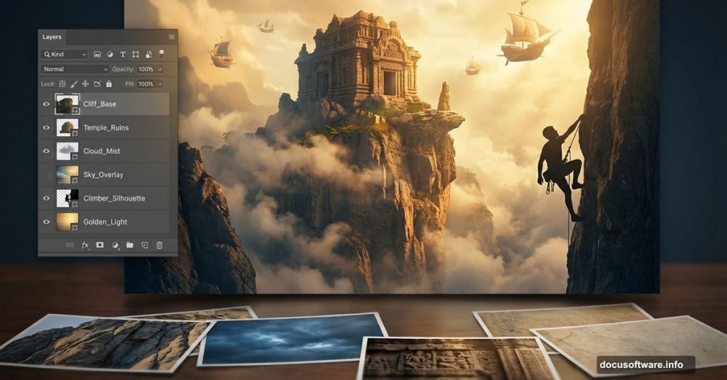
What You’re Building
Picture this: a lone climber discovers an ancient temple floating above the clouds. Flying ships drift past. Crows circle overhead. The whole scene glows with golden light.
Sounds complex? It breaks down into manageable steps. We’ll start with the sky, build the cliff landscape from stone photos, add characters and structures, then polish with color effects.
You’ll need Photoshop CS5 or newer. All stock photos are provided. Let’s get started.
Sketch Your Vision First
Before touching Photoshop, grab paper and pencil. Seriously.
Sketch your composition roughly. Mark where the cliff goes, where the climber stands, how the temple sits. This quick drawing becomes your roadmap.
Why bother? It tells you exactly which photos to shoot or find. No wasting time gathering images you won’t use. Plus, you’ll know the perspective and lighting you need before starting.
So spend 10 minutes sketching. It saves hours of trial and error later.
Shoot or Find Your Source Photos
Now gather images that match your sketch. Pay attention to two critical factors: perspective and lighting direction.
For this tutorial, I photographed stones and landscapes while hiking Mount Lawu in Indonesia. All the stone textures come from that single location. That’s why they blend seamlessly.

Take your own photos when possible. You get exactly the angle and lighting you need. However, stock photos work fine if you choose carefully.
The tutorial includes these source images:
- Three sky photos for the background
- Four stone photos for building cliffs
- Temple, tree, and climber photos
- Crows and flying ships
- Ivy for decoration
Download them all before starting. Having everything ready speeds up your workflow dramatically.
Set Up Your Canvas
Create a new document in Photoshop. Go to File > New (or hit Cmd/Ctrl + N).
Set the dimensions to 3000 pixels wide by 2000 pixels high. This gives you room to work while maintaining quality for prints.
Keep the resolution at 300 DPI if you plan to print. For web-only work, 72 DPI works fine and keeps file sizes manageable.
Now you’re ready to add images.
Import Your Sky Background
Go to File > Place and select your first sky photo. Photoshop imports it as a Smart Object automatically.
That’s good news. Smart Objects let you resize without losing quality. You can always scale up or down later without pixelation.
Position the sky photo to fill your canvas. Hit Cmd/Ctrl + T to transform it. Drag the corner handles to stretch it across the frame.

Don’t worry about perfection yet. We’ll blend multiple sky photos together next.
Build Dramatic Cloud Layers
Add your second sky photo the same way. Place it over the first layer.
Lower the opacity to around 50-70%. Now you can see both skies at once. Blend them by painting on a layer mask with a soft brush.
This technique creates depth in your sky. Real clouds have multiple layers at different distances. Mimicking that makes your sky feel more realistic.
Add a third sky layer if needed. Vary the opacity and blend modes. Try Screen or Lighten to brighten certain areas. Multiply darkens them instead.
The goal? A sky that feels expansive and dramatic, not flat and boring.
Create Cliffs From Stone Photos
Here’s where it gets interesting. You’re building an entire cliff face from photos of individual stones.
Start by placing your first stone photo. Transform it to match your sketch’s perspective. The stone should look like part of a massive cliff, not a small rock.
Duplicate this layer (Cmd/Ctrl + J). Move the copy to a different position. Transform it again, maybe flip it horizontally. Now you have two unique-looking cliff sections from one photo.
Keep duplicating and transforming. Overlap the stones slightly. This hides the repetition and creates natural-looking cracks and crevices.
But won’t it look repetitive? Not if you follow the next step carefully.
Blend Stones With Masks and Brushes

Each stone layer needs a layer mask. Click the mask icon at the bottom of the Layers panel.
Grab a soft brush. Set black as your foreground color. Paint on the mask to hide hard edges where stones overlap.
Vary your brush opacity. Paint at 30% opacity for subtle blending. Use 100% to completely hide sections.
The secret? Never use 100% hardness on your brush. Soft edges blend naturally. Hard edges scream “fake.”
Add texture variation by changing each layer’s brightness and contrast. Some stones should be darker, others lighter. This mimics how real cliffs have uneven weathering and shadows.
Soon you’ll have a convincing cliff that looks completely natural.
Position Your Climber Realistically
Place the climber photo where they make sense compositionally. Usually, that’s off-center following the rule of thirds.
Cut out the climber carefully. The Pen Tool works best for clean selections. It’s slower but worth the precision.
Transform the climber to match the cliff’s perspective. If the cliff recedes into the distance, the climber should shrink slightly too.
Now add shadows. This step makes or breaks realism.
Create a new layer below the climber. Paint a shadow using a soft black brush at 20-30% opacity. The shadow should follow the cliff’s contours.
Match the direction of light in your sky. If light comes from the right, shadows fall left. Simple but crucial.
Finally, adjust the climber’s color temperature to match the environment. Use Color Balance or Hue/Saturation adjustments. They should feel part of the scene, not pasted on.
Add Atmospheric Elements

Time for the temple, trees, and other details. Each follows the same process:
- Place the photo
- Cut it out cleanly
- Match the perspective
- Add shadows
- Color correct to match the scene
For the flying ships, reduce contrast slightly. Distant objects lose contrast in atmospheric haze. This is called atmospheric perspective.
The crows add movement and scale. Place them at varying sizes. Smaller crows appear farther away. This depth trick makes your scene feel vast.
Don’t forget the ivy. Use the Puppet Warp tool (Edit > Puppet Warp) to bend it naturally around structures. Place pins at key points, then drag to reshape.
Each element should feel like it belongs. Test by zooming out. If something jumps out visually, adjust its color or contrast.
Apply Warm Color Grading
All your elements are in place. Now unify them with color grading.
Add a Color Lookup adjustment layer at the top of your layer stack. Try presets like “Moonlight” or “Late Sunset” for instant warmth.
Not quite right? Add a Curves adjustment layer instead. Drag the curve up slightly in the red channel. This adds warmth. Lower the blue curve for even more golden tones.
A Photo Filter adjustment layer works too. Choose “Warming Filter (85)” and adjust the density to taste.
The key is consistency. Every element should share the same color temperature. That’s what makes Photoshop composites look real instead of cobbled together.
Final Polish With Dodge and Burn

Create a new layer set to Overlay blend mode. Fill it with 50% gray.
Grab the Dodge Tool. Brighten areas where light naturally hits: cliff edges, the climber’s face, temple rooftops.
Switch to the Burn Tool. Darken shadows in crevices, under overhangs, behind objects.
This manual shading adds dimension that adjustment layers miss. It’s tedious but transforms flat composites into dimensional scenes.
Work subtly. Set tool opacity around 10-20%. Build up gradually. Overdoing it creates obviously manipulated areas.
Zoom out frequently to check your progress. The goal is enhancement, not distraction.
Common Mistakes to Avoid
Perspective mismatch ruins believability. If your cliff recedes into the distance but the temple sits perfectly upright, it looks wrong. Transform objects to match the scene’s vanishing point.
Inconsistent lighting breaks immersion. All shadows must fall in the same direction. All highlights must come from the same light source. Check every element carefully.
Ignoring atmospheric perspective makes scenes flat. Distant objects need less contrast, cooler colors, and slight blur. Use Gaussian Blur at 1-2 pixels on far background elements.
Over-sharpening creates halos. Sharpen only where eyes naturally focus. The climber and temple can be sharp. The distant sky should stay soft.
Forgetting to vary texture density. If every stone has identical detail, the pattern becomes obvious. Blur some layers slightly to create depth variation.
Advanced Technique: Smart Object Workflow
Convert all placed images to Smart Objects before transforming them. This preserves quality through multiple adjustments.
To convert: Right-click the layer and choose “Convert to Smart Object.” Or place images using File > Place instead of opening them directly.

Smart Objects let you apply filters non-destructively. Add Gaussian Blur to a Smart Object and you can edit or remove it later. Regular layers permanently apply filters.
This flexibility saves you when art direction changes. And it always changes.
Brush Settings That Make the Difference
For natural-looking masks, customize your brush settings. Press F5 to open the Brush panel.
Enable Shape Dynamics. Set Size Jitter to Pen Pressure if using a tablet. This varies brush size as you paint.
Enable Transfer. Set Opacity Jitter to Pen Pressure. Now pressure controls transparency too.
Add Scattering at 10-15%. This breaks up brush strokes so they don’t look mechanical.
These settings mimic natural painting. Your blending becomes more organic automatically.
Save this brush preset. You’ll use it constantly for photo manipulation work.
When to Use Layer Blend Modes
Blend modes change how layers interact with those beneath them. Master these five for photo manipulation:
Multiply darkens by multiplying colors. Perfect for shadows and darkening overexposed areas.
Screen lightens by inverting and multiplying. Use it for adding light effects or brightening dark photos.
Overlay combines Multiply and Screen. Increases contrast while preserving highlights and shadows. Great for texture overlays.

Soft Light applies subtle contrast. Excellent for color grading layers and gentle adjustments.
Linear Burn creates rich, dark shadows. Useful for deep shadow areas under objects.
Experiment freely. Blend modes are non-destructive. Try different options until something clicks visually.
Lower the layer opacity if the effect overwhelms. Often 30-50% opacity gives just enough impact.
Save Your Work Properly
Save your working file as PSD format. This preserves all layers and editing flexibility.
For final output, save a flattened copy as JPEG or PNG. Never overwrite your layered PSD with a flat file.
Name files descriptively: “temple-scene-v3-working.psd” and “temple-scene-final.jpg.” You’ll thank yourself later when revisions come.
Back up your work. Cloud storage or external drives. Losing hours of compositing work hurts. Trust me.
Practice Makes Perfect
This tutorial teaches techniques, not just one specific image. Apply these methods to your own creative visions.
Try creating different scenes: underwater temples, floating islands, apocalyptic cities. The process remains identical. Only the source photos change.
Collect reference images constantly. Save interesting textures, skies, and architectural details. Your personal stock library makes future projects faster.
Don’t expect perfection immediately. Photo manipulation rewards patience and practice. Each project teaches new tricks.
Most importantly, experiment. Break rules intentionally. Some of the best effects come from happy accidents.