Creating surreal landscapes sounds intimidating. But with the right approach, anyone can blend multiple photos into dreamlike scenes.
This tutorial breaks down the exact process. You’ll learn non-destructive editing techniques, layer mask mastery, and how to make disparate elements look like they belong together. Plus, these skills transfer to any photo manipulation project.
Let’s build something unreal.
Start With Your Canvas Foundation
First, create a new file in Photoshop. Go with 1311px width and 1100px height. That gives you room to work without massive file sizes.
Before adding any photos, build a gradient background. This creates visual cohesion from the start. Choose colors that match your final vision—perhaps blues and purples for a twilight scene, or warm oranges for sunset vibes.
The gradient serves as your unifying element. Every photo you add will share this color influence. So pick colors that complement your source images rather than fight them.

Place Your Base River Image
Go to File > Place to import your river photo. This becomes your foundation layer.
Resize it to fill the canvas. Grab a corner handle and hold Shift while dragging. That maintains proper proportions without distortion.
Now reduce the layer opacity to 80%. Why? This lets the gradient show through slightly. The result looks more integrated than a photo just sitting on top of colored background.
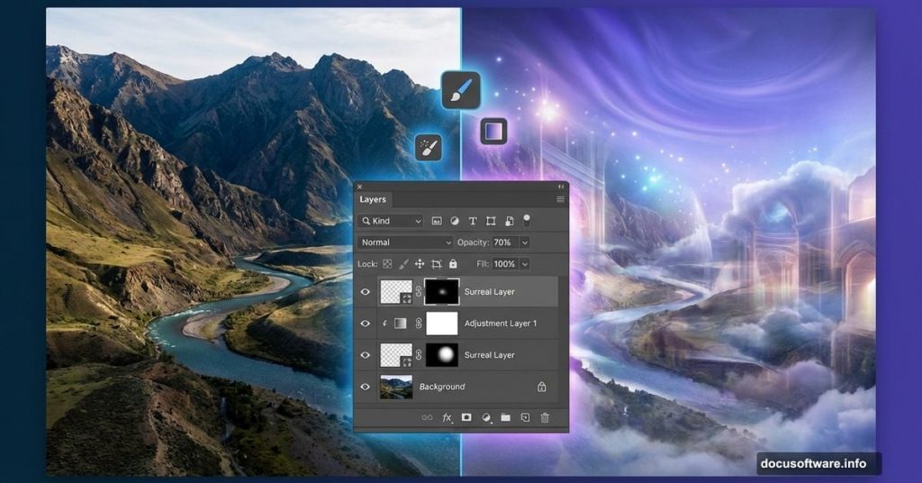
Hide Unwanted Elements With Layer Masks
Add a layer mask to your river layer. Click the mask icon at the bottom of your Layers panel.
Select a soft round brush. Set it to black with 50% opacity. Now paint over any parts you want to hide—typically clouds or sky portions that clash with your gradient.

The beauty of layer masks? They’re non-destructive. Your original image stays intact. You can always paint with white to reveal hidden areas again. This flexibility beats erasing pixels permanently.
Build Depth With Mountain Layers
Place your first mountain image. Resize it using the same corner-drag technique.
Here’s where color harmony matters. Double-click the layer thumbnail. A new window opens—just click OK. This converts the layer to a Smart Object, letting you edit non-destructively.
Press Ctrl+U to open Hue/Saturation. Check the Colorize option. Reduce saturation to around 12. This desaturates the mountains slightly, making them look farther away. Distance equals less color saturation in nature.
Save the file (Ctrl+S). The color change updates automatically thanks to Smart Objects.
Create Atmospheric Perspective

Add a layer mask to your mountains. Paint with a soft black brush to blend edges.
But here’s the trick—reduce your mountain layer opacity to 70%. This lets background elements show through subtly. Distant objects in real landscapes never appear at full opacity. Atmosphere dulls them.
Now place additional mountain layers. Stack them with closer mountains at higher opacity, distant ones at lower opacity. This creates depth through atmospheric perspective.
Layer Order Matters More Than You Think
Move your river layer above the mountain layers. Why? Rivers flow in front of distant mountains, not behind them.
This seems obvious. Yet many beginners stack layers in the order they placed them rather than thinking spatially. Always ask: “In real space, which element sits in front?”
Your layer order should mirror physical depth. Background elements at the bottom, foreground elements at the top.

Add Architectural Details Strategically
Place your castle or tower images. These need careful selection work first.
Use the Magic Wand tool to select the sky around your building. Click the sky, then hit Delete. This removes unwanted background quickly.
For more complex selections, try the Quick Selection tool or Pen tool. The goal? Clean edges that won’t betray the composite nature of your image.
Resize your buildings to match perspective. Closer objects appear larger. Distant castles should look appropriately small.
Blend Everything With Consistent Lighting
This step separates amateur composites from professional work. Every element needs consistent lighting direction.

Look at your source images. Note where shadows fall. If one mountain has light from the right but your castle has light from the left, something feels wrong.
Solution? Use adjustment layers to modify shadows and highlights. Create a Curves adjustment layer above each element. Brighten the lit side, darken the shadow side. This unifies lighting across all components.
Add Blur for Realistic Distance
Distant objects appear slightly blurred. Your eyes can’t focus on everything simultaneously.
Select your background mountain layers. Go to Filter > Blur > Gaussian Blur. Apply a subtle blur—maybe 2-3 pixels. This mimics how distant objects look less sharp.
Foreground elements stay sharp. Mid-ground elements get slight blur. Background elements get more blur. This depth-of-field effect makes your composite feel like a real photograph rather than pasted cutouts.
Fine-Tune With Dodge and Burn

Create a new layer set to Overlay blend mode. Fill it with 50% gray.
Now use the Dodge tool to lighten areas that should catch light. Use the Burn tool to darken shadow areas. This adds dimensionality that flat photos lack.
Focus on edges where elements meet. A darker edge on the shadow side helps separate objects. A lighter edge on the lit side creates definition. These subtle touches make huge differences in believability.
Polish Your Final Composite
Step back and evaluate the whole image. Does everything feel cohesive?
Add a final adjustment layer at the top of your stack. Try a Color Lookup adjustment set to low opacity. This adds a consistent color grade across all elements.
Consider adding atmospheric effects. A subtle fog layer between foreground and background enhances depth. Use a soft white brush at low opacity on a new layer.

Finally, add sharpening selectively. Sharpen foreground elements slightly. This directs viewer attention where you want it.
The Real Secret Nobody Mentions
Technical skills matter. But composition matters more.
You can execute every technique perfectly and still create a boring image. Why? Because surreal landscapes need visual storytelling.
Ask yourself: What draws the eye? Where does the viewer’s gaze travel? Is there a focal point?
Great surreal landscapes balance familiar and strange. They feel dreamlike yet believable. Master the technical skills here, then push your creative vision. That’s when these techniques transform from tutorial exercises into art.
Your first attempt won’t be perfect. Mine wasn’t either. But each composite teaches you something new about light, color, and visual harmony. Keep practicing. The results speak for themselves.