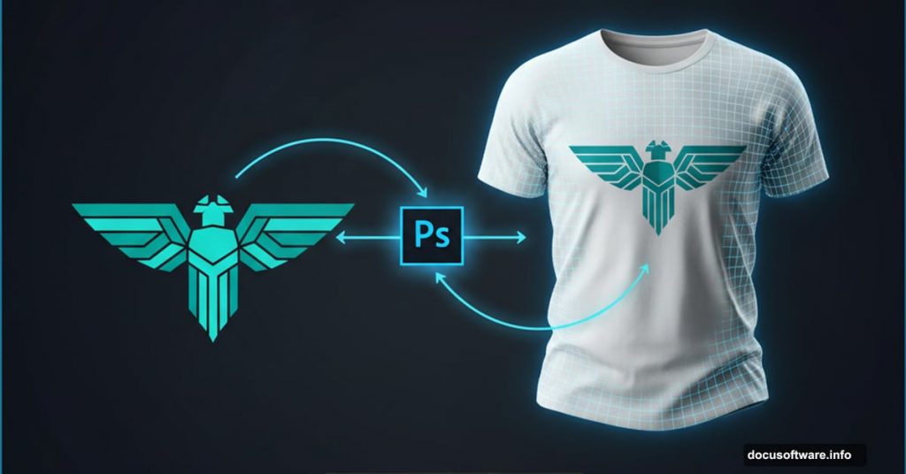
Creating realistic t-shirt mockups sounds intimidating. Most tutorials overcomplicate it with dozens of steps and confusing layer stacks.
But here’s the truth. You need just a handful of Photoshop techniques to make professional mockups that clients actually believe. Plus, once you nail the workflow, you can apply it to hoodies, jackets, or any clothing item.
Let’s break down the exact process that works every time.
Set Up Your Smart Object Foundation
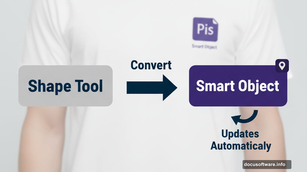
Start by creating a rectangle with the shape tool. Make it bigger than the actual artwork area on your shirt. That seems counterintuitive, right?
However, oversizing gives you flexibility. You can always mask away excess later. Plus, it’s easier to work with a larger canvas when placing your graphics.
Convert this rectangle to a Smart Object immediately. This step matters because Smart Objects let you swap artwork without redoing the entire mockup. Change the design once inside the Smart Object, and it updates everywhere automatically.
Now use Free Transform to match your rectangle to the shirt’s perspective. Stretch, rotate, and distort it until the corners align with where your artwork should sit. Take your time here because this determines how realistic everything looks later.
Create Your Displacement Map
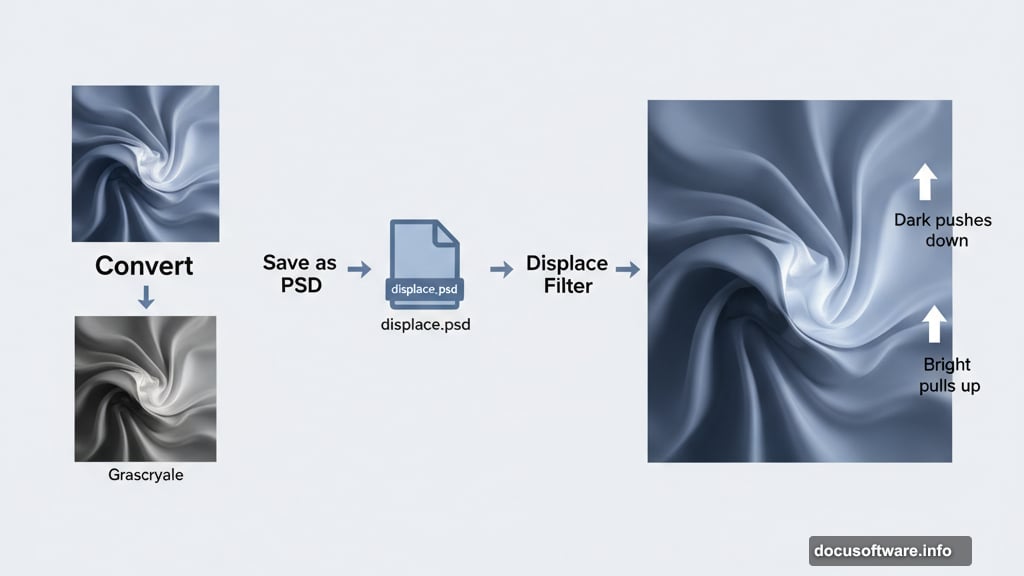
Turn off the Smart Object layer for a moment. Duplicate your background photo and convert it to black and white using any method you prefer.
Save this grayscale image as a PSD file. Name it something obvious like “displace.psd” so you remember what it does. Then delete that black and white layer from your main document.
Why bother with this step? The displacement map reads the brightness values of your fabric wrinkles. Dark areas push your artwork down. Bright areas pull it up. This creates that crucial fabric texture that makes mockups look real instead of pasted on.
Add Your Artwork the Smart Way
Double-click your Smart Object rectangle’s thumbnail. This opens a new document window. Copy your artwork from wherever it lives and paste it into this Smart Object document.
Hide the background shape layer so you only see your artwork on a transparent background. Save this document and close it. Watch your artwork magically appear on the shirt in your main document.
But it still looks flat and fake. Time to fix that.
Apply Displacement for Fabric Realism
Select your Smart Object artwork layer. Go to Filter menu and choose Distort, then Displace. Set both horizontal and vertical displacement to 5 pixels. Load that PSD file you saved earlier.
The artwork now follows the fabric wrinkles. Pretty cool, right?
Next, add a tiny Gaussian Blur. Use 0.5 to 1 pixel maximum. Real printed shirts never look perfectly sharp. This subtle blur makes your mockup significantly more believable.
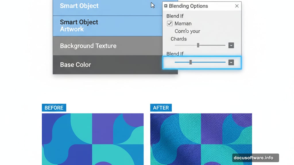
Blend Highlights and Shadows Naturally
Double-click your Smart Object layer to open Blending Options. Focus on the “Blend If” sliders at the bottom.
Hold Alt on Windows or Option on Mac. Click the black slider on the bottom layer. It splits in half. Drag the right half to position 100.
Do the same with the white slider on top. Split it and drag to position 200.
What just happened? You told Photoshop to blend your artwork into the shirt’s existing shadows and highlights. Dark wrinkles show through your design. Bright spots don’t get completely covered. Suddenly your mockup looks like fabric instead of a sticker.
Adjust Contrast to Match Reality
Add a Curves adjustment layer and clip it to your artwork layer. Click the chain icon between the layer and adjustment layer to make sure they move together.
Reduce contrast by lifting the black point and lowering the white point. How much depends on your specific artwork. Bright, bold graphics need more contrast reduction. Subtle designs need less.
The goal is making your artwork look printed on fabric rather than displayed on a screen.
Control Saturation with Smart Masking
Add a Selective Color adjustment layer clipped to your artwork. Go through each color channel and set the black slider to -100%. Then do the same for the tonal channels but set them to +100%.
This creates a saturation mask. Brighter areas keep more color. Darker areas lose saturation. Just like real fabric where shadows appear less vibrant.
Follow this with a Vibrance adjustment layer. Pull down the saturation or vibrance slider until colors look more muted and natural. Printed shirts never have the same color intensity as your computer screen.
Add Shadow Punch for Depth
Select around the shirt area on your original photo. Hit Cmd+J on Mac or Ctrl+J on Windows to duplicate just that section to a new layer.
Drag this layer above all your adjustment layers. Desaturate it completely and clip it to your adjustment stack. Set the blend mode to Overlay.
Now the shadows in your fabric wrinkles punch through more dramatically. If it looks too strong, use the Blend If sliders again to dial it back.
Fine-Tune with Strategic Masking
Select your Smart Object artwork layer’s mask. Grab the Brush tool and set opacity to 10%.
Zoom in and gently dab away tiny bits of artwork that cover the deepest shadow areas in fabric wrinkles. Don’t go overboard. You’re not erasing the design. You’re just letting extreme shadows show through naturally.
This final touch separates amateur mockups from professional ones.
Why This Method Beats Others
Most mockup tutorials give you a million steps without explaining why each matters. That makes it impossible to adapt the technique to different situations.
This approach teaches you the actual principles. Smart Objects for flexibility. Displacement maps for fabric texture. Blend If for natural integration. Contrast reduction for realism.
Master these concepts and you can mockup anything. T-shirts today. Tote bags tomorrow. Hoodies next week.
The tools stay the same. Only the photos change.