Recreating movie poster effects sounds intimidating. But this stripe pattern mask technique requires zero advanced skills.
I’ve walked dozens of beginners through this exact tutorial. Most finish in under 30 minutes. Plus, you’ll learn non-destructive editing tricks that work across hundreds of other projects.
Let’s break down how to build that iconic Bourne Legacy look step by step.
What You’ll Need Before Starting
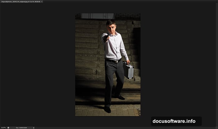
First, grab a suitable photo. The original tutorial uses a professional action shot from Depositphotos. But honestly? Any dramatic portrait works fine.
Look for images with strong contrast and clear subjects. Dark clothing against lighter backgrounds gives the best results. Free stock photo sites like Unsplash or Pexels offer plenty of options.
You’ll also need Photoshop CS4 or newer. CS6 works best since the tutorial was designed for it. However, most steps translate perfectly to newer Creative Cloud versions.
Setting Up Your Canvas
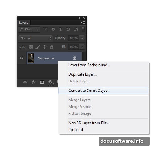
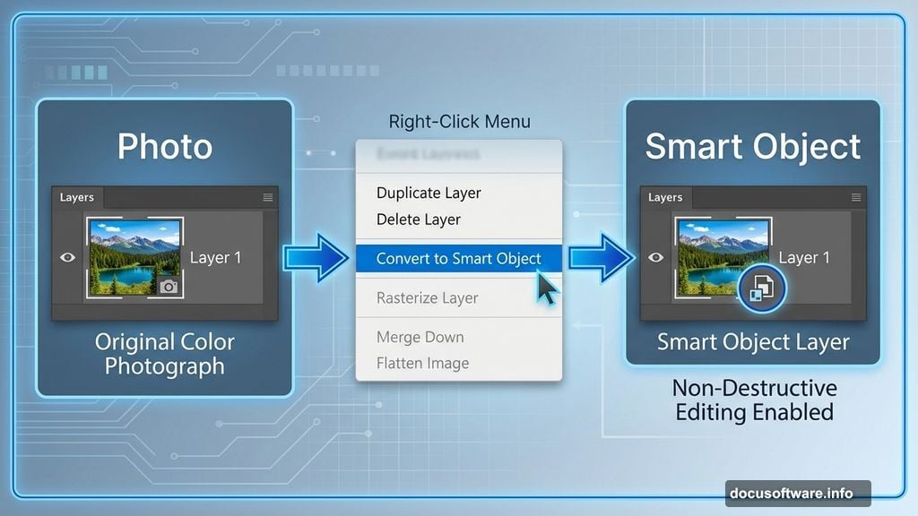
Open your chosen image in Photoshop. Then immediately convert it to a Smart Object by right-clicking the layer.
Why bother with Smart Objects? They preserve your original image data. So you can tweak effects later without destroying quality. This matters more than most beginners realize.
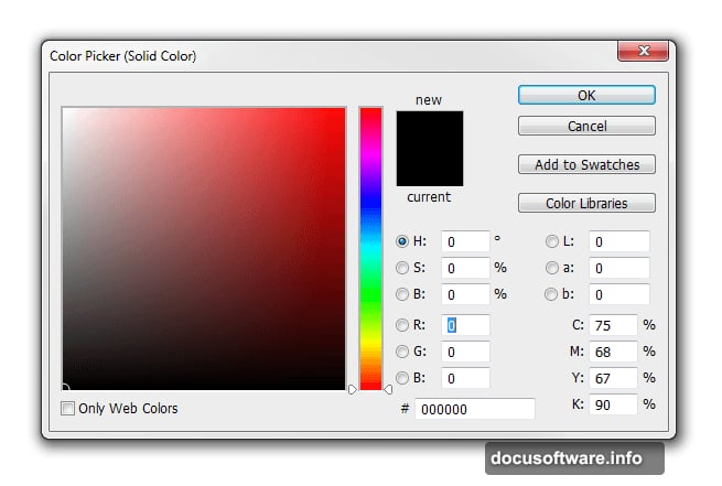
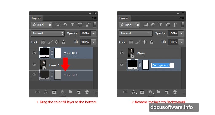
Next, add a solid black fill layer beneath your photo. Go to Layer > New Fill Layer > Solid Color. Pick black and click OK.
Rename your layers to stay organized. Call the top one “Photo” and the bottom one “Background.” Double-click any layer name to edit it. Trust me, this saves confusion later.
Building That Gritty Photo Effect
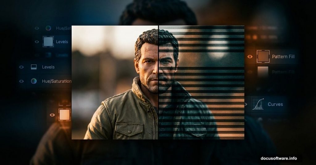
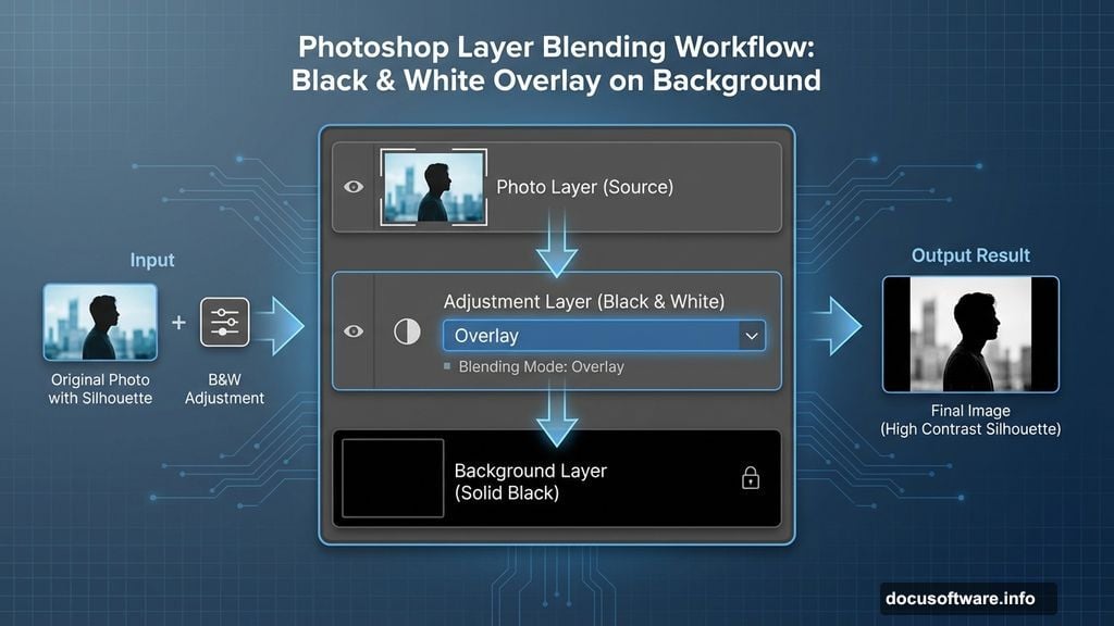
Now comes the fun part. Add a Black & White adjustment layer above your photo.
But here’s the trick. Change the adjustment layer’s blending mode to Overlay instead of leaving it on Normal. This creates an instant grungy lighting effect that screams action movie.
Play with the color sliders in the Properties panel. Each adjustment dramatically changes the mood. No single “correct” setting exists, so experiment until it feels right.
Controlling Color Intensity
Your image probably looks oversaturated after that last step. Fix it with a Vibrance adjustment layer.
Reduce the Vibrance slider until just a hint of color remains. We want desaturated, not completely grayscale. That subtle color adds depth without looking cartoonish.
The difference seems small at first. However, it prevents the final poster from feeling flat or lifeless.
Recovering Hidden Details
Those adjustment layers created mood but buried important details in shadows. Your background might blend too much with the black fill.
Select your Photo layer and go to Image > Adjustments > Shadows/Highlights. Set shadows to roughly 35% and highlights around 15%.
This pulls detail back from dark areas without washing out the gritty effect. The stripes we’ll add later need contrast to pop properly.
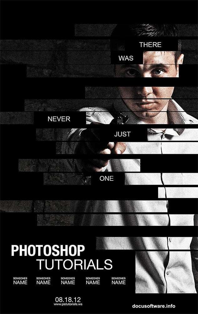
Creating the Signature Stripe Pattern
Here’s where the Bourne Legacy look really takes shape. Create a new layer above everything else.
Select the Rectangle Tool and draw thin vertical stripes across your canvas. Make them about 20-30 pixels wide with equal spacing between each.
Hold Shift while dragging to keep lines perfectly vertical. Precision matters here since wonky stripes ruin the whole effect. Take your time getting the spacing consistent.
Masking the Stripes to Your Subject
Now for the magic trick. Select your Photo layer and create a layer mask.
Paint black on the mask over areas where you want stripes to show through. Paint white where you want the full image visible. Gray creates partial transparency for subtle transitions.
This selective masking creates that fragmented, classified document aesthetic. Focus stripes on faces and important details for maximum impact.
Adding Text Like a Pro
Pick a bold, condensed font for your title text. The original Bourne Legacy posters use heavily condensed sans-serifs.
Place text strategically to complement your stripe pattern, not compete with it. Often this means positioning it in darker areas or along the edges.
Keep text minimal. Movie posters succeed through visual impact, not lengthy descriptions. A title and tagline usually suffice.
Fine-Tuning the Final Look
Step back and evaluate your composition. Does anything feel too dark or too bright?
Add Levels or Curves adjustment layers to dial in the perfect tonal range. Small tweaks make huge differences in professional polish.
Consider adding subtle color grading with a Color Lookup adjustment layer. Movie poster aesthetics often push toward teal and orange or other stylized color schemes.
Common Mistakes to Avoid
Don’t make your stripes too wide or too narrow. Test different widths until they feel balanced with your image size. Wider stripes work better for large prints, while narrow stripes suit web graphics.
Avoid over-masking. Some beginners go crazy with the stripe effect and obscure too much of the subject. The viewer should still clearly see what the poster depicts.
Watch out for inconsistent spacing. Evenly distributed stripes look intentional and professional. Random spacing screams amateur hour.
Why This Technique Works
The stripe pattern creates visual intrigue while suggesting redacted information or classified status. Perfect for action thrillers and spy movies.
But this effect translates beyond Bourne posters. Use it for concert promotions, sports graphics, or any design needing edgy, modern energy. The fundamentals stay the same.
Plus, you learned non-destructive editing principles that apply to countless other projects. Smart Objects and adjustment layers form the foundation of professional Photoshop work.