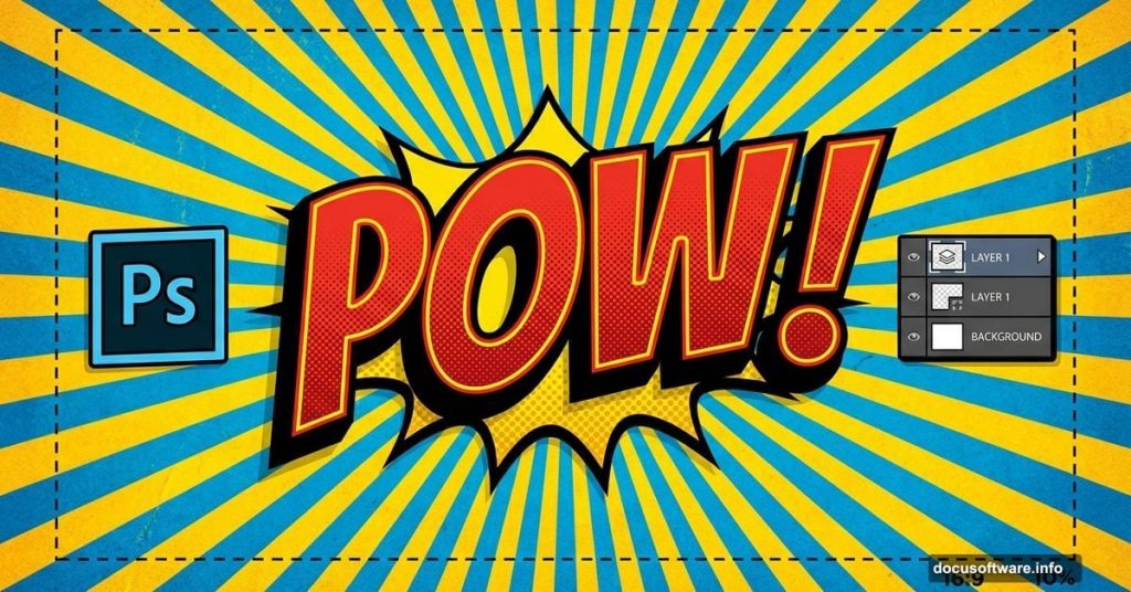
Want to create text that leaps off the screen like classic comic art? This 3D effect mimics vintage comic fonts with bold colors, sharp edges, and authentic halftone textures.
You’ll work extensively with layer styles and learn tricks professional designers use. Plus, the technique works for posters, social media graphics, and any project needing that retro comic punch.
Here’s everything you need to know.
What You’ll Need Before Starting
First, grab these free resources. You can’t replicate the authentic comic look without them.
Download halftone brushes from DeviantArt user Gregkmk. These create those distinctive dotted patterns you see in vintage comics. Also, pick up the Komika Axis font from DaFont’s Vigilante Typeface Corporation collection.
Both downloads are free. Install the brushes by loading them into Photoshop‘s brush panel. Install the font like any system font by double-clicking the file.
Make sure you’re using Photoshop CC or newer. Older versions might not support some layer style features we’ll use later.
Building Your Comic Background
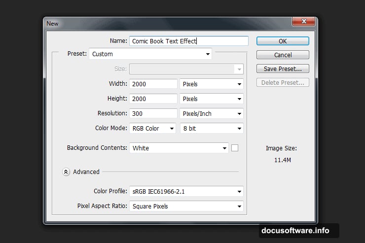
Start by creating a new document. Go to File > New and set dimensions to 2000 x 2000 pixels. Resolution doesn’t matter since we’re working in pixels, not print measurements.
Now double-click your background layer to unlock it. This opens the layer style window where you’ll add a gradient overlay. Choose bright, saturated colors typical of comic books. Think bold reds, blues, or yellows.
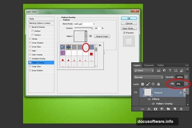
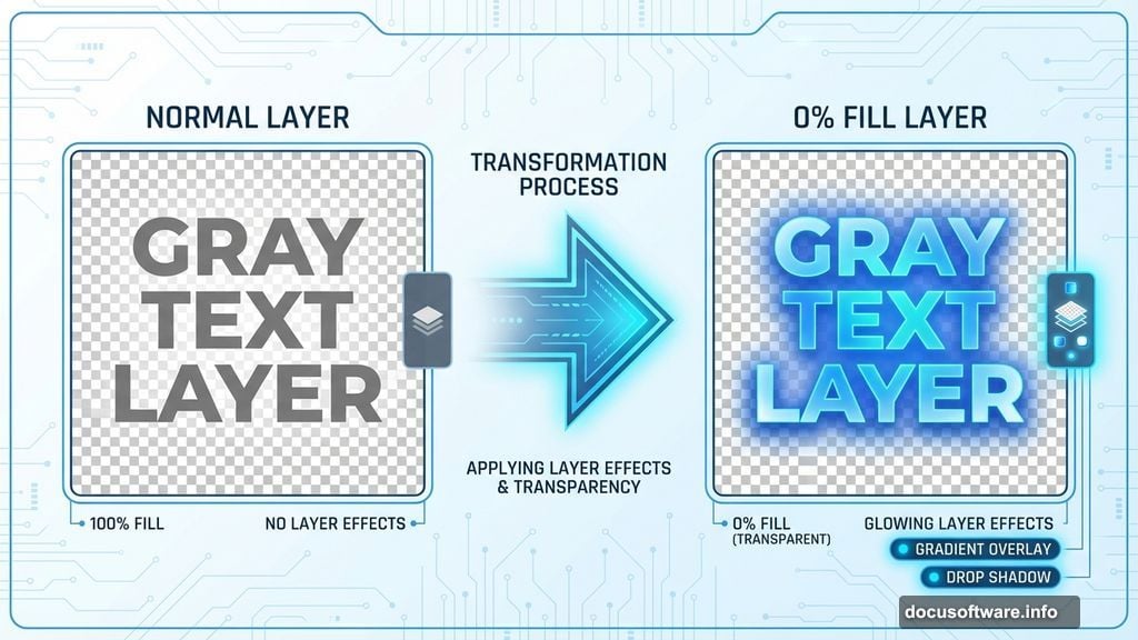
Next, create a new layer above the background. Fill it with any color, then immediately set the fill to 0%. This seems weird, but here’s why it works. Setting fill to zero hides the color while keeping layer effects visible.
Double-click this layer and apply a pattern overlay. Pick a subtle texture that adds visual interest without overwhelming your text later. Reduce opacity if the pattern feels too strong.
Adding Authentic Halftone Texture
Create another new layer. Select your Brush tool and load those halftone brushes you downloaded earlier.
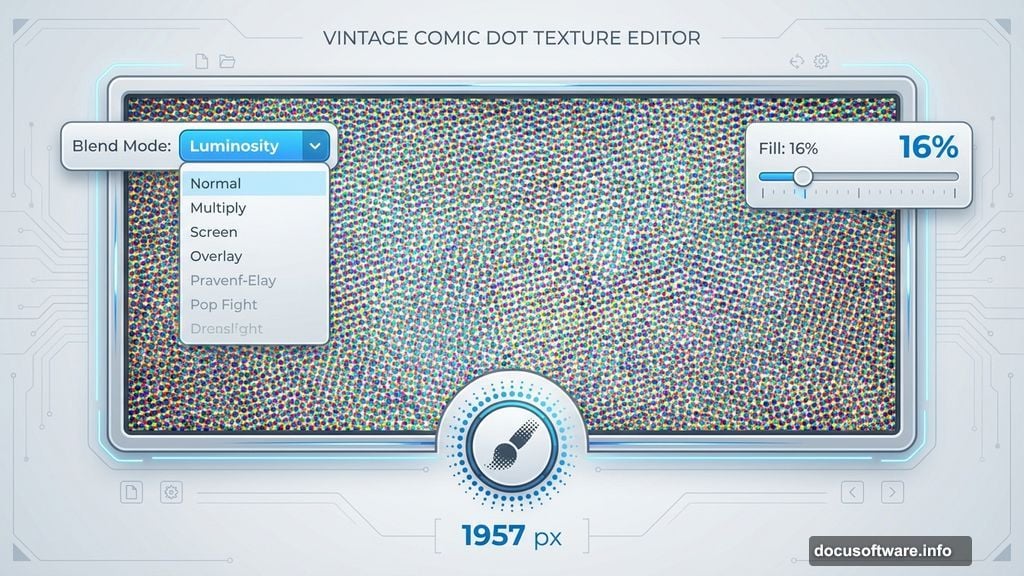
Set brush size to about 1957 pixels. The exact number matters less than choosing a size that covers most of your canvas. Pick any color you want since we’ll adjust the blend mode next.
Click once in the center of your document. Then change the layer blend mode to Luminosity and reduce fill to 16%. This creates that characteristic comic book dot pattern without overpowering everything else.
Moreover, the Luminosity blend mode preserves the underlying colors while adding texture. That’s exactly what we need for an authentic comic feel.
Creating the Base Shape
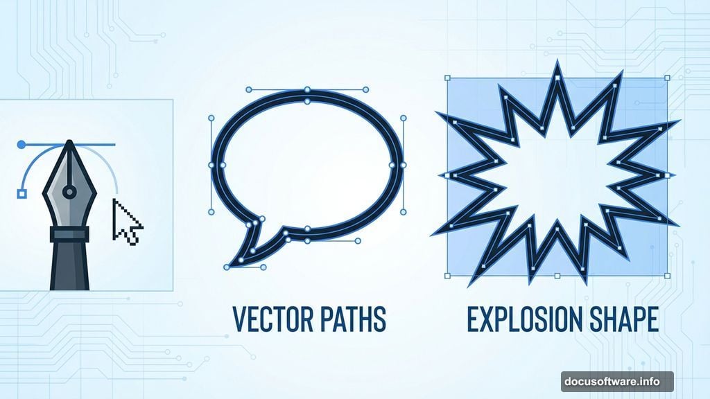
Now grab your Pen tool. Draw a dynamic shape that will hold your text. Think speech bubbles, explosion bursts, or angular comic panels.
Don’t stress about perfection. Comic art embraces bold, slightly imperfect shapes. In fact, too-perfect geometry kills the hand-drawn aesthetic we’re after.
Once you’ve drawn your path, switch to the Paths panel. Right-click your path and select “Make Selection.” Click OK on the dialog box.
Fill this selection with your chosen color. Then double-click the layer to add a Color Overlay and Drop Shadow. The drop shadow should be substantial but not excessive. Comic art uses strong shadows to create depth.
Layering Halftone for Dimension
Here’s where things get interesting. Create a new layer above your shape layer.
Hold Ctrl and click the thumbnail of your shape layer. This loads the shape as a selection. Now grab your halftone brush again and click once inside the selection.
Use a complementary color to your shape. If your shape is red, try orange or yellow halftones. This creates subtle color variation that adds visual richness.
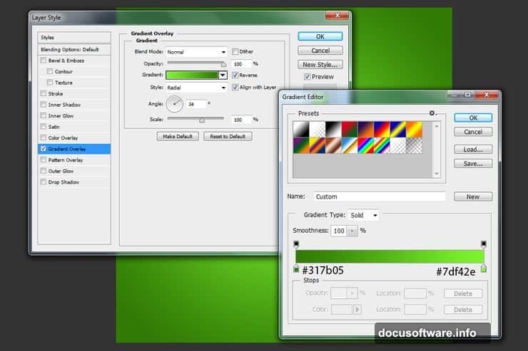
Double-click this new layer and add a Gradient Overlay. Set the layer fill to 0% so only the gradient shows through the halftone pattern. Adjust gradient colors to match your overall color scheme.
Building the 3D Edge Effect
Create another new layer. Use the Pen tool to draw an outline just inside your original shape’s edge. This creates the illusion of depth.
Make a selection from this path and fill it with black. Move this layer underneath your main shape layer. This acts as a shadow that makes the shape appear raised off the background.
You can adjust the offset to make the 3D effect more or less dramatic. Bigger offset means stronger 3D effect but also more exaggerated shadows.
Adding Your Comic Text
Now for the star of the show. Select the Type tool and choose that Komika Axis font you installed earlier.
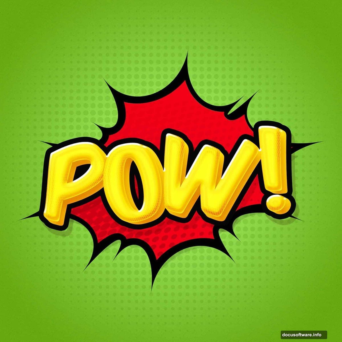
Type your text in all caps. Comic fonts work best in uppercase letters. Set the size large enough to fill your shape without crowding. Remember, comic text should be bold and easily readable.
Pick a bright, contrasting color. Yellow text on blue shapes, red text on yellow backgrounds. High contrast is essential for that comic book aesthetic.
Creating Text Depth Through Duplication
Here’s the key to making text pop in 3D. Duplicate your text layer multiple times. Stack these duplicates directly behind the original.
On each duplicate layer, nudge the text down and to the right by a few pixels. This creates that classic offset shadow effect you see in vintage comics.
Change each duplicate layer’s color to progressively darker shades. The layer closest to the original might be a medium tone, while the bottom layer is nearly black.
This manual technique gives you precise control over the 3D effect. Photoshop’s built-in 3D tools can’t replicate this authentic comic look.
Applying the Finishing Bevel
Select all your text layers and merge them. Then double-click to open layer styles.
Add a Bevel and Emboss effect with these settings: Style should be Inner Bevel, Technique set to Chisel Hard, and Depth increased until edges look crisp and defined.
Also, add a Stroke effect. Set stroke position to Outside, size around 8-12 pixels depending on your text size. Use a dark contrasting color, usually black or dark blue.
The stroke creates that bold outline characteristic of comic lettering. Meanwhile, the bevel adds subtle highlights and shadows that enhance the 3D illusion.
Fine-Tuning Color and Contrast
Step back and evaluate your overall composition. Does the text stand out clearly? Are colors balanced?
Adjust individual layer styles if needed. Maybe your drop shadows need more spread, or your gradient overlay requires different colors.
Use adjustment layers to tweak overall image brightness and saturation. Comic art typically features saturated colors and strong contrast. Don’t be afraid to push these values higher than normal.
Remember, subtle doesn’t work in comic aesthetics. Bold, bright, and high-contrast wins every time.
Saving Your Layer Styles
Here’s a pro tip that saves massive time on future projects. After perfecting your text effect, save those layer styles.
Right-click any layer with effects applied and select “Copy Layer Style.” Then you can paste these exact settings onto new text later.
Better yet, save styles as presets through the Styles panel. This lets you build a library of comic effects you can apply with one click.
Common Problems and Quick Fixes
Halftone brushes looking too harsh? Reduce layer opacity or change blend modes. Experiment with Multiply or Overlay for different effects.
Text edges looking jagged? Make sure Anti-aliasing is enabled in your Type tool options. Choose “Sharp” or “Crisp” for best results with bold comic fonts.
Colors looking muddy instead of vibrant? Work in RGB color mode, not CMYK. Also, double-check that your color profile is set to sRGB for screen display.
3D effect not dramatic enough? Duplicate your shadow layers more times and increase the offset between each layer. The more layers you stack, the deeper the effect appears.
This technique works for any bold, graphic text project. Master these fundamentals and you’ll create professional comic effects faster than you’d expect.