
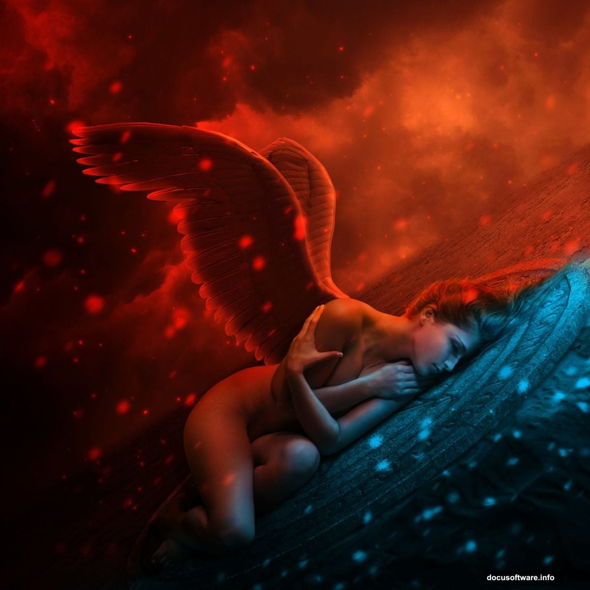
Fallen angel compositions rank among Photoshop‘s most striking projects. But most tutorials skip the crucial details that separate amateur work from professional results.
This guide walks you through creating a moody, dramatic fallen angel scene from scratch. You’ll learn advanced masking, realistic lighting integration, and color grading techniques that professional digital artists use daily. Plus, every step includes specific settings and brush values so you can follow along precisely.
No vague instructions. No skipped steps. Just practical techniques that actually work.
What You’ll Need Before Starting
Gather these elements first. Having everything ready prevents workflow interruptions later.
Stock Images:
- Desert landscape for your ground element
- Dramatic sky with interesting cloud formations
- Angel wings (white feathered wings work best)
- Model photo with appropriate pose
- Pagan symbol or decorative element (optional)
Photoshop Version:
Any version from CS6 onward works fine. Older versions might lack Smart Filters, but you can work around that limitation.
Time Investment:
Plan for 2-3 hours on your first attempt. Once familiar with the process, you’ll finish in under an hour.
Build Your Canvas and Background
Start with a square canvas. The 1:1 ratio works perfectly for dramatic compositions and social media sharing.
Create a new document at 1000×1000 pixels. Fill it with white or any neutral color you prefer. The background color doesn’t matter since you’ll cover it completely.
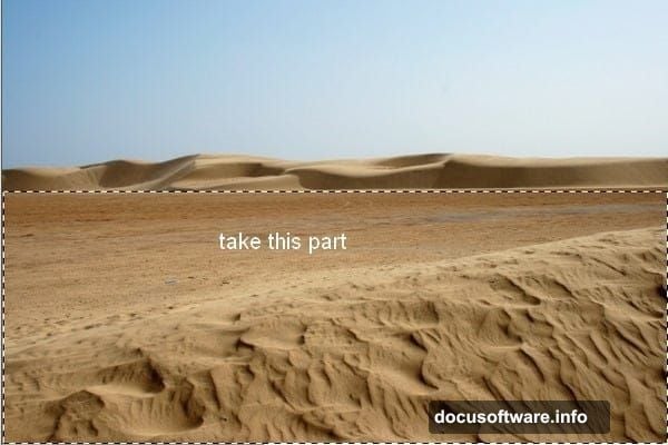
Open your desert stock image. Use the Rectangular Marquee Tool to select just the ground portion. Drag it onto your canvas with the Move Tool (V).
Now comes the first creative decision. Press Cmd/Ctrl+T to activate Free Transform. Rotate the ground layer to create a slight diagonal angle. This lean adds visual energy and breaks up the static horizontal line.
Don’t make it too extreme. A subtle 5-10 degree rotation usually works best.
Blend the Ground Seamlessly
Hard edges scream “amateur photo manipulation.” So let’s fix that immediately.
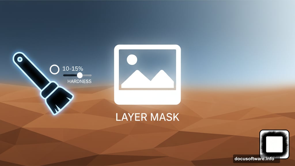
Click the layer mask button at the bottom of your Layers panel. That’s the second icon from the left. This adds a white mask to your desert layer.
Select a soft black brush. Set the hardness to 10-15% maximum. Paint along the edges of your ground layer to fade them smoothly into the background.
Focus especially on the left and right edges. You want the ground to appear like it’s fading into atmospheric haze rather than just ending abruptly.
Check your work by toggling the background layer visibility. The transition should look natural and gradual.
Add Atmospheric Depth
Real landscapes aren’t uniformly sharp. Distance creates blur. So let’s replicate that effect.
Select your desert layer. Go to Filter > Blur > Gaussian Blur. Set the radius to exactly 2 pixels. This creates subtle softness without making things look obviously blurred.
But here’s the trick most tutorials miss. You don’t want the entire ground blurred equally. That looks artificial.
The Gaussian Blur created a Smart Filter mask automatically. Select that mask. Use a soft black brush to paint over the middle ground area. This reveals the sharp detail where your subject will stand while keeping the foreground and background softer.
The result mimics how human eyes actually perceive depth. Foreground slightly soft, middle ground sharp, background fading to blur.
Fix Problem Areas with Clone Stamp
Every stock photo has imperfections. Distracting elements, unwanted objects, or awkward textures that don’t fit your composition.
Create a new layer above your desert layer. Make sure it’s set to Clipping Mask. Hit Cmd/Ctrl+Shift+N for the New Layer dialog, then check the “Use Previous Layer to Create Clipping Mask” option.
Activate the Clone Stamp Tool (S). Hold Alt/Option and click to sample from clean areas of the desert. Then paint over problem spots.
Work patiently. Small, careful strokes prevent the cloned area from looking obvious or repetitive. Vary your sample points frequently to maintain natural texture variation.
Darken and Mood the Ground
Now shape the lighting to create drama. Start with a Curves adjustment layer set as a Clipping Mask.
Go to Layer > New Adjustment Layer > Curves. Pull the curve down to darken the overall ground. Don’t worry about getting it perfect yet.
Here’s where precision matters. Select the Curves layer mask. Choose a soft black brush with opacity around 10-15%. Paint over the top portion of the ground to reduce darkness there.
Switch to 40-45% opacity. Paint over the middle areas where your subject will stand. This creates a spotlight effect, drawing the viewer’s eye exactly where you want it.
The darkened edges frame your composition while the lighter center provides visual breathing room.
Desaturate for Mood
Overly saturated landscapes look cartoonish in dark, moody compositions. So pull back the color intensity.
Add a Hue/Saturation adjustment layer as a Clipping Mask. Drag the Saturation slider to the left. Exact values depend on your source image, but typically -20 to -40 works well.
You want muted, subdued earth tones. Not completely desaturated (that’s too lifeless), but definitely toned down from the original stock photo.
Check the result at different zoom levels. What looks good at 100% might appear too gray when zoomed out.
Shift Color Toward Darkness
Color Balance adjustment layers provide the most control for color grading. Add one now as a Clipping Mask.
Push the sliders toward cooler tones. Add cyan in the shadows. Maybe a touch of blue in the midtones. Keep highlights relatively neutral or slightly warm to maintain contrast.
The exact numbers depend entirely on your source images and creative vision. But generally, cooler shadows and warmer highlights create depth and dimension.
Don’t push too far. Subtle color shifts feel more realistic than heavy Instagram-style filters.
Position Your Sky Dramatically
Open your sky stock image. Use the Move Tool to drag it onto your main canvas. Position it at the top of your composition.
This layer should sit UNDER your desert layer. That way the ground appears in front of the sky, maintaining proper depth.
Rotate and scale the sky to match your ground’s angle. If your desert leans 10 degrees clockwise, your sky should too. Consistency matters for believable composites.
Look for interesting cloud formations. Position dramatic clouds or color variations where they’ll frame your future subject most effectively.
Darken Specific Sky Areas
Sky rarely appears uniformly lit. So let’s add variation and direct the viewer’s attention.
Create a Curves adjustment layer set as a Clipping Mask to your sky. Pull the curve down to darken significantly.
Now comes the painting. Select the Curves layer mask. Use a soft black brush with varied opacities between 15-20% for subtle areas and 100% for areas you want completely bright.
Paint away darkness from the area directly behind where your subject will stand. This creates natural backlighting and helps separate the subject from the background.
Darken the corners and edges aggressively. This vignetting effect focuses attention toward the center composition.
Add Your Model
Time to bring in the star of your composition. Open your model stock photo.
Extract the model using your preferred selection method. Pen Tool provides the most precision for complex selections. Quick Selection Tool works faster if you’re comfortable refining edges afterward.
Once extracted, drag the model onto your main canvas. Position and scale appropriately. The model should be large enough to command attention but not so huge that they fill the entire frame.
Place the model layer above your sky layer. This maintains proper stacking order with the ground potentially overlapping the bottom of the model.
Integrate Model Lighting
Nothing destroys photo composites faster than mismatched lighting. So let’s fix that immediately.
Study your background lighting direction. Where’s the light source? Typically it’s coming from behind and above in dramatic compositions.
Create adjustment layers specifically for your model. Use Curves to match the overall tone to your background. If the background is dark and moody, your model needs similar darkness.
Add a second Curves layer for highlights. Pull the highlights slider up slightly, but only in areas facing your light source. Paint this effect onto the layer mask manually. Don’t apply it to the entire model uniformly.

For shadows, create another Curves layer pulled down. Paint this onto areas facing away from your light source. This contrast between highlighted and shadowed areas creates three-dimensionality.
Attach the Wings
Open your wing stock. Extract them carefully. Wings have intricate feathers, so precise selection matters enormously.
Position wings behind your model layer. Scale them appropriately. Real angel wings would be massive – significantly larger than people expect initially.
The wings should appear to connect naturally to the model’s back. Align the wing’s base with the shoulder blade area. Rotate slightly to match the model’s pose and create dynamic angles.
Use layer masks to blend the wing base into the model’s back. This prevents them from looking pasted on. Paint carefully where wings and body overlap.
Light the Wings Properly
Wings need the same lighting treatment as your model. Actually, they need MORE attention because their position makes lighting mismatches obvious.
Create Curves adjustment layers specifically for the wings. Match the overall tone to your background first.
Then add highlights. Wings catch light beautifully on their outer surfaces and tips. Paint brightness there using masked Curves layers.
Don’t forget shadows. Wings cast shadows on themselves and potentially on the model. Add a new layer set to Multiply blend mode. Paint soft shadows where wings overlap and where they might cast shadows onto the model’s back.
Opacity around 30-40% usually works for these shadows. Too strong looks harsh. Too weak looks like the wings float disconnected.
Add Decorative Elements
Optional but effective: add symbolic elements to strengthen your narrative. Pagan symbols, geometric patterns, or mystical glyphs work well for fallen angel themes.

Place these elements strategically. Behind the subject as background decoration works. Or incorporate them into the ground as if burned or carved there.
Keep opacity relatively low – around 40-60%. These elements should enhance, not compete with your main subject for attention.
Use blend modes creatively. Overlay or Soft Light modes help decorative elements integrate naturally rather than sitting on top obviously.
Final Color Grading
Time to unify everything with final color grading. This step ties all your individual elements together into a cohesive whole.
Add a Curves adjustment layer at the very top of your layer stack. Don’t use Clipping Mask this time – let it affect everything.
Make subtle adjustments. Typically a slight S-curve adds punch. Pull shadows darker, push highlights brighter slightly. This increases overall contrast and drama.
Add a Color Balance adjustment layer. Push shadows toward blue/cyan for coolness. Maybe warm the highlights with slight yellow/red. This creates sophisticated color harmony.
Consider a Photo Filter adjustment layer set to Cooling Filter (80) at 10-15% opacity. This ties everything together with a consistent cool tone.
Polish with Final Touches
Almost done. Now fix any remaining issues and add finishing details.
Zoom to 100% and examine edges carefully. Any selection halos or masking errors? Fix them now with careful brush work on layer masks.
Check lighting consistency across all elements. Does every element appear lit from the same direction? If not, add localized adjustment layers to fix problems.
Add subtle vignetting if you haven’t already. Create a new layer filled with black. Add a layer mask and use the Gradient Tool to create a radial fade from center outward. Set the layer to Soft Light blend mode at 30-40% opacity.
Finally, add a subtle grain texture. This prevents the over-smooth digital look. Go to Filter > Camera Raw Filter (or Filter > Noise > Add Noise in older versions). Add just 3-5% grain. Your composition should look slightly textured, not plastic smooth.
Common Mistakes to Avoid
Several issues plague beginner fallen angel compositions. Let’s address them directly.
Mismatched lighting angles ruin believability immediately. Every element must appear lit from the same direction. Spend extra time on lighting adjustment layers to get this right.
Over-saturation makes compositions look amateur. Real dramatic scenes have muted, controlled color palettes. Err on the side of less saturation rather than more.
Inconsistent blur and sharpness breaks immersion. Elements at the same distance from camera should have similar sharpness levels. Use Gaussian Blur selectively to match depth across all stock elements.
Halos around selections scream “bad compositing.” Always refine edges and paint into layer masks to feather selections naturally into the background.
Flat lighting on model and wings makes them look pasted on. You need both highlights AND shadows painted manually to create dimensional lighting that matches your background.
Why This Technique Matters
Photo manipulation isn’t just about copying tutorials step-by-step. It’s about understanding principles you can apply to any project.
This fallen angel composition teaches you advanced masking, which transfers to product photography retouching. The lighting integration skills work for any composite scene. Color grading principles apply to portrait enhancement and landscape photography equally.
Plus, dramatic fantasy composites showcase technical skills that clients notice. Your portfolio needs pieces that demonstrate mastery of complex techniques. This composition style does exactly that.
Most importantly, you’ll understand how professional digital artists think. How they problem-solve lighting mismatches. How they create depth and dimension in flat 2D space. These thinking patterns matter more than memorizing tool locations.
Practice this composition multiple times with different stock images. Change the pose. Try different wing styles. Experiment with color grading variations. That repetition builds intuition you can’t get from reading tutorials alone.
Your first attempt won’t be perfect. That’s expected. But each iteration teaches lessons that make the next one better. Soon you’ll manipulate photos intuitively without referencing tutorials at all.