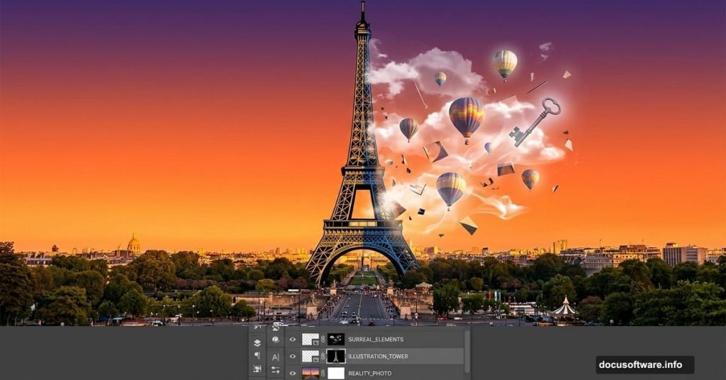
Want to blend reality with fantasy? This surreal photo manipulation technique transforms ordinary stock images into dreamlike compositions that stop scrollers mid-feed.
You’ll learn professional masking, lighting adjustments, and color grading that creates seamless image blending. Plus, the techniques work for any photo manipulation project, not just this specific composition.
Let’s build something magical.
What You’ll Need Before Starting
Gather these stock images first. Hunting for resources mid-project kills creative momentum.
Required Images:
- Cloud formations for dramatic sky
- Desert sunset for warm color base
- Eiffel Tower cutout (transparent background preferred)
- Skeleton key prop
- Hot air balloons
- Human figure for scale
- Piano element
Photoshop Skills Needed:
- Basic layer management
- Selection tools (Rectangular Marquee, Move Tool)
- Brush tool fundamentals
- Adjustment layers
Don’t worry if you’re new to photo manipulation. Each step breaks down clearly with specific settings.
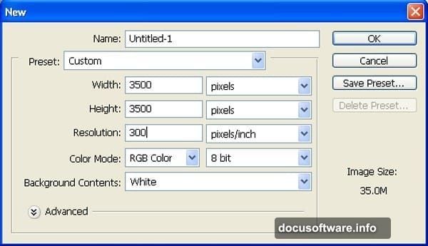
Set Up Your Canvas Properly
Create a new document at 3500×3500 pixels with 300 DPI resolution. Yes, that’s huge. But you’ll thank yourself later when details stay crisp during final edits.
Keep the background white for now. That changes soon.
Why square dimensions? Social media loves square images. This format works perfectly for Instagram posts, Facebook shares, and portfolio presentations.
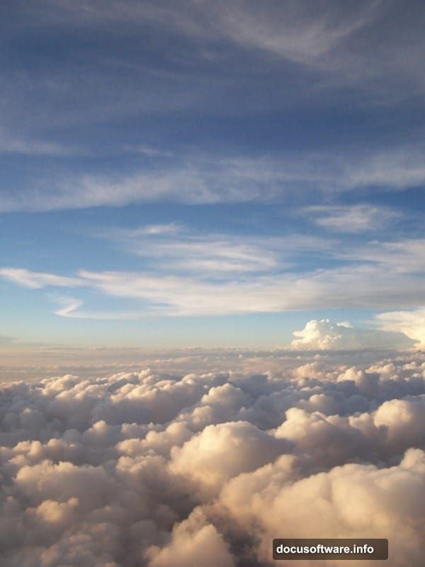
Build Your Sky Foundation
Open your cloud stock image. Press V to activate the Move Tool, then drag the clouds onto your main canvas. Rename this layer “Sky 1” immediately.
Here’s why naming matters: You’ll create 15+ layers during this project. Generic “Layer 1” labels turn into organizational nightmares fast.
Press Ctrl/Cmd+T to activate Free Transform. Scale the clouds until they fill your canvas edge-to-edge. Don’t worry about distortion yet. Surreal compositions embrace unusual perspectives.
Layer the Sunset Atmosphere
Now open your desert sunset image. Press M for the Rectangular Marquee Tool. Select just the sky portion—avoid including ground elements.
Hit V again for Move Tool, then drag your selection to the main canvas. Name this layer “Sky 2” and position it below your first sky layer.
Pro tip: Keep similar elements on separate layers. This gives you maximum control during color adjustments later.
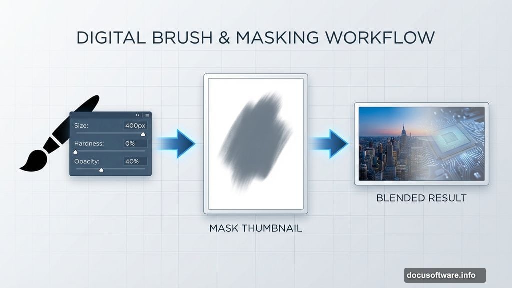
Blend Skies Seamlessly with Masking
Click the Mask icon at the bottom of your Layers palette while “Sky 2” is selected. You’ll see a white rectangle appear next to your layer thumbnail.
Press B to activate the Brush Tool. Configure these exact settings:
- Size: 400px
- Hardness: 0%
- Opacity: 40%
- Flow: 100%
- Color: Black (#000000)
Paint along the edges where your two sky layers meet. The soft brush creates gradual transitions that trick the eye. No harsh lines allowed in surreal work.
Each brush stroke removes a bit of Sky 2, revealing Sky 1 underneath. Take your time here. Subtle blending separates amateur composites from professional work.
Adjust Sky Colors for Drama
Select your “Sky 1” layer. Click the Adjustment Layer icon (half-black, half-white circle) at the bottom of the Layers palette. Choose Color Balance.
Shadows Settings:
- Cyan/Red: +15
- Magenta/Green: -10
- Yellow/Blue: -25
Midtones Settings:
- Cyan/Red: +10
- Magenta/Green: 0
- Yellow/Blue: -15
Highlights Settings:
- Cyan/Red: +5
- Magenta/Green: 0
- Yellow/Blue: -10
These adjustments add cooler tones that enhance the surreal atmosphere. Standard blue skies feel too realistic for what we’re building.
Color Grade Sky 2 Separately
Now select “Sky 2” layer. Add another Color Balance adjustment layer.
Shadows Settings:
- Cyan/Red: +25
- Magenta/Green: -5
- Yellow/Blue: -30
Midtones Settings:
- Cyan/Red: +15
- Magenta/Green: 0
- Yellow/Blue: -20
Hold Alt/Option and click between the Color Balance layer and Sky 2 layer. This creates a clipping mask—the adjustment affects only Sky 2, not your entire image.
Why separate adjustments? Different light sources require different color temperatures. Sky 1 represents daylight while Sky 2 adds sunset warmth.
Fine-Tune Brightness with Curves
Create a Curves adjustment layer (same method as Color Balance). Again, hold Alt/Option and clip it to Sky 2.
Click the center of the diagonal line in the Curves window. Drag it slightly upward to brighten midtones. This subtle lift makes the sunset glow more believable.
Watch your histogram while adjusting. You want smooth gradations, not harsh jumps between tones.
Add the Eiffel Tower Element
Open your Eiffel Tower stock image. If it doesn’t have a transparent background, use the Pen Tool (P) to create a precise selection around the tower edges.
Press Ctrl/Cmd+J to duplicate your selection onto a new layer. Drag this tower layer to your main canvas using the Move Tool.
Position the tower slightly off-center. Dead-center compositions feel static. Surreal work thrives on tension and unusual placement.
Scale the tower using Free Transform (Ctrl/Cmd+T) until it dominates the composition but doesn’t overwhelm it. The tower should feel imposing yet not suffocating.
Blend Tower Edges
Zoom to 200% and examine the tower edges closely. See those sharp, digital-looking outlines? Those scream “bad composite.”
Create a layer mask on your tower layer. Select a small, soft brush (50px, 0% hardness, 60% opacity). Paint along the tower edges with black to soften them.
Focus especially on areas where the tower meets the sky. Metal structures this massive would have atmospheric haze affecting their edges.
Match Tower Lighting to Sky
The tower lighting must match your sky direction. If sunset light comes from the right, the tower’s right side should be warmer and brighter.
Add a Curves adjustment layer clipped to your tower. Create two points on the curve—one in highlights, one in shadows.
Drag the shadow point down slightly to deepen dark areas. Lift the highlight point up to brighten light-facing surfaces. This contrast adds dimensionality.
Then add a Color Balance adjustment clipped to the tower. Push warm tones (red/yellow) toward the light side, cool tones (cyan/blue) toward the shadow side.
Integrate Supporting Elements
Time to add your skeleton key, balloons, figure, and piano. Each element follows the same workflow:
- Isolate the subject from its original background
- Scale and position on your canvas
- Add layer mask and paint soft edges
- Create clipped Curves adjustment for lighting
- Create clipped Color Balance for color harmony
Critical mistake to avoid: Don’t just drop elements in and call it done. Every object needs lighting and color adjustments that match your environment.
The human figure especially needs attention. Skin tones react dramatically to colored light. If your sunset casts orange light, the figure’s light-facing side should reflect that warmth.
Create Depth with Atmospheric Perspective
Objects farther away appear hazier, less saturated, and slightly lighter. This atmospheric perspective adds believable depth to impossible scenes.
For your background balloons, add a Hue/Saturation adjustment layer (clipped to balloons layer). Reduce saturation by 30-40%. Then add a Curves adjustment and lift the entire curve slightly.
Foreground elements get opposite treatment—increased saturation and contrast. This depth trick guides the viewer’s eye through your composition.
Add Final Color Grading
Create a new Curves adjustment layer at the top of your layer stack (not clipped to anything). This affects your entire composition.
Create a subtle S-curve by lifting highlights and dropping shadows slightly. This adds richness and contrast to the complete image.
Then add a Color Balance adjustment layer on top. Introduce subtle color casts that unify your composition:
- Shadows: Push toward blue (-15 yellow/blue)
- Highlights: Push toward warm (+10 cyan/red)
These micro-adjustments tie disparate elements together. Your eye perceives them as existing in the same light environment.
Polish and Export
Zoom out to 50% view. Does anything jump out as not belonging? Trust your gut—if an element feels off, it probably is.
Common final issues:
- Edges too sharp (fix with soft mask painting)
- Colors don’t match (adjust Color Balance)
- Contrast inconsistent (tweak Curves)
- Elements lack depth (enhance atmospheric perspective)
Once satisfied, flatten your image (Layer > Flatten Image) and save a master PSD file. Keep all those layers intact for future edits.
Export a high-resolution JPG at quality level 10-12 for final output. Your 3500×3500 pixel canvas provides plenty of resolution for prints, web use, and portfolio presentations.
One Adjustment Changes Everything
The difference between amateur and professional photo manipulation isn’t technical skill. It’s patience with lighting and color adjustments.
Beginners drop elements onto canvas and wonder why nothing looks real. Professionals spend 60% of their time tweaking Curves, Color Balance, and masks until every element breathes the same air.
Your Eiffel Tower manipulation works when viewers momentarily forget it’s impossible. That belief comes from consistent lighting, atmospheric depth, and unified color grading.
Now take these techniques and manipulate something entirely your own.