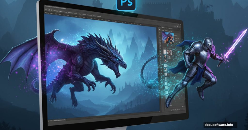
Want to create an epic fantasy scene with dragons and castles? This tutorial breaks down the process step by step.
Building surreal fantasy art in Photoshop challenges you to master multiple techniques at once. But the results are worth it. You’ll combine photo manipulation, color grading, and compositing to create something completely original.
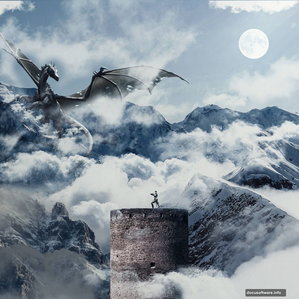
This tutorial walks through creating a dramatic mountain fortress scene complete with a knight and dragon. Plus, I’ll show you how to blend everything seamlessly using adjustment layers and masks.
Gather Your Source Images First
Before diving into Photoshop, collect all the stock photos you’ll need. This tutorial requires several specific elements.
You’ll need two mountain photographs for the background layers. Also grab a castle image, a knight in armor, and a dragon. For atmospheric effects, download some moon, bird, and cloud brushes. Finally, get a rays brush pack for the lighting effects.
Having everything ready before starting saves time later. So download all your resources and organize them in a single folder.
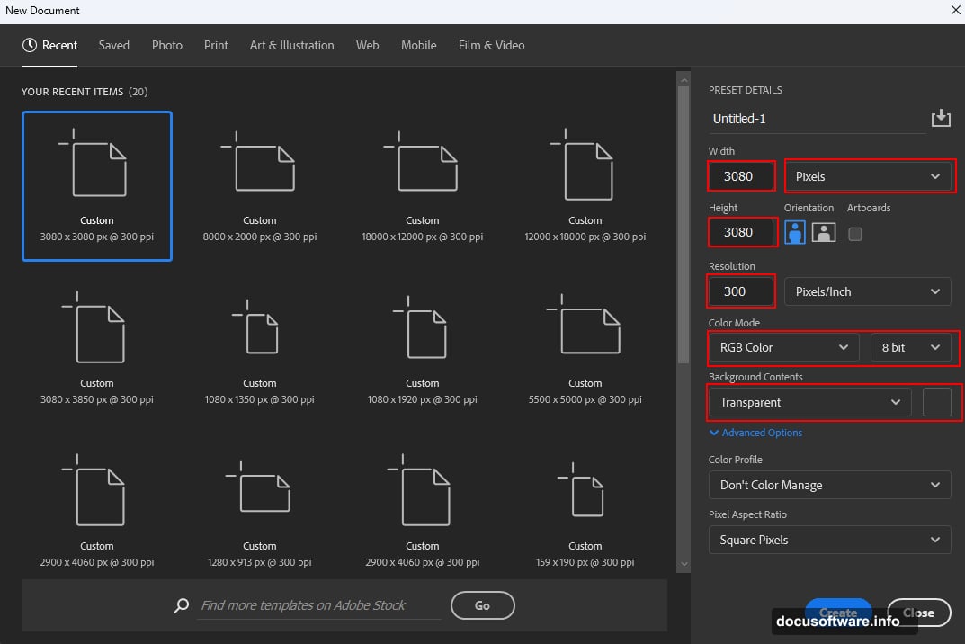
Set Up Your Canvas Properly
Start with the right canvas size and settings. This matters more than most people think.
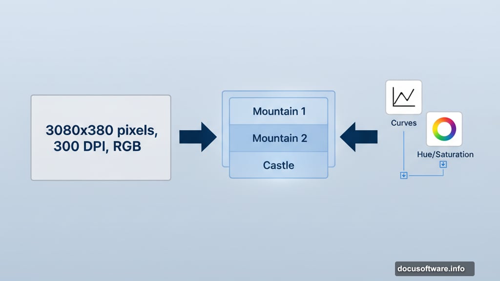
Open Photoshop and create a new document. Set the width and height to 3080 pixels each. Keep the resolution at 300 DPI for print-quality output. Choose RGB color mode with 8-bit depth. Make the background transparent so you can build from scratch.
This square format works great for social media and portfolio pieces. Plus, the high resolution means you can print the final artwork if you want.
Build the Mountain Background
Now comes the fun part. Let’s create that dramatic mountain backdrop.
Place your first mountain image by going to File > Place. Position it using the Transform tool (Ctrl/Cmd + T). Hold Alt and Shift together while dragging to maintain proportions. In Photoshop CC, just hold Alt to scale from the center.
Next, add a Curves adjustment layer clipped to this mountain. Darken the overall tone slightly to create mood. Then add a Hue/Saturation adjustment layer. Shift the colors toward cooler blues and desaturated tones.
Layer the Second Mountain
The background needs depth. So let’s add another mountain layer.
Place your second mountain photo the same way. Position it in front of the first mountain to create depth. But here’s the trick: you need to blend it naturally.
Create a layer mask and invert it by pressing Ctrl/Cmd + I. This hides the entire layer. Now grab a soft round brush with white as your foreground color. Paint back only the parts you want visible. This gives you precise control over the blending.
Add Curves and Hue/Saturation adjustments to this layer too. Match the color temperature and contrast to your first mountain. The layers should look like they belong in the same scene.
Extract the Castle Cleanly
Getting a clean selection on the castle makes or breaks this composition. Take your time here.
Open your castle image and grab the Pen Tool (P). Click to create anchor points around the castle’s edges. For straight edges, just click at each corner. For curved sections, click and drag to create smooth Bezier curves.
Close the path by clicking on your starting point. Then right-click and choose “Make Selection.” Set the Feather Radius to 0 pixels and check Anti-aliased for smooth edges.
Copy (Ctrl/Cmd + C) and paste (Ctrl/Cmd + V) the castle into your main document. Transform it to fit naturally into your mountain scene. The castle should look like it’s actually built into the mountainside.
Add the Knight Character
Your fortress needs someone to defend it. Time to add the knight.
Use the same Pen Tool selection method to extract your knight from his original background. Make sure you get clean edges on the armor details. These reflective surfaces need precise selections.
Place the knight in your scene. Consider the perspective carefully. If your mountains are viewed from a low angle, the knight should match that viewpoint. Scale him appropriately so he doesn’t look like a giant or a toy soldier.
Add subtle shadow beneath the knight’s feet. This grounds him in the scene. A small soft shadow makes him feel connected to the surface he’s standing on.
Composite the Dragon
Dragons are tricky because they need to feel both massive and believable. Here’s how to nail it.
Extract your dragon using the Pen Tool. Dragon wings have lots of intricate edges, so zoom in close while selecting. Those membrane details make the difference between amateur and professional work.
Position the dragon in your sky. Think about the story you’re telling. Is the dragon attacking? Circling? Landing? The pose and placement should convey action and drama.
Add atmospheric perspective to sell the distance. Dragons farther away need less contrast and more blue color shift. This mimics how real atmosphere affects distant objects.
Create Dramatic Lighting
Lighting transforms flat composites into believable scenes. Let’s add those dramatic light rays.
Load your rays brushes into Photoshop. Create a new layer above your castle but below your dragon. Use white or light yellow as your foreground color. Paint light rays streaming down from above.
Set this layer’s blend mode to Screen or Lighten. Lower the opacity until it looks natural, not overdone. Real sunbeams are subtle. They hint at light rather than shouting about it.
Add a layer mask and paint away any rays that shouldn’t appear. They should emerge from behind clouds and interact logically with your scene elements.
Balance Colors Across Elements
Now your scene probably looks like a bunch of random photos stacked together. Time to unify everything.
Add a Curves adjustment layer above all your other layers. Don’t clip it to anything. Adjust the curve to bring all elements into the same tonal range. Usually this means crushing the blacks slightly and lifting the shadows.
Next, add a Color Balance adjustment layer. Shift the overall scene toward warmer or cooler tones depending on your vision. Fantasy scenes often benefit from cooler, desaturated colors with warm accent lights.
Finally, add a Hue/Saturation adjustment. Reduce overall saturation by 10-15%. This removes that “obviously photoshopped” look and makes everything feel like it belongs to the same world.
Add Atmospheric Elements
Empty skies feel dead. Let’s populate yours with life.
Load your cloud brushes and create a new layer. Paint additional clouds to fill empty sky areas. Vary the opacity and brush size for natural-looking cloud formations. Real clouds have different densities and shapes.
On another layer, use your bird brushes to add flying birds. Birds add scale and movement to fantasy scenes. Place them at different sizes and distances to enhance depth perception.
Add a moon if your scene calls for it. Position it carefully so it makes sense as a light source. Your other lighting should roughly correspond to the moon’s location.
Apply Camera Raw for Final Polish
Almost done. One more crucial step separates good from great.
Convert your composite to a Smart Object by right-clicking the top layer group and choosing “Convert to Smart Object.” This preserves all your layers while allowing non-destructive filters.
Go to Filter > Camera Raw Filter. Adjust the following settings to taste:
- Increase Clarity for enhanced midtone contrast
- Add subtle Dehaze to punch up the atmosphere
- Adjust Highlights and Shadows for better dynamic range
- Fine-tune Temperature for color mood
- Add a touch of Vibrance rather than Saturation
The Camera Raw Filter gives you incredible control over the final look. Plus, you can double-click it later to readjust settings without destroying your work.
Common Mistakes to Avoid
Let me save you some headaches by sharing what usually goes wrong with these fantasy composites.

First mistake: Inconsistent lighting directions. If your castle is lit from the left but your dragon from the right, viewers notice immediately. Pick one main light source and stick with it.
Second mistake: Ignoring perspective. Elements shot from different camera angles don’t blend naturally. Match the viewpoint of all your source images as closely as possible.
Third mistake: Over-saturating colors. Beginners think fantasy means neon colors. Actually, slightly desaturated palettes often feel more epic and cinematic.
Fourth mistake: Razor-sharp edges everywhere. Real photography has varying degrees of sharpness based on distance. Add slight blur to distant elements to mimic depth of field.
Why This Technique Matters
Photo manipulation teaches you to see images differently. You start noticing light, perspective, and color relationships everywhere.
These skills transfer beyond fantasy art. Product photography, movie posters, book covers, and advertising all use similar techniques. So mastering photo compositing opens multiple career paths.
Plus, creating surreal scenes flexes your creative muscles. You’re not just editing photos anymore. You’re building entirely new worlds from scratch.
Practice this tutorial multiple times with different source images. Each iteration teaches you something new about blending, lighting, and composition. Over time, these techniques become second nature.
Your imagination is the only real limit to what you can create.