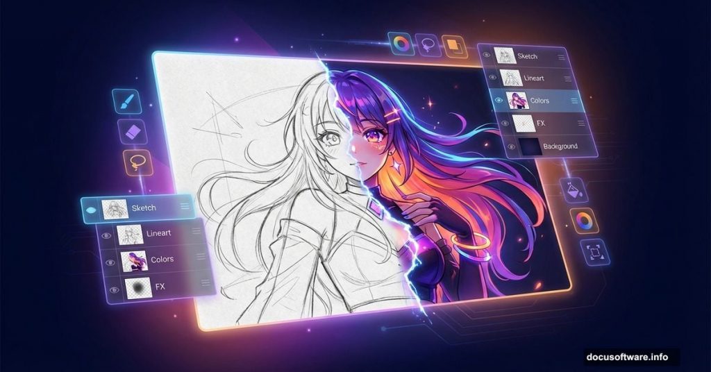
Creating anime artwork in Photoshop might feel intimidating at first. But the process is actually quite logical once you break it down into stages.
This guide walks you through every step — from scanning your pencil outline to adding that final warm light glow. Whether you’re a complete beginner or someone who’s dabbled in digital art, you’ll find something useful here. Plus, the lighting techniques you’ll pick up apply to all kinds of digital illustration, not just anime.
Let’s get started.
Getting Your Line Art into Photoshop
Most artists draw their outline on paper first, then scan it into the computer. That’s a perfectly solid approach.
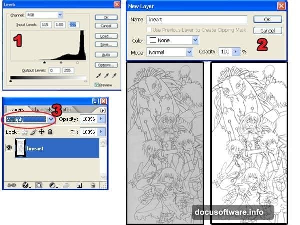
Once your scan is open in Photoshop, the first job is cleaning it up. Go to Image > Adjustments > Levels and drag the black and white input sliders toward the center of the histogram. The goal is simple — pure white background, pure black lines, no gray muddiness in between.
Next, unlock your Background layer by double-clicking it in the Layers palette and hitting OK. Then change the blending mode to Multiply. This turns the white areas transparent, which makes everything much easier later.
One important tip before you move on: check your outlines carefully for broken lines. You’ll be using the Magic Wand tool constantly throughout this process, and gaps in your outlines will slow you down significantly.
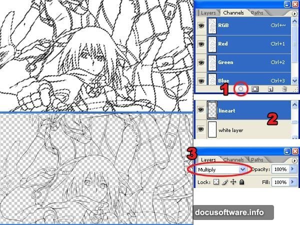
Separating the Outline Layer Cleanly
Here’s where many beginners make a mistake that comes back to bite them later. The Magic Wand tool seems like the obvious choice for selecting around your outline — but it produces jagged edges that look terrible against colored backgrounds.
Instead, use the Load Selection from Layer command. Head to the Channels palette (Window > Channels) and click the load selection button. This creates a selection based on the layer’s tonal information, giving you much smoother, cleaner edges.
Once you have that selection active, press Delete to remove the white background. Then add a new layer beneath your outline layer, fill it white, and set its blending mode to Multiply. Now your outline is floating cleanly on its own layer, ready for coloring.
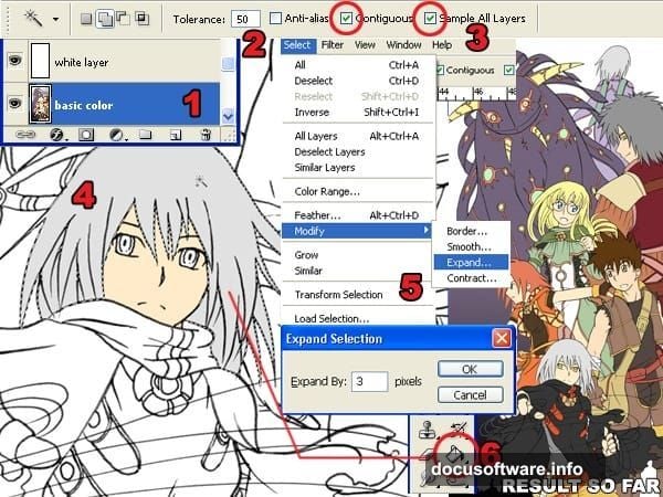
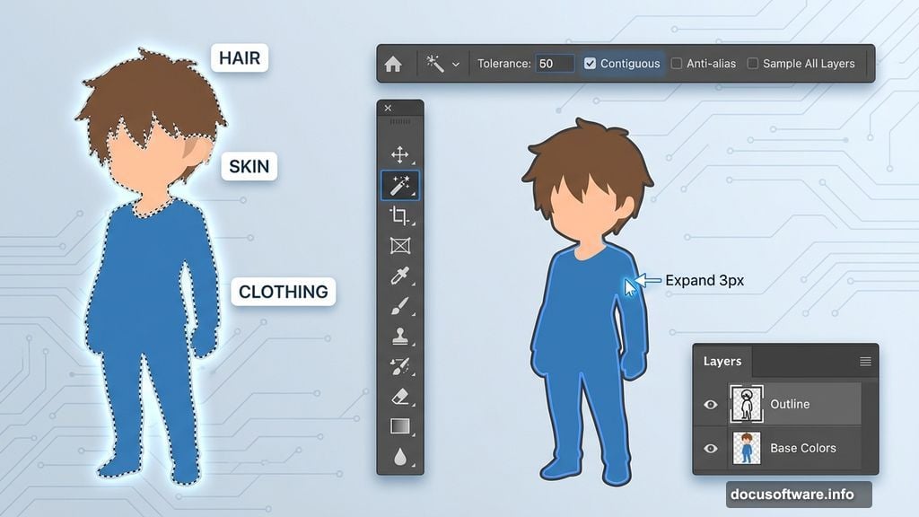
Blocking in Base Colors with the Magic Wand Tool
Now the fun begins. Add a new layer below your white layer — this is where your base colors live.
Select the Magic Wand tool and set the Tolerance to 50 in the option bar. Check both Contiguous and Sample All Layers. Click the area you want to fill, then expand that selection by 3 pixels using Select > Modify > Expand. This tiny expansion prevents frustrating white gaps between your fill color and the outline.
Fill the selection using the Paint Bucket tool. Repeat this process for every section of the image — skin, hair, clothing, background elements, all of it. Take your time here. Good base colors make every step after this much easier.
Adding Shadows with Smart Color Selection
Flat base colors look fine, but shadows bring the character to life. Create a new layer and position it between the white layer and the base color layer.
Switch the Magic Wand tool Tolerance down to 1. This makes it pick up only one specific color at a time. Also uncheck Contiguous and Sample All Layers — you want precision here, not broad selections.
Here’s the key technique for picking realistic shadow colors. Select the Brush tool and set hardness to 100% for sharp edges. Click the foreground color swatch to open the Color Picker. Sample your base color first to get the correct hue. Then shift the color toward darker, more saturated territory — anime shadows typically lean slightly cooler or more saturated than the base color rather than simply going darker.
Paint your shadows while thinking carefully about where your light source sits. Consistent lighting makes a huge difference to how professional the final piece looks.
Dodge and Burn for Gradient Tones
![Photoshop layers panel showing dodge and burn workflow on anime character hair with gradient tonal shading applied]
Solid colors and hard shadows look flat. The Dodge and Burn tools solve that by adding gradient transitions that make everything feel more dimensional.
Duplicate both your base color and shadow layers, placing the duplicates above the originals. You’ll use the originals purely for making Magic Wand selections, and the duplicates for the actual dodge and burn work.
In the Brushes palette (Window > Brushes), turn on Other Dynamics. Set the range to Midtones in the tool options. Set brush hardness to 0% — you want soft, feathered transitions, not hard edges.
Work on the shadow duplicate layer first. Use the Burn tool to deepen the lower portions of shadow areas, then switch to Dodge to lighten the upper edges. Move to the base color duplicate and repeat — Dodge on top, Burn on the bottom. The result is a smooth, rounded quality that makes flat anime shading look genuinely polished.
Reflected Light for Depth and Atmosphere
Reflected light is what separates flat digital art from something that feels three-dimensional. It’s the subtle color that bounces onto your character from the environment around them.
Keep the same Magic Wand settings from before. Set brush hardness to 0% with Other Dynamics still active. For this particular tutorial, a dark purple shade covers the side of the characters away from the light source. A light yellow handles the areas facing toward ambient light.
The colors you choose here depend on your scene. Cool blue reflected light reads as indoor or moonlit. Warm amber suggests firelight or sunset. Pick colors that tell the same story as your environment.
Coloring the Outlines for a Polished Finish
Black outlines everywhere look a bit harsh, especially in color-rich anime art. Tinting your outlines to match nearby colors softens the whole image beautifully.
Select your outline layer in the Layers palette. Lock the transparent pixels by clicking the lock button. Now use the Brush tool and the Eyedropper to sample colors from just beside each section of outline, then paint over the line itself with that color. Hair outlines pick up a darker version of the hair color. Skin outlines shift toward a warm shadow tone.
This step takes patience but the difference is immediately visible. The art starts feeling cohesive rather than like flat shapes behind a black grid.
Building Swirling Smoke Effects
Smoke and energy effects are a staple of anime artwork, and creating them in Photoshop is more fun than you’d expect.
Create a new layer and paint loose zigzag shapes with a hard brush. Then use the Smudge tool to drag those shapes in swirling, flowing motions. Apply Dodge and Burn to build volume — lighter in the center, darker toward the edges.
Load the selection of your smoke layer, then use Select > Modify > Contract to shrink it roughly by half. Create a new layer inside that contracted selection and paint yellow-orange with a soft brush. Nudge this highlight layer slightly upward with the arrow keys. This creates the illusion that light is glowing from within the smoke.

Painting a Dramatic Cloudy Sky
The sky follows almost the same process as the smoke. Create a sky layer and fill it using the Gradient tool, moving from your desired sky color down toward the horizon tone.
On a new layer above that, paint rough horizontal brush strokes for cloud shapes. Smudge them in billowing, rounded motions. Contract the selection, paint a slightly darker version of the cloud color on a new layer above the clouds, and then apply Dodge and Burn to make the clouds feel three-dimensional.
Duplicate the cloud layer, use Free Transform to scale it up, and drop the opacity to 75%. This adds a sense of depth — closer clouds appear more defined while background clouds fade slightly. Use Dodge and Burn on the sky layer itself to establish where your light source sits.
Adding the Light Glow
Create a new layer at the very top of your layer stack. Name it “light.”
In the Brushes palette, enable Other Dynamics and set hardness to 0%. Set your foreground color to white. Paint softly over the areas where light should be strongest — near the light source, on reflective surfaces, along the bright edges of the characters.
This step is subtle but powerful. Done well, it makes the whole scene feel like light is actually hitting it rather than looking like a flat illustration.
Color Temperature Gradient for Realistic Lighting
This final step is a small touch that makes a big perceptual difference.
Create a new layer above everything. Load the selection of your characters. Use the Gradient tool to draw a gradient from orange to blue, going from the light source side to the shadow side of the image. If your light comes from the left, the gradient runs left to right.
Set this layer’s blending mode to Color and reduce the opacity to somewhere between 10 and 20%. This warms the lit areas and cools the shadows, mimicking how natural and artificial light actually behaves. It’s the kind of detail that makes viewers feel a painting is well-crafted without quite knowing why.
Learning these eleven steps gives you a complete workflow for anime-style digital painting. The techniques here — especially the reflected light, color temperature gradient, and dodge-and-burn shading — carry over into portrait painting, concept art, and illustration work far beyond anime specifically. Start with a simple character, work through each stage patiently, and you’ll have something genuinely impressive at the end.