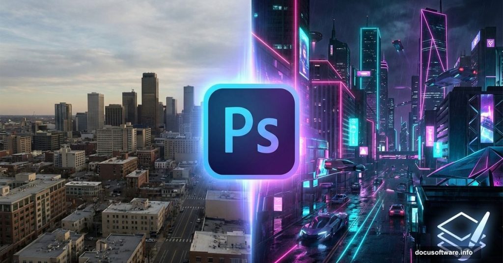
Want to build a cyberpunk metropolis from scratch? This tutorial transforms ordinary city photos into glowing neon landscapes.
No fancy plugins needed. Just Photoshop’s core tools and a few stock images. Plus, the whole process takes under an hour once you get the hang of it.
Let’s break down exactly how to composite multiple cityscapes and add that signature sci-fi atmosphere.
What You’ll Need Before Starting
Grab these resources first. You can’t skip ahead without them.
Required stock images:
- Two different city skyline photos
- Two nighttime city shots
- Planet or moon texture
- Abstract texture overlays
- Bird silhouettes (optional detail)
Photoshop version: CC 2020 or newer works best. Older versions can work but adjustment layers behave differently.
Time commitment: First attempt takes 60-90 minutes. After that? About 30 minutes for similar scenes.
One quick tip. Download all images before opening Photoshop. Switching between browser and editor breaks your creative flow.
Set Up Your Canvas Right
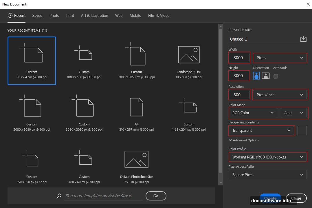
Create a new document with these exact specs. Wrong dimensions mess up the final composition.
Document settings:
- Size: 3000 x 3000 pixels
- Resolution: 300 DPI
- Color mode: RGB 8-bit
- Background: Transparent
Why 3000×3000? Square format works perfectly for social media. Plus, that resolution gives you flexibility to crop or resize later without quality loss.
Hit Ctrl/Cmd + N to open the new document dialog. Then punch in those numbers.
Layer Your Base Cityscape
Time to place your first city image. This becomes the foundation everything else builds on.
Go to File > Place Embedded and select your main city photo. Then grab the transform tool (Ctrl/Cmd + T) to position it.
Resizing trick: Hold Alt while dragging corners. This keeps the image centered and proportional. In Photoshop CC, just Alt alone works. Older versions need Alt + Shift together.
Place the horizon line about one-third up from the bottom. Compositional rule of thirds makes images more dynamic.
Right-click the layer and choose “Rasterize Layer” when happy with placement.
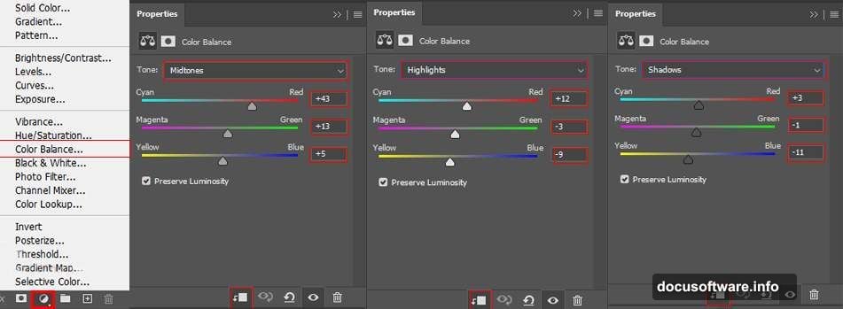
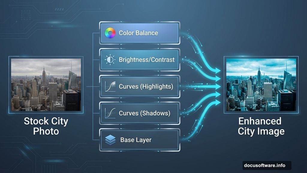
Balance Colors With Adjustment Layers
Raw stock photos rarely match. So we fix that with adjustment layers.
First, add Color Balance:
- Layer > New Adjustment Layer > Color Balance
- Shift midtones toward cyan and blue
- Reduces that typical stock photo warmth
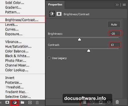
Next, Brightness/Contrast:
- Crank contrast up about 15-20 points
- Slight brightness reduction adds moodiness
- Don’t overdo it or shadows crush
Then two Curves adjustments:
First curves layer controls highlights. Add it then immediately invert the mask (Ctrl/Cmd + I). Grab a soft white brush and paint over bright areas you want to emphasize.
Second curves layer handles shadows. Same process but paint on dark areas needing depth.
Why two separate curves? More control. One adjustment for lights, one for darks. Professional compositors always separate these.
Add Atmospheric Glow
Create a new layer above everything. Switch to a soft round brush.
Pick an orange color (try #FF8C00). Paint loosely across the bottom third of your image. Don’t worry about precision here.
Set that layer’s opacity to 75%. This creates that signature sci-fi atmospheric haze.
Pro tip: Use a Wacom tablet if you have one. Mouse painting looks choppy. Tablet pressure sensitivity creates natural gradients.
Composite Your Second City
Place your second cityscape image the same way. File > Place Embedded, then position with transform tool.
This layer sits above your base city. We’re building depth through layering.
The selection process:
Grab the Pen Tool (P). Yeah, it’s tedious. But it’s the only way to get clean selections around complex buildings.
Click around building edges to create anchor points. Connect them to form a closed path. Right-click and choose “Make Selection” when done.
Then hit the layer mask button. This cuts out everything except your selected buildings.
Pen tool shortcuts:
- Hold Ctrl/Cmd to switch to Direct Selection temporarily
- Alt to convert anchor points from corner to curve
- Spacebar to pan while drawing
The first building takes forever. But you’ll speed up with practice. I can select a complex skyline in about 10 minutes now.
Stack Night City Elements
Now we add those glowing windows and neon lights. This transforms day into night.
Place your first night city image. Use the same placement and masking technique. But this time select only the brightest building clusters.
Blending mode trick: Set this layer to “Screen” or “Lighten.” This makes dark areas transparent while keeping bright lights visible.
Add your second night image. Stack it differently for depth. Maybe offset it slightly left or right.
Vary the opacity between 60-80% on these layers. Full opacity looks too harsh.
Create Depth With Textures
Abstract textures add grit and atmosphere. They separate amateur composites from professional ones.
Place your first texture. Set blend mode to “Overlay” or “Soft Light.” Drop opacity to 20-30%.
Position your second texture on a new layer. Try “Multiply” blend mode this time. This darkens and adds grain.
What textures work best:
- Dust and scratches
- Subtle gradients
- Light leaks
- Film grain
Don’t go overboard. One or two texture layers maximum. More than that looks muddy.
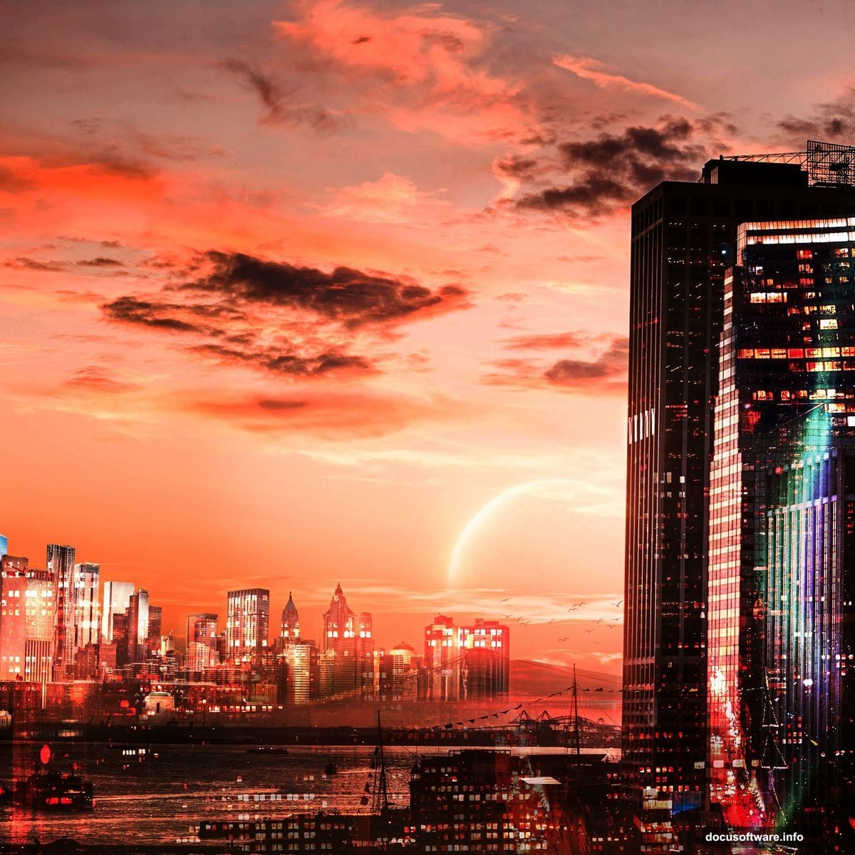
Add Celestial Elements
That planet texture? Place it in your sky area. Scale it large enough to feel imposing.
Set blend mode to “Screen” to make it glow. Then reduce opacity until it feels atmospheric rather than pasted on.
Moon or planet positioning: Put it off-center. Dead center feels static. Place it in the upper third, slightly left or right.
Add a subtle outer glow if needed. Right-click layer > Blending Options > Outer Glow. Use a soft yellow or orange.
Birds for Scale Reference
Those bird silhouettes add a crucial element. They give viewers a sense of massive scale.
Place a few scattered across your scene. Make them tiny. Really tiny. That’s what sells the illusion of huge buildings.
Vary their sizes slightly. Birds farther away should be smaller. Basic perspective but easy to forget.
Set their opacity around 70%. Full black birds look flat.
Final Polish With Camera Raw
Almost done. Last step brings everything together.
Go to Filter > Camera Raw Filter. This gives you powerful color grading tools.
My typical adjustments:
- Boost Clarity about +15 to +20
- Add slight Dehaze for atmosphere
- Push Vibrance up 10-15 points
- Cool down Temperature slightly
- Add subtle vignette
The vignette draws eyes toward your composition center. Drag the Vignetting slider to about -15.
Play with the color wheels in Camera Raw. Push shadows toward blue. Lift highlights toward orange. This creates that cinematic teal-and-orange look.
Common Mistakes to Avoid
Oversharpening: Resist cranking up sharpness. Soft atmospheric scenes shouldn’t be razor-sharp.
Inconsistent light sources: Make sure all your city elements share similar lighting direction. Mixed lighting screams “fake composite.”
Forgetting to match grain: Your placed images probably have different noise levels. Add a slight noise filter to unify them. Filter > Noise > Add Noise at about 2-3%.
Skipping adjustment layers: Always use adjustment layers instead of applying effects directly. You can’t undo direct edits easily.
Save Your Work Properly
Save as PSD to preserve all layers. You’ll want to revisit and tweak later.
Then export a JPEG for sharing. File > Export > Export As. Choose JPEG quality around 90-95%.
Export settings:
- Resolution: 72 DPI for web
- Color space: sRGB
- Quality: 90%
Save at full 3000×3000 resolution. You can always make it smaller. But you can’t add pixels back later.
Make It Your Own
This tutorial gives you the framework. But don’t just copy it exactly.
Try different city combinations. Swap in other textures. Change the color grading to green instead of orange. Add rain or fog effects.
The technique matters more than the specific result. Once you understand layering, masking, and adjustment layers, you can create infinite variations.
Your first attempt won’t be perfect. Mine looked pretty rough too. But each composite teaches you something new about light, color, and composition.
The only way to improve? Make more scenes. Experiment. Break things. Figure out why they broke and fix them.
That’s how you develop your own style instead of just following tutorials forever.