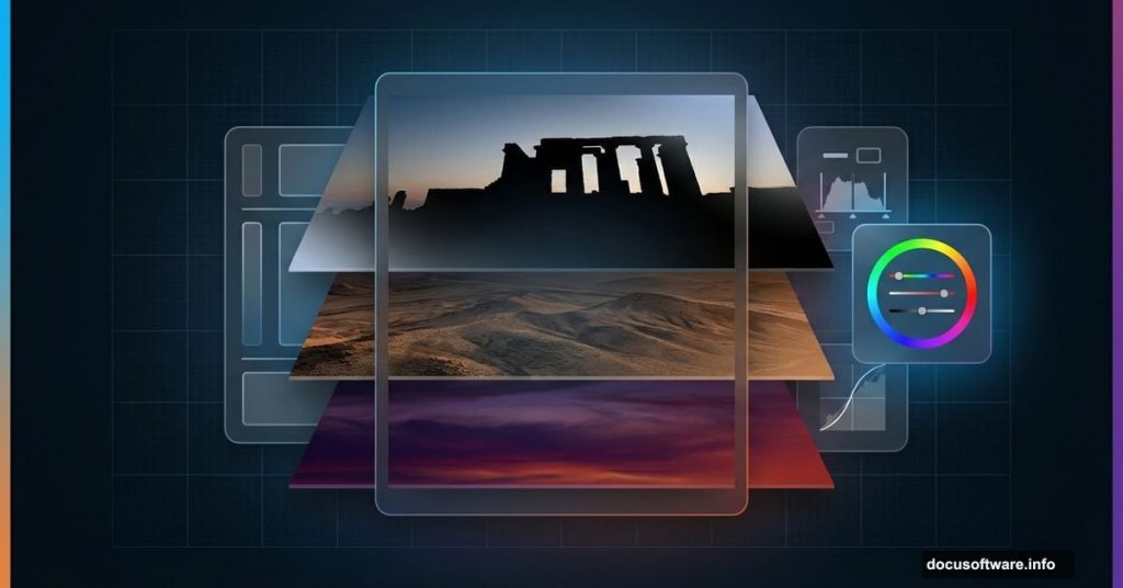
Want to create dramatic landscapes that look like abandoned worlds? This technique works for game concept art, book covers, or just stunning portfolio pieces.
I’m breaking down how to blend multiple photos into one cohesive ruined landscape. You’ll master layer masking, color grading, and lighting tricks that make everything look naturally weathered. Plus, this method works for any apocalyptic or fantasy scene you dream up.
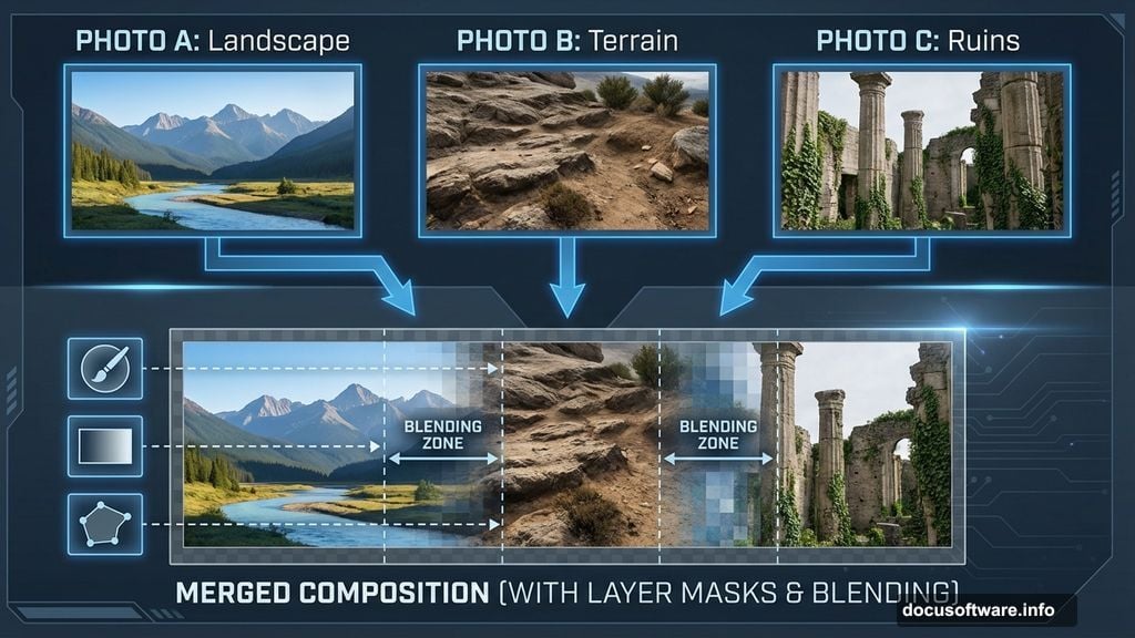
Gather Your Source Images First
Before touching Photoshop, collect your raw materials. You need at least three landscape photos with similar perspectives. Also grab a few rock formations and ruin references.
Why multiple sources? Single photos rarely have everything you need. One might have perfect lighting but boring terrain. Another has great textures but wrong colors. So you’ll frankenstein the best parts together.
Here’s what worked for my scene: two desert landscapes, one mountain vista, three rock formations, and two architectural ruins. Mix and match until you find combinations that spark ideas.
Set Up Your Canvas and Base Layer
Create a new document at 3000×1500 pixels. That’s wide enough for dramatic panoramas without slowing down your workflow.
Fill the background with white. Then drag your primary landscape onto this canvas using the Move Tool (V). Convert this layer to a Smart Object immediately. That lets you apply filters non-destructively later.
Smart Objects save your bacon when you change your mind. And trust me, you’ll change your mind constantly during this process.
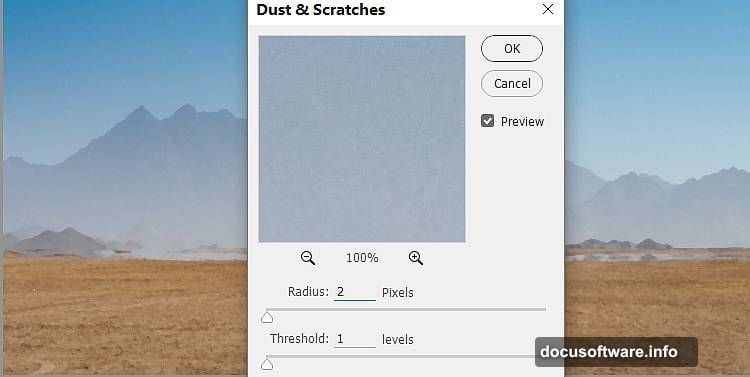
Clean Up the Base with Dust & Scratches
Go to Filter > Noise > Dust & Scratches. Set Radius to about 5 pixels and Threshold to 0. This smooths out distracting details in your background.
But here’s the trick. You don’t want this effect everywhere. Click the filter mask and grab a soft black brush. Paint over your foreground and middle ground to bring back detail where viewers actually look.
This selective blur focuses attention on your main subjects later. Plus, it makes different photos blend more naturally since they’ll share a similar softness level.
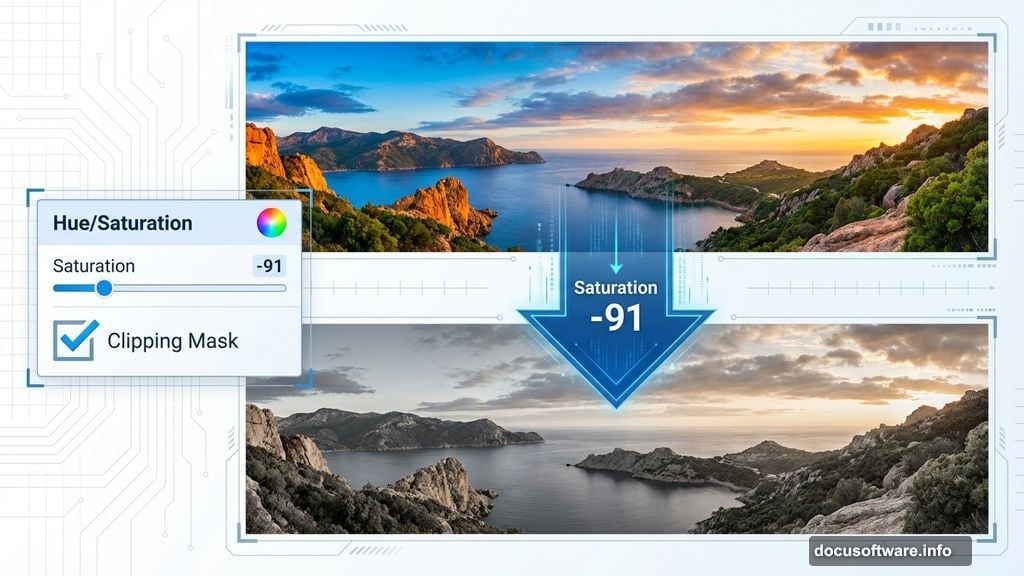
Desaturate for Mood
Add a Hue/Saturation adjustment layer and set it as a Clipping Mask. Drag the Saturation slider down to -91.
Why so extreme? Color photos fight each other. One image has warm sunset tones, another has cool shadows. By removing most color, you create a neutral base that accepts your custom color grading later.
Besides, desaturated scenes feel more desolate and abandoned. That’s exactly the mood you want for ruins at dusk.
Build New Ground from Another Photo
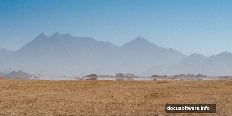
Open your second landscape image. Use the Rectangular Marquee Tool (M) to select just the lower terrain section. Drag this into your main document.
Now add a layer mask and grab a soft black brush. Paint away the edges until this new ground merges seamlessly with your base layer. Focus on hiding any obvious seams or mismatched textures.
This layering technique lets you build impossible landscapes. Take the best ground from one photo, the best sky from another, and rocks from a third. Reality becomes optional.
Match the New Ground’s Color
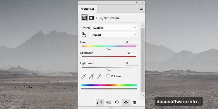
Create another Hue/Saturation adjustment layer for this ground section. Set Saturation to -87.
Notice these aren’t identical saturation values. Each photo needs slightly different adjustments to match. Don’t just copy settings blindly. Instead, adjust until your eyes say the layers belong together.
The goal? When someone views your final image, they should never guess it came from multiple sources.
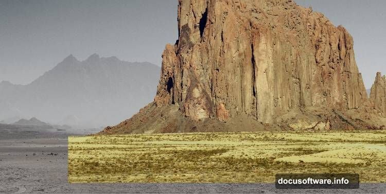
Add Rock Formations for Depth
Open your rock image and isolate it from the background. Your method doesn’t matter. Pen Tool, Select and Mask, or quick selection all work fine.
Convert the isolated rock to a Smart Object. Place it on the right side of your scene. Add a layer mask and use a medium-hard black brush to remove any ground the rock brought with it.
Medium-hard brushes give you control without creating obvious cutout edges. Vary your brush hardness depending on what you’re masking.
Sharpen Strategic Areas
Use the Lasso Tool (L) to select the lower left portion of your rock. Go to Filter > Sharpen > Unsharp Mask. Set Amount to 150%, Radius to 1 pixel, and Threshold to 0.
Why sharpen? It makes this rock feel closer to the viewer. Selective sharpening creates depth perception. Sharper areas read as foreground, softer areas recede into distance.
Just don’t sharpen everything. That flattens your image instead of adding dimension.
Desaturate Rocks to Match
Add a Hue/Saturation adjustment layer clipped to your rock layer. Drop Saturation to -88.
Seeing a pattern? Every element gets desaturated individually. This ensures consistent color across all your Frankensteined pieces. Later you’ll add color back globally for a unified palette.
Darken Edges with Curves
Create a Curves adjustment layer to reduce overall brightness on the rock. Drag the curve down slightly.
But here’s the refinement. On the layer mask, use a soft black brush to remove darkening from the sharpened area you created earlier. This keeps your focal point bright while pushing edges into shadow.
This dodging and burning technique guides viewer attention. Bright areas attract eyes, dark areas create mystery and depth.
Layer Your Background Sky
Open your third landscape image and drag it into your main document with the Move Tool. Place this layer below your ground layers.
This creates your distant background and sky. Position it so the horizon line aligns roughly with your other elements. Don’t worry about perfect alignment. Slight mismatches add to the surreal, constructed feeling.
Blend Multiple Ruins Into the Scene
Open your ruin reference images. Isolate the architectural elements from their backgrounds. Scale and position them throughout your landscape.
Place some ruins in the foreground for impact. Add smaller ones in the distance for scale and depth. Vary their angles and states of decay. Too much symmetry looks artificial.
Each ruin needs its own Hue/Saturation adjustment to match the overall desaturation. Also add shadows where ruins meet the ground. A simple Curves adjustment layer with selective masking handles this.
Create Atmospheric Perspective
Distant objects need less contrast and detail than foreground ones. So create a Curves adjustment layer for background elements. Flatten the curve slightly to reduce contrast.
Also add a slight blue tint to distant areas. This mimics atmospheric haze. Use Color Balance or Photo Filter adjustment layers set to cool tones.
Meanwhile, keep foreground elements contrasty and relatively neutral. This separation creates convincing depth even though everything came from different photos.
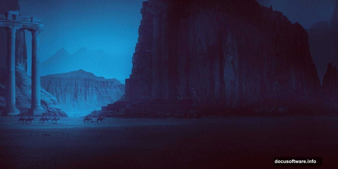
Add Dusk Lighting
Now for the magic. Create a new layer set to Overlay blend mode. Use a large soft brush with orange and purple tones. Paint light across the sky and highlights on your ruins.
This simulates golden hour lighting. Orange represents the last sunlight. Purple fills the shadows as dusk approaches. Don’t go overboard. Subtle shifts feel more natural than dramatic color splashes.
Also add a Curves adjustment to warm your highlights slightly. Drag the blue curve down in highlights. This pushes oranges and yellows forward.
Enhance Shadows and Depth
Create a new layer set to Multiply blend mode. Use a soft black brush at low opacity (around 20%). Paint shadows at the base of rocks, behind ruins, and in crevices.
Multiply mode darkens without blocking detail. Build up shadow depth gradually with multiple brush strokes. This beats trying to nail it in one pass.
Shadows anchor objects to the ground. Without them, elements float unconvincingly no matter how good your masking is.
Add Light Sources
Place warm glowing points of light within your ruins. Use a soft yellow or orange brush on a new layer set to Linear Dodge (Add) blend mode.
Then create another layer below it set to Outer Glow. This adds light spill onto surrounding surfaces. Adjust the glow color and size until it looks like actual illumination.
These light sources suggest life or mystery within the ruins. They also provide compositional anchors that guide viewer attention through the scene.
Final Color Grading
Add a Color Lookup adjustment layer. Try different presets like “Moonlight” or “Late Sunset.” These apply professional color grades instantly.
Don’t like any preset exactly? Reduce the layer opacity to 50-70%. This applies the grade more subtly. You can also mask areas where the effect seems too strong.
Finally, add a Curves adjustment to fine-tune your overall contrast. Bring down highlights slightly and lift shadows. This creates that compressed, cinematic feel.
Polish with Selective Sharpening
Create a merged copy of all visible layers (Ctrl+Alt+Shift+E). Go to Filter > Sharpen > Unsharp Mask. Set Amount to 100%, Radius to 1.5 pixels, Threshold to 0.
Add a layer mask and fill it with black. Then paint white on your focal points with a soft brush. This reveals sharpening only where you want viewers to look.
Selective sharpening adds that final professional polish. It makes important details pop without creating harsh, oversharpened artifacts everywhere.
Why This Technique Beats Others
Most tutorials tell you to blend photos but skip the crucial details. They don’t explain why you sharpen selectively or how Multiply mode creates natural shadows.
This method works because it mimics how light actually behaves. Distant objects lose contrast. Foreground elements stay sharp. Light sources cast realistic spill. Atmospheric haze shifts colors.
Plus, working with Smart Objects means you can revise any step without starting over. Made your rocks too dark? Just adjust that specific Curves layer. No need to recreate everything.
Master these fundamentals and you’ll build any fantasy or post-apocalyptic scene you imagine. The specific ruins or landscapes don’t matter. The blending principles stay the same.