You don’t need to be a Photoshop wizard to create stunning mixed-media compositions. Most people think complex artwork requires years of experience. Wrong.
This guide breaks down shape layers, smart objects, and masking techniques into simple steps anyone can follow. Plus, you’ll learn tricks that work across Adobe Illustrator too. By the end, you’ll understand how professional designers build layered compositions from basic geometric shapes.
Let’s start building.
What You’ll Need Before Starting
First, gather your resources. You can’t cook without ingredients.
Essential Tools:
- Adobe Photoshop (any recent version works)
- Adobe Illustrator (for custom shape creation)
- Basic stock photos and textures
Recommended Stock Resources:
- Paper textures for backgrounds
- Model photography for focal points
- Halftone patterns for visual interest
- Watercolor textures for organic elements
- Brush stroke overlays
- Grunge brushes for texture

You can substitute similar resources if specific links are unavailable. The techniques matter more than exact images.
Setting Up Your Canvas
Start with a blank workspace. Don’t overthink dimensions at this stage.
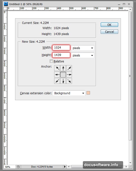
Create a new file around 2000×2500 pixels at 300 DPI. That gives you flexibility to scale up or down later. You can always adjust canvas size mid-project using Image > Canvas Size.
Here’s the reality. Most designers start with rough dimensions and refine as they work. Perfectionism at this stage wastes time.
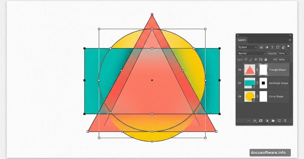
Building Your Foundation With Geometric Shapes
Shape layers form the backbone of this design. They’re vector-based, which means they scale perfectly without quality loss.
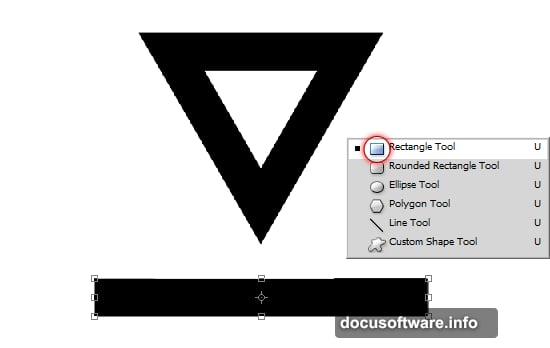
Creating the Triangle Base
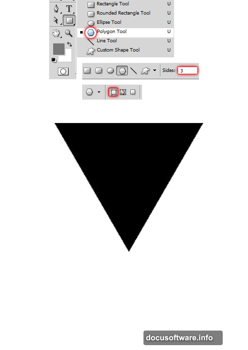
Select the Polygon Tool from the toolbar. Click the canvas once to open the polygon options dialog.
Key settings:
- Set sides to 3 (creates a triangle)
- Choose “Shape Layers” option (not Fill Pixels)
- Draw your triangle
This creates a new layer with an editable vector path. That path is powerful. You can manipulate it, duplicate it, and use it to cut holes or create complex shapes.
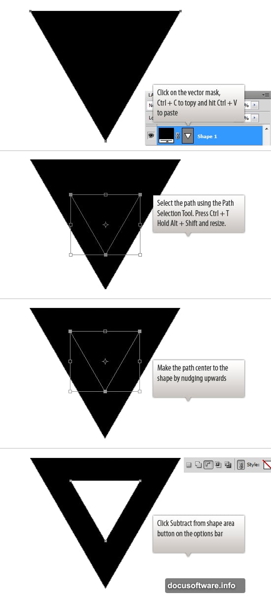
Cutting Holes in Shapes
Now comes the clever part. You can use shape paths to subtract from other shapes.
Copy your triangle’s path (Ctrl+C, Ctrl+V). Scale the copied path down using Transform (Ctrl+T). Position it inside the original triangle.
Then select “Subtract From Shape Area” from the top options bar. The inner triangle disappears, leaving a hollow frame. This technique works with any shape combination.
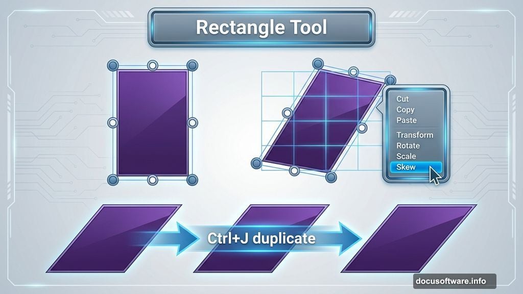
Adding Slanted Rectangles
Use the Rectangle Tool to draw a long, narrow rectangle. Press Ctrl+T to enter Transform mode.
Right-click the shape and choose “Skew.” Click and drag the corners to create a slanted effect. This adds dynamic angles to your composition.
Duplicating and Flipping Shapes
Press Ctrl+J to duplicate your slanted rectangle. With the duplicate selected, press Ctrl+T again and choose “Flip Horizontal.”
Now you have matching slanted elements. Position them on opposite sides of your triangle.
Precise Rotation and Positioning
Press Ctrl+T and type -60 in the rotation field. Use the Info palette (F8) to check exact angles and coordinates.
Rotate the second slanted rectangle to match. Position both shapes underneath the triangle layer in your layer stack. This creates depth and hierarchy.
Why Layer Order Matters
Photoshop renders layers from bottom to top. Shapes on lower layers appear behind upper layers. Understanding this stacking principle is crucial for complex compositions.
Working With Smart Objects
Smart objects preserve original image quality. They’re essential for non-destructive editing.
Convert any layer to a smart object by right-clicking the layer and choosing “Convert to Smart Object.” Now you can scale, rotate, and apply filters without permanently altering the original.
Benefits of Smart Objects
Transform smart objects repeatedly without quality degradation. Apply filters that remain editable. Link multiple instances that update simultaneously.
Regular layers lose quality with each transformation. Smart objects don’t. That’s huge for iterative design work.
Masking Techniques for Clean Edges
Layer masks hide parts of a layer without deleting pixels. Click the mask icon at the bottom of the Layers panel to add a mask.
Paint with black on the mask to hide areas. Paint with white to reveal them. Gray values create transparency.
Quick Masking Workflow
Select your layer. Add a mask. Choose a soft brush. Paint with black to hide unwanted areas.
Need to see what you masked? Alt+click the mask thumbnail. This shows the mask in isolation, making it easier to refine edges.
Building Visual Interest With Textures
Import your texture files. Place them above your shapes but below your main subject.
Set texture layers to blend modes like Multiply, Overlay, or Soft Light. These modes let underlying colors show through while adding texture.
Adjusting Texture Opacity
Most textures look too strong at 100% opacity. Reduce opacity to 30-50% for subtle effects. The goal is adding depth without overwhelming your composition.
Use layer masks to control where textures appear. This creates selective texture application that looks more intentional.
Integrating Photography Elements
Import your main model photo. Remove the background using Select > Subject for quick selections. Refine edges using Select and Mask for cleaner results.
Place your subject as a smart object. This preserves quality and allows non-destructive adjustments.
Blending Photos With Shapes
Position photo elements to interact with your geometric shapes. Parts of the subject should overlap shapes while other parts appear behind them.
This interaction creates visual depth. Flat compositions look amateur. Layered compositions with intentional depth feel professional.
Adding Decorative Elements
Import additional graphics like halftone patterns, watercolor splashes, or brush strokes. These elements add personality and visual complexity.
Position decorative elements thoughtfully. Don’t just scatter them randomly. Each element should guide the viewer’s eye or balance the composition.
Creating Visual Hierarchy
Larger elements attract attention first. Place your most important elements at larger scales. Supporting details work better at smaller sizes.
Use color contrast to emphasize key areas. Bright colors pop against muted backgrounds. Dark elements stand out on light backgrounds.
Color Adjustment Strategies
Add adjustment layers above your composition. Go to Layer > New Adjustment Layer and choose from options like Curves, Hue/Saturation, or Color Balance.
Adjustment layers affect everything below them in the layer stack. Use layer masks on adjustment layers to control where color changes apply.
Creating Color Harmony
Stick to a limited color palette. Three to five main colors usually work better than a rainbow explosion.
Use complementary colors (opposites on the color wheel) for high contrast. Use analogous colors (neighbors on the color wheel) for harmony.
Final Touches and Polish
Zoom out to view your full composition. Look for areas that feel empty or overly busy.
Add subtle shadows under elements using layer styles. Set blend mode to Multiply and reduce opacity. This grounds elements and adds realism.
Sharpening Your Final Image
Merge all layers into a new layer (Ctrl+Alt+Shift+E). Apply subtle sharpening with Filter > Sharpen > Smart Sharpen.
Set Amount to 80-120% and Radius to 0.8-1.2 pixels. Don’t over-sharpen. Subtle sharpening enhances details without creating halos.
Exporting Your Finished Artwork
Save your working file as PSD format. This preserves all layers and editability.
For sharing, export as JPEG or PNG. Go to File > Export > Export As. Set quality to 90% for JPEGs to balance file size and quality.
Choose PNG for transparent backgrounds or graphics that need maximum quality. JPEG works better for full-color artwork with no transparency needs.
Common Mistakes to Avoid
Don’t flatten your layers prematurely. Always keep a layered working file. Flattening destroys editability.
Avoid using too many different fonts or conflicting styles. Visual chaos overwhelms viewers. Consistency creates professionalism.
Don’t ignore composition principles. Balance, contrast, and focal points matter. Even creative designs benefit from solid fundamentals.
What Makes This Approach Work
This technique combines vector precision with photographic realism. Shape layers provide clean geometric elements. Photos add human interest and realism. Textures create depth and visual richness.
The result feels both modern and organic. Geometric shapes bring structure. Organic elements bring life. That combination works across countless design applications.
Start simple with basic shapes. Build complexity gradually by adding layers. This approach prevents overwhelm and produces better results than trying to create everything at once.