Want to make text that looks delicious enough to eat? This Photoshop tutorial transforms plain typography into glazed, frosted donuts complete with sprinkles and drips.
The technique works for bakery logos, social media graphics, or any project needing that sweet touch. Plus, you’ll master layer styles and masking along the way.
Let’s bake some letters.
What You’ll Need Before Starting
First, grab the Joint by Pizzadude font from DaFont. It’s free and gives that perfect rounded donut shape.
You’ll work in Photoshop CS6 or newer. The tutorial takes about 45 minutes for beginners. Intermediate users can finish faster.
The core techniques involve gradient overlays, bevel effects, and layer masking. Nothing too complex. But you’ll combine them in ways that create realistic depth and texture.
Building the Canvas and Background
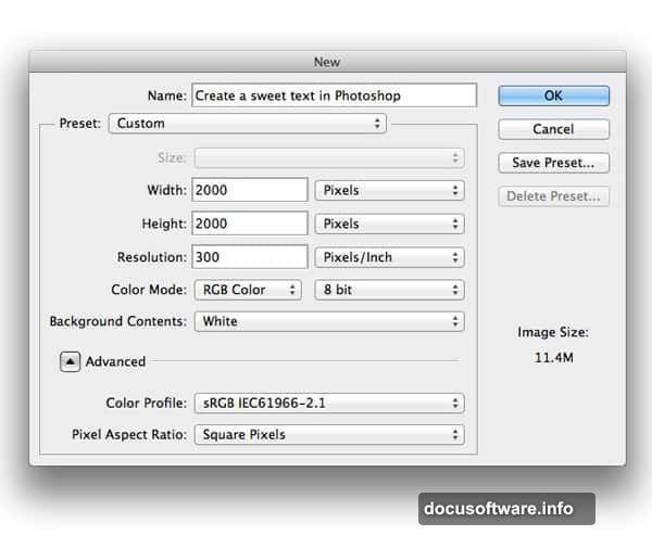
Create a new document at your preferred size. The tutorial doesn’t specify exact dimensions because the effect scales to any resolution.
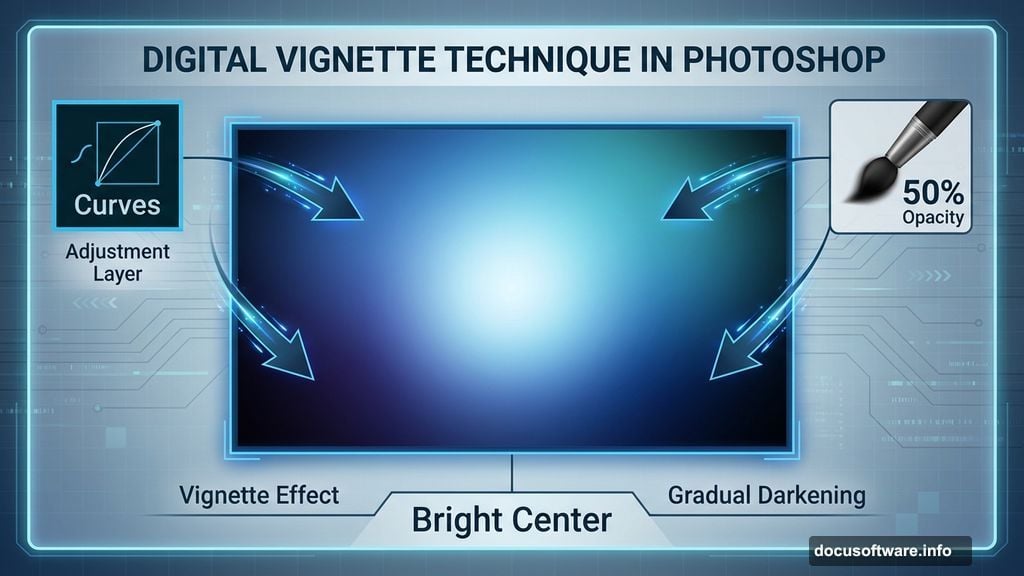
Fill your background with any color. Then add a gradient overlay through the Layer Style menu. This creates subtle depth behind your text.
Next comes a Curves adjustment layer. Use a large, soft black brush at 50% opacity to darken the edges. This vignette effect makes your donut text pop from the background.
The center stays bright while corners fade to shadow. It’s a classic technique that directs viewer attention exactly where you want it.
Creating the Base Donut Shape
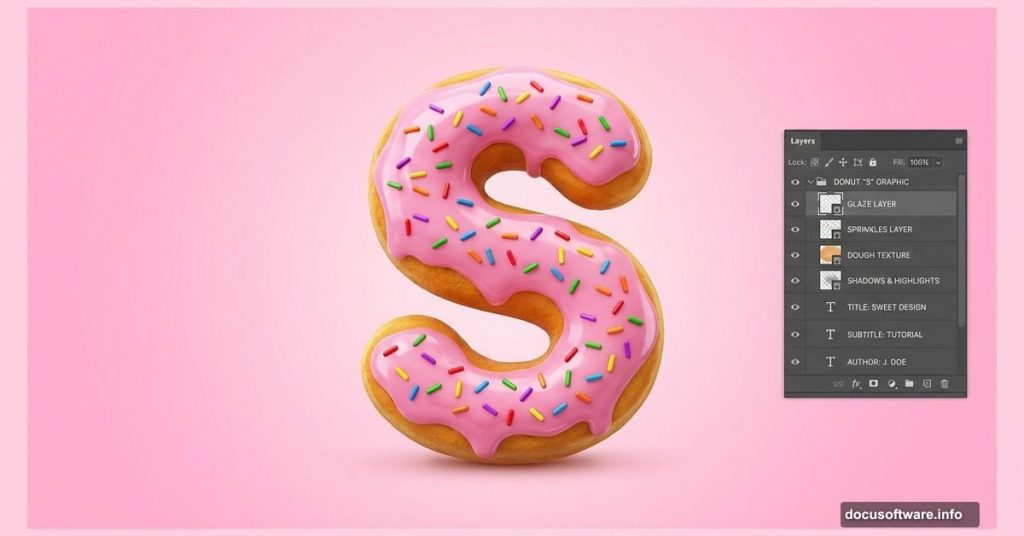
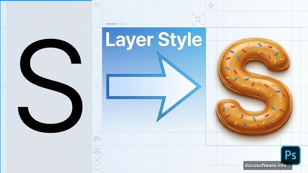
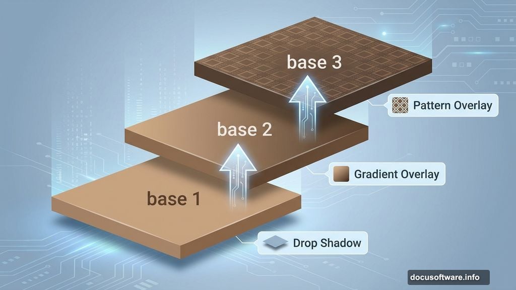
Start with a single letter to master the technique. The tutorial uses “S” as an example.
Type your letter at 90px using the Joint font. Name this layer “base 1” because you’ll build multiple layers for depth.
Now open Layer Style and add three effects. First, Drop Shadow creates separation from the background. Then Gradient Overlay gives the dough its golden-brown color. Finally, Bevel and Emboss adds dimension.
The gradient is key here. Choose browns that transition from light toast to darker caramelization. Real donuts aren’t uniform in color, so neither should your text be.
Stacking Layers for Depth
Duplicate your “base 1” layer and rename it “base 2.” Move it up slightly to create a stacked effect.
Adjust the Layer Style settings on this new layer. Tweak the Drop Shadow to enhance separation. Modify the Gradient Overlay to show a different tone of dough. Update Bevel and Emboss for varied lighting.
This stacking technique mimics how real donuts have irregular thickness. Some parts catch more light. Others sit in shadow. By layering styled text, you replicate that natural variation.
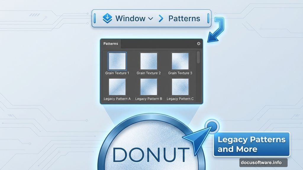
Duplicate again to create “base 3.” This time, add a Pattern Overlay using Photoshop’s built-in grain texture. It adds subtle surface detail that sells the fried dough texture.
If you’re using CS6 or newer, find patterns under Window > Patterns. Select “Legacy Patterns and More” from the panel menu to access the grain texture.
Adding the Frosting Layer
Now for the fun part. Create a new layer above your donut base.
Hold Ctrl/Cmd and click the “base 3” layer thumbnail to load its selection. Then go to Select > Modify > Contract and shrink the selection by a few pixels. This ensures your frosting sits inside the donut edges rather than covering them completely.
Name this layer “Cream S” and fill it with any color. The color doesn’t matter yet because you’ll replace it with gradient and bevel effects.
Open Layer Style again. Add Drop Shadow so frosting casts shadow on the dough below. Then apply Gradient Overlay with pastel colors—pink, white, chocolate brown, whatever frosting flavor you’re creating.
The Bevel and Emboss effect makes frosting look glossy and thick. Add Contour to enhance the shine. Real frosting catches light unevenly, creating highlights and dark spots.
Making Frosting Look Realistic
Perfect frosting looks fake. Real frosting drips, pools unevenly, and has irregular edges.
Add a layer mask to your frosting layer. Use a soft brush to erase small sections along the outer edge. This creates the appearance of drips and imperfect coating.
Don’t go overboard. Subtle irregularities work better than obvious chunks missing. Think about how gravity affects frosting—it drips down, pools at the bottom, and thins at the top.
You can also vary brush opacity to create semi-transparent sections where frosting is thin. This adds another layer of realism.
Adding Sprinkles for Detail
Sprinkles are optional but they really sell the donut effect. Create a new layer above your frosting.
Use a small, hard brush to paint individual sprinkles in bright colors. Vary the size and rotation so they look scattered naturally. Real sprinkles don’t line up perfectly—some are sideways, others overlap, many cluster in certain areas.
Add a tiny Drop Shadow to each sprinkle so they cast subtle shadows on the frosting. This anchors them to the surface rather than looking pasted on.
Alternatively, use custom sprinkle brushes if you have them. But hand-painting gives you more control over placement and density.
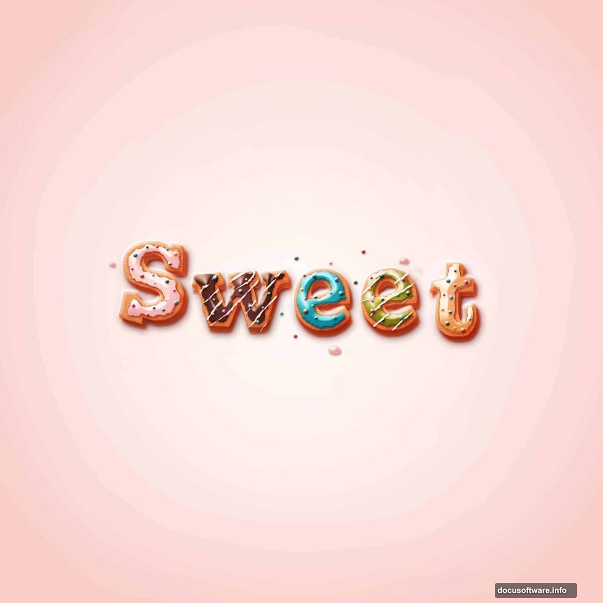
Repeating for Additional Letters
Once you’ve perfected one letter, the rest goes faster. Create a new group for each letter and repeat the process.
The tutorial uses separate groups to keep layers organized. Otherwise you’ll end up with dozens of layers and lose track of which belongs to which letter.
Each letter should match the others in style but can vary slightly in details. Maybe one letter has more sprinkles. Another has thicker frosting in spots. These small differences make the overall composition feel handmade rather than template-stamped.
Common Issues and Quick Fixes
Some users report the “base 3” layer making their donut look burnt. This happens if your gradient overlay uses colors that are too dark or saturated.
Solution: Lighten your gradient colors slightly. Real fried dough ranges from pale tan to medium brown, not deep chocolate. Adjust the gradient until it looks appetizing rather than overcooked.
Can’t find the grain pattern in Step 6? Go to Window > Patterns, click the panel menu, and select “Legacy Patterns and More.” This loads Photoshop’s default pattern library including the grain texture you need.
Pattern overlay not showing up? Make sure your pattern layer is above the text layer in your layer stack. Also verify that Pattern Overlay is checked and set to a visible opacity in Layer Style.
Making Other Food Text Effects

This technique adapts easily to other treats. Use the same layer structure but change colors and textures.
For cookies, swap brown gradients for tan ones and use a different pattern for texture. Add chocolate chip “sprinkles” instead of frosting.
For cake, make frosting thicker and more opaque. Add texture to the frosting itself using pattern overlays or subtle noise filters.
For candy, use bright solid colors instead of gradients. Add sharp highlights with white paint on a new layer to simulate glossy coating.
The core principle stays the same: stack styled layers, add texture, and use masking for imperfection.
When to Use This Effect
Donut text works great for bakery branding, dessert menus, and food-related social media posts. It’s playful and immediately communicates “sweet treats.”
But be strategic. This effect is bold and attention-grabbing. Use it for headlines and key phrases, not body text. Too much decorative typography becomes illegible and overwhelming.
The effect also works well for children’s content, party invitations, or any design that needs a fun, casual vibe. It’s less appropriate for serious or professional contexts.
Consider your audience. A donut text logo works for an indie cupcake shop. It probably doesn’t work for a law firm.
The Techniques You Actually Learned
This tutorial teaches more than just donut text. You practiced layer organization, which matters for any complex Photoshop project.
You learned how gradient overlays create dimension and color variation. How bevel effects add lighting and depth. How layer masks create realistic imperfection.
These same techniques apply to countless other effects. Once you understand how to stack styled layers, you can create realistic metal, wood, fabric, or any other texture.
The frosting drip technique using layer masks works for paint drips, melting effects, or liquid of any kind. The sprinkle method applies to confetti, stars, or any scattered decorative element.
So while you made donut text, you actually built a foundation for dozens of other effects. That’s the real value here.
Creating food-styled text takes patience but the results speak for themselves. Your text literally looks good enough to eat. And unlike real donuts, these won’t add calories to your diet—just style to your designs.