Ever stumbled across those bold, glowing retro text effects and wondered how designers pull them off? The good news is you don’t need to be a Photoshop wizard to make them happen. With some layer painting, smart brushwork, and a few lighting tricks, you can build a colorful typographic illustration that looks genuinely stunning.
This tutorial walks you through the full process, step by step. By the end, you’ll have a shiny, multi-toned retro text piece with rich color gradients and glowing highlights. Let’s get into it.
What You Need Before Starting
Grab two things before you open Photoshop. First, download the Tetra font from Font Fabric. It has a chunky, geometric shape that works perfectly for this style. Second, grab some bokeh textures from the Photoshop Tutorials site. You’ll use those later for the background glow effects.
Got both? Good. Now open Photoshop and let’s build this from scratch.
Setting Up Your Document
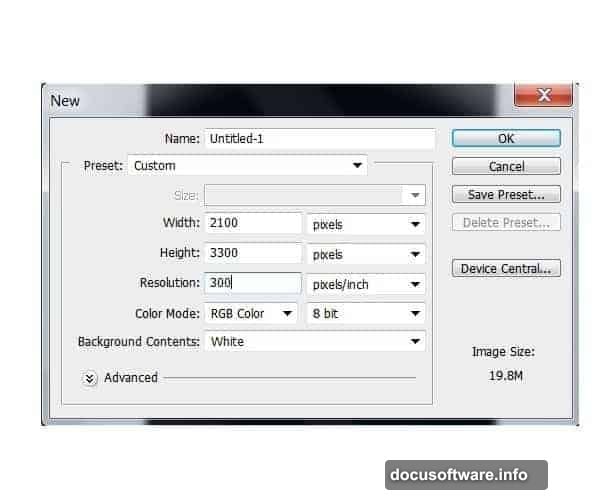
Start by creating a new document. Set the width to 2100 pixels and the height to 3300 pixels. Use a resolution of 300 dpi so everything stays crisp if you ever print it.
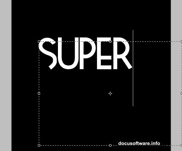
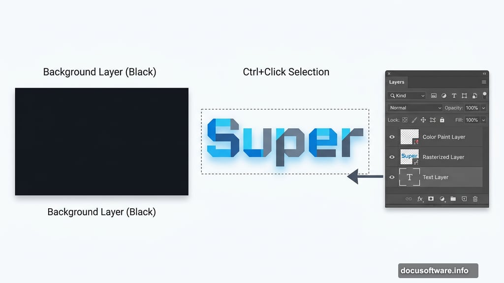
Select the Bucket tool (G) and fill your background layer with solid black. That dark base makes your colors pop dramatically once you start adding the glowing tones. Think of it like turning off the lights before lighting candles — the contrast does all the heavy lifting.
Adding Your Type
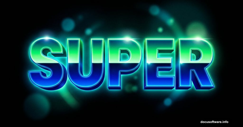
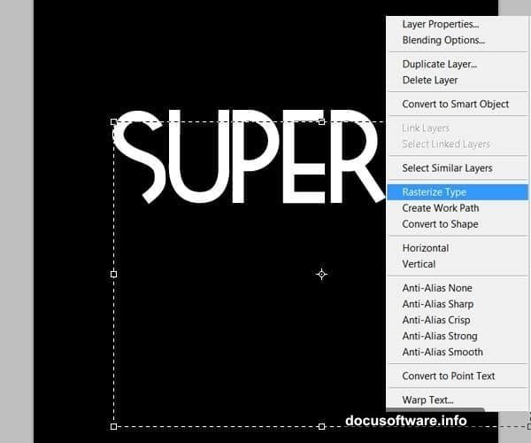
Grab the Type tool (T) and set your font to Tetra. Use a size around 250pt, though you can go bigger if you want the letters to fill more of the canvas. Type the word “Super” in the upper portion of your document.
Once your text is placed, right-click the text layer and select “Rasterize Layer.” This converts the live text into editable pixels. You lose the ability to change the wording after this point, so double-check your spelling before confirming.
Painting Color onto Your Letters
Here’s where the magic starts. Create a brand new layer above your rasterized text. Then hold Ctrl and click the text layer thumbnail — this loads the letter shapes as an active selection on your canvas.
Now grab the Brush tool (B). You’re about to hand-paint color directly onto the letters using that selection as your boundary.
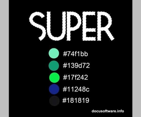
For this first word, the color palette runs from deep blues at the bottom to bright greens at the top. That shift from cool darks to vivid lights gives the letters their dimensional, shiny appearance.
Start by filling the entire selection with your mid-tone blue. This becomes your base color layer.
Building Depth with Shadows and Highlights
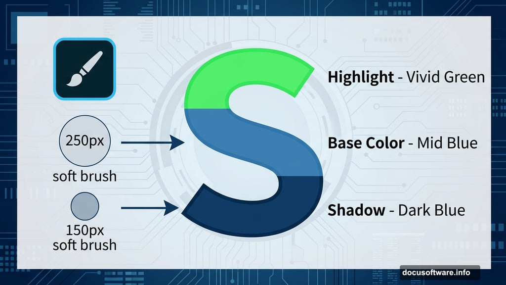
Switch to a soft brush with 0% hardness and a size around 250 pixels. Paint the lower portions of each letter with a darker blue shade. This creates shadow at the base and makes the letters feel like they have volume.
Next, reduce your brush to about 150 pixels. Pick your darkest green and start working on the upper areas of the letters. Don’t cover everything cleanly — leave traces of the blue peeking through underneath. That subtle blending is what separates a flat look from a realistic glow.
Lower your brush opacity to around 40% as you layer in lighter greens. This lets you blend colors gradually instead of making harsh jumps between shades. Keep building up lighter tones while preserving hints of the darker colors beneath.
Finally, pick up a small white brush and add precise highlights to the brightest spots on each letter. Think about where a light source above would catch the curves and edges. These white accents are what sell the shiny, almost chrome-like quality of the finished effect.
Boosting the Colors
Once you’re happy with your painted layer, go to Image > Adjustments > Brightness and Contrast. Push the contrast up a little. This makes the colors more saturated and vibrant without requiring you to repaint anything.
It’s a quick win that makes a noticeable difference. Before you hit this adjustment, the colors might look a touch muddy. After, they should feel rich and punchy.
A Few Tips If You Get Stuck
Several people working through this tutorial run into the same snags. The pen tool steps in later pages trip people up most often. If your pen tool paths aren’t filling with color, make sure you’re working on a regular pixel layer and not an empty path layer. Switching to the brush-and-selection approach described above avoids most of those headaches entirely.
The Tetra font also isn’t included in Photoshop by default. You need to download and install it separately before it shows up in your font menu. If it’s not appearing in your font list, close Photoshop, install the font at the system level, then reopen the program.
For the warping steps later in the tutorial, make sure your layer actually contains visible pixels before trying to warp it. Photoshop throws an error if you try to warp an empty or purely path-based layer. Merging your painted elements onto a single layer before warping usually solves that.
What Makes This Effect Work
The real secret here isn’t any single tool. It’s the combination of hand-painting color gradients and using a dark background to make those colors glow. The brush opacity control is especially important. Painting at 100% opacity gives you flat, solid color. Painting at 30-50% opacity lets you blend and layer organically, like mixing paint on a physical canvas.
Retro text effects like this one work because they mimic the kind of neon and backlit signage from mid-century design. That nostalgic quality resonates visually even for viewers who don’t consciously recognize the reference. The bold letterforms, saturated color shifts, and glowing highlights hit a sweet spot between decorative and modern.
Take your time with the color painting stage. Rushing through it leaves you with something that looks flat. Investing an extra twenty minutes to blend carefully and add those final white highlights pays off significantly in the finished result.