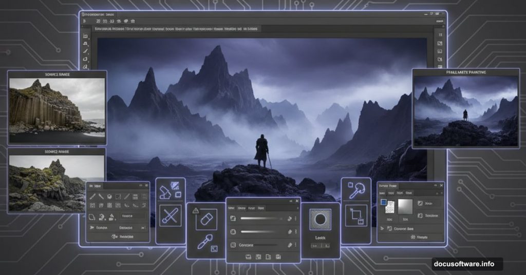
Dark fantasy landscapes aren’t easy to pull off. Most attempts end up looking either too muddy or painfully fake.
But this matte painting technique actually works. I’ve tested it multiple times, and the results consistently deliver that mysterious, atmospheric quality you see in concept art. Plus, it teaches fundamentals you’ll use in basically every photo manipulation project.
Here’s what makes this approach different from generic compositing tutorials.
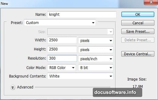
Start With Strong Foundation Elements
The tutorial uses Iceland’s Golden Circle landscape as the base. Smart choice. Real locations always beat generic stock photos because the lighting and perspective feel authentic.
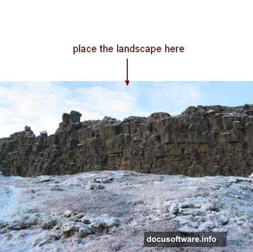
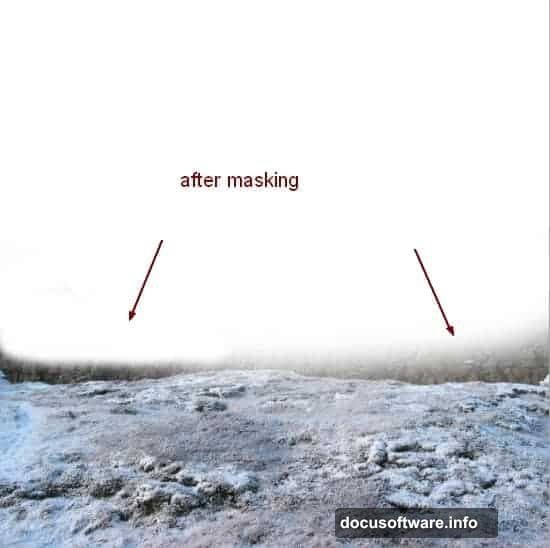
You’ll drag this landscape onto a fresh canvas and immediately mask out the sky. Why remove perfectly good sky? Because you’re building atmosphere from scratch. Pre-existing skies rarely match the mood you’re creating.
The ground stays intact. That natural texture becomes your foundation. Then you’ll desaturate it using a Hue/Saturation adjustment layer with clipping mask. This strips away distracting colors so you control the palette later.
Layer Rocks to Create Depth
Here’s where most tutorials go wrong. They just slap rocks onto a scene and call it done.
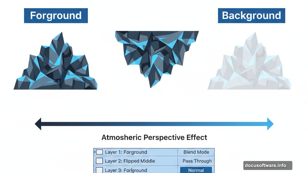
Instead, you’ll place sharp rocks in the foreground at full opacity. Those anchor the viewer’s eye. Then duplicate and flip them to create natural-looking formations on both sides.
But the magic happens with background rocks. Drop their opacity to 50%. This simple trick creates atmospheric perspective automatically. Distant objects appear hazier in real life, and lowered opacity mimics that effect perfectly.
Group all rock layers together. Change the group blend mode from Pass Through to Normal. Why? This lets adjustment layers affect all rocks simultaneously instead of treating each one separately.
Control Color and Contrast Aggressively
Color Balance adjustment layers add subtle red tones to the ground. Not much. Just enough to suggest warmth beneath the dark atmosphere.
Then Curves layers darken everything. You’ll pull down the midtones and shadows until the scene feels genuinely gloomy. Don’t be timid here. Dark fantasy needs actual darkness.
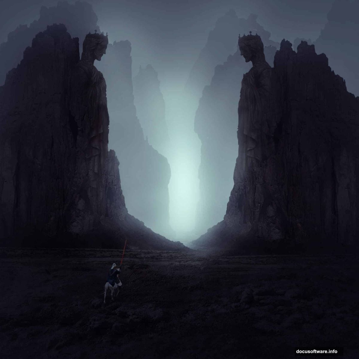
The statue and knight get added next with careful masking. These hero elements need clean edges, so spend time refining those masks. Sloppy selections destroy the illusion immediately.
Blend them using more adjustment layers. Match their color temperature to the environment. Adjust their brightness so lighting feels consistent across the scene.
Build Atmosphere With Mist Layers
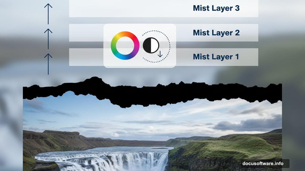
Mist makes or breaks atmospheric scenes. Too much looks fake. Too little feels flat.
The tutorial uses Color Fill layers with reduced opacity. This creates haze without obliterating your carefully composited elements. You can stack multiple mist layers at different opacities to build complex atmospheric depth.
Mask the mist selectively. Let it gather in low areas naturally. Keep foreground elements sharper than background ones. This reinforces depth and directs the viewer’s attention where you want it.
Fine-Tune Lighting Effects
Final adjustments matter enormously. Even perfectly composited elements look wrong if the lighting doesn’t unify them.
Add subtle light sources that make sense for your scene. Maybe rim light on the statue’s edge. Perhaps a faint glow near the horizon. These touches sell the reality of your fantasy world.
Curves adjustments refine overall contrast. Pull up highlights slightly. Deepen shadows further. Create separation between light and dark areas so the image reads clearly even when viewed small.
Color grading ties everything together. Subtle color shifts in highlights versus shadows add sophistication. Real environments exhibit this quality, so your matte painting should too.
Why This Technique Actually Works
Most compositing tutorials throw random elements together and hope for the best. This one builds systematically.
You establish foundation first. Add depth through opacity variations. Control color aggressively. Build atmosphere deliberately. Refine lighting until everything feels cohesive.
Each step supports the next. Skip one and the whole thing falls apart. Follow the sequence and you’ll end up with something that actually looks professional.
The skills transfer too. Master these fundamentals and you can create any atmospheric scene. Fantasy castles. Sci-fi cityscapes. Post-apocalyptic wastelands. The approach stays consistent even when the subject changes.
Stock photos from Iceland’s landscape, various rock formations, a statue, and a knight figure combine into something entirely new. That’s the real power of matte painting. You’re not just editing photos. You’re building completely new worlds from existing pieces.
Practice this technique until the workflow becomes automatic. Then you can focus on creative decisions instead of technical steps. That’s when your matte paintings truly start looking mysterious and compelling instead of obviously composited.