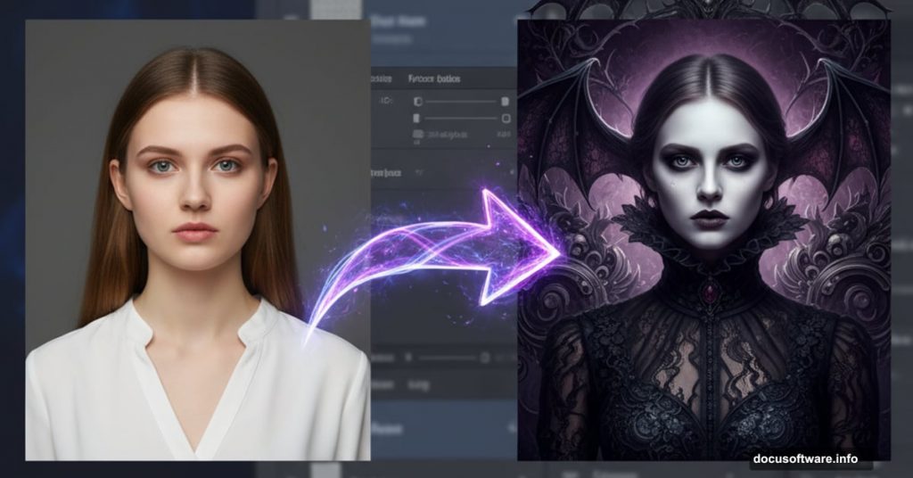
Want to create hauntingly beautiful gothic artwork? This technique turns ordinary photos into surreal, symmetrical compositions that look straight out of a twisted fairy tale.
You’ll learn to build atmospheric backgrounds, warp faces convincingly, and blend multiple images into cohesive dark art. Plus, the symmetry trick works for any style beyond gothic themes.
The whole process takes about 2-3 hours. But the techniques you’ll master apply to countless other projects.
Gather Your Source Images First
Before opening Photoshop, collect these elements. You’ll need a gothic model photo, ornate floor texture, vintage dress form, antique clocks, white rabbit image, stormy sky, decorative wall crest, and weathered wallpaper texture.
Can’t find exact matches? Look for similar gothic or Victorian-era elements. The specific images matter less than understanding how they work together.
Most importantly, choose high-resolution files. Low-quality sources will ruin your final artwork no matter how skilled your editing.
Build the Symmetrical Background
Create a new 2000x2000px canvas at 300dpi. This gives you plenty of resolution for detailed work.
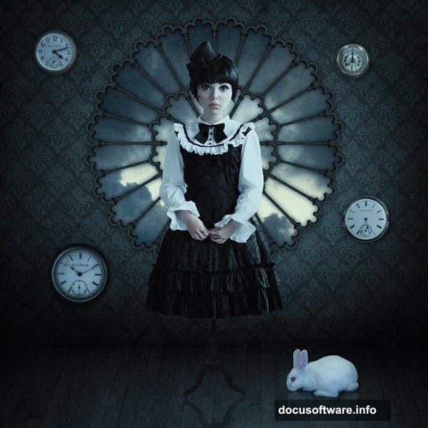
Start with your floor texture. Paste it and hit Ctrl+T to transform. Stretch it from the corners until it covers the bottom third of your canvas. Then drag the top edge down to create proper floor perspective.
Next, place your wall crest dead center. This becomes your symmetry anchor point for the entire composition.
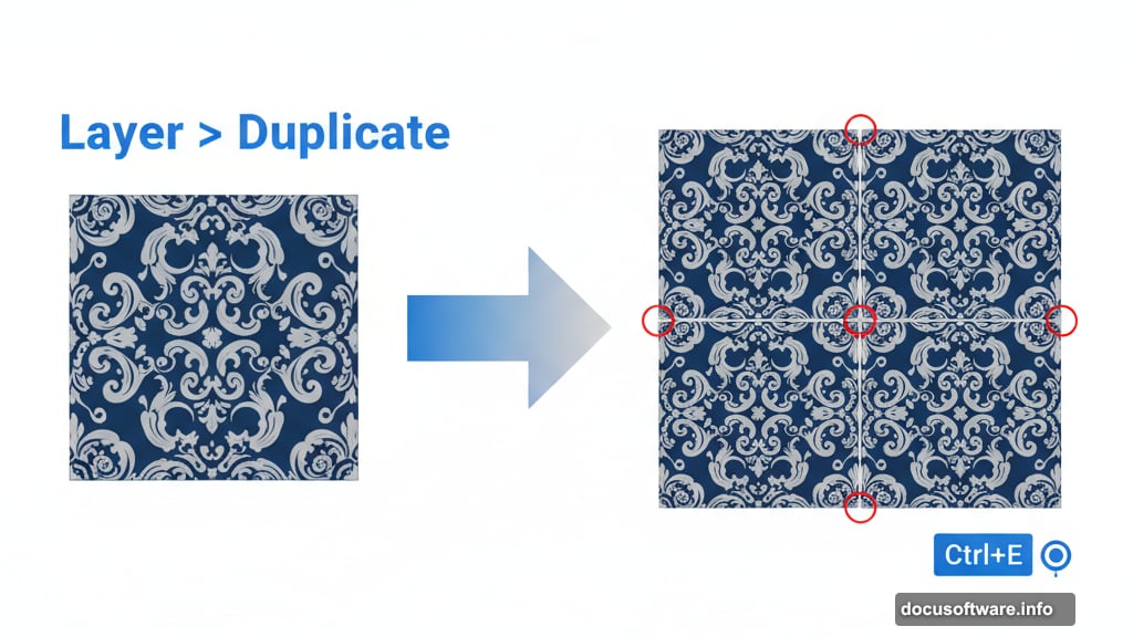
Master the Wallpaper Tile Technique
Here’s where patience pays off. Take your wallpaper texture and enlarge it so the pattern shows clearly. Position this layer behind your wall crest.
Now duplicate the wallpaper layer (Layer > Duplicate). Move this copy directly beside the first tile. Watch for gaps between tiles – even tiny spaces will show in the final piece.
Merge both tiles together by selecting them and pressing Ctrl+E.
Keep duplicating and merging. Place new tiles above, below, and beside existing ones. Think of it like laying real wallpaper, just digitally. The goal is complete wall coverage with seamless pattern repetition.
Zoom to 100% and check every edge. One missed gap ruins the illusion.
Cut Out the Crest Opening
Now for some selection magic. Click your wall crest layer. Grab the Magic Wand Tool (W) and click the area around the crest. Make sure “Contiguous” is checked so you only select connected areas.
Switch to your wallpaper layer. Hit Ctrl+Shift+I to invert your selection. Press Delete to remove wallpaper from inside the crest frame.
Press Ctrl+D to release the selection. You should now see a clean window through your wallpaper where the crest sits.
Add Atmospheric Sky
Drop your stormy sky image on a new layer beneath the crest. Resize until the clouds look appropriately dramatic through your crest window.
Here comes the mood setting. Go to Image > Adjustments > Brightness/Contrast. Drop brightness to -150 and contrast to -35. This darkens the sky considerably.
Then reduce Vibrance to -60. This desaturates colors for that gothic aesthetic. The sky should look threatening but not cartoonishly dark.
Place and Warp Your Main Subject
Position your gothic model photo on a new layer. She should be centered in your composition, perhaps slightly overlapping the crest frame.
Hit Ctrl+T for Transform. Right-click and choose Warp. This is where you’ll reshape the face to look younger or more doll-like. Push and pull the warp grid points gently – subtle changes work better than dramatic distortions.
Focus on enlarging the eyes slightly and shortening the face. Real children have different proportions than adults. Study reference photos if needed.
Take your time here. Warping looks obvious when done poorly but magical when done right.
Add Gothic Props Strategically
Bring in your antique clocks and position them around your composition. Vary their sizes using Free Transform (Ctrl+T). Rotate some for visual interest.
Add your white rabbit next. In gothic art, rabbits often symbolize time or innocence corrupted. Place it prominently but not centrally.
Include the vintage dress form off to one side. This adds Victorian flavor and fills negative space.
Each prop should feel intentional, not randomly scattered. Think about leading the viewer’s eye around your composition.
Blend Elements with Layer Masks
Now everything looks pasted together. Time to fix that. Add layer masks to your prop layers (Layer > Layer Mask > Reveal All).
Grab a soft brush set to black and paint on the mask edges. This softens harsh cutout edges and helps elements blend into your background.
Don’t mask too aggressively. You want soft edges, not faded transparency. Paint carefully around important details like the rabbit’s ears or clock hands.
Also adjust opacity on some layers. Not everything needs to be 100% visible. Subtle transparency creates depth.
Create Reflections in the Floor
Duplicate your main subject layer. Flip it vertically (Edit > Transform > Flip Vertical). Position this flipped copy below your original subject to create a floor reflection.
Lower the reflection’s opacity to about 40-50%. Reflections are never as bright as the original.
Add a layer mask and use a gradient (black to transparent) on the mask. This fades the reflection as it extends across the floor – exactly how real reflections behave.
For extra realism, add slight motion blur (Filter > Blur > Motion Blur) set to vertical. This mimics the slight blur you see in shiny floor reflections.
Balance Lighting Across Elements
Your composition probably has mismatched lighting right now. Some elements look bright, others dark, all from different source photos.
Create a new Curves adjustment layer above everything. Gently adjust the curve to unify your midtones. Don’t go extreme – subtle shifts work better.
Then add individual Brightness/Contrast adjustments to specific layers that still look off. Clip these adjustments to their target layers so they don’t affect everything.
The goal is making every element feel like it exists in the same space under the same lighting conditions.
Apply Color Grading for Mood
Time for that signature gothic color palette. Create a new Selective Color adjustment layer at the top of your stack.
Focus on the Cyans, Blues, and Magentas channels. Push them toward deeper, moodier tones. Gothic art typically favors cool colors with slight magenta contamination.
Don’t obliterate all warm tones though. A touch of warmth in skin tones keeps your subject human, not lifeless.
Also try a Color Lookup adjustment with the “Moonlight” or “Night from Day” preset. These instantly push images toward gothic territory.
Adjust the Color Lookup layer’s opacity until it feels right – usually 40-60% works better than full strength.
Add Texture for Aged Look
Gothic art often benefits from aged, weathered textures. Create a new layer at the top and fill it with your grunge texture.
Set this texture layer’s blend mode to Overlay or Soft Light. Lower opacity to taste – usually 20-30% adds character without overwhelming your image.
Consider adding a subtle vignette too. Create a new layer, fill it with black, and add a layer mask. Use a large soft brush with black to reveal the center, leaving darker edges. Set to Multiply mode at low opacity.
These touches add atmosphere and draw attention to your central subject.
Fine-Tune Symmetry Details
Step back and evaluate your composition’s balance. Gothic art often employs symmetry, but perfect symmetry can feel lifeless.
Look for opportunities to break symmetry intentionally. Maybe one side has slightly more shadow. Perhaps a prop appears only on one side.
Controlled asymmetry creates visual interest while maintaining the formal, balanced feeling gothic aesthetics demand.
Also check that your central subject remains the clear focal point. Everything else should support her, not compete for attention.
Final Polish and Sharpening
Almost done. Create a merged copy of all visible layers (Ctrl+Alt+Shift+E). This gives you a flattened version while preserving your layer stack.

Apply selective sharpening to this merged layer. Use Unsharp Mask or Smart Sharpen on important details like faces and key props.
Don’t sharpen backgrounds as much – slightly softer backgrounds help your subject pop forward.
Finally, evaluate your overall contrast. Does the image have rich blacks and clean highlights? Adjust with a final Curves or Levels adjustment if needed.
Save Multiple Versions
Export your final artwork as a high-res JPEG for sharing. But also save your PSD with all layers intact.
Why? You’ll probably want to tweak something later. Saved layers give you that flexibility. You might also want to create variations with different color grades or prop arrangements.
Consider exporting a slightly different color grade as well. Sometimes an image looks perfect on your monitor but needs adjustment for print or different screens.
This Technique Goes Beyond Gothic
These same methods work for countless other styles. The symmetry approach creates formal portraits. The warping technique ages or de-ages subjects. The blending methods apply to any photo manipulation.
Really, you’ve learned a complete photo composition workflow disguised as a gothic art tutorial. Master these techniques and you can create surreal composites in any aesthetic.
The key lies in thoughtful element selection and patient blending. Rushing produces obvious composites. Taking time creates artwork that looks painted rather than assembled.
Start with simple compositions. Add complexity as your comfort grows. Soon you’ll develop your own signature style within this dark, dramatic aesthetic.