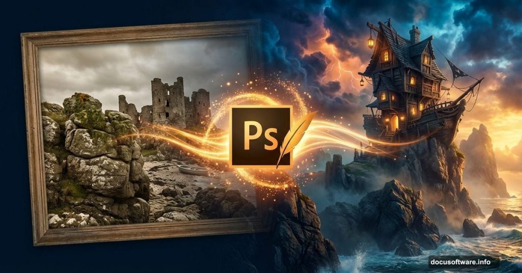
Want to build impossible worlds in Photoshop? This tutorial walks you through creating a dramatic pirate house perched on rocky mountains in a dreamlike landscape.
You’ll learn practical photo manipulation techniques that work across projects. Plus, these methods apply whether you’re crafting fantasy scenes or more grounded compositions. The core skills transfer to any creative photo editing work.
Let’s build something wild.
What You’re Actually Making
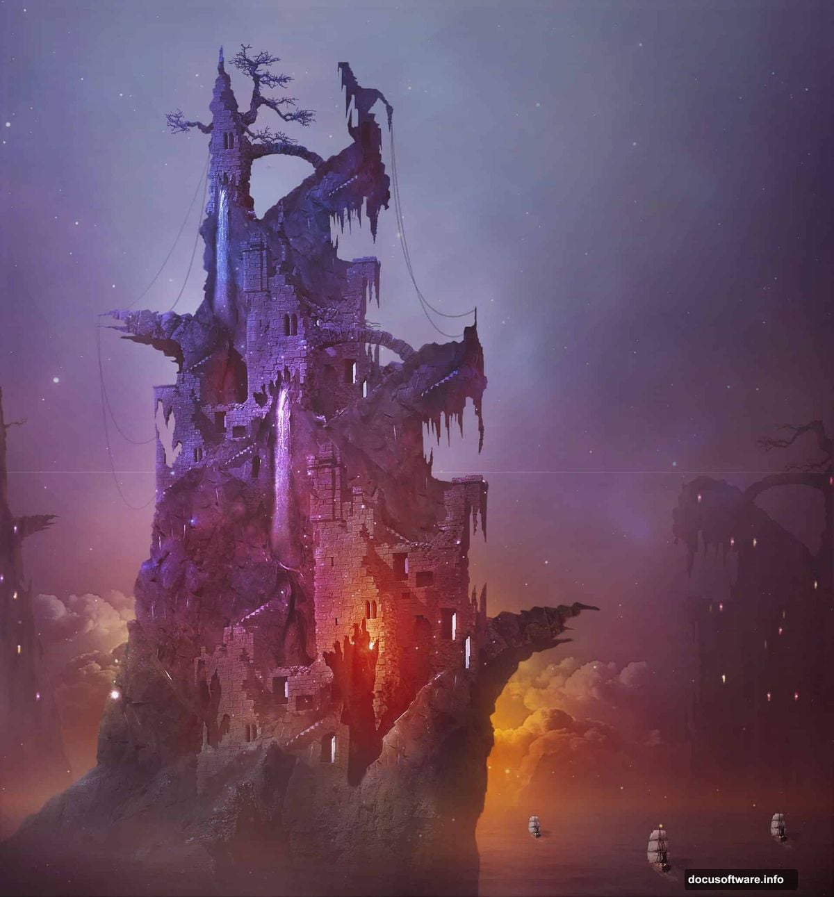
This isn’t just another basic compositing exercise. You’re creating a complete fantasy environment from ordinary stock photos.
The final piece features ruined castle walls transformed into a pirate dwelling. It sits atop rocky cliffs you’ll construct from crack and stone images. Everything gets bathed in warm, dramatic lighting that ties the scene together.
More importantly, you’ll master techniques that apply to countless projects beyond this specific tutorial.
Tools and Images You Need
First, grab these free stock photos. The tutorial relies on specific images that provide the right textures and elements.
You’ll need cloud formations, waterscapes, mountain rocks, beach scenes, castle ruins, bridges, towers, and trees. Plus pirate ships, waterfalls, cosmos textures, and crack details. All these come from stock photography sites like DeviantArt and similar platforms.
Software requirements: Photoshop CS3 or newer. The techniques work in modern versions too. In fact, newer releases make some steps faster with improved selection tools.
Also worth having nearby: coffee and patience. This tutorial takes several hours to complete properly.
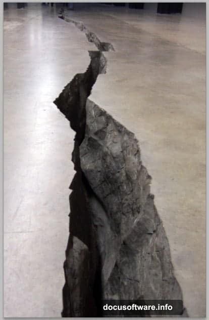
Building Rocky Mountains From Cracks
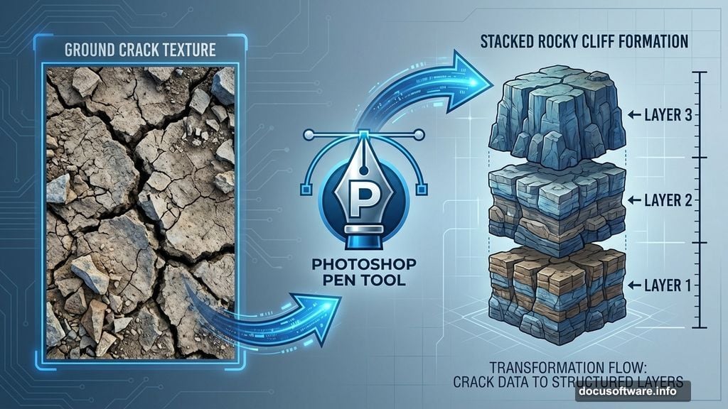
The foundation starts with an unusual choice. Instead of mountain photos, you’re using close-up crack images scaled up dramatically.
Why? Cracks provide interesting texture and natural-looking geological formations. When enlarged and stacked, they create convincing rocky cliffs.
Here’s the process: Open your crack image and grab the Pen Tool (P). Carefully trace around the crack formation, creating a path that isolates just the fissure itself. Convert that path to a selection, then cut out the crack.
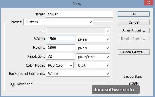
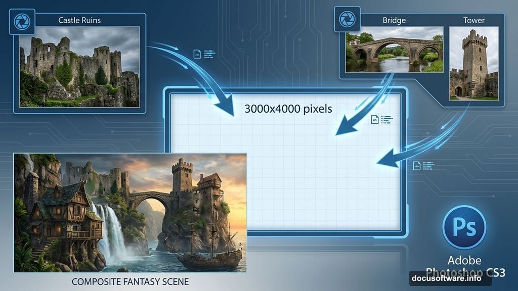
Next, create your main canvas. Set dimensions around 3000×4000 pixels for high-resolution output. This gives you room to work and detail to refine.
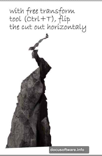
Paste your first crack cutout onto the canvas. Flip it horizontally using Edit > Transform > Flip Horizontal. This creates visual variety so repeated elements don’t look identical.
Now duplicate that layer (Ctrl+J). Flip this second crack back to its original orientation. Then move it behind the first crack, positioning it higher up. Scale as needed to create depth.
Repeat this process for a third crack layer. Stack them strategically to build a convincing rocky mountain face. The overlapping creates natural-looking geological strata.
This stacking technique works because our brains interpret the layers as three-dimensional forms. The shadows and highlights in the original photos sell the illusion.
Adding Castle Ruins to Rocky Peaks
Once your mountain base exists, you’ll add architectural elements. These transform the natural formation into a habitable structure.
Open your castle ruin images. You’re looking for walls, towers, and structural fragments that suggest age and weathering. These elements need to feel ancient and battle-worn.
Use the Pen Tool again for precise selections. Trace around castle sections you want to extract. Clean selections matter here because sloppy edges break the illusion instantly.
After cutting out castle pieces, paste them onto your main composition. Position them on the rocky cliffs you built earlier. Some should sit atop the peaks, while others nestle into crevices.
Layer masks become crucial at this stage. Add a mask to each castle layer. Paint with a soft black brush where castle meets rock. This blends the architectural elements into the natural forms.
The goal isn’t perfect cleanliness. Weathering, moss, and natural deterioration make the integration believable. So embrace rough edges in places.
Transform and rotate castle pieces until they appear structurally sound yet precarious. The pirate house should look livable but dangerous. That tension creates visual interest.
Creating Atmospheric Background Elements
Background layers add depth and atmosphere. Without them, your foreground elements float in empty space.
Start with your waterscape image. This forms the distant horizon and establishes the scene’s environment. Position it behind your rocky mountain layers.
Add cloud formations next. Clouds provide scale reference and enhance the dreamlike quality. Place them in the upper third of your composition.
Layer multiple cloud images for variety. Some should appear distant and hazy, while others sit closer to the viewer. This creates atmospheric perspective.
Adjust cloud layer opacity between 60-80%. Full opacity looks pasted-on and fake. Reduced opacity lets them interact with the overall color scheme.
Mountains in the far distance add another depth layer. Position mountain stock photos behind the waterscape. Blur them slightly with Filter > Blur > Gaussian Blur. Distance equals less detail.
Color matching becomes important here. Background elements should share a color temperature with your overall scene. If you’re going warm, shift backgrounds toward oranges and reds.
Use adjustment layers for color consistency. Hue/Saturation and Color Balance work well for this purpose. Apply them to individual layers or layer groups as needed.
Masking Techniques That Actually Work
Masking makes or breaks photo manipulation. Clean masks create seamless composites, while sloppy masks scream “fake.”
Layer masks work non-destructively. That’s their power. Paint with black to hide areas, white to reveal them. Gray creates partial transparency.
For hard edges like architectural elements, use the Pen Tool to create initial selections. Convert those to masks for sharp, clean boundaries.
Soft brushes work better for organic elements. Trees, rocks, and natural forms benefit from gentle transitions. Use a soft-edged brush at 20-30% opacity, building up gradually.
Here’s a pro technique: paint your mask while viewing just the mask itself. Alt-click (Windows) or Option-click (Mac) the mask thumbnail. This shows the mask in grayscale, making it easier to spot problems.
Refine Edge (or Select and Mask in newer versions) helps with tricky selections. This tool detects edges and creates better masks automatically. Use it for hair, foliage, and complex organic shapes.
Don’t forget the brush hardness setting. Hard brushes create harsh transitions, while soft brushes create gradual ones. Adjust based on what you’re masking.
Layer mask density controls overall opacity. Lower density makes the entire mask more transparent. This helps blend elements that need to maintain some visibility through the mask.
Lighting and Color Harmony
Consistent lighting sells the illusion. Mismatched light directions or color temperatures break believability instantly.
Decide on a primary light source. In this tutorial, warm golden light comes from the upper left. Every element needs to reflect that decision.
Use the Dodge Tool (O) to brighten areas facing the light source. Work on separate layers if possible, maintaining flexibility. Set the tool to Highlights range at 15-20% exposure.
The Burn Tool darkens areas away from light. Use it on shadows and recessed areas. Midtones range at 10-15% exposure works well. Build up gradually rather than applying heavy adjustments immediately.
Color Lookup tables create cohesive color grading. These appear under Image > Adjustments > Color Lookup. They apply film-style color grades that unify disparate elements.
Curves adjustments offer precise control. Create a Curves adjustment layer above your composition. Adjust the RGB curve for overall contrast, then tweak individual color channels.
For warm lighting, lift the red channel slightly while pulling down the blue channel. This shifts the entire image toward golden tones. Adjust to taste.
Selective Color adjustments target specific color ranges. Use this to enhance or reduce particular hues without affecting the entire image.
Gradient Map adjustment layers apply color grades based on luminosity values. Darks take one color, lights take another, with smooth transitions between. Great for dramatic lighting effects.
Details That Add Realism
Small details separate good manipulations from great ones. These finishing touches demand patience but deliver impact.
Add atmospheric haze between depth layers. Create a new layer set to Screen blending mode. Paint with a soft blue-gray brush at low opacity between foreground and background elements.
This simulates atmospheric perspective—the natural haze that builds with distance. It grounds your fantastical scene in perceptual reality.
Texture overlays add grit and character. Find subtle texture images—paper, fabric, stone. Place them over your composition at low opacity (10-20%) with Overlay or Soft Light blending modes.
Lens effects enhance the photographic feel. Add subtle vignetting by creating a dark oval selection, inverting it, and filling with black on a new layer. Set to Soft Light at 20-30% opacity.
Consider adding water spray effects near waterfalls or ocean elements. Use cloud or smoke brushes at low opacity with blue-white colors.
Light rays streaming through clouds create drama. Paint them on a new layer with a soft white brush, then apply Motion Blur. Set the layer to Screen mode at 40-60% opacity.
Don’t forget small environmental details. Birds flying in the distance, flags on the pirate structure, or smoke from chimneys. These tiny elements suggest life and activity.
Common Mistakes to Avoid
After years of photo manipulation, certain errors appear repeatedly. Here’s what trips up most creators.
Scale inconsistencies break immersion. A person-sized door on a massive castle wall looks wrong. Keep realistic proportions between architectural elements.
Overusing filters creates a processed look. Filters should enhance, not dominate. If someone notices a filter immediately, you’ve gone too far.
Ignoring light direction causes disaster. Every element must share a consistent light source. Shadows pointing different directions reveal composite work instantly.
Too much saturation looks cartoonish. Real photographs rarely feature super-saturated colors. Keep adjustments subtle, especially in multiple-element scenes.
Sharp edges where elements meet look pasted on. Always blend boundaries with soft brushes or mask feathering. Real-world transitions are rarely razor-sharp.
Matching color temperature matters more than exact color. Warm elements look wrong in cool scenes. Make sure every piece shares the overall temperature.
Forgetting to vary opacity creates flat compositions. Distant elements should be lighter and less saturated than foreground ones. This mimics natural atmospheric effects.
Advanced Finishing Touches
Once the base composition exists, final refinements elevate the work.
Smart Sharpen filter adds crispness. Apply it to foreground elements only, not background layers. Use Amount: 80-120%, Radius: 0.8-1.2 pixels.
Create a High Pass sharpening layer for control. Duplicate your composition, convert to Smart Object, then apply Filter > Other > High Pass. Set Radius to 1-2 pixels, then change blending mode to Overlay at 50-70% opacity.
Chromatic aberration adds subtle realism. Real lenses create color fringing at high-contrast edges. Duplicate your composition layer, separate color channels, and shift them slightly.
Noise grain matches the photographic feel of stock images. Add a new layer filled with 50% gray. Apply Filter > Noise > Add Noise at 2-4%. Set blending mode to Overlay at 20-40% opacity.
Final color grading unifies everything. Add a Color Balance adjustment layer at the top of your layer stack. Make subtle adjustments to shadows, midtones, and highlights.
Consider split toning—warm tones in highlights, cool tones in shadows. This creates visual interest while maintaining overall harmony.
Testing Your Composition
Before declaring the piece finished, test it critically.
View at 50% zoom. This approximates how most people see images online. Details that work at 100% might look muddy at display size.
Flip the canvas horizontally (Image > Image Rotation > Flip Canvas Horizontal). Fresh perspective reveals composition problems you’ve stopped noticing.
Walk away for an hour or overnight. Coming back with fresh eyes exposes issues invisible during active work.
Ask someone unfamiliar with the project for honest feedback. They’ll spot problems you’ve rationalized away.
Check the composition in grayscale (Ctrl+Shift+U on a duplicate layer). This reveals whether contrast and values work independent of color.
Look for tangents—lines that nearly touch but shouldn’t. These create visual confusion. Adjust placement to clearly separate or overlap elements.
Test different backgrounds behind the image. Sometimes pieces that look great on white appear weak on dark backgrounds.
Why This Tutorial Matters
This specific pirate house scene teaches techniques that transfer everywhere.
You learned to build convincing environments from unrelated photos. That skill applies to product photography, concept art, advertising work, and personal projects.
Masking, lighting, and color harmony matter in every composite. Master these fundamentals and you can create anything.
The stacking technique for building mountains works for creating any large-scale environmental element. Cities, forests, ice formations—the principle stays the same.
More importantly, you learned to see potential in ordinary images. That crack photo becomes a mountain. Castle ruins transform into a pirate dwelling. This creative vision matters more than technical skills.
Keep practicing these techniques. Each project reveals new challenges and solutions. The seventh hour of work teaches lessons the first hour couldn’t.
Your next fantasy scene awaits. Start building impossible worlds.