Changing red to blue? Easy. Swapping yellow for green? No problem.
But turning pure white or solid black into vibrant color? That’s where most people hit a wall. The usual Hue/Saturation adjustments barely make a dent. Plus, those automatic color tools completely ignore white and black.
Here’s the trick Adobe doesn’t advertise. One slider movement makes impossible color changes suddenly easy.
Why Standard Color Adjustments Fail on White and Black
Photoshop’s color tools work by shifting existing color information. However, white and black contain no color data to shift.
White reflects all wavelengths equally. Black absorbs everything. So when you move the Hue slider, nothing happens. You might see tiny changes in shadows or highlights, but the main areas stay stubbornly colorless.
The Colorize checkbox helps a bit. But it produces weak, washed-out results. That’s because Photoshop still can’t add color where none exists.
Until you understand the secret slider.
Transform White into Vivid Color in Three Steps
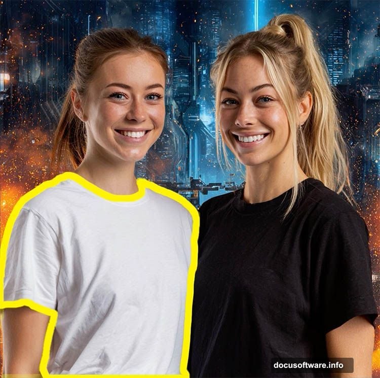
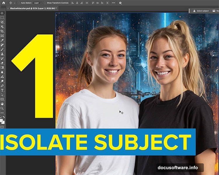
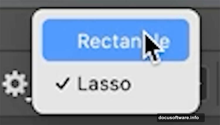
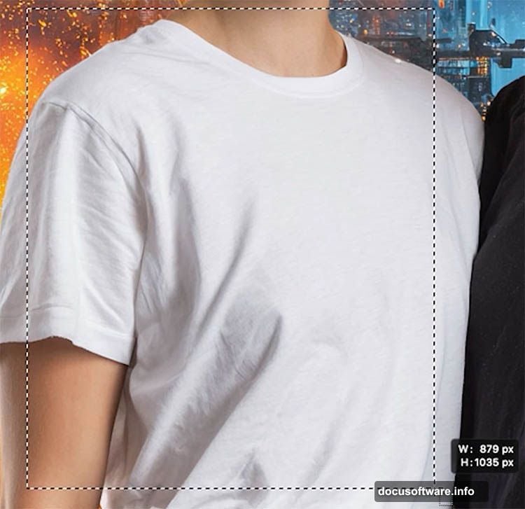
Start by selecting your white object. The Object Selection tool makes this fast.
Choose the Rectangle mode from the tool options. Then drag a box around your white shirt, dress, or object. Photoshop automatically detects the edges and creates your selection.
Hold Alt (Option on Mac) to subtract areas Photoshop grabbed by mistake. Hold Shift to add sections it missed. Get your selection clean before moving forward.
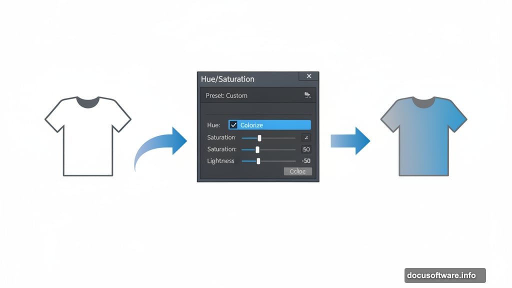
Now click the Adjustment Layer icon in your Layers panel. Choose Hue/Saturation from the menu. Photoshop creates a mask from your selection automatically.
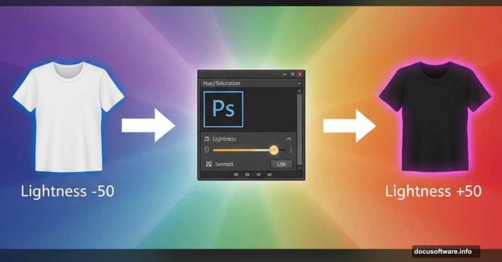
Here’s where the magic happens. Check the Colorize box first. Then move the Lightness slider left toward -50 or darker.
Watch what happens. Your white object turns gray, then starts accepting color. The Hue slider now controls which color you get. Saturation determines how intense that color appears.
This works because you’re forcing white into the gray range where color information can exist. Once gray, colorization succeeds. Simple physics Photoshop won’t explain.
Turn Black into Any Color You Want
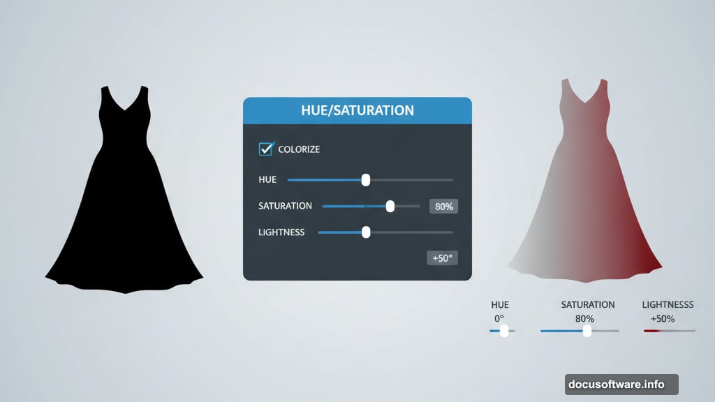
Black needs the opposite approach. Select your black object using the same Object Selection technique.
Add another Hue/Saturation adjustment layer. Check Colorize again. But this time, push Lightness right instead of left.
As black brightens toward gray, color suddenly works. Move Lightness to +50 or higher. Then adjust Hue to pick your color. Increase Saturation for deeper, richer results.
The same principle applies. Gray accepts color where pure black cannot. So you force black lighter until colorization takes hold.
You now control three sliders for complete color freedom:
- Hue: Picks which color (0-360 degrees on the color wheel)
- Saturation: Controls color intensity (0% = gray, 100% = maximum color)
- Lightness: Activates color by creating gray tones (-100 to +100)
Most tutorials stop here. But you’ll notice ugly edges around your recolored objects.
Fix Selection Edges That Ruin Your Color
Light halos or dark outlines often appear after colorizing. Sometimes they show up, sometimes they don’t. When they do, here’s the fix.
Hold Cmd (Ctrl on Windows) and click your layer mask thumbnail. This loads your selection again.
Go to Select > Modify > Expand. Enter 1 or 2 pixels. Usually 1 works best. Click OK to slightly enlarge your selection.
Then choose Select > Modify > Feather. Add 1 pixel of feathering. This softens the edge.
Press Cmd+H (Ctrl+H) to hide the marching ants. Your selection stays active but becomes invisible. Now you can see what you’re fixing.
Grab the Brush tool. Set white as your foreground color. Make sure your layer mask is selected in the Layers panel.
Paint along the bad edges. White removes areas from the mask, revealing your color corrections right up to the edge. The halo disappears as you paint.
This technique works because you’re essentially removing the problematic edge pixels from your adjustment. The original image shows through cleanly.
Match Two Colors Perfectly Without Guessing
Suppose you colorized both a white shirt and black shirt. Both look blue, but different shades. Here’s how to match them exactly.
Click the top Hue/Saturation adjustment layer. Look at the Properties panel. Note the Hue number (say 213) and Saturation value (maybe 68).
Select your other adjustment layer. Enter those same numbers. The colors now match their hue and intensity.
Only Lightness remains different. Adjust it by eye until both objects appear the same shade. This takes seconds instead of endless trial and error.
Why this works: Hue and Saturation define the actual color. Lightness controls brightness. By copying the first two values, you guarantee identical color. Then you just balance the brightness.
When Contrast Needs Fixing Too
Sometimes your colorized object looks flat. The color is perfect, but shadows and highlights seem weak.
Add a Curves adjustment layer above your color layer. Create a gentle S-curve by placing one point in the shadows (pull down slightly) and another in highlights (lift up slightly).
The S-curve increases contrast without changing your carefully matched colors. However, it might affect the overall tone too much.
Use Blend If to protect your colors. Double-click next to your Curves layer name. In the Layer Style dialog, move the Blend If sliders to affect only certain tonal ranges. This lets you boost shadow contrast while protecting midtones.
Hold Alt (Option) and drag the slider markers to split them. This creates smoother transitions. Your contrast improves, but colors stay true.
Alternative Approach: LAB Color Mode
Advanced users sometimes prefer LAB color mode for colorizing. It separates luminosity from color channels completely.
Convert your image to LAB mode via Image > Mode > Lab Color. The L channel contains all brightness information. The A channel controls green-magenta color. The B channel handles blue-yellow.
Apply Curves to the A and B channels independently. Push colors toward any direction you want. Meanwhile, the L channel preserves all your tonal detail.
LAB offers more control over color intensity and prevents brightness shifts. But it’s harder for beginners to visualize. The Hue/Saturation method remains more intuitive for most people.
Common Mistakes That Kill Your Results
Don’t skip the Colorize checkbox. Without it, your sliders barely affect white or black. Always check Colorize first.
Moving Lightness the wrong direction causes problems. Remember: white needs darker (left), black needs lighter (right). Get this backward and nothing works.
Over-saturating looks fake fast. Start around 40-50% saturation. Increase gradually until it looks natural. Real fabric rarely hits 100% saturation.
Ignoring edge issues creates obvious compositing. Always check your edges at 100% zoom. Fix halos before finishing.
Skipping the Expand and Feather steps leaves harsh selection lines. Those one-pixel adjustments make professional versus amateur differences.
When This Technique Saves Projects
Product photography benefits most. White and black products are common. Clients often request multiple color versions for catalogs. This method delivers any color instantly.
Fashion photography uses this constantly. Stylists photograph white samples, then colorize for different seasonal lines. One photoshoot produces dozens of color variations.
Graphic designers fixing client-supplied images rely on this. When someone provides a black logo that needs color, or white text that should match brand colors, this technique solves it.
Composite artists colorizing objects to match scenes use this daily. Dropped in a white car that needs to be red? Black jacket that should be blue? This handles it.
Your ability to colorize previously impossible subjects just expanded dramatically. White and black no longer resist your color changes. Instead, they accept any hue you choose with full saturation and perfect edge quality.
Test this on your own images. Start simple with solid-colored objects. Once you nail the Lightness direction for white versus black, everything else clicks into place.