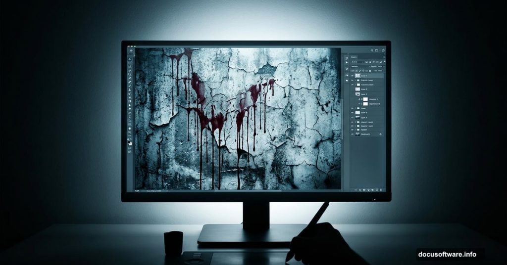
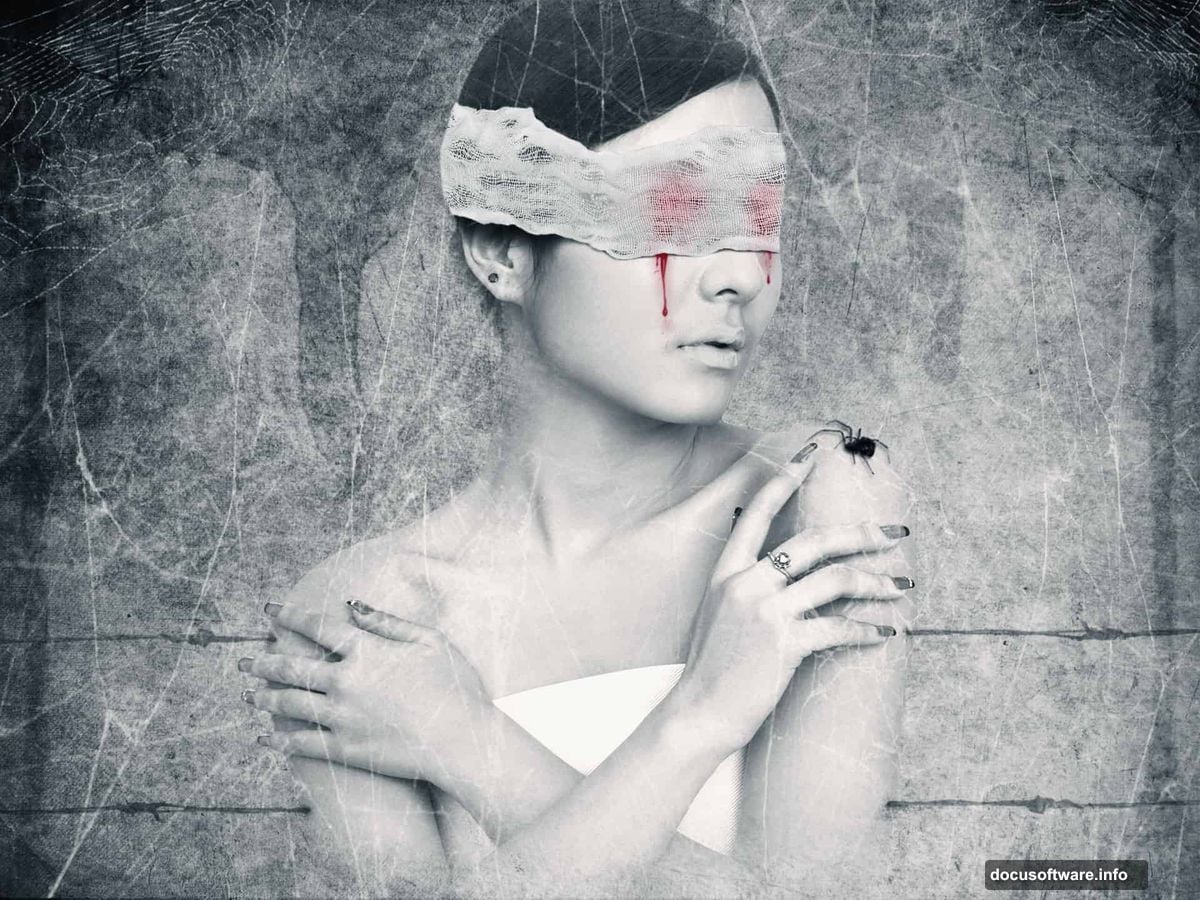
Dark, moody, and unsettling in the best way possible. That’s exactly what this photo manipulation tutorial delivers. “The Pain” combines grunge textures, blood splatter effects, and cold color tones into one striking piece of abstract art.
Whether you’re new to photo manipulation or looking to sharpen your compositing skills, this project walks you through every layer, every blend mode, and every texture trick you need to pull it off.
Let’s get into it.
Setting Up Your Canvas and Grunge Texture Base
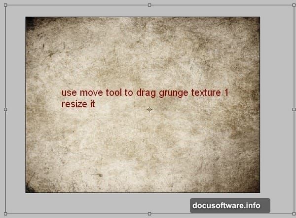
Start by creating a new document at 1333x1000px and fill it with white. You can use any size you like, but these proportions work well for the final composition.
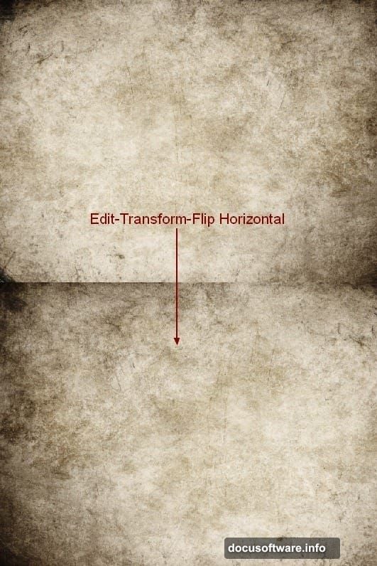
Open your first grunge texture stock image. Grab the Move Tool (press V) and drag it into your main document. Resize it to cover the canvas, then head to Edit > Transform > Flip Horizontal. Next, press Cmd/Ctrl+Shift+U to fully desaturate the texture, stripping it down to black and white.
This step builds the raw, weathered foundation everything else sits on.
Layering the Second Grunge Texture
Open your second grunge texture and drag it into the canvas. Apply the same steps — resize, transform, and flip. One important note here: you only need the center portion of this texture. Focus on that area and let the edges fall away.
Set this layer’s blend mode to Multiply at 50% opacity. The two textures together create a gritty, aged surface that already feels uncomfortable to look at.
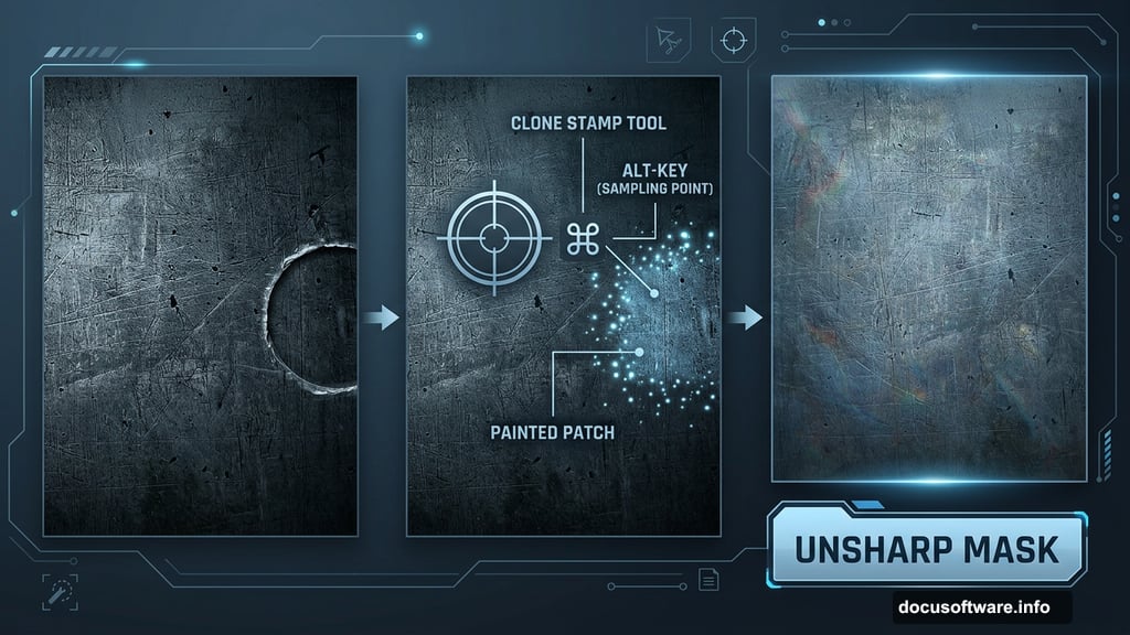
Fixing the Background with Clone Stamp
Take a close look at the right edge of your background. There’s a carved circle detail that doesn’t belong in this composition. Create a new layer (Cmd/Ctrl+Shift+N), then press S to activate the Clone Stamp Tool.
Hold Alt to sample a clean area nearby, then paint over the circle to cover it. It doesn’t have to be perfect — this is a grunge background, so rough edges add character. Once you’ve cloned over the area, sharpen things up with Filter > Sharpen > Unsharp Mask to tighten any blurring the clone process introduced.
Adding Blood Splatter to the Background
Create a new layer and set your foreground color to black. Load the dried blood splatter brushes and pick one that feels right for the mood. Paint your chosen splatter near the top of the image.
Set this layer’s blend mode to Soft Light at 100%. Depending on how bold your brush stroke looks, you can adjust the opacity or duplicate the layer to dial in the effect. The goal is texture and tension, not a literal blood puddle.
Building Up the Splatter Layers
Make another new layer. Use the first brush from the pack and paint along the left side of the background, setting this layer to Soft Light at 50%. Then duplicate it and mirror it to the right side for balance.
Keep going with additional layers of smaller splatters. Set one to Soft Light at 50% and another to 100% for variation. Add a layer mask to any of these layers if you need to erase bits that feel too heavy or land in the wrong place. The layered approach gives the splatter depth and makes it look organic rather than stamped on.
The Tutorial Resources You’ll Need
Before jumping in, gather these stock assets:
- Grunge texture 1 and 2 from darkrose42-stock
- Model photo from Adobe Stock
- Dried blood splatter brushes from Photoshop Tutorials
- Glossy blood splatter brushes from Photoshop Tutorials
- Cobweb brushes from Obsidian Dawn
- Cobweb texture from Fantasystock
- Wire from Morguefile
- Bandage from Titelgestalten
Each element plays a specific role in the final composition. The wire and bandage pieces especially add that eerie, almost clinical feeling that makes this piece so unsettling.
Why This Technique Builds Real Photoshop Skills
The “The Pain” project teaches you several compositing fundamentals that apply to almost any photo manipulation work. Blend modes like Multiply and Soft Light are the backbone of non-destructive texture blending. Knowing when to use each one — and at what opacity — is a skill that takes practice to develop.
The Clone Stamp correction step is equally valuable. Real-world compositing rarely involves perfect source images. Learning to clean up unwanted elements quickly and convincingly makes your workflow dramatically more efficient.
Plus, applying a cold color tone in the later stages teaches you how a single color grade can unify completely different source images into one cohesive scene. That’s the difference between a composition that looks assembled and one that looks intentional.
This project is absolutely worth the time if you want to push your photo manipulation work into darker, more expressive territory. The techniques here — texture layering, splatter painting, color grading — are tools you’ll reach for again and again. Start with the five steps covered here, work through the full tutorial, and don’t be afraid to make it your own.