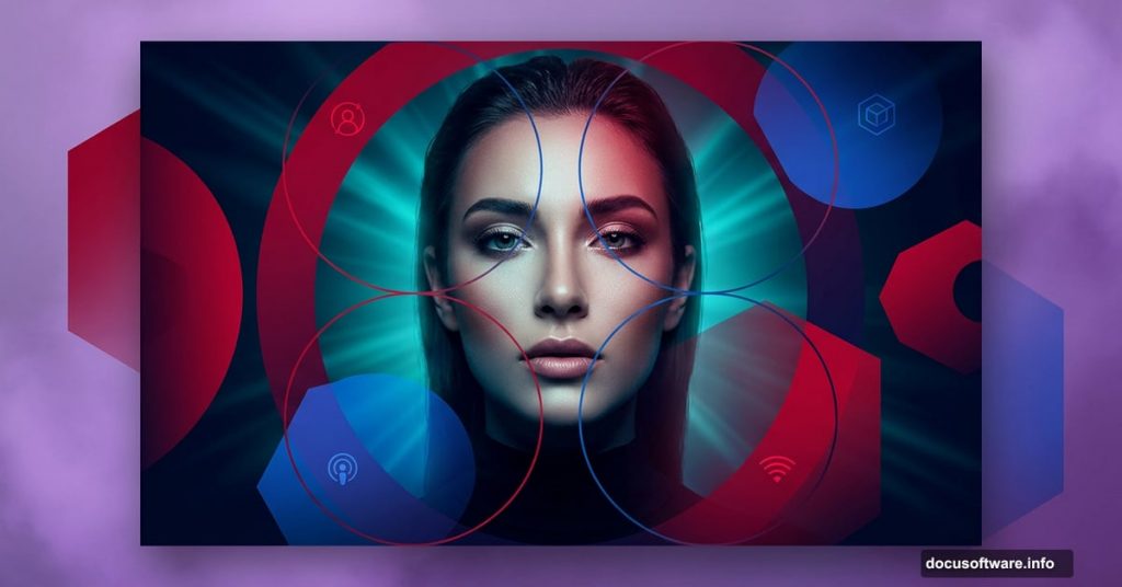
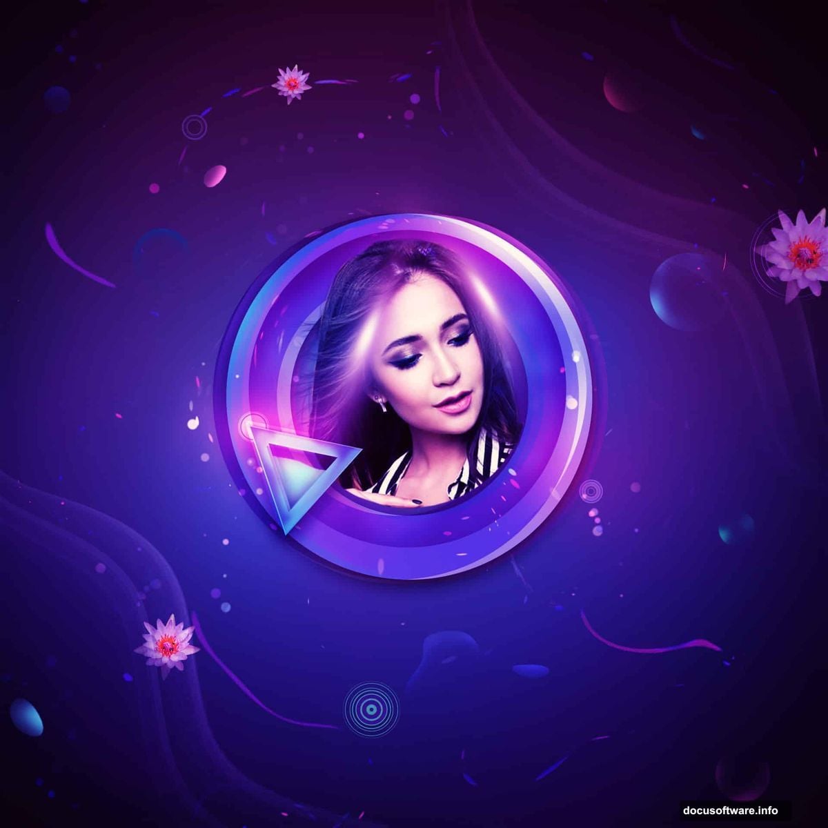
Digital art doesn’t have to be intimidating. With the right steps, you can build a gorgeous abstract portrait with bold geometric shapes, moody lighting, and rich color effects that look professionally crafted.
This tutorial walks you through the entire process. You’ll learn how to layer gradients, work with custom shapes, paint atmospheric lighting, and blend colors in ways that feel dynamic and alive. The finished piece features a woman surrounded by modern geometric elements with a sleek, editorial feel.
Let’s build it from scratch.
What You Need Before You Start
Grab these resources before opening Photoshop:
- A model photo (the original tutorial uses a “Waterlily” stock image)
- Circular vector elements
- Light ray overlays
Also, make sure you’re working in Photoshop with Custom Shape tools available. You’ll use them quite a bit throughout this project.
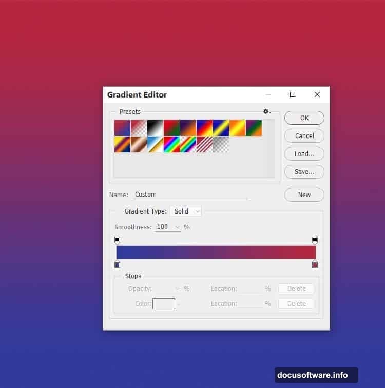
Building Your Background Gradient
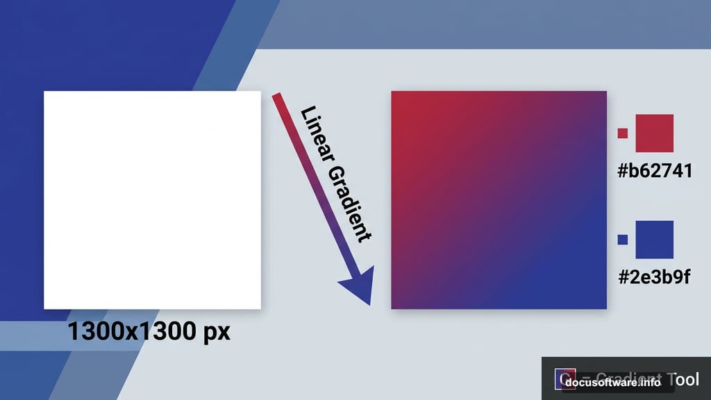
Start with a new 1300×1300 px document filled with white. This square canvas gives you plenty of room to work with balanced composition.
Next, hit Ctrl+Shift+N to create a fresh layer. Press G to activate the Gradient Tool, then select Linear Gradient. Pick two colors: a warm crimson red (#b62741) and a deep cobalt blue (#2e3b9f).
Drag your gradient line straight from the top of the canvas to the bottom. You should see a vivid red-to-blue transition that sets a punchy, dramatic tone for everything that follows.
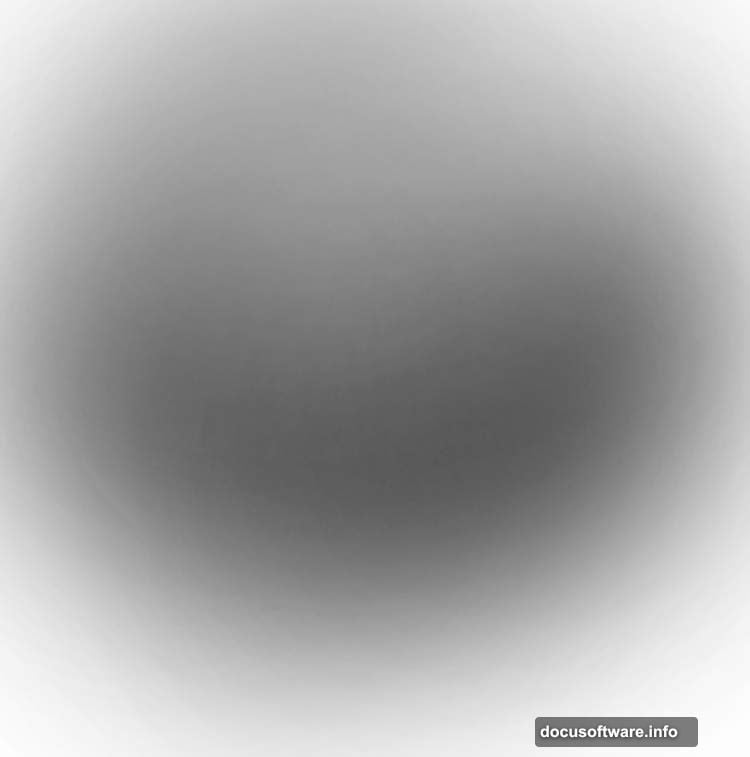
Adding Depth with Shadow and Light Layers
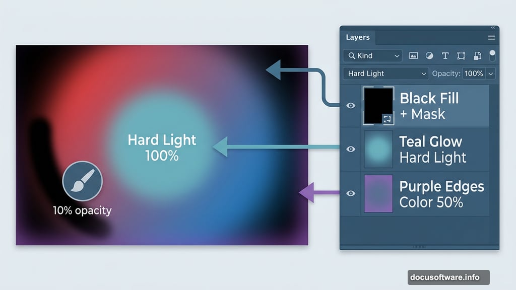
Here’s where things start feeling three-dimensional. Create a new layer and fill it completely with black. Then click the mask icon at the bottom of the Layers panel to add a layer mask.
Grab a soft round brush, set it to black, and drop the opacity to about 10%. Gently paint over the middle section of the canvas. This dark vignette pushes the edges back visually, creating a natural focus point in the center.
Now add another new layer. Switch your brush color to a soft teal (#6db1bd) and paint loosely over the middle area. Change this layer’s blend mode to Hard Light at 100%. That teal glow punches through the gradient underneath and adds a cool, electric feel to the center.
Painting Atmospheric Color
Create one more new layer and switch your brush color to a soft purple (#885ca9). Paint this color loosely around the outer edges of the canvas. Then set this layer’s blend mode to Color at 50%.
Add a mask to this layer. Using a soft black brush at around 10-15% opacity, gently erase the color from the middle section. This keeps the atmospheric purple framing the edges while leaving your central focus area cleaner and more vibrant.
The result so far should feel moody and rich, like the background of a high-end concert poster.
Drawing the Geometric Circle Elements
This is the part that transforms a simple gradient into something that feels genuinely designed. Create a new layer and press U to activate the Custom Shape Tool.
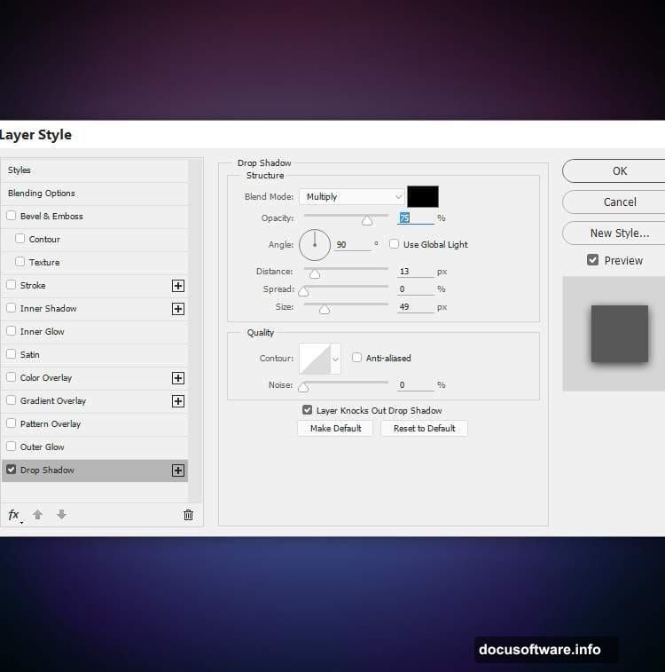
Find the Circle Frame shape in your shape library. Set the color to a bright sky blue (#63a1ec) and draw it centered on the canvas. Double-click the layer to open Layer Style options. Add a Drop Shadow effect and set the shadow color to black. This gives the circle a subtle sense of floating above the background.
Now duplicate that circle layer. Change its color to a deep violet (#360955). Right-click the layer and choose Clear Layer Style to remove the shadow. Use the Move Tool (V) to nudge it slightly to the left. Set this layer to Overlay mode at 50%. The dark violet circle blends beautifully with the gradient beneath it.
Layering More Circles for Visual Rhythm
Duplicate the violet circle layer and change its color to a hot pink (#ec63bd). Move this one slightly to the right of the first circle. Set its blend mode to Overlay at 30%.
Add a mask to this pink circle layer. With a soft black brush at about 20% opacity, gently erase the left side of the circle. This creates a fade effect that makes the circles feel like they’re overlapping and interacting naturally rather than just stacking on top of each other.
Finally, duplicate this layer and move it slightly to the left. Change its color to a warm coral-red (#ec6663). At this stage, you can adjust the blend mode to show the shape’s original color more clearly, depending on how you want the color balance to feel.
Why These Color and Blend Mode Choices Matter
It’s worth pausing here to appreciate what’s happening with these blend modes. Overlay, Hard Light, and Color modes all interact differently with the layers beneath them.
Overlay intensifies contrast while letting underlying colors show through. Hard Light creates strong light and shadow effects. Color mode applies only the hue while preserving the original luminosity underneath. Together, these modes let you build rich, layered color effects that would be nearly impossible to paint manually.
That’s the real skill being practiced in this tutorial. It’s not just about following steps. It’s about understanding how layers talk to each other.
The combination of geometric precision and loose painted lighting gives this style its distinctive appeal. The circles feel structured and intentional. The soft brush strokes feel organic and atmospheric. Those two energies together create something that feels both designed and alive.
As you continue building this piece, keep experimenting with opacity and blend mode combinations. Small adjustments create big visual differences, and that creative flexibility is exactly what makes Photoshop such a powerful tool for digital portrait art.